👩🏻🔬 Accessibility Testing Insights
During my review of the TELL Japan website, I identified 17 accessibility and UI/UX issues. While 7 of these issues required coding changes, I addressed the other 10 through design improvements. Here’s how I tackled them.
✅ How I Solved Accessibility and UX Issues
1. Low Color Contrast on Buttons and Text:
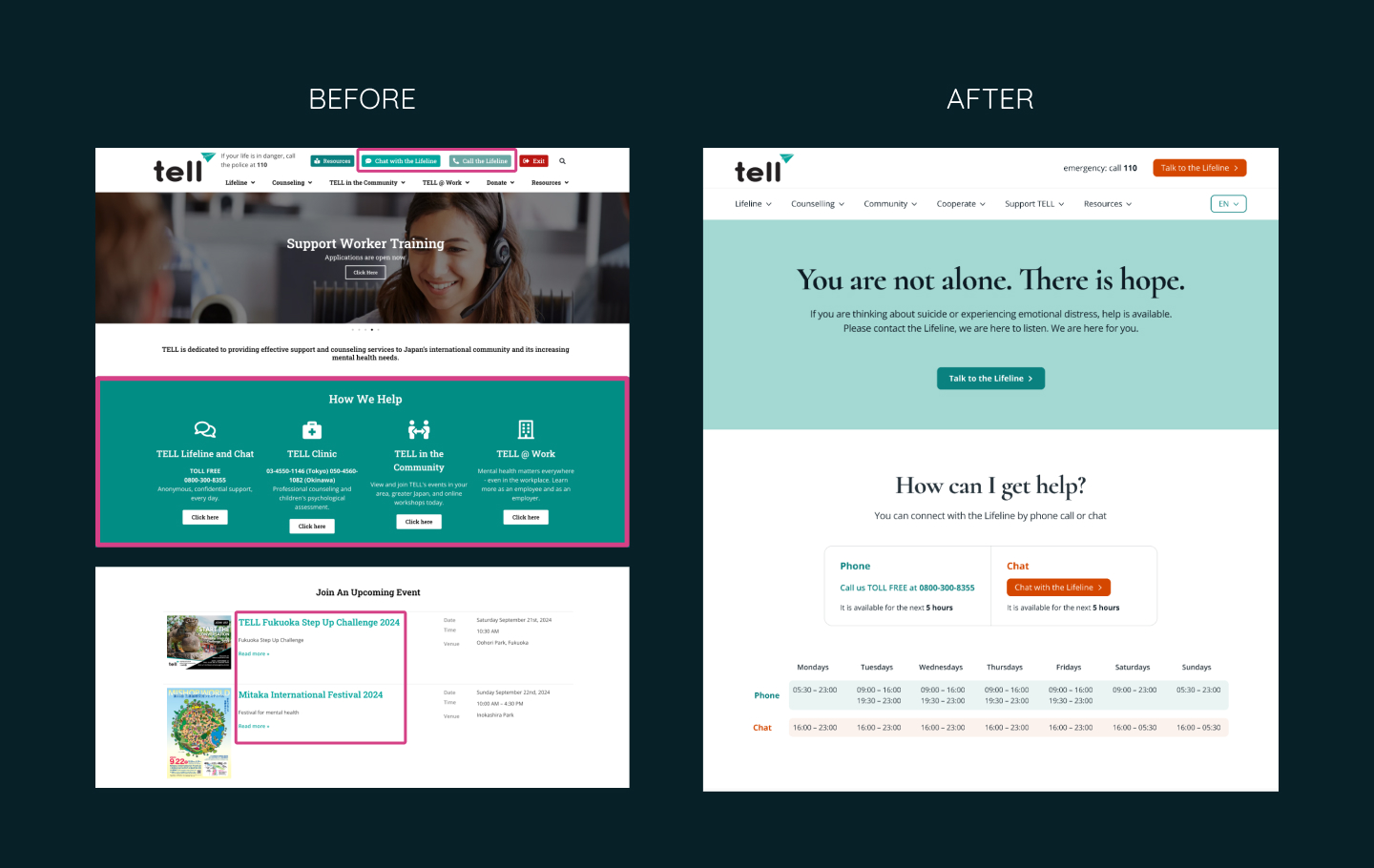
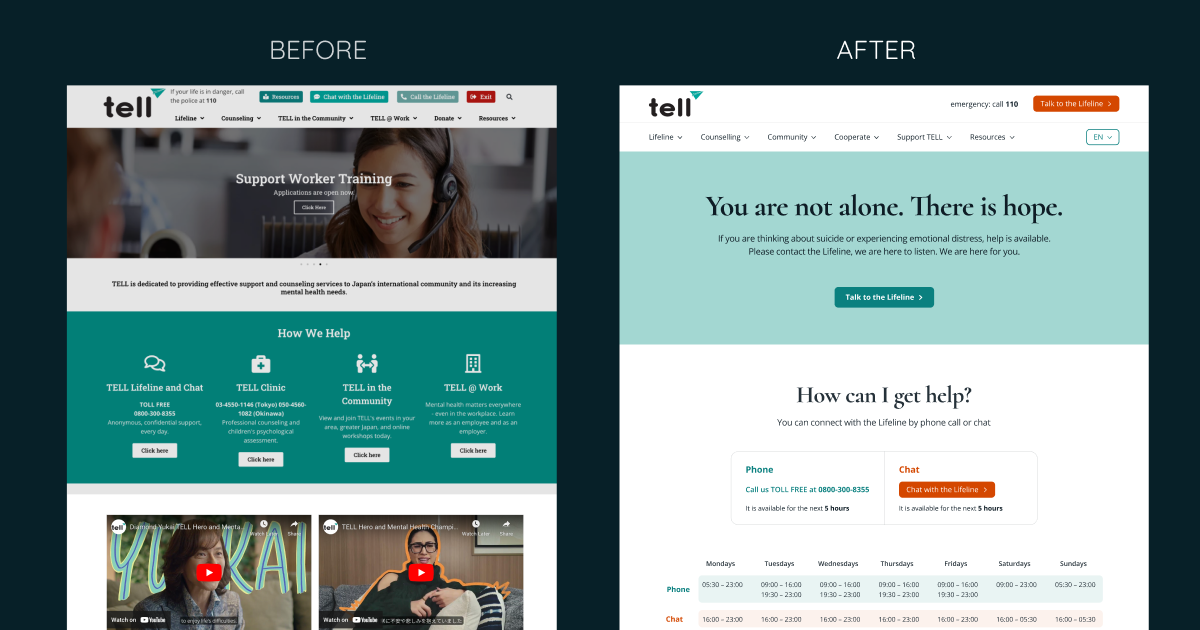
I improved the colour contrast of text and essential buttons to meet the recommended 4.5:1 ratio. For users with deuteranomaly, I used a colour-blind simulator and adjusted the contrast to 4.3:1.
2. Poor Contrast in Keyboard Navigation for Deep Menu Items:
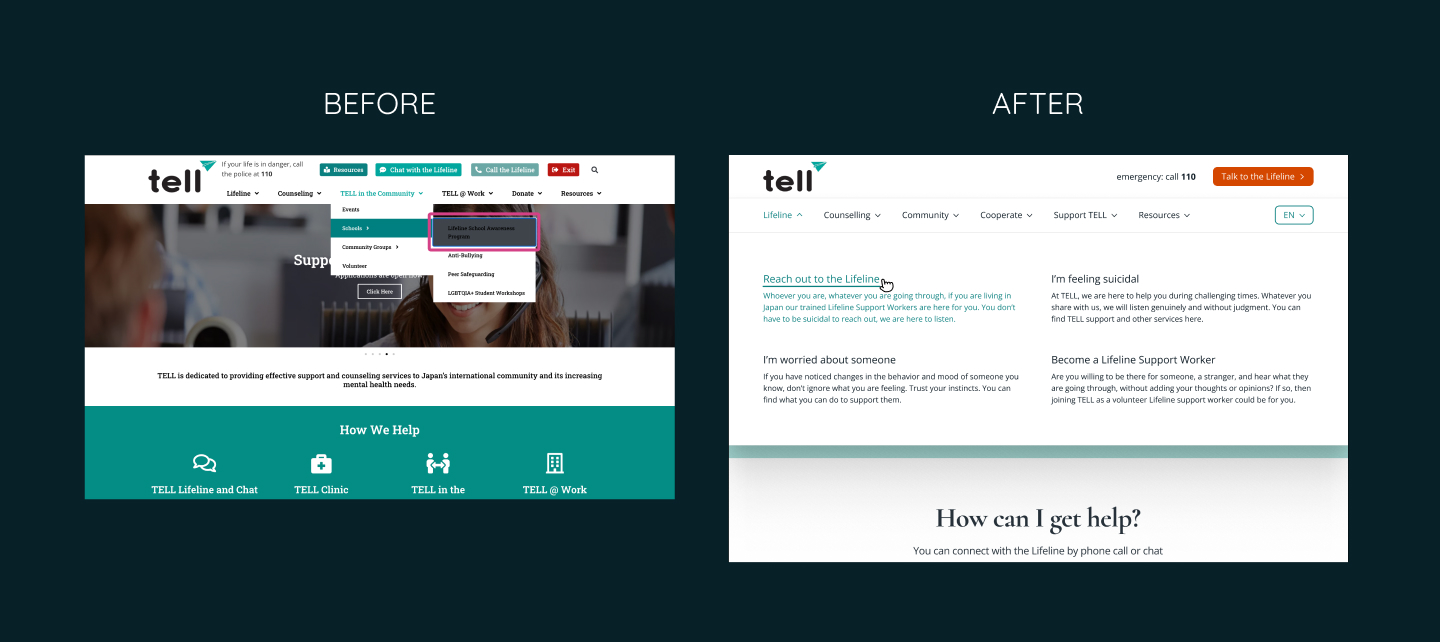
To enhance the user experience, I redesigned the deep menu items by expanding the second-level pages and making the content easier to navigate and click.
3. Missing Labels for Input Fields:

I added proper labels to input fields, including the newsletter subscription form, to improve usability.
4. Misleading “Annual Report in Japanese”:
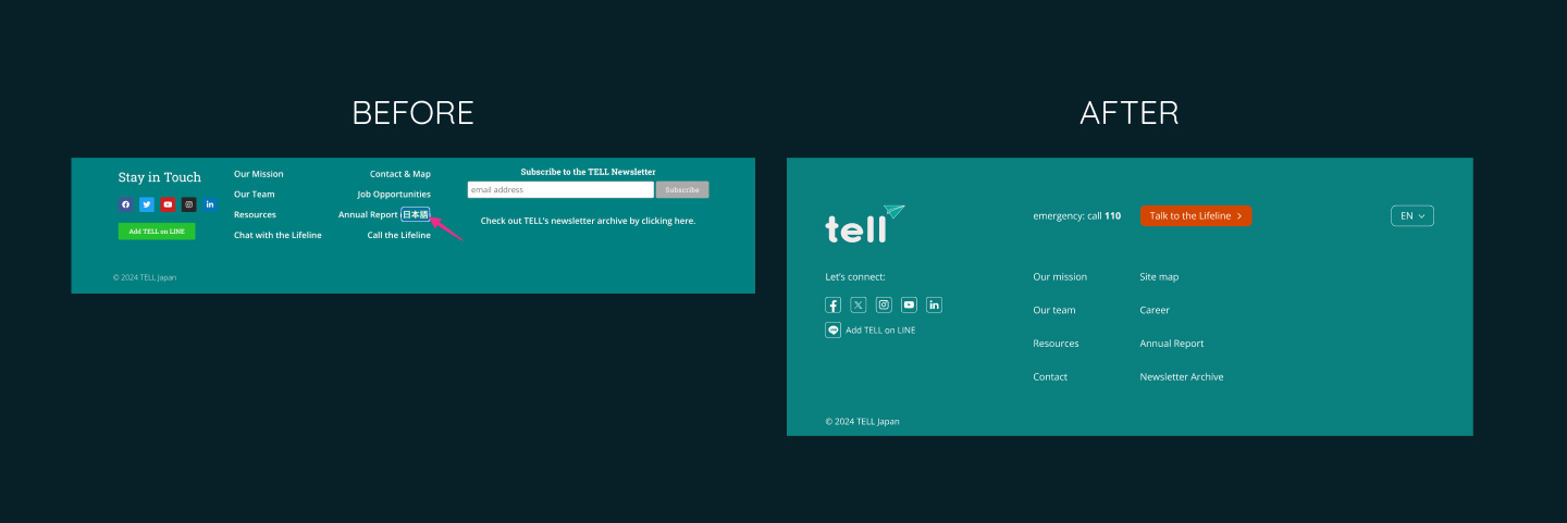
Since the English Annual Report is from 2023, but the Japanese one is from 2022, I simplified the footer by removing the outdated Japanese report link.
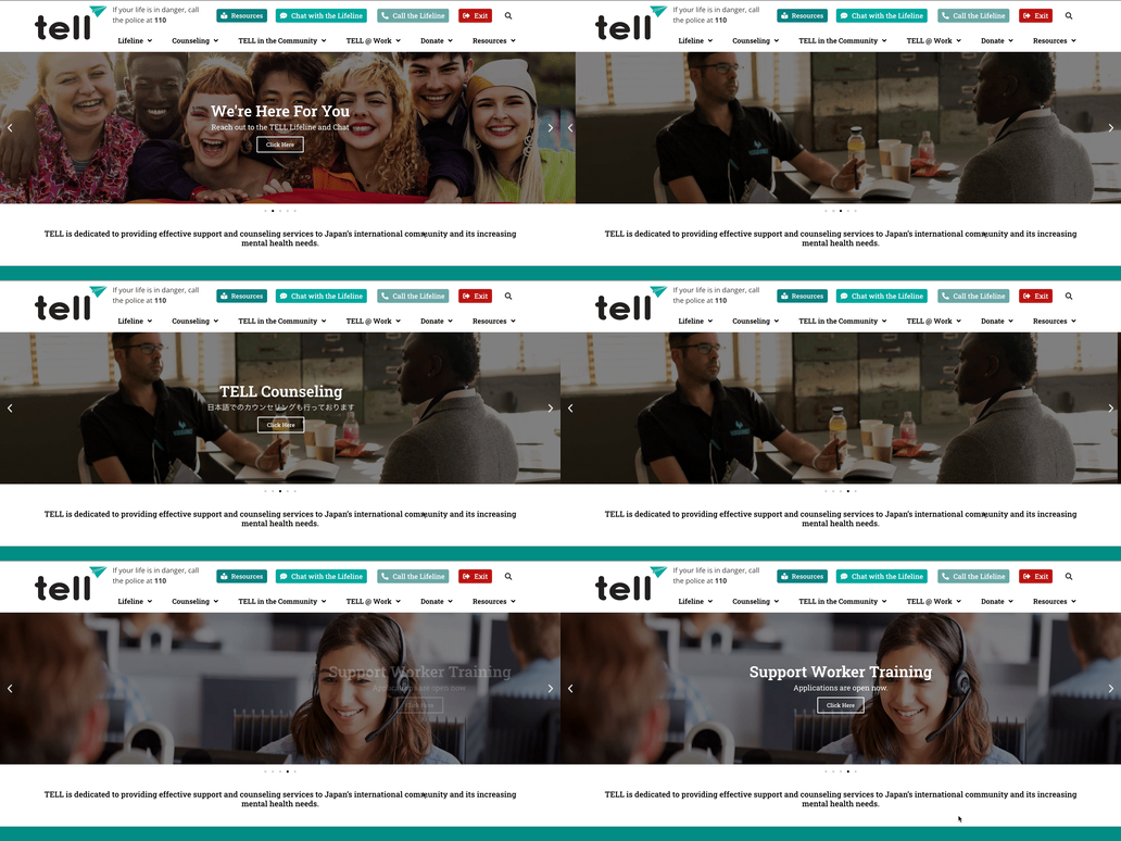
5. Sliders in the Header:
↓
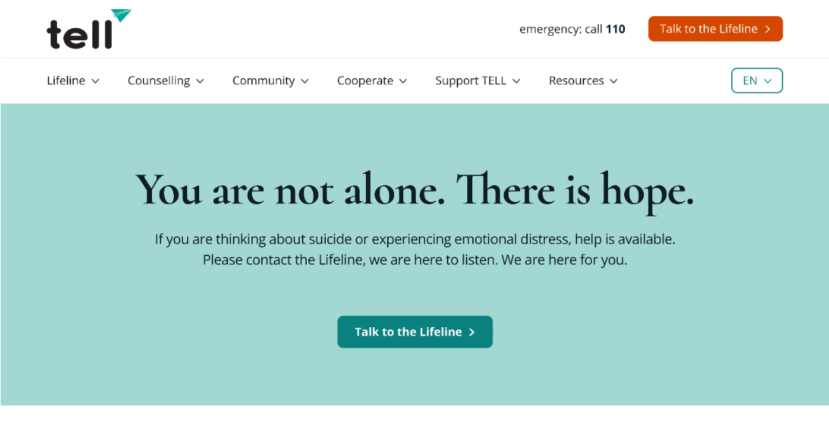
I removed the sliders and replaced them with a cleaner, more straightforward header for better usability.
6. Improved Visual Hierarchy:
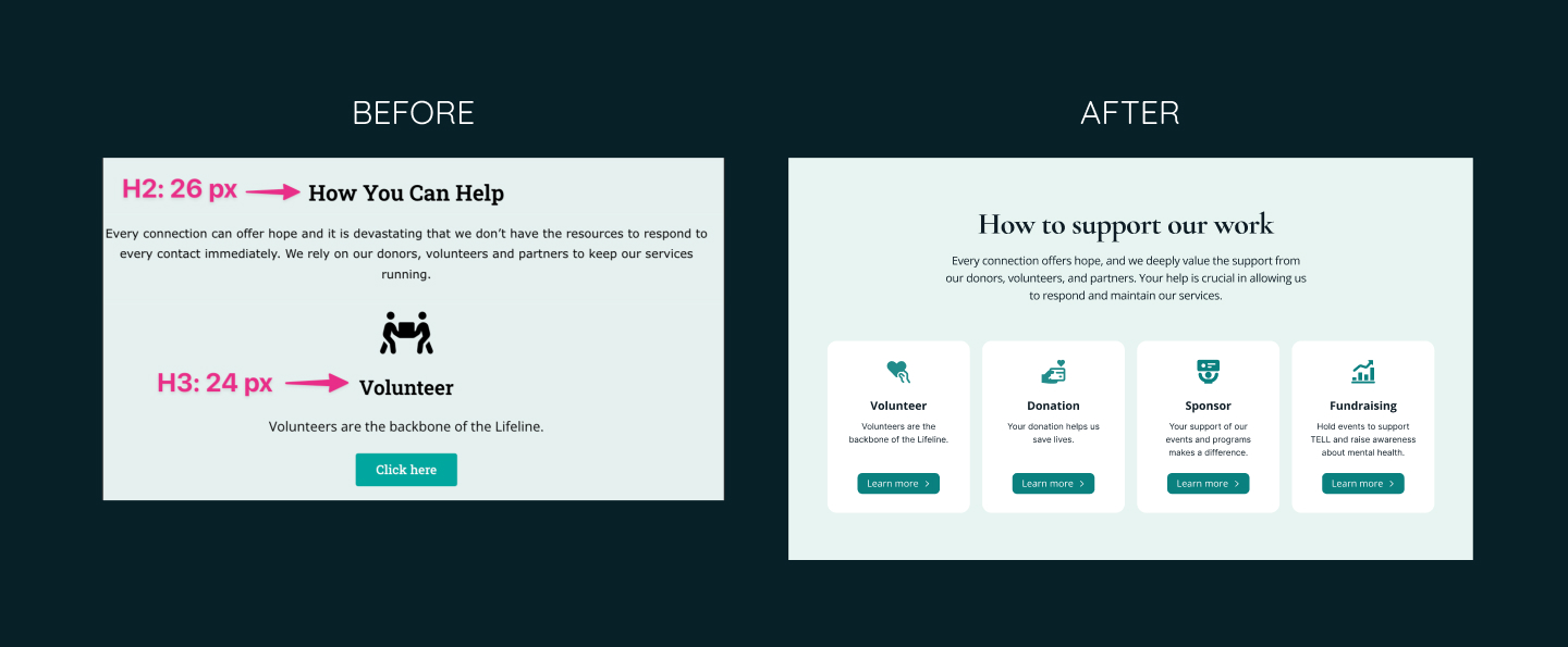
I adjusted the font size and weight of headings to establish a clear visual hierarchy, ensuring that H2 and H3 tags are distinct.
7. Error Handling on Newsletter Signup:
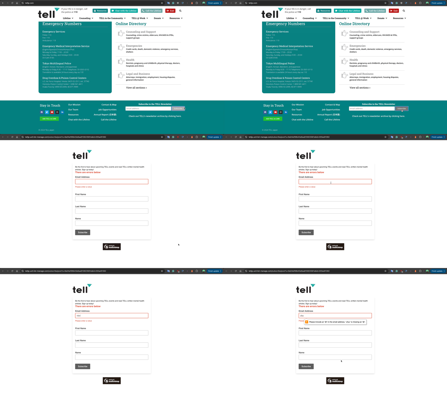
↓
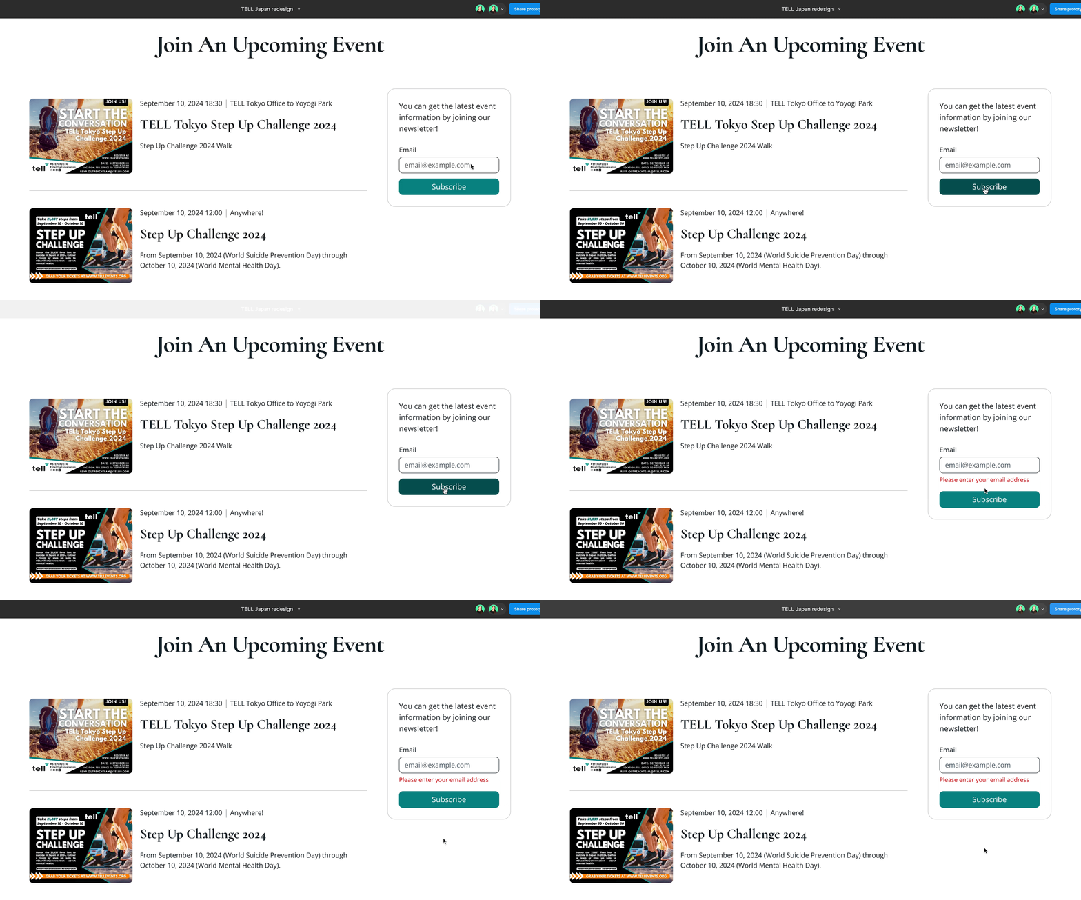
I made error messages more descriptive and displayed them on the same page, avoiding the confusion caused by opening new tabs.
8. Small Social Media Icons in the Footer:
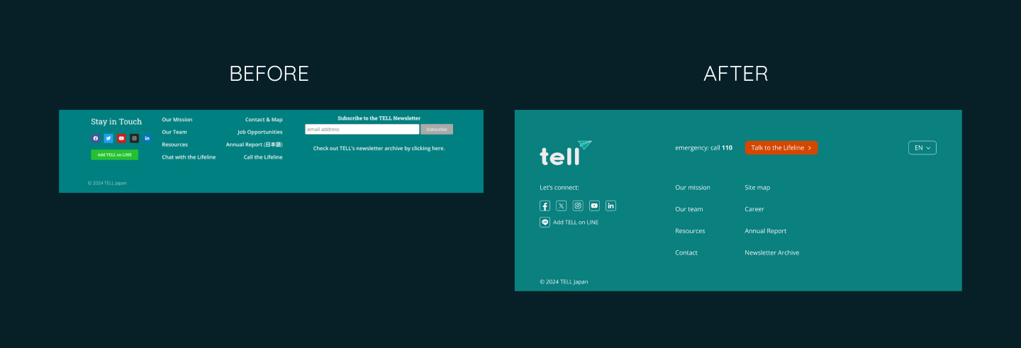
I increased the size and contrast of social media icons, ensuring that the clickable areas meet the recommended minimum size of 44x44 pixels.
9. Inconsistent Visual Elements (Icons, Buttons, etc.):

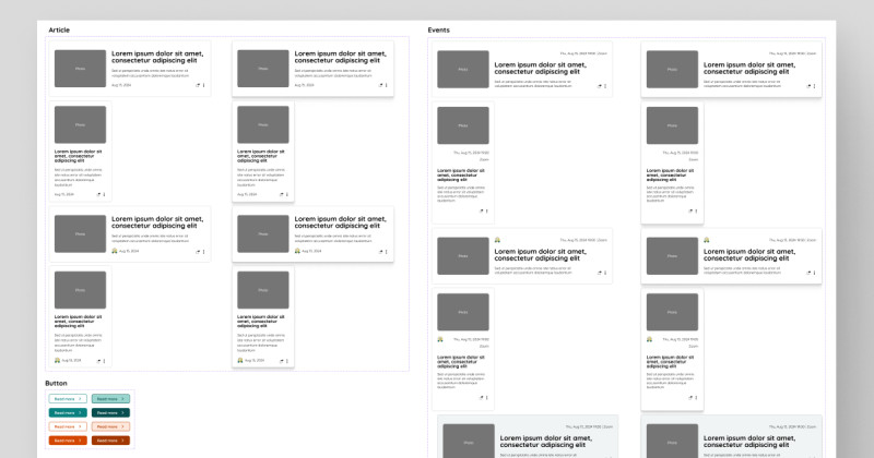
I standardized the design by creating a cohesive design system, ensuring consistency in icons, buttons, and other UI components.
10. “View More Events” Link:
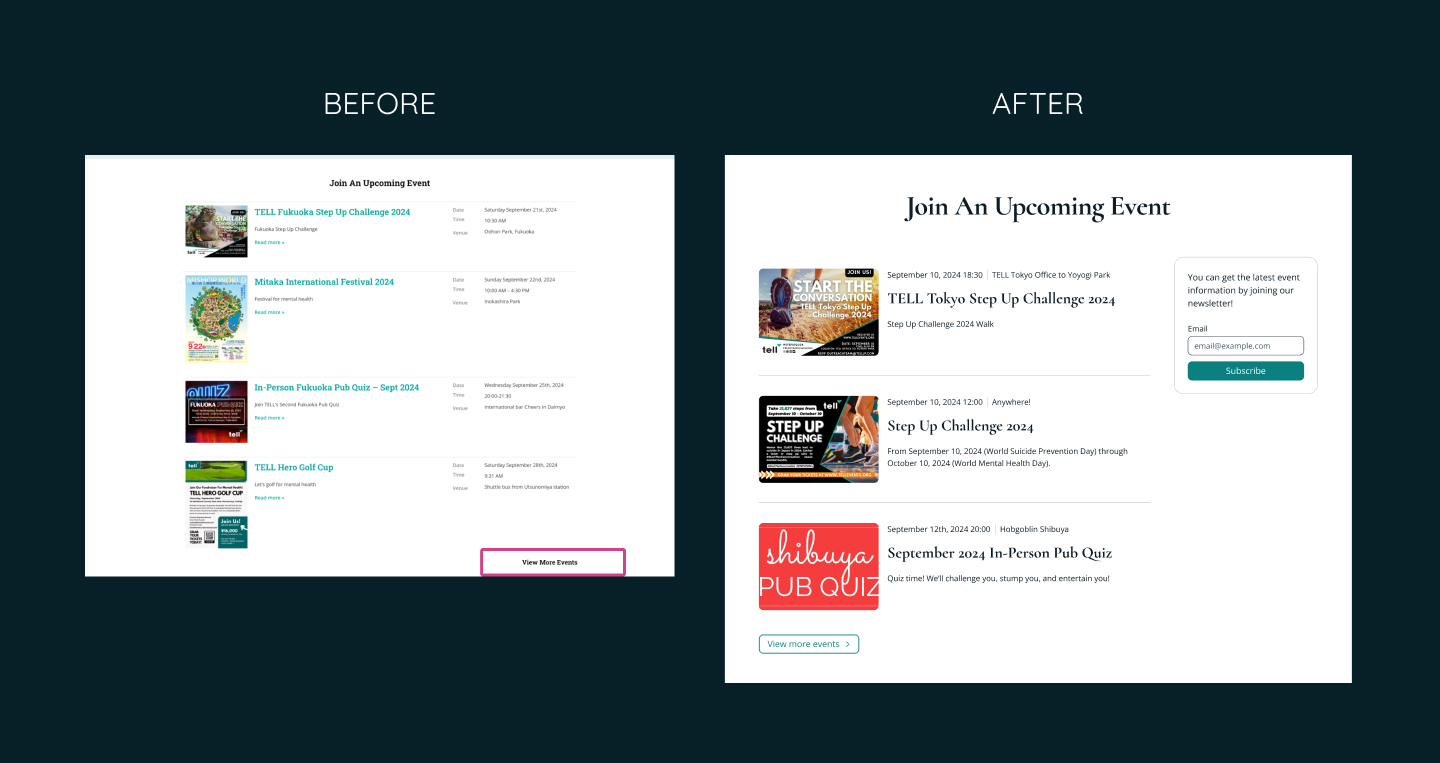
I added a right arrow icon to the “View More Events” link, making it clear that it redirects users to a new page.
👩🏻💻 Programming Fixes
While this blog focuses on design solutions, here are some programming-related accessibility fixes:
-
“Skip to Content” Button Doesn’t Work:
Ensure the “Skip to content” button works. -
Missing Focus Indicator on Menu Toggle:
Add a visible focus indicator to the menu toggle button on tablets and mobile devices. -
Alt Text for Images:
Provide descriptive alt text for all images, especially those functioning as links. -
Inconsistent Heading Hierarchy:
Adjust the heading structure to maintain a logical hierarchy. -
Broken Buttons at 737px Screen Width:
Adjust button sizes to prevent them from breaking at specific screen widths. -
Inaccessible Menu Items on Mobile and Tablet:
Ensure all menu items are fully accessible and clickable on touch devices. -
Overlapping Text in the “Join An Upcoming Event” Section:
Fix overlapping text issues by adjusting layouts and using media queries to handle zoom and screen size changes.
📝 Lessons and Takeaways
-
Building a design system before expanding a website is essential for maintaining consistency and avoiding clutter as new content is added.
-
Conducting accessibility tests can reveal issues you might not have considered. Testing with keyboard navigation and screen readers is especially important for catching details that can easily be overlooked.
-
This project was my first experience with keyboard navigation and voiceover tools. It was time-consuming but invaluable for deepening my understanding of accessible design.
➡️ What’s Next?
Even though I worked as a software engineer for over 3 years, I had never paid attention to accessibility… until I met my partner and he told me and showed me how important it is. I am super excited to learn more about how I can improve my design!
I’d love to hear your thoughts. Are there any accessibility issues I missed? What would you change in my redesign? Let’s connect on Mastodon!
Thank you for reading to the end!
Have a wonderful day 🥰
