UI/UX

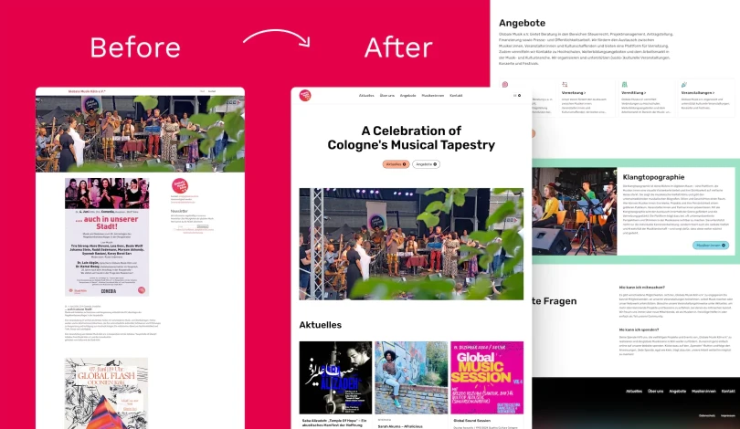
The image of the current homepage of Droople's website and Yoshie's redeisng of it

Improving Accessibility & UX on Droople’s Website! 💧

👩🏻‍🔬 Accessibility Insights from My Review While reviewing Droople’s website, I identified 23 accessibility and UI/UX issues on the homepage. Of these, 10 could be fixed with design changes, 12 required programming fixes, and 1 involved content editing. Let’s explore how I approached these issues and improved the design! ✅ How I Solved Accessibility and UX Issues 1. Colour Contrast Many text …

Improving Accessibility on Mission Control’s Website! ✨

👩🏻‍🔬 Accessibility Insights from My Review While reviewing Mission Control’s website, I identified 13 accessibility and UI/UX issues on the homepage. Out of these, 7 required coding fixes, but I could address 6 through design changes. Let’s dive into how I solved them! ✅ How I Improved Accessibility and UX Colour Contrast: Green/Yellow Buttons: The original green and yellow buttons didn’t provide …

Finding Balance Between Fun, Joy, and Seriousness

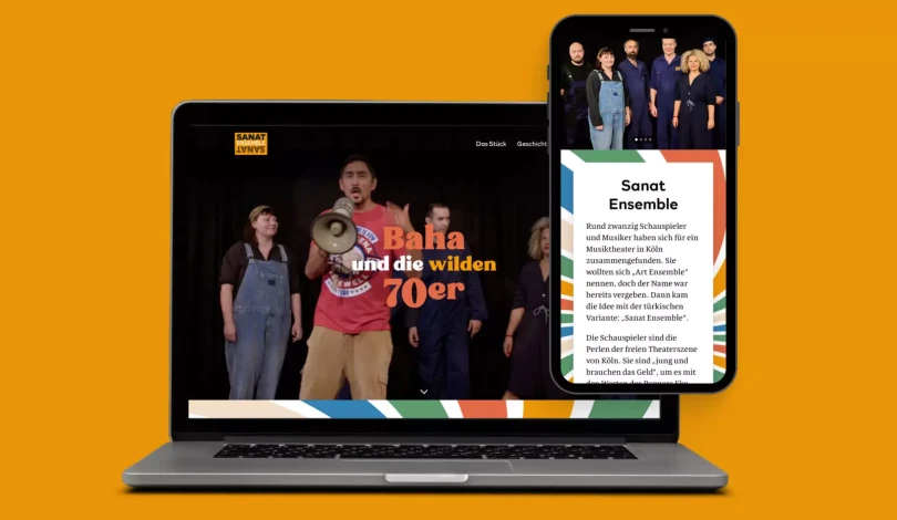
Designing the Sanat Ensemble website was both a rewarding and challenging experience. The task was to capture the vibrant energy of the 70s whilst honouring Turkish people and other communities who fought for equal rights. I also wanted the design to reflect the joy and lively spirit of their music and performances. Here’s a breakdown of the key struggles I encountered and how I overcame them! 1. …

Making the Fermenstation Website Accessible 🥢

👩🏻‍🔬 Accessibility Testing Insights During my review of the Fermenstation website, I identified 10 accessibility and UI/UX issues. While 3 required coding changes, I addressed 7 through design improvements. Here’s how I solved them: ✅ How I Solved Accessibility and UX Issues 1. Low Colour Contrast: The contrast on buttons, text, and links (e.g., “READ MORE” under NEWS) was too low. …

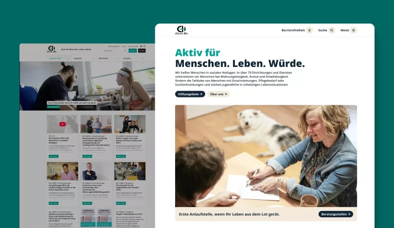
Making TELL Japan Website Accessible and Decluttered 🧹

👩🏻‍🔬 Accessibility Testing Insights During my review of the TELL Japan website, I identified 17 accessibility and UI/UX issues. While 7 of these issues required coding changes, I addressed the other 10 through design improvements. Here’s how I tackled them. ✅ How I Solved Accessibility and UX Issues 1. Low Color Contrast on Buttons and Text: I improved the colour contrast of text and …

Day 30 of 30 Day UI/UX Design Challenge: Reflecting on My Journey 🌱

🎨 Today’s Task: Reflection and Review For the final day, my partner suggested I reflect on the 29 challenges I’ve completed to identify what I enjoyed most and what areas I excel in. 💡 Reviews & Redesigns Here’s a look back at what I would change now and which challenges I enjoyed the most! Day 1: Detective Conan Escape Room Booking Page Card Order: I’d reorder the difficulty levels …

Day 28 of 30 Day UI/UX Design Challenge: Landing Page for Cat Poopy Tracker! 🐾

🎨 Today’s Design Task Today’s task was a lot of fun, especially since I got to play around with animations in Figma! Task Overview: Poopy Tracker App Landing Page with Animated Features Design a landing page for the Poopy Tracker mobile app using Figma, featuring an animated transition for the key features section. Hero Section: Create a hero section explaining the app’s purpose …

Day 27 of 30 Day UI/UX Design Challenge: Designing the Blog Article Page! ✍🏻

🎨 Today’s Design Task I was really excited about today’s task! After designing the overall layout for my blog yesterday, I focused on designing how each article page would look. 🚀 My Design Process Component Research: I started by examining other blog articles to identify the components I wanted to include in my design and made a list. Initial Layout Testing: I added some of my existing …

Day 26 of 30-Day UI/UX Design Challenge: Creating My Custom Blog Design! 👩🏻‍🎨

🎨 Today’s Design Task I’ve been using a template for my blog, but my partner suggested I design my own—and he’d handle the coding! I was super excited to dive in and create something uniquely mine 🤩 🚀 My Design Process Inspiration Gathering: I explored various blogging websites to gather inspiration. Initial Sketches: I sketched out my ideas on my iPad. Lo-fi Mockup: I created a lo-fi …

Day 25 of 30 Day UI/UX Design Challenge: Redesigning a Japanese Website for Accessibility 🎌

🎨 Today’s Design Task Today’s task was both fun and a bit confusing! I focused on redesigning the Japanese website note.com to better align with their other pages and values while improving accessibility. The current website: Task Overview: Day 2: Design Improvement Apply research to create focused improvements for the chosen website. Steps: Refine Improvement Plan: Review Day 1 notes …

Day 23 of 30 Day UI/UX Design Challenge: Making Accessible! 👀

🎨 Today’s Design Task I was excited about today’s task because I got to turn the accessibility issues I identified on Day 22 into actual design improvements! 🛠️ Today’s challenge: Choose one page or screen and create a redesign that addresses the accessibility issues: Sketch or create a digital mockup of your improved design Focus on fixing the problems you identified while maintaining the …

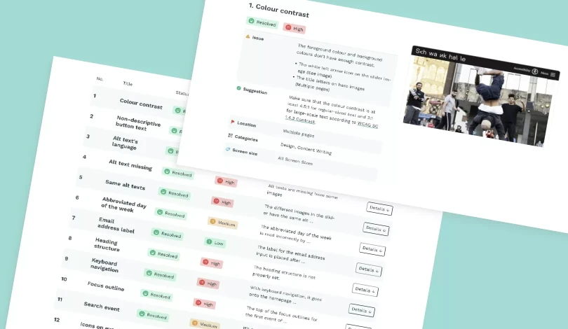
Day 22 of 30 Day UI/UX Design Challenge: Diving Deep into Accessibility! 🕵🏻‍♀️

🎨 Today’s Task Conduct an accessibility audit for pickuplimes.com Today’s task was both challenging and valuable. Accessibility is a crucial aspect of design, and I learned a lot from this deep dive! 🚀 My Process I followed the Accessibility Insights for Web assessment guidelines closely to ensure I covered all necessary checks. 🧠 Challenges and Solutions Finding the Right Guidelines: Initially, …

Day 21 of 30 Day UI/UX Design Challenge: All About Components! 🍱

🎨 Today’s Design Task Today’s task was right up my alley—I love organising and creating lists, so working on components was really satisfying! See task description 🚀 My Design Process Understanding the Task: I began by carefully reading the task instructions to grasp what components I needed to create. Base Components: I designed base components for articles and events, drawing inspiration from …

Day 20 of 30 Day UI/UX Design Challenge: Smart Animation! 🪂

🎨 Today’s Design Task Today’s task was something I knew I’d have to tackle eventually, so I’m glad I took it on! See task description 🚀 My Design Process Understanding the Task: I carefully read the task to ensure I knew exactly what was required. Lo-Fi Design: I started by creating a lo-fi design of the navigation bar and hero section, adding a path for a paraglider silhouette. AI Assistance: I …

Day 19 of 30 Day UI/UX Design Challenge: Getting Tidy! 📦

🎨 Today’s Design Task Today’s task was a bit overwhelming but also rewarding. Just like decluttering a home, I focused on tidying up the design and content of a cluttered homepage. Show task description 🚀 My Design Process Content Review: I went through all the content on the homepage, marking key services (green), calls-to-action (red), and redundancies (yellow). I added notes directly onto …

Day 18 of 30 Day UI/UX Design Challenge: Logo Design for Tell Japan! 🌱

🎨 Today’s Design Task Today’s challenge was something completely new for me—designing a logo! I chose to redesign the logo for TELL Japan, an organization I’ve supported in the past ✏️ This is what the current logo looks like: 🚀 My Design Process Research: To gain a deeper understanding of TELL Japan, I reviewed its mission and services. Concept Development: I decided to retain their signature …

Day 17 of 30 Day UI/UX Design Challenge: Poopy Tracker Animation! 🍃

🎨 Today’s Design Task I was really excited about today’s task—creating animations! While I’m still learning, I gave it my best shot 💪🏻 🚀 My Design Process Task Review: Carefully read through today’s challenge. Brainstorming: Jotted down ideas for possible animations on each screen. First Animation: Focused on customising the message and selection on the second Data Entry screen. Component …

Day 16 of 30 Day UI/UX Design Challenge: Poopy Tracker Mobile App 🐈‍⬛ 💩

🎨 Today’s Design Task Today’s challenge was to create a high-fidelity mobile app design based on yesterday’s low-fidelity design. I had a clear vision for the colours and overall vibe, but this project was more challenging than expected! 🥲 🚀 My Design Process Inspiration Gathering: I started by collecting inspiration from Dribbble and other mobile apps, and building a mood board. Color and …

Day 15 of 30-Day UI/UX Design Challenge: Mobile App Lo-fi Design! ✍🏻

🎨 Today’s design task Today’s project was so much fun because it allowed me to think about my baby, Teto 🐈‍⬛❤️ 🚀 My design process Brainstormed key features for the app: Started with a brainstorming session to identify essential features. Defined the primary user persona: Essentially, I used myself as the primary user persona. Listed potential data points to track: Created a list of data …

Day 14 of 30 Day UI/UX Design Challenge: Desktop site redesign for Juni! 🥤🖥️

🎨 Today’s design task Hi, everyone! Today’s challenge is the second day of my 2-day task of redesigning the Juni website! Today, I focused on the desktop version to align with the mobile design I created yesterday. Let’s dive in! 👏🏻 The current desktop website: 🚀 My design process Task Review: I started by thoroughly reading today’s task. Current Website Check: I checked their current …

Day 13 of 30 Day UI/UX Design Challenge: Mobile site redesign for Juni! 🥤✨

🎨 Today’s design task Hi, everyone! Today’s challenge is redesigning a mobile website! I’ve been following Jay Shetty and his wife Radhi for a while now, and when I noticed their Juni website could use a little polish, I couldn’t wait to dive in and make it shine! The current mobile site: 🚀 My design process Initial Review: I looked at the Juni website on my mobile and listed …

Day 12 of 30 Day UI/UX Design Challenge: Diving into Data Design! 📊✨

🎨 Today’s design task I’m back with another exciting day of my UI/UX Design Challenge. I saw a job post on Dribbble and decided to tackle some of the requirements as my challenge for today. Task: Design the dashboard page based on the provided wireframe. (The requirement has a design of ‘Snapshot View’ page but I decided to do only At a Glance page for this challenge) 🚀 My design process I …

Day 11 of 30 Day UI/UX Design Challenge: Icon Creation on Figma! 〰️

🎨 Today’s design task Another exciting morning! Today’s project is continuing to make the icons! Day 2: Final Icon Design (3 hours) Create the final versions of your 6 icons based on your Day 1 sketches. Requirements: Refine and digitize your chosen sketches Ensure consistency in style across all 6 icons Design icons that work well at both large and small sizes 🚀 My design process I …

Day 10 of 30 Day UI/UX Design Challenge: Icon Design! ➰

🎨 Today’s design task Last night, I discussed my task for today with my partner. I’m grateful for his input, as he’s always thinking about how I can upskill as a designer. 🥹❤️ Today’s task: It’s a 2-day series focused on icon design! 🚀 My design process Understanding the task: I started by reading the task requirements. Research: To understand how to make consistent icons, I …

Day 9 of 30 Day UI/UX Design Challenge: Website Refresh for My Partner! 😘

🎨 Today’s design task Another exciting morning! After a hot day yesterday, I was grateful for the cool morning breeze today 🌬️ Today’s task: Redesign this website: medienbaecker.com. Here is how it looks now 🥨 🚀 My design process Study the website: I started by understanding what needs to be on the homepage. Inspiration: I looked up some inspirations. There were so many cool ideas that it …

Day 8 of 30 Day UI/UX Design Challenge: Redesigning Checkout Process! 👛

🎨 Today’s design task Today’s challenge felt more comfortable, given my previous experience with forms in both design and coding. As always, Thomas Sensei provided valuable feedback! Task: Redesign the cart/checkout for Freibad Hornberg, improving upon their current design. current website 🚀 My design process Sketched initial ideas on iPad Researched best practices for login, account …

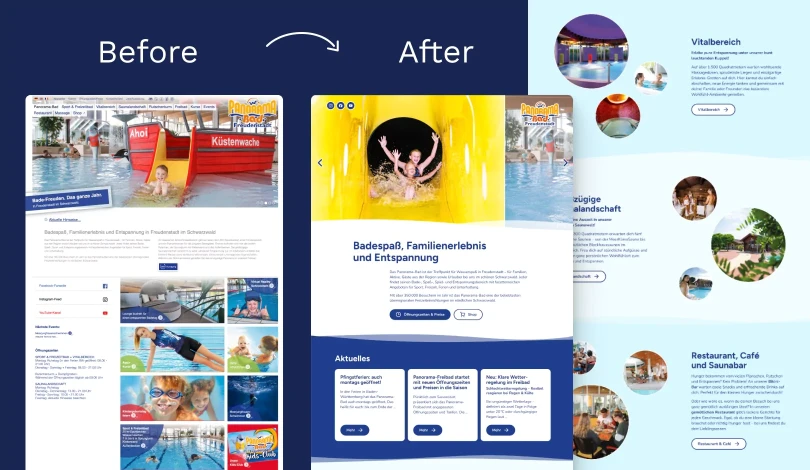
Day 7 of 30 Day UI/UX Design Challenge: Modernising an Outdoor Pool Website! 🏊🏻‍♀️

🎨 Today’s design task Thanks to our hungry cat Teto 🐈‍⬛, I had an early start today. After creating a poster this morning (detailed at the end), I tackled today’s challenge in the evening. After yesterday’s struggles, I was eager to dive in, knowing it could only go up from here! Here is the original website: 🚀 My design process Gathered existing images from the current homepage …

Day 6 of 30 Day UI/UX Design Challenge: Decoding Cat Body Language 🐈

🎨 Today’s design task Another day, another challenge! Today’s task pushed me out of my comfort zone, focusing on cat body language. 🚀 My design process Researched cat body language (despite having a cat, I realised there was a lot to learn!) Sketched initial ideas on paper Selected ethical colour palette Chose font pairing: Poiret One & Montserrat Found and incorporated cat images …

Day 5 of 30 Day UI/UX Design Challenge: Meditation app with Psyduck! 🐥

🎨 Today’s design task Today was probably my most challenging task yet — designing a mobile meditation app featuring Psyduck! As a former web developer, mobile apps are new territory for me, but combining meditation with one of my favourite Pokémon made it exciting. 🚀 My design process Thoroughly analysed the task requirements Sketched initial ideas on my iPad using Freedom app Researched …

Day 4 of 30 Day UI/UX Design Challenge: Medieval Artistry 👨🏻‍🎨

🎨 Today’s design task I was so excited about today’s task that I even dreamed about it last night! 😂 Today, I’m building on yesterday’s wireframe by designing the Portfolio Gallery section for Andreas Maler, capturing his unique art style and the game’s aesthetic. Design the Portfolio Gallery section from your wireframe, capturing the essence of Andreas Maler’s …

Day 3 of 30 Day UI/UX Design Challenge: First Lo-Fi Web Page Design! 😮

🎨 Today’s design task Despite feeling a bit tired from a late night, I was excited about today’s task: creating a wireframe for a medieval artist’s portfolio website. It’s a two-day project, but my partner helped me break it down into manageable steps. As a fan of medieval art (thanks to playing Pentiment), I was thrilled to work on this. The task: Create a lo-fi design …

Day 2 of 30 Day UI/UX Design Challenge: Green is My Favourite! 💚

🎨 Today’s design task Another exciting morning! Today’s project is a nutrition dashboard with a green theme. As a vegan who loves green, this task really resonates with me, even though I’m not a nutrition expert. 🚀 My design process I started by sketching my initial ideas on paper. My experience with dashboard design as a software engineer came in handy! I researched daily …

Day 1 of 30 Day UI/UX Design Challenge: The Journey Begins!

🎨 Today’s design task I woke up super excited today — a feeling I haven’t had in a while! My partner gave me an amazing project to work on. Detective Conan Escape Room Booking Page: Design a visually engaging and user-friendly page for the “Beika Street Escapes” website. A company offering Detective Conan-themed escape rooms Target Audience Detective Conan fans aged 15-45 …

30 Day UI/UX Design Challenge

Hello! Welcome to my first blog. I’m Yoshie and I’m so excited to share this new adventure with you here – my 30-day UI/UX design challenge. Here’s where I am, what this challenge is, and why I’m diving into this creative journey. 🙋🏻‍♀️ A bit about me First, let me introduce myself. I look like I’ve been a bit all over the place, with a heart full of love and passion for helping …