Introduction
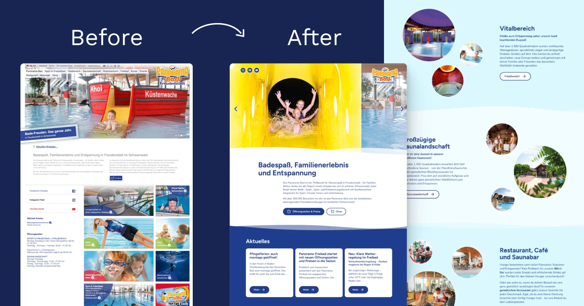
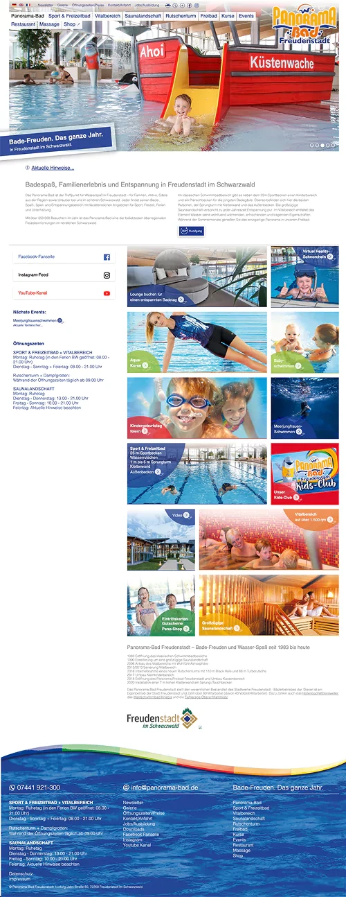
I am thrilled to announce that the new website for Panorama-Bad Freudenstadt went live last Friday! 🎉 Check it out here.
Identifying the Challenge
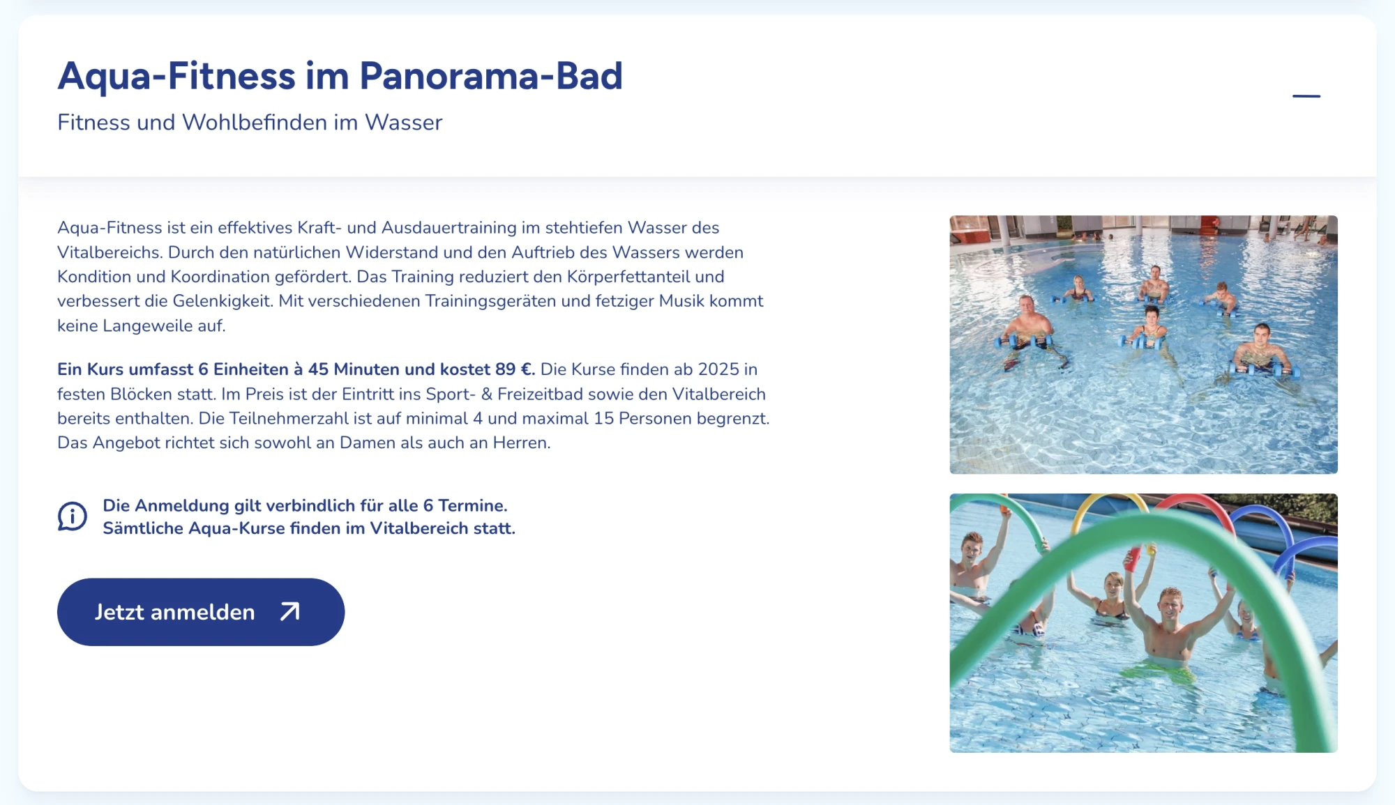
When I first received the initial design for the Panorama-Bad website, I saw that it had some good ideas. However, it needed more structure and a focus on development. The challenge was to create a site that not only showcased the vibrant atmosphere of the swimming pool but also effectively show a lot of information. I wanted to include numerous photos to convey the lively vibe of the facility, but I needed to strike the right balance between visuals and text to ensure a seamless user experience.
Seeking Inspiration
To kick off the project, I dove into research, exploring various swimming pool facility websites. However, I found that many of them lacked the inspiration I was seeking. Frustrated but determined, I created a mood board filled with ideas from diverse sources beyond just swimming pools. This creative exploration helped me establish a unique visual direction for Panorama-Bad to make sure that the design has its playful spirit.
Finding the Right Balance
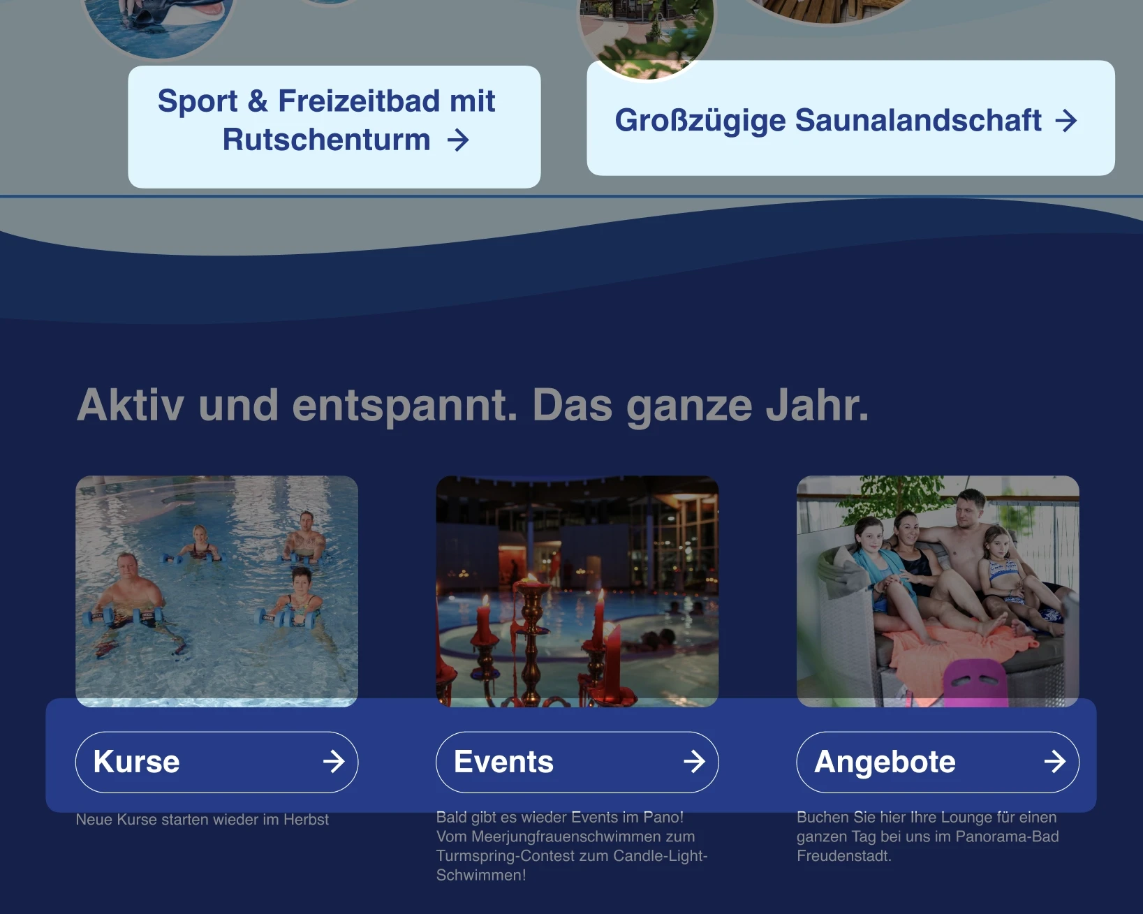
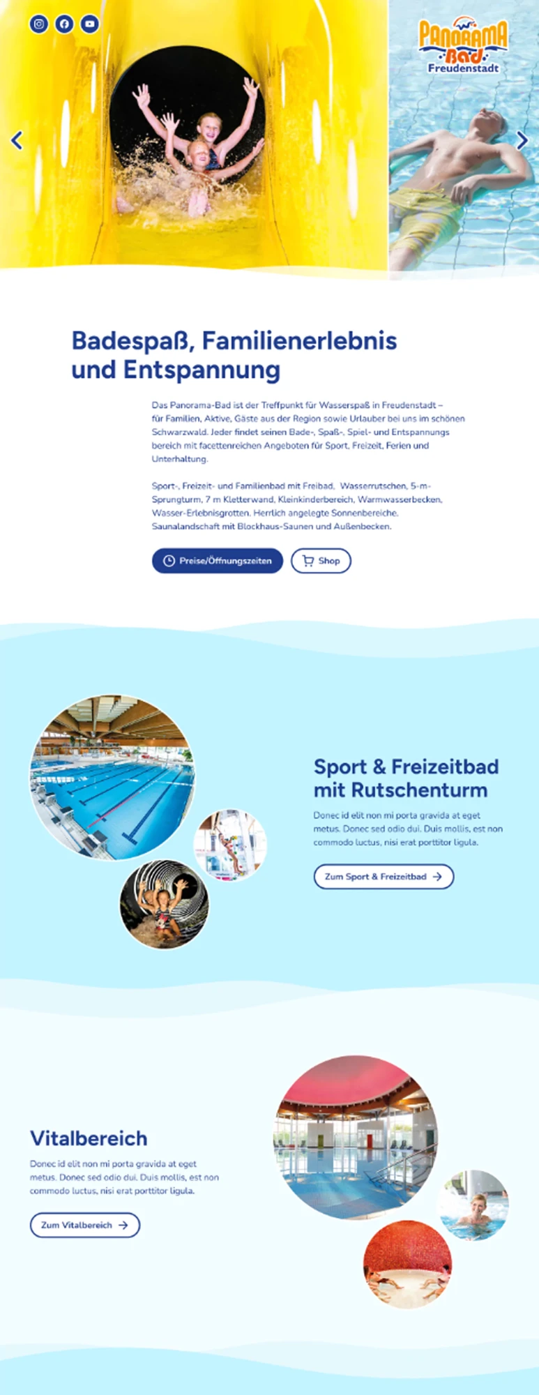
As I began to conceptualise the design, I knew I had to find a way to include all the necessary information without overwhelming visitors. That’s when I had a conversation with Thomas, who developed the website. He suggested making the bubble images interactive, allowing users to click and expand each image. It provided a delightful way for visitors to explore the visuals while keeping the layout clean and organised! Play with it here 🫧
The Design Process
With a clear direction in mind, I moved on to the design phase.
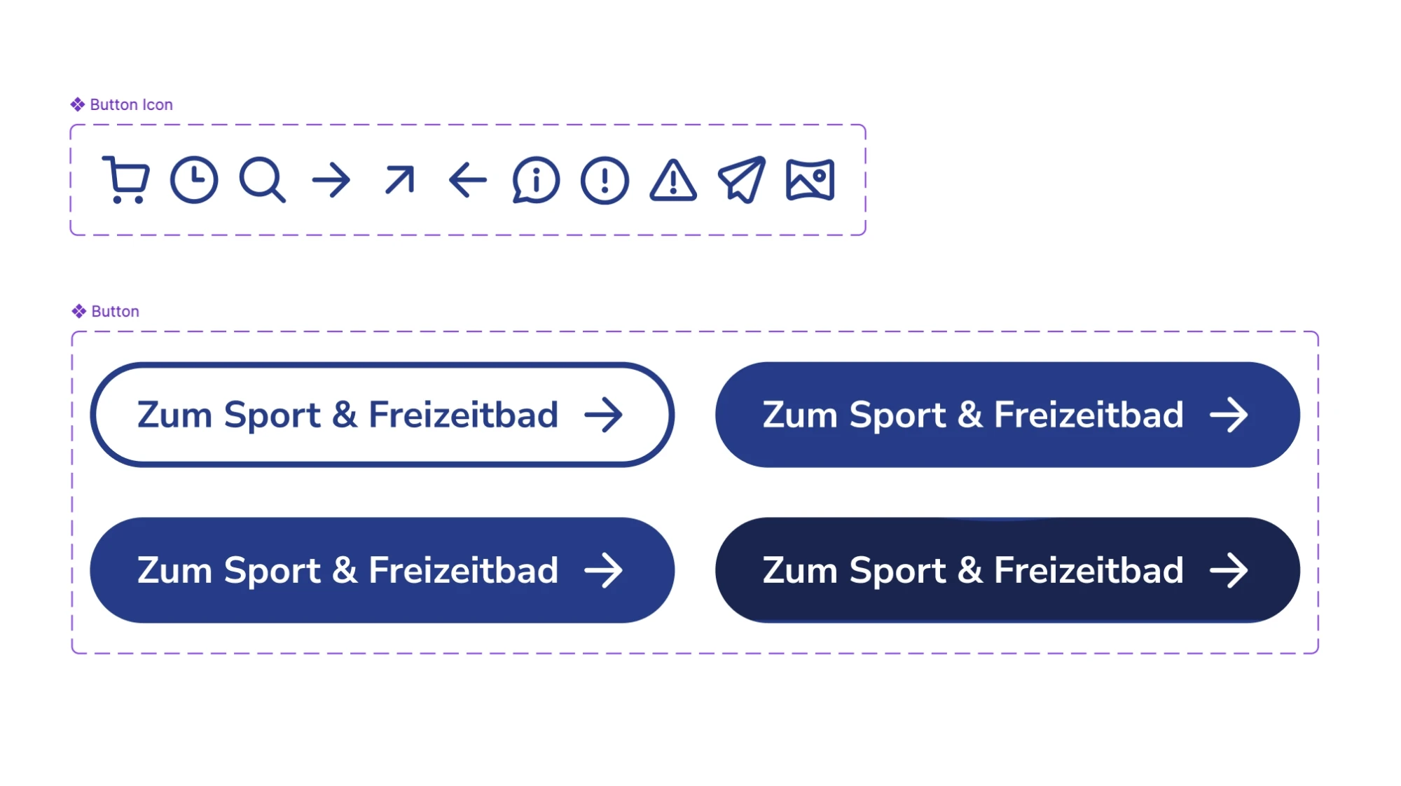
I standardised the button styles across different sections to create a cohesive user experience.
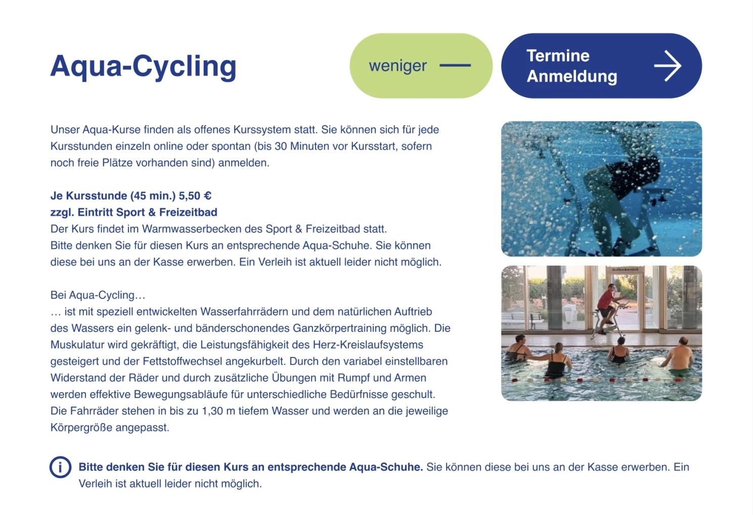
To improve clarity, I redesigned the accordions to have an open/close button and a CTA button inside the accordion.
Throughout the design process, I prioritised accessibility by following WCAG guidelines. Features like keyboard navigation and screen reader compatibility ensure that all users can enjoy the website fully. Working with Thomas, who understands the importance of accessibility and has extensive knowledge in design and development, made the process much easier and more effective.
Launch
After months of hard work and collaboration, I am happy to see the final result of the Panorama-Bad Freudenstadt website. It beautifully embodies their playful and clean vibe while being well-structured for easy navigation. The positive response, with over 1,000 visitors on the first day, was a wonderful validation of our efforts! 👏
Conclusion
I truly enjoyed translating the essence of who they are and what they are as Panorama-Bad Freudenstadt into the visual appearance and experience of their website in a way that resonates with the client and their audience.
If you’re looking for an accessibility-focused, purpose-driven designer, I would love to hear from you! Feel free to reach out at hello@yoshieagata.com
Thank you for reading 🙏 Until next time!
Yoshie
Panorama-Bad Freudenstadt website is designed and developed by me and Thomas Günther 🥨

