A Case Study: Development-Ready and Accessible Design for Value for Good

Posted
Tags
Case Study
Share
The website navigation and hero of Value for Good

The Journey

I had the opportunity to work on Value for Good’s website redesign. My task was to transform the approved design into something developable, while minimising changes to what the client had signed off on.
You can visit the website from here.

The Challenge

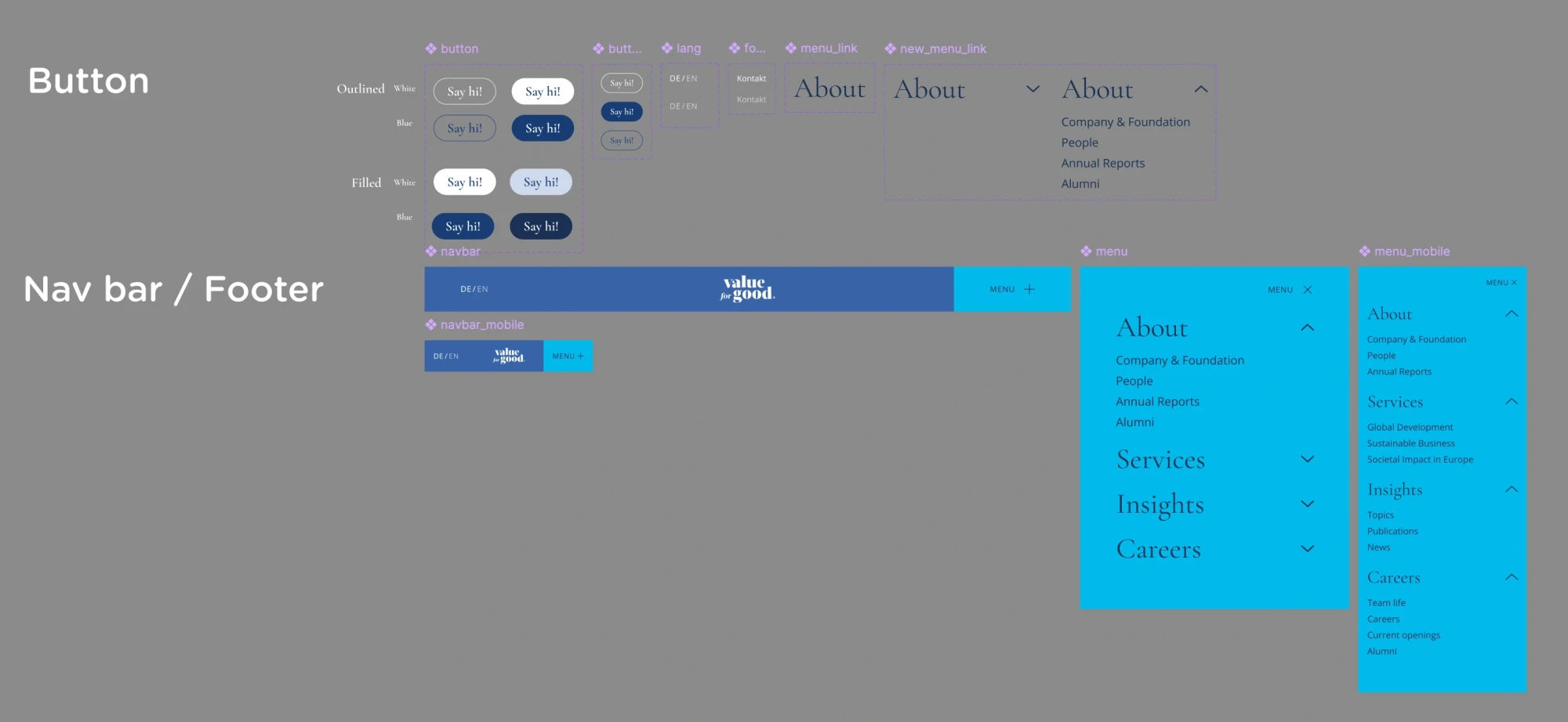
Working with an approved design meant finding creative solutions to make it both developable and accessible, without substantial visual changes. There were quite a few issues including overlapping navigation elements, inconsistent spacing, accessibility concerns such as unstructured headlines and colour contrast, and inconsistent design patterns that needed standardisation.

Our Solution

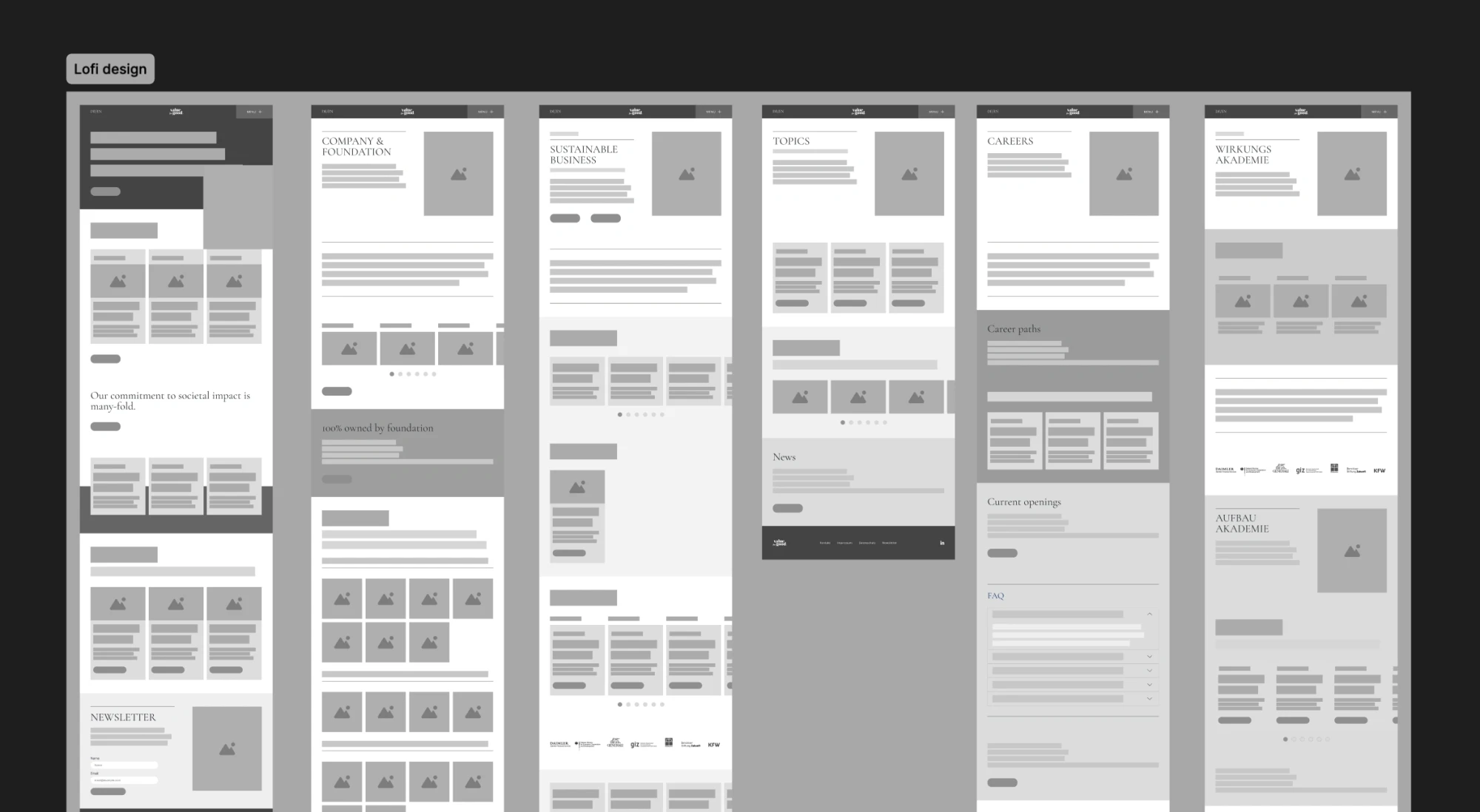
Starting fresh with low-fidelity wireframes helped me create structure while preserving the approved design elements. I developed reusable components and refined the navigation system to work smoothly for everyone.

On the top, there is a design of components of different kinds of buttons. On the bottom, there is a design of navigation and menu modal for desktop and mobile.
A part of components
Low fidelity design of the homepage and 5 other pages of Value for Good's website.
Low-fidelity design

What We Achieved

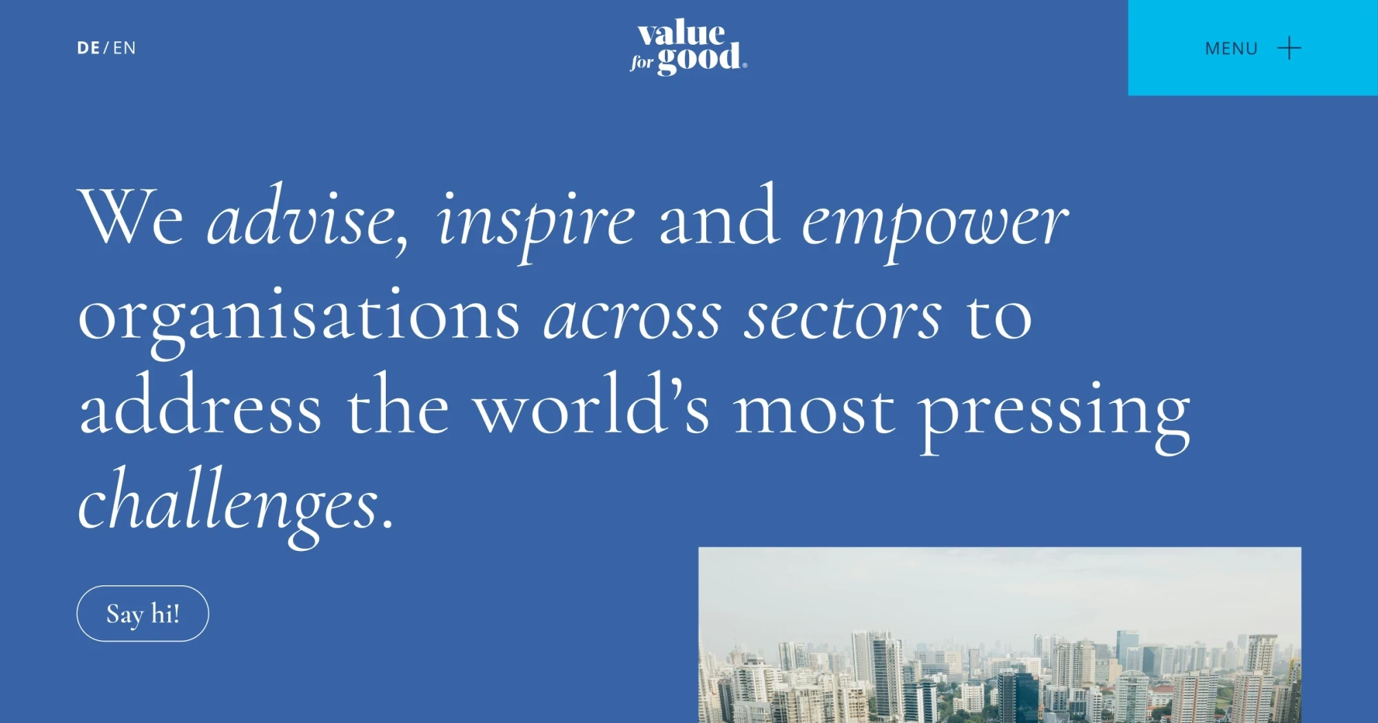
The website is now live and working beautifully! valueforgood.com
It stays faithful to the approved design while being technically sound and accessible to all users.

Let’s Create Together

I love helping bring designs to life in ways that work for everyone. If you’re looking for someone who can balance aesthetics with technical needs while keeping accessibility at heart, I’d love to chat about your next project.

Thank you for reading until the end 🫶

Yoshie

Email: hello@yoshieagata.com

Related articles

On the left, there is a word that says Before and a desktop screen of the old version of toMotion Racing website. On the right, there is a word that says After and a desktop screen of the new website of toMotion Racing.

A Case Study: toMotion Racing Website Redesign

Project Overview As a designer and accessibility auditor, I undertook the redesign of toMotion Racing’s website. This case study outlines my design process and key decisions that shaped the final product. You can visit the website from here. Client Brief The project began with a clear foundation: toMotion Racing needed a simple website structure and had a clear vision for their new design …

Case Study: Designing An Inclusive & Accessible Platform for Musicians

Introduction I redesigned the website for Globale Musik Köln e.V. to improve usability and accessibility. Here’s how I tackled its challenges, refined the user experience, and what I learned! You can visit the website from here. My Design Mission The original site had issues that made it hard for users to understand the organisation’s purpose, see which musicians they support, find …

A laptop screen showing a website with the text

Case Study: Designed and Built a Website for an Empowering Women Community

Creating a website for a women’s empowerment community was an exciting opportunity to apply thoughtful design and development practices. I created a visually appealing yet practical platform that aligns with the brand’s values of kindness and inclusivity. While the project didn’t go live, the process was a valuable learning experience that I am proud to share 🙌 You can see the whole homepage …