Accessibility Audit for Schwankhalle
List Overview
Non-descriptive button text
Abbreviated day of the week
Details
1. Non-descriptive button text
Issue
The plus icon in the hero section and the "Tickets" button on the homepage are not descriptive.
Suggestion
Make sure that the button text is descriptive according to WCAG SC 2.4.2 Link Purpose (In Context) (Level A).
Location
Home
Categories
Screen size
2. Alt text missing
Issue
Alt texts are missing from some images
Suggestion
Add alt text to the images that are not decorative
Location
Derya Yıldırım section on the homepage, Logos on the event page
Categories
Screen size
3. Alt text's language
Issue
Some alt texts are in German on the English page
Suggestion
Translate alt text for each language page
Location
Multiple pages
Categories
Screen size
4. Same alt texts
Issue
The different images in the slider have the same alt text.
Suggestion
Update alt text to describe each image in the slider
Location
Categories
Screen size
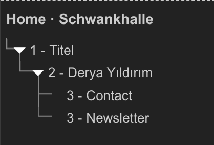
5. Heading structure
Issue
The heading structure is not properly set.
Suggestion
Make sure that each page has both a properly structured visual hierarchy and HTML headings.
Location
All the pages
Categories
Screen size
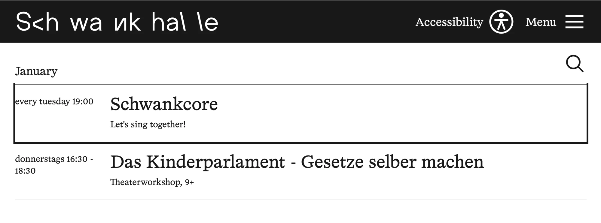
7. Focus outline
Issue
The top of the focus outlines for the first event of every month is not displayed.
Suggestion
Display the top of the focus outlines for the first event of every month
Location
Categories
Screen size
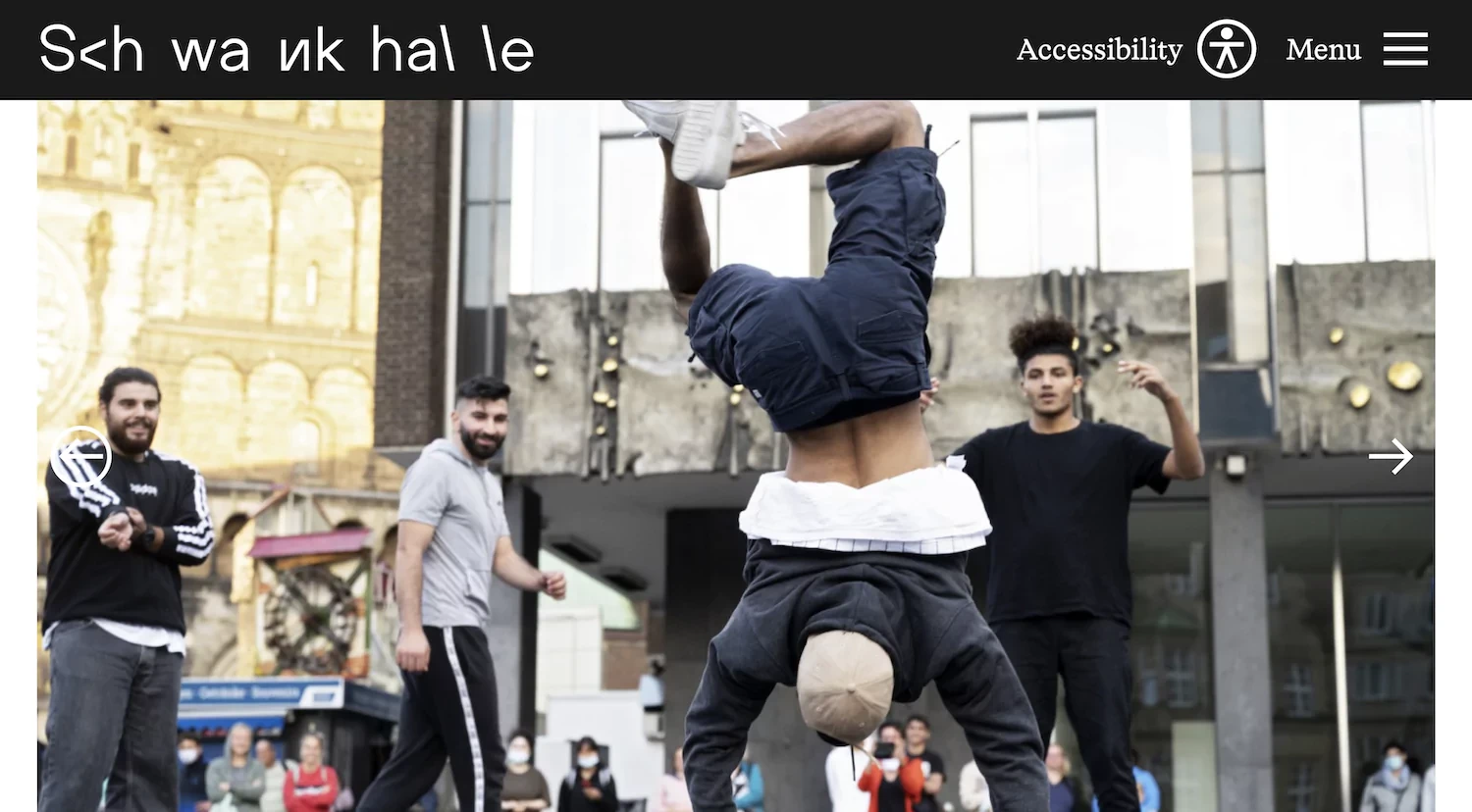
8. Colour contrast
Issue
The foreground colour and background colours don't have enough contrast.
- The white left arrow icon on the slider image (See image)
- The title letters on hero images (Multiple pages)
Suggestion
Make sure that the colour contrast is at least 4.5:1 for regular-sized text and 3:1 for large-scale text according to WCAG SC 1.4.3 Contrast.
Location
Multiple pages
Categories
Screen size
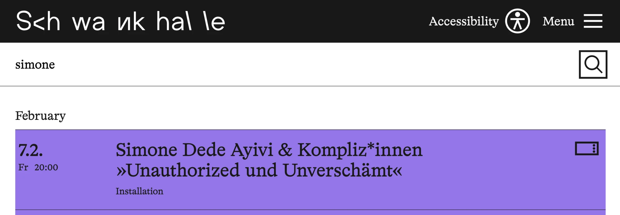
9. Abbreviated day of the week
Issue
The abbreviated day of the week is read incorrectly by the screen reader.
Suggestion
Change the abbreviated day of the week to three characters instead of two (e.g., from "Fr" to "Fri") since it is more common, and add the full word as an aria-label. Alternatively, use the full day name instead of an abbreviation.
Location
Multiple event pages, home, calendar and archive
Categories
Screen size
10. Search event
Issue
It's not clear that clicking the magnifying glass icon after typing in the search box will close the search box and end the search.
Suggestion
After a user types in the search input, change the magnifying glass button to a close button.
Location
Categories
Screen size
11. Email address label
Issue
The label for the email address input is placed after the input field. According to WCAG, the label element should be positioned before the input, textarea, or select element to properly identify the purpose of the control.
Suggestion
Put the email address label before the input
Location
Footer
Categories
Screen size

12. Icons on events
Issue
The icons, such as family-friendly, sign language,s are not accessible to those who use voice over
Suggestion
Add icons' descriptions to each event link's aria-label
Location
Calendar, Home, Archive
Categories
Screen size
Legend
Severity
This issue severely impacts accessibility, making content or functionality difficult or impossible to use for some users. It fails to meet WCAG 2.1 A and AA standards and creates major barriers. Immediate fixes are needed.
This issue affects usability but does not completely block access. While it may meet WCAG 2.1 AA, it does not follow best practices, causing confusion or difficulty. Fixing it improves both accessibility and user experience.
This issue is not a major barrier but an opportunity to enhance inclusivity. Addressing it aligns with WCAG best practices, improving readability, navigation, and usability for a wider audience.
Status
The process to address this issue has not yet begun.
Work is currently being carried out to resolve the issue.
The necessary changes have been implemented and are now awaiting review.
This status is updated only by Yoshie upon her confirmation that the issue has been resolved.
Screen sizes
Mobile phones (≤ 600px)
Tablets and small screens (601px – 1024px)
Laptops and desktops (1025px – 1440px)
Terminologies
The Web Content Accessibility Guidelines (WCAG) are internationally recognised standards developed by the World Wide Web Consortium (W3C) to make digital content more accessible to people with disabilities. WCAG provides specific criteria to improve accessibility for users with visual, auditory, motor, and cognitive impairments.
Following WCAG ensures a more inclusive digital experience and helps meet legal accessibility requirements in many countries.
Colour contrast is a term used in colour theory that describes the difference between different colour hues. The details of how to meet the accessibility standard of colour contrast are in this article: Make Your Website Easy to Read for Everyone (Why Colour Contrast Matters)
