Recent projects
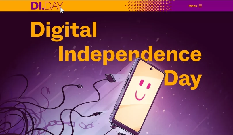
Digital Independence Day ↗
Design, Accessibility
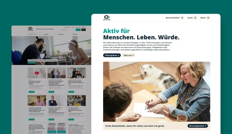
Erlacher Höhe ↗
Design, Accessibility
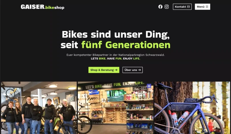
Gaiser bikeshop ↗
Design, Development
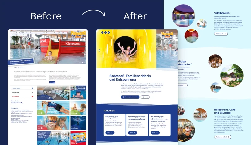
Panorama-Bad Freudenstadt →
Design, Accessibility
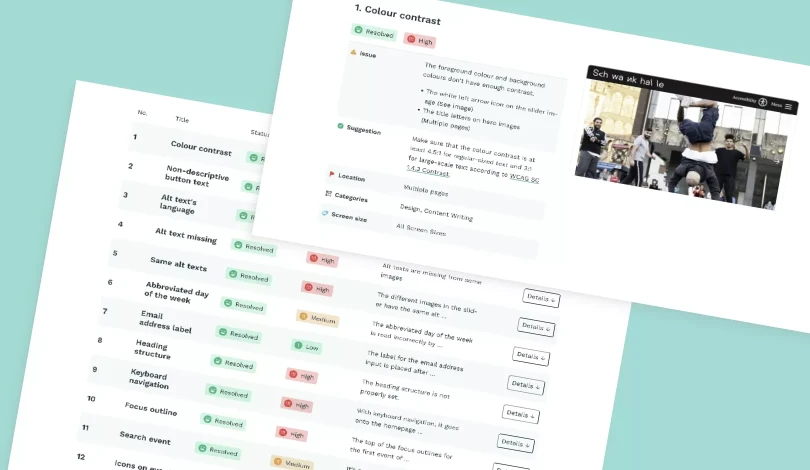
Schwankhalle →
Accessibility audit
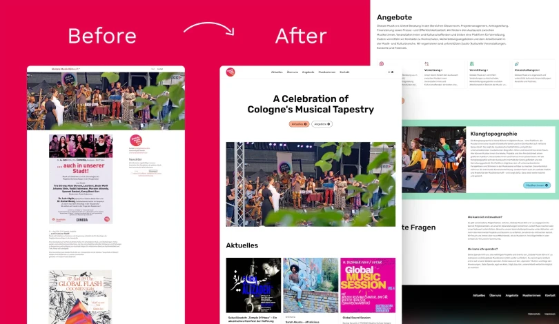
Globale Musik Köln →
Design, Accessibility, Development
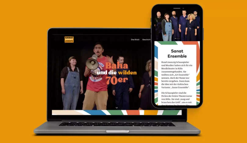
Sanat Ensemble →
Design
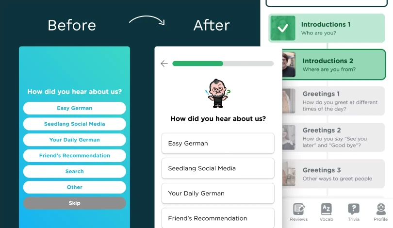
Seedlang →
Design