🎨 Today’s Design Task
Today’s task was a bit overwhelming but also rewarding. Just like decluttering a home, I focused on tidying up the design and content of a cluttered homepage.
Show task description

🚀 My Design Process
-
Content Review: I went through all the content on the homepage, marking key services (green), calls-to-action (red), and redundancies (yellow). I added notes directly onto screenshots.

-
User Personas: I developed 3 user personas to understand the target audience.
-
Content Audit: The site had nine different phone numbers, so I listed them out to understand their purpose.
-
User Journey Mapping: I created user journeys for three distinct personas to see how they would navigate the site.

-
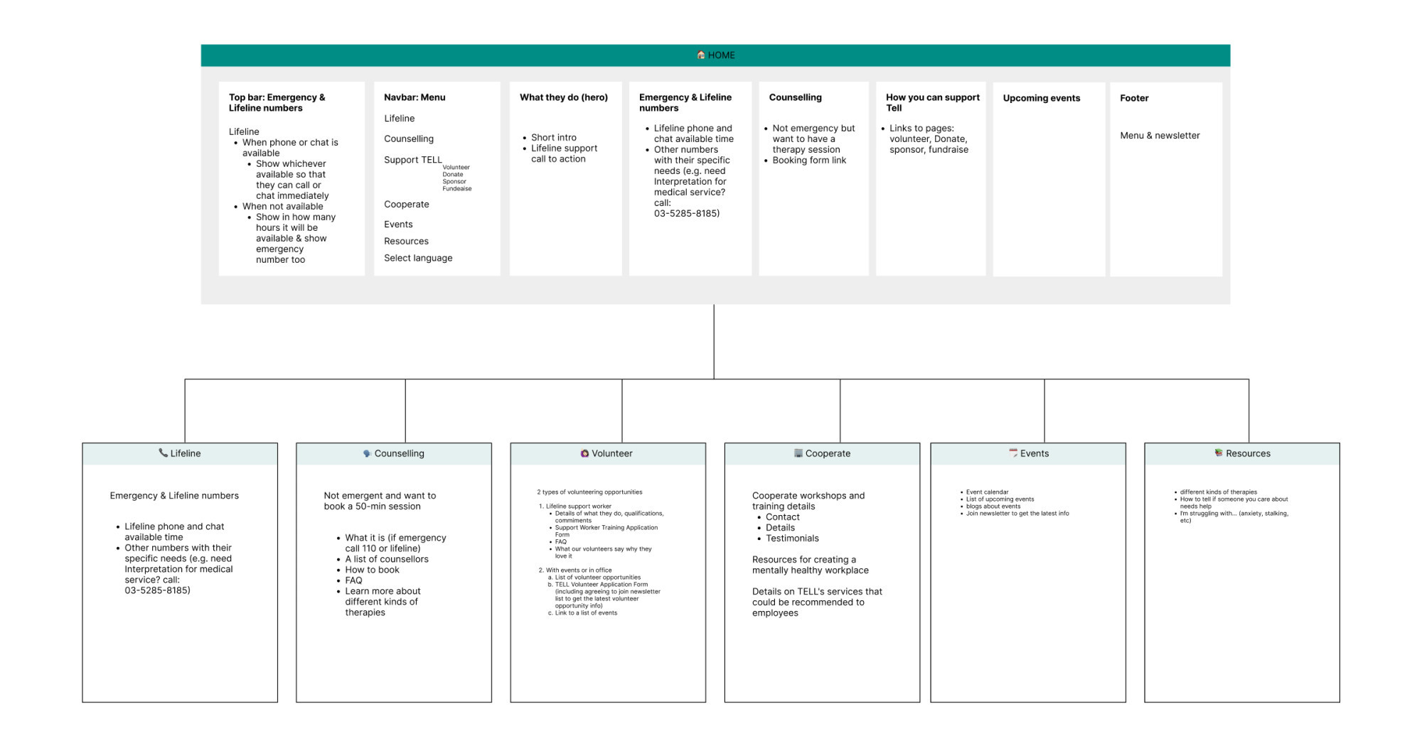
Site Map Creation: I developed a site map, prioritizing content, establishing hierarchy, and grouping related information based on user journeys.

-
Lo-Fi Design: With extra time, I created a lo-fi design, emphasizing clear calls-to-action by incorporating white space and minimizing the number of buttons.
🧠 Challenges and Solutions
- Prioritizing Information: The homepage had an overwhelming amount of content, making it difficult to identify the most important information. Defining user personas helped me decide what should be prominent on the homepage.
- Content Organization: By understanding the user needs, I was able to reorganize the site map to ensure key information is easily accessible, no more than three clicks away.
🖼️ The Final Design

💡 What I Learned Today
Having a lot of useful information on a site is great, but unfortunately, it’s practically useless if it’s hard to find. This exercise reinforced the importance of accessible design with well-prioritised content.
⏰ If I Had More Time
- I’d work on a hi-fi design of the navigation bar and hero section.
- I’d create a comprehensive list of all site information and categorise it to further improve user navigation.
💌 Any Thoughts?
What are you working on these days? I’d love to hear your feedback or any advice you might have!
Thanks for following along on Day 19 of my challenge. See you tomorrow for Day 20!
With love and light 🫶🏻
Yoshie
P.S. Yesterday, my family and I went hiking and visited a memorial of a concentration camp. Reading “Man’s Search for Meaning” gave me some insight, but seeing it in person was heartbreaking. There was a quote that resonated deeply with me:
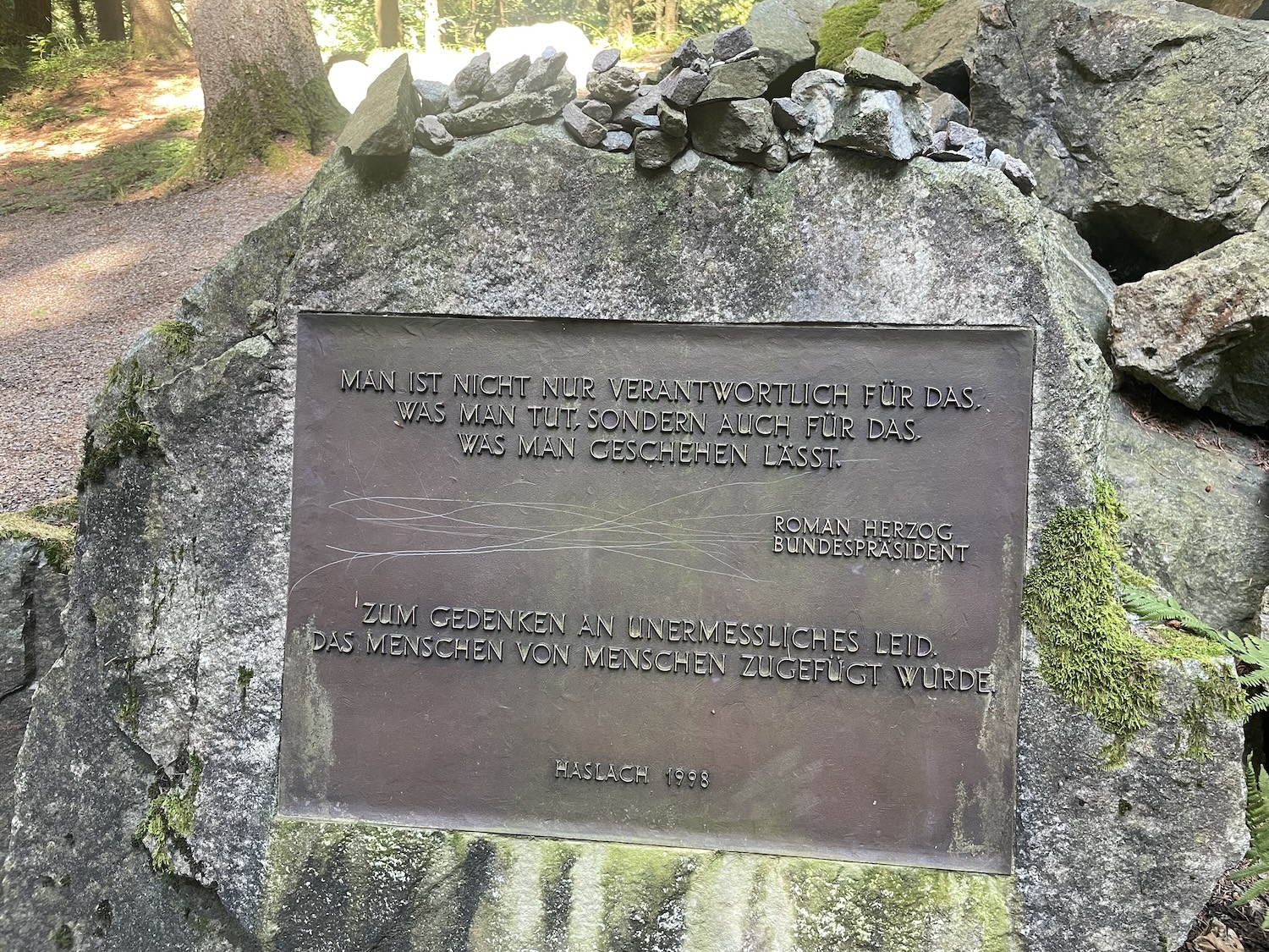
“You are not only responsible for what you do, but also for what you allow to happen.”