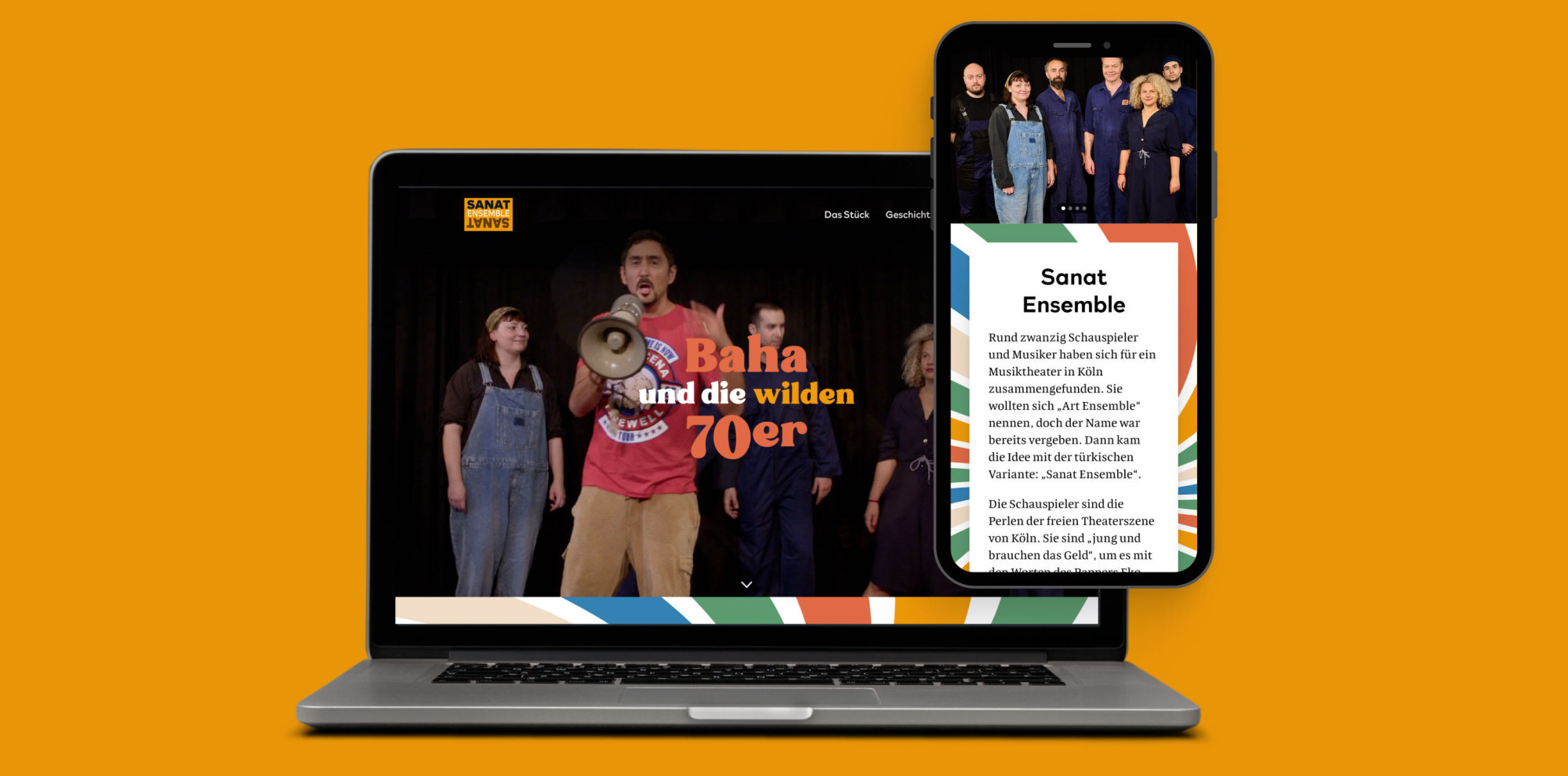
Designing the Sanat Ensemble website was both a rewarding and challenging experience. The task was to capture the vibrant energy of the 70s whilst honouring Turkish people and other communities who fought for equal rights. I also wanted the design to reflect the joy and lively spirit of their music and performances. Here’s a breakdown of the key struggles I encountered and how I overcame them!
1. Striking the Right Balance in the 70s Theme
When I first started gathering ideas, I explored classic 70s design themes. However, much of what I found leaned heavily towards the stereotypical “hippie” aesthetic—groovy patterns, mushrooms, and bright, swirling colours. While these visuals were playful, they didn’t quite fit with the deeper message of Sanat Ensemble’s work in social justice and equal rights.
➡️ Solution:
I struck a balance by combining fun, bold colours with a clean white background and dark text. This approach allowed the website to maintain the joyful spirit of the 70s whilst respecting the gravity of their cause. The colour scheme provides a fun, musical vibe, while the minimal background keeps the focus on their message.
2. Letting Go of the Megaphone Illustration
At one point, I wanted to use a megaphone as the main illustration for the site because I thought it would represent the idea of raising voices and standing up for rights. However, it just didn’t fit visually with the rest of the design and began to feel out of place.
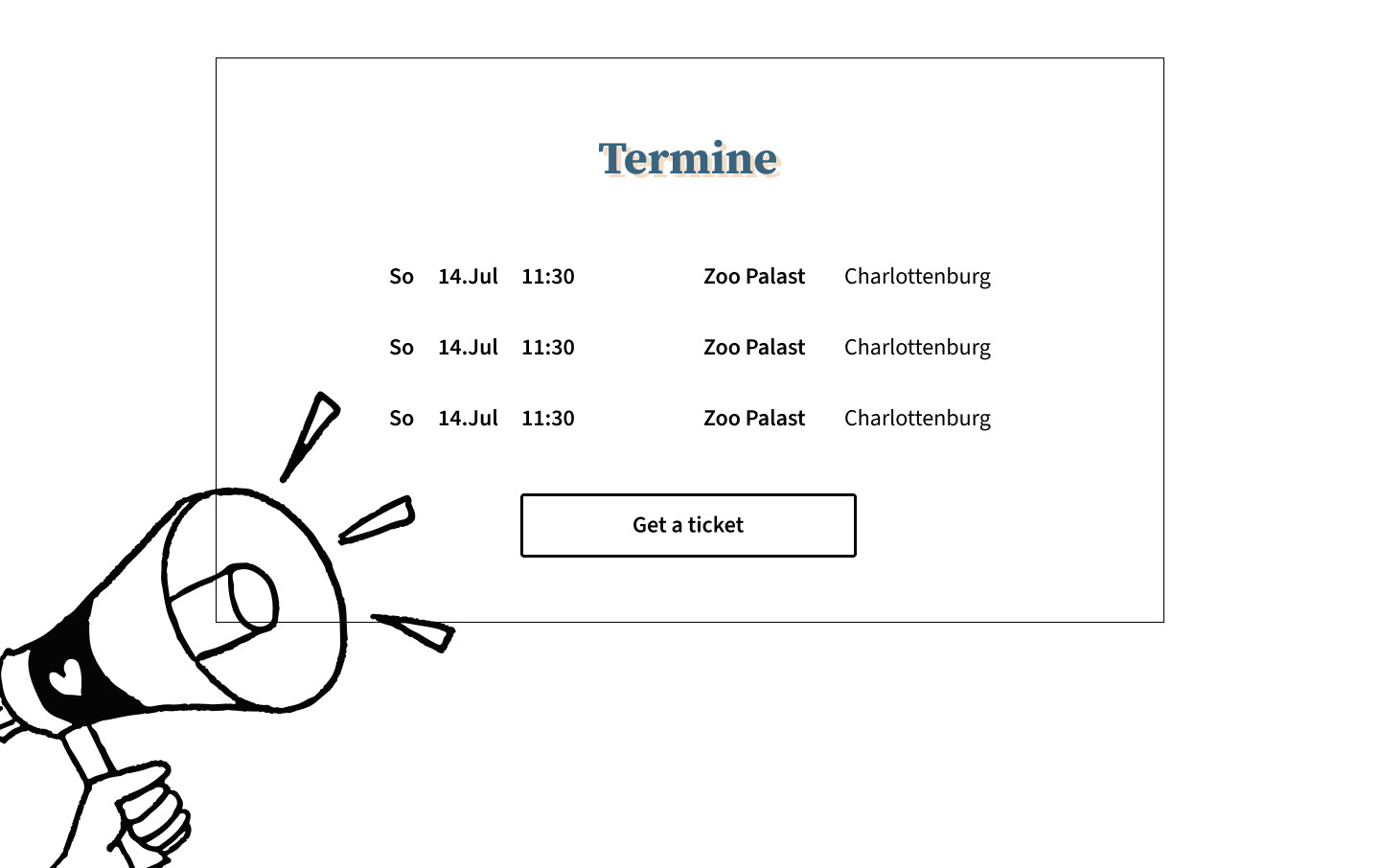
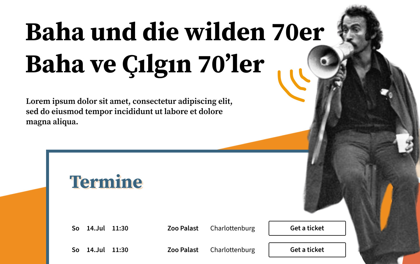
➡️ Solution:
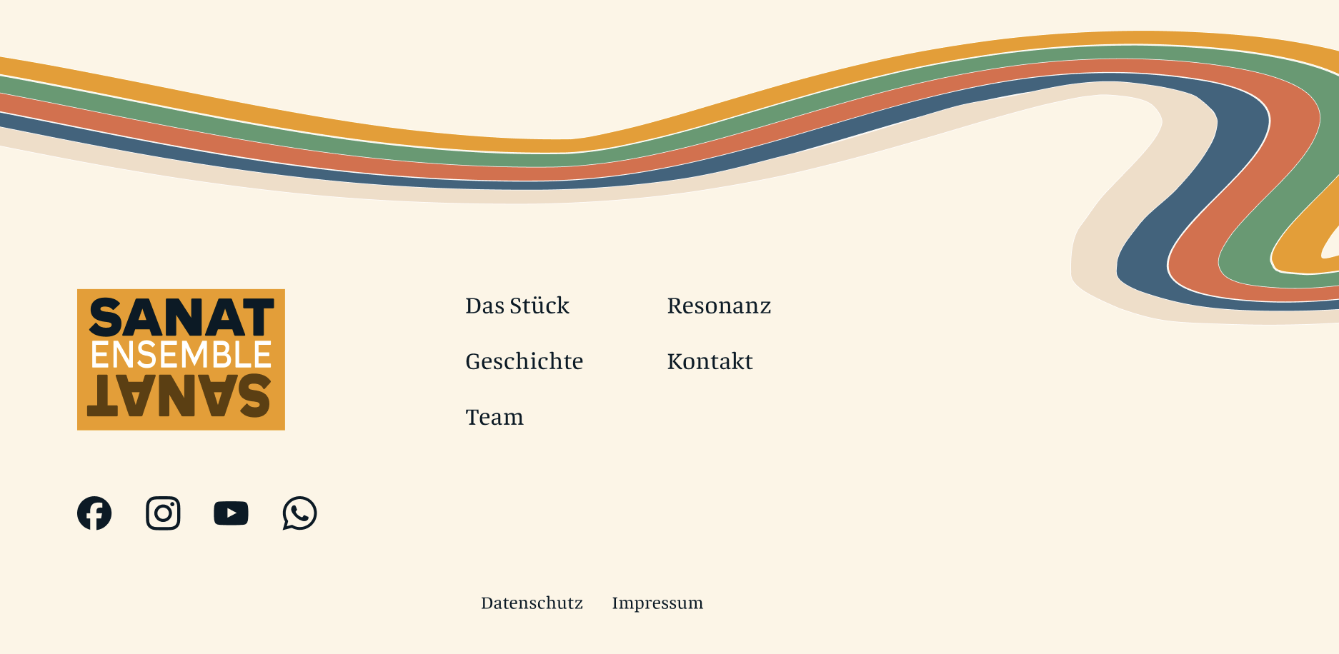
I decided to simplify the design and have more alignment throughout the entire website, so I let go of the megaphone idea. Instead, I embraced the 70s-themed colours and explored other patterns, which led to a musical-inspired illustration just before the footer. I also added colourful backgrounds that made the design feel more dynamic and cohesive and kept the website lively and engaging.
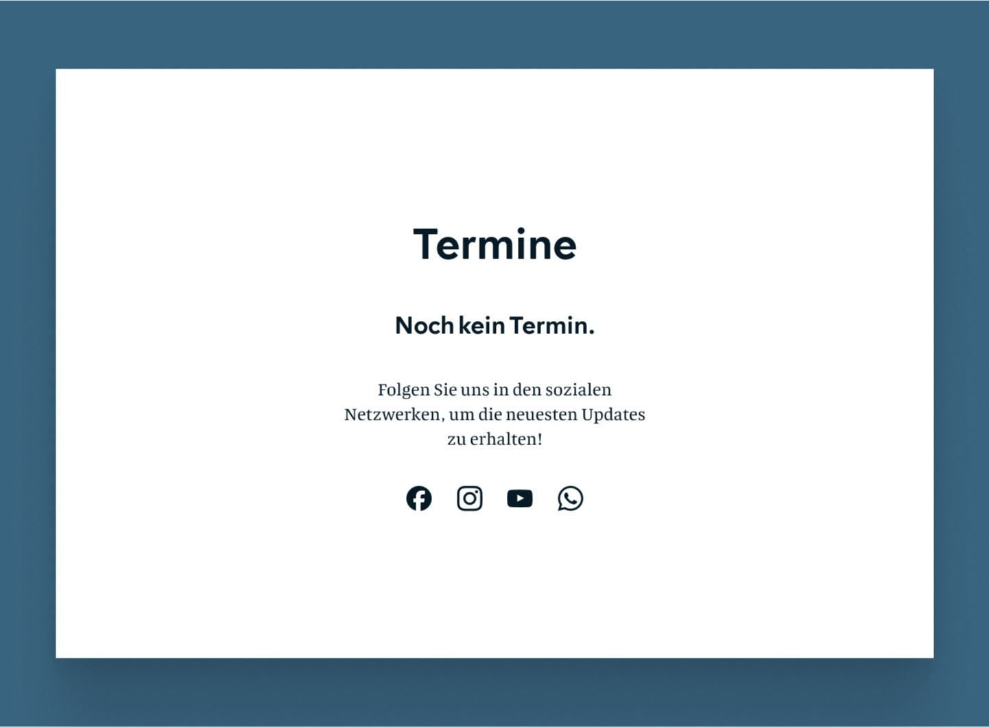
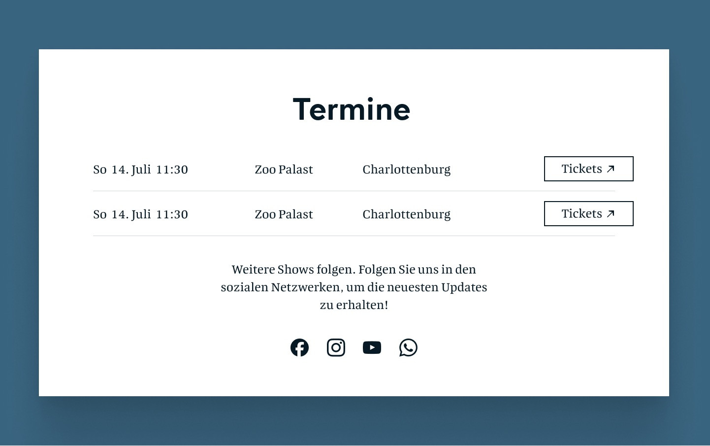
3. Handling the “No Upcoming Events” Situation
One of the tricky aspects was figuring out how to manage the “Termine” (Events) section when no performances were scheduled. I didn’t want visitors to feel disengaged or disappointed if there were no upcoming events listed.
➡️ Solution:
I put myself in the shoes of a fan eager to go watch a performance. Instead of leaving the section empty or just a few events, I added a message with links to their social media, encouraging users to stay connected for updates. The client later decided to add a newsletter sign-up link.
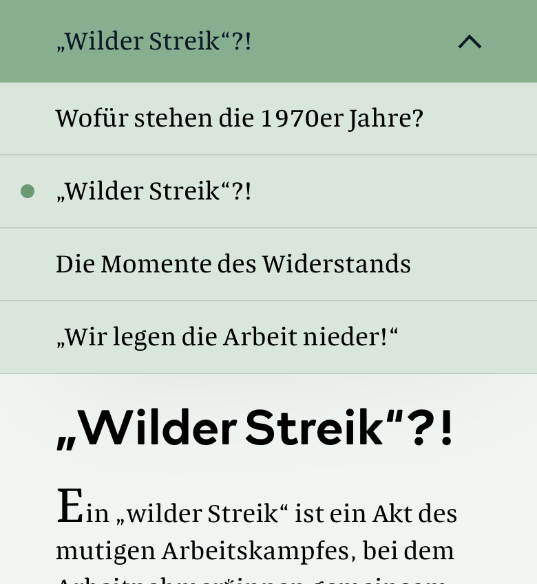
4. Optimising the Article Menu for Mobile
For the desktop version of the article page, I took inspiration from Google Docs, where users can see the titles on the left-hand side.
This is a great idea not only for users to see where they are in a possibly long article but also to keep the article page more accessible by having a limited number of characters per line (WCAG states that width is no more than 80 characters or glyphs.). However, when I attempted to adapt this layout for mobile, it didn’t work well.

➡️ Solution:
My partner stepped in with a great suggestion, showing me how other websites handle mobile design for similar layouts. This insight helped me modify the article menu so it worked smoothly on smaller screens, maintaining an enjoyable navigation experience without feeling cluttered.
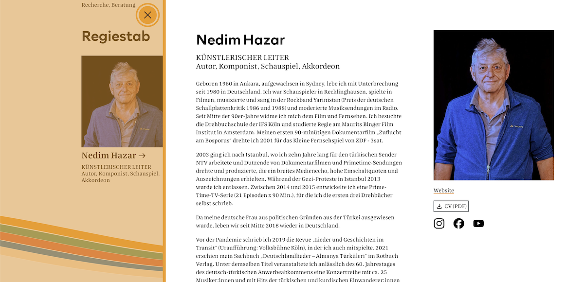
5. Ensuring Consistency in the Person Popup
Another challenge I faced was with the person popups on the team page. Initially, the portfolio images in the modal were smaller than those on the main page, which disrupted the visual flow.
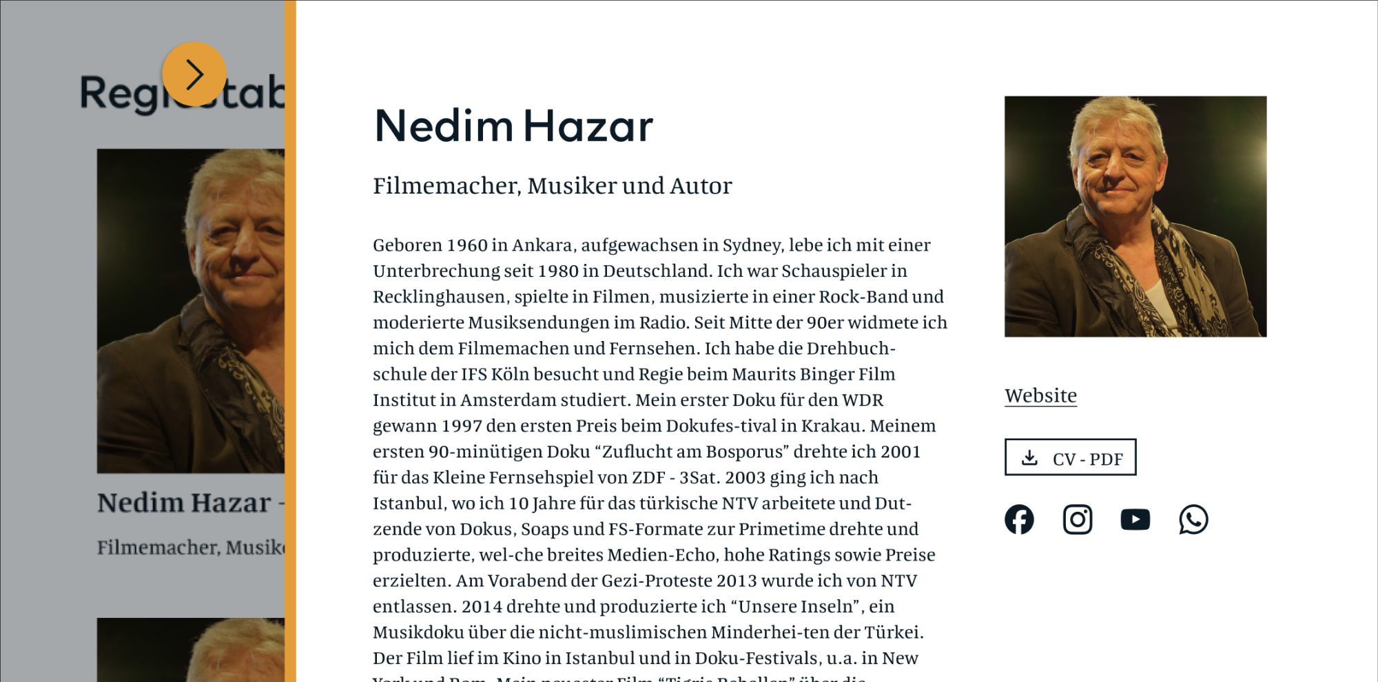
➡️ Solution:
I resized the images to make them bigger than those on the team page, creating a smoother and more consistent experience for users. I also added a small hover animation, which I think adds a fun, playful touch to the interaction! 😚
Final Thoughts
Designing the Sanat Ensemble website was a journey of balancing fun, joy, and serious messaging. From the 70s-inspired colours to the energetic yet thoughtful layouts, every design choice was made with the goal of bringing their story to life in an engaging and visually exciting way.
This project reinforced the importance of letting joy and energy shine through in design, especially when it involves music and performance. It also reminded me that I’m still on a path of learning and growth in my field. I’m grateful to my partner for trusting me in working on this project with him 🙏🏻 🥰
As a foreigner living in Germany, I personally resonated with this project. It made me even more grateful for the equal rights I have today, thanks to those who stood up for them. One of my goals is to continue improving my German so that when I go watch one of their performances, I can fully understand and enjoy the experience! 🎶