Making TELL Japan Website Accessible and Decluttered 🧹

Posted
Tags
UI/UX Accessibility
Share
Website comparison showing a before and after redesign of the Tell mental health support platform, highlighting a shift from a cluttered layout to a cleaner, more empathetic design with a prominent message of hope and support.

👩🏻‍🔬 Accessibility Testing Insights

During my review of the TELL Japan website, I identified 17 accessibility and UI/UX issues. While 7 of these issues required coding changes, I addressed the other 10 through design improvements. Here's how I tackled them.

How I Solved Accessibility and UX Issues

1. Low Colour Contrast on Buttons and Text:

Side-by-side comparison of a website's design before and after a redesign, showcasing a transformation from a cluttered layout to a clean, compassionate mental health support interface with a reassuring message: You are not alone. There is hope. The before design has parts highlighted in pink that do not have enough colour contrast.

I improved the colour contrast of text and essential buttons to meet the recommended 4.5:1 ratio. For users with deuteranomaly, I used a colour-blind simulator and adjusted the contrast to 4.3:1.

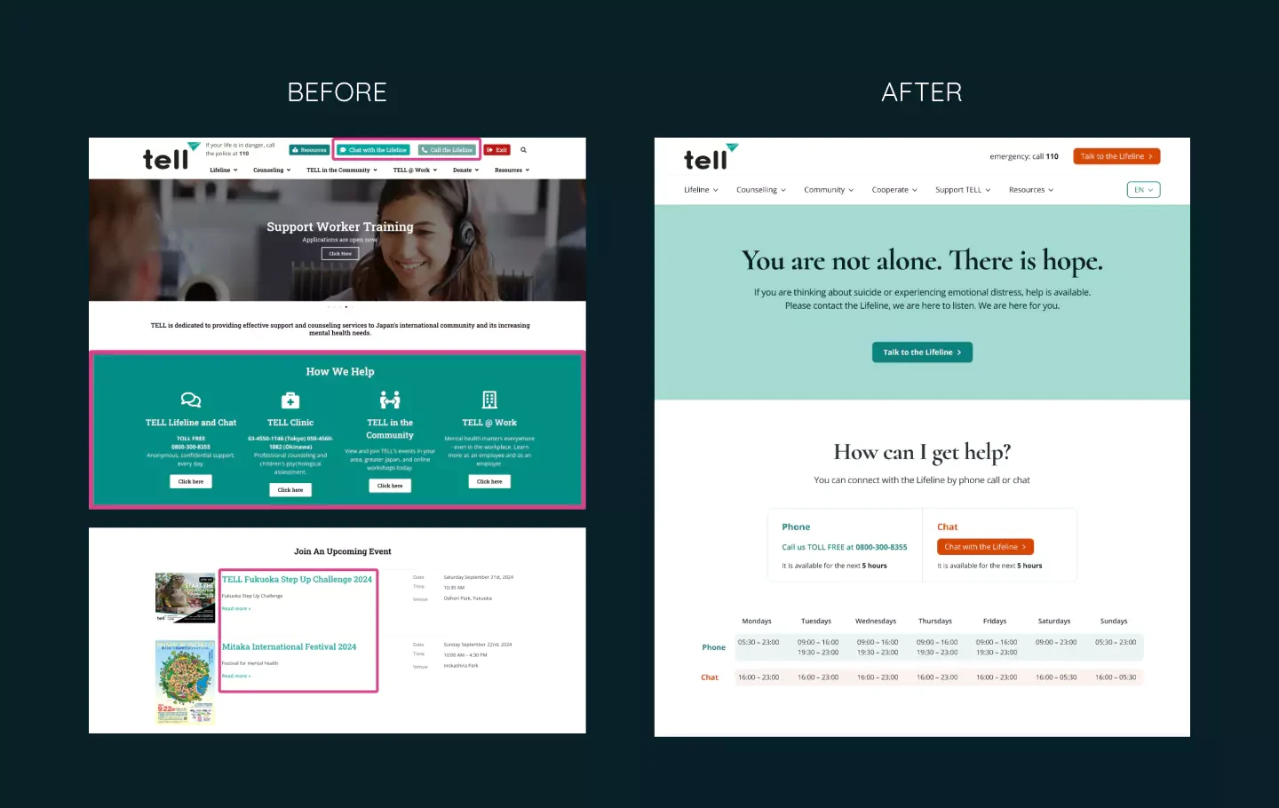
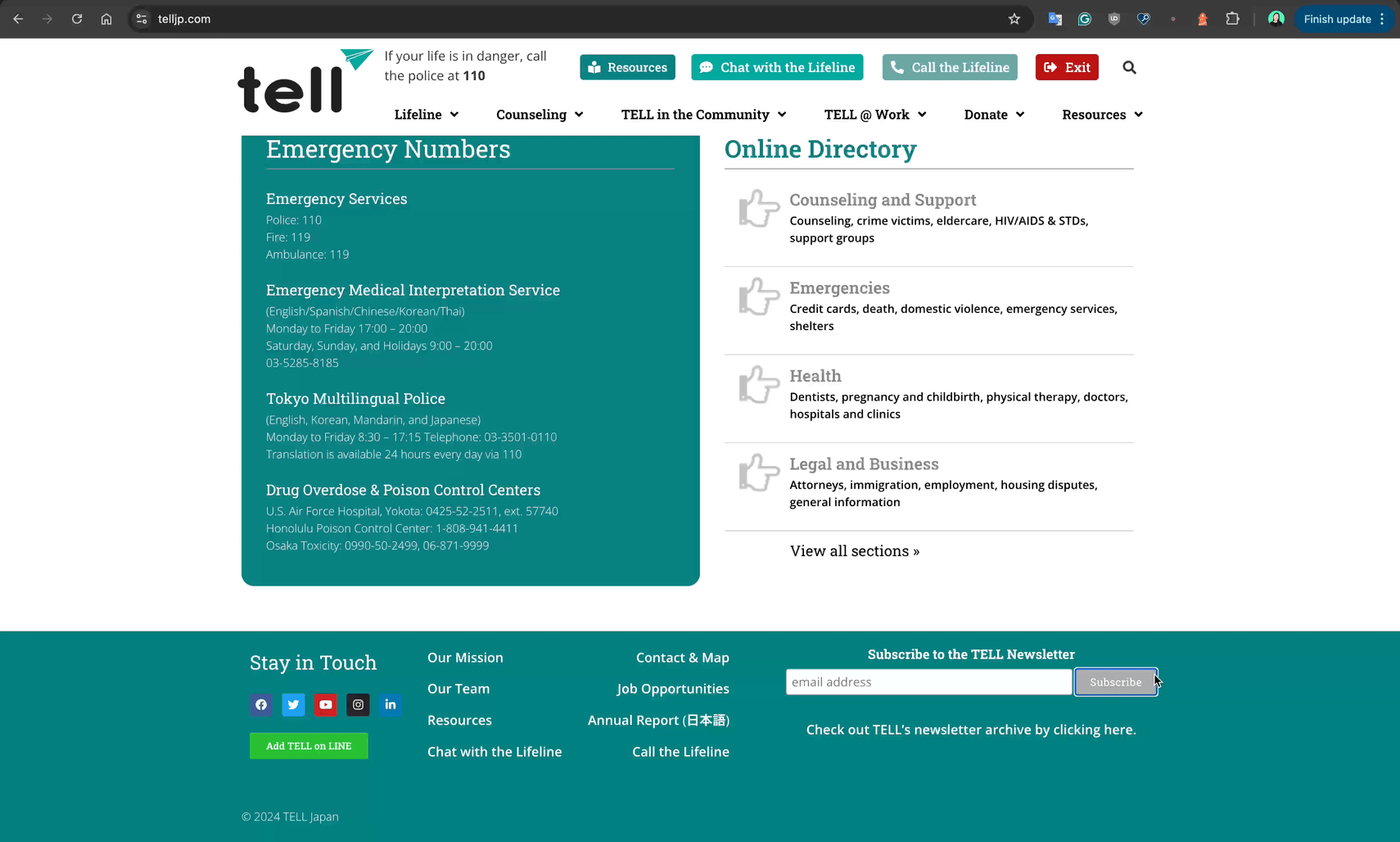
2. Poor Contrast in Keyboard Navigation for Deep Menu Items:

Side-by-side comparison of a website's design, with the "Before" version showing a more cluttered interface and the "After" version presenting a cleaner, simpler layout with a focus on help and support options. The "Before" design has highlighted menu items that do not have enough colour contrast.

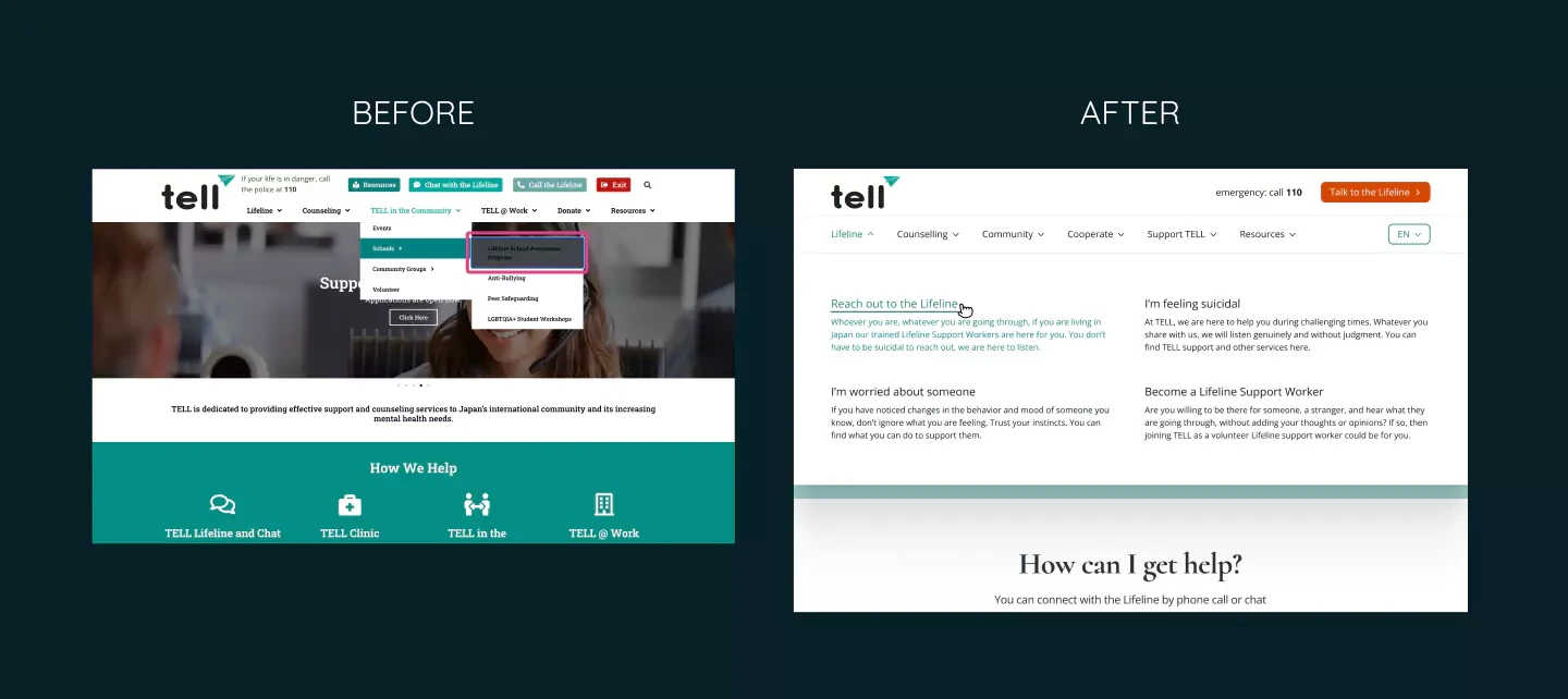
To enhance the user experience, I redesigned the deep menu items by expanding the second-level pages and making the content easier to navigate and click.

3. Missing Labels for Input Fields:

Side-by-side comparison of a website interface before and after a design update, showing a transformation from a teal-colored footer bar to a more modern layout. The 'Before' version features the email input for the newsletter highlighted with a pink stroke box in the footer, while the 'After' version shows the email input positioned next to the events list.

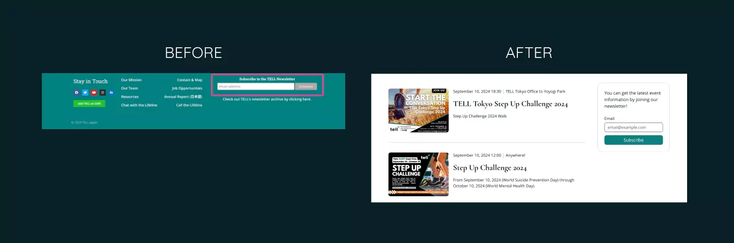
I added proper labels to input fields, including the newsletter subscription form, to improve usability.

4. Misleading “Annual Report in Japanese”:

Side-by-side comparison of a footer before and after a redesign. The "Before" screen has a cluttered layout with multiple sections, and the menu item that says Japanese in Japanese is pointed at by a pink arrow, while the "After" screen presents a cleaner, more streamlined design with a teal color scheme and simplified information display.

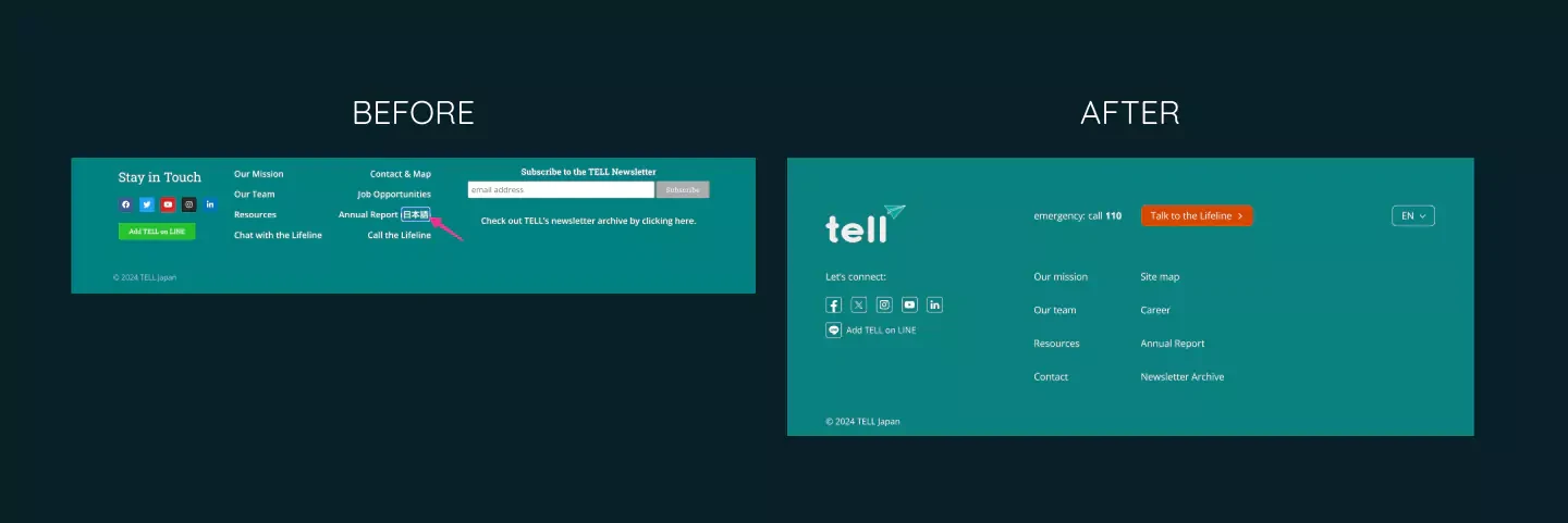
Since the English Annual Report is from 2023, but the Japanese one is from 2022, I simplified the footer by removing the outdated Japanese report link.

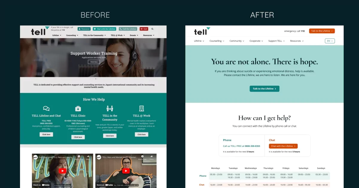
5. Sliders in the Header:
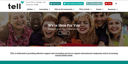
TELL Japan's current website features an image slider in the hero section. The first image displays a diverse group of smiling people clustered together, accompanied by the title We're Here For You. The second image depicts two men having counselling, with the title TELL Counselling. The last image shows a woman wearing headphones and a microphone, resembling a support agent, with the title Support Worker Training.

Webpage for Tell Lifeline suicide prevention support, with a message "You are not alone. There is hope." and a prominent teal "Talk to the Lifeline" button.

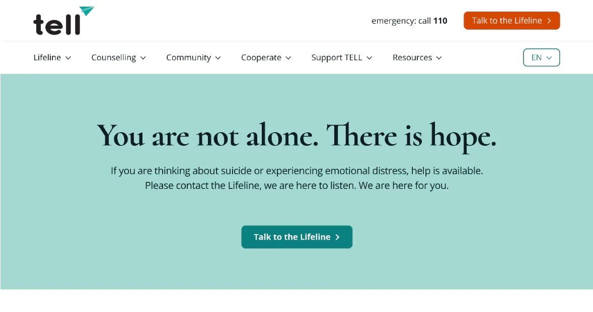
I removed the sliders and replaced them with a cleaner, more straightforward header for better usability.

6. Improved Visual Hierarchy:

Website design comparison showing a before and after of a page layout, with the updated version presenting a cleaner, more organised interface for supporting an organisation's work through multiple action options. In the "Before" version, the H2 and H3 texts are pointed at by pink arrows.

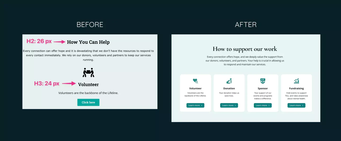
I adjusted the font size and weight of headings to establish a clear visual hierarchy, ensuring that H2 and H3 tags are distinct.

7. Error Handling on Newsletter Signup:

The footer of the TELL website displays an email input field with the subscribe button clicked, despite the email field being empty. The next screen shows several input fields, with the email field outlined in red, and the text above indicates that there are errors below.

There is a list of events for TELL Japan's redesign, and on the right side, there is an email input field with a subscribe button. After the button is clicked, a message appears in red above the button, stating Please enter your email address.

I made error messages more descriptive and displayed them on the same page, avoiding the confusion caused by opening new tabs.

8. Small Social Media Icons in the Footer:

Comparison of a user interface before and after a redesign, with the 'after' version showing a cleaner, more modern layout with improved visual hierarchy and spacing in a teal color scheme.

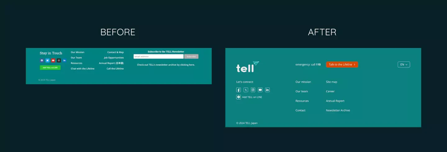
I increased the size and contrast of social media icons, ensuring that the clickable areas meet the recommended minimum size of 44x44 pixels.

9. Inconsistent Visual Elements (Icons, Buttons, etc.):

Side-by-side comparison of a user interface design, with the left "Before" version showing a collection of various icons that are different from each other, and the right "After" version presenting a cleaner, more spaced-out card-based design with aligned, harmonious icons and buttons.

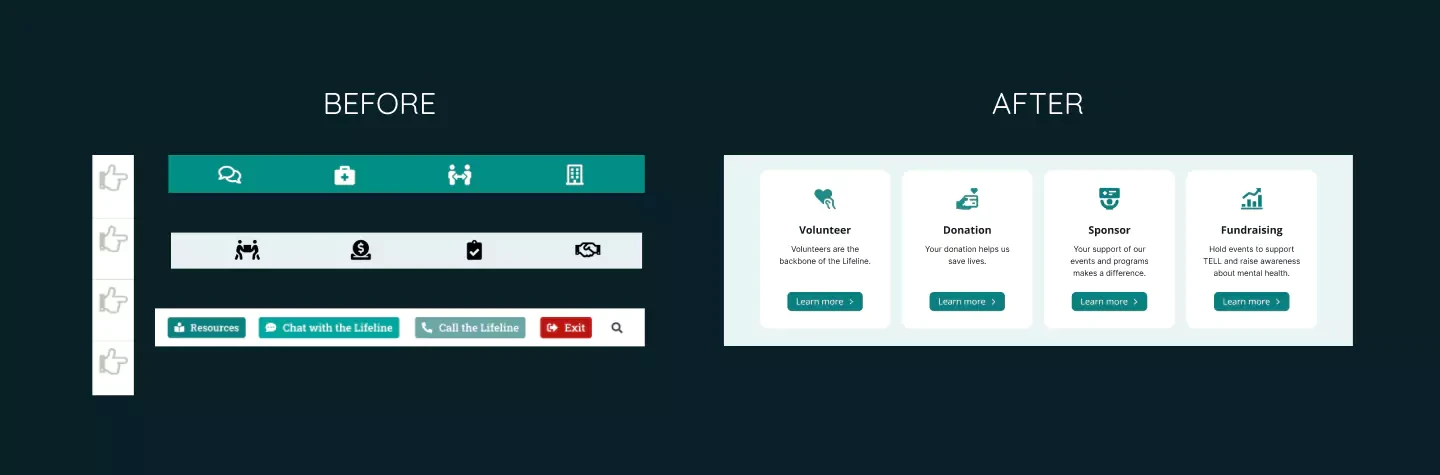
I standardised the design by creating a cohesive design system, ensuring consistency in icons, buttons, and other UI components.

10. "View More Events" Link:

Web page design comparison showing 'Before' and 'After' layouts for an event list interface, highlighting improvements in visual design and user experience. In the 'Before' version, the 'View More Events' button is highlighted in a pink box.

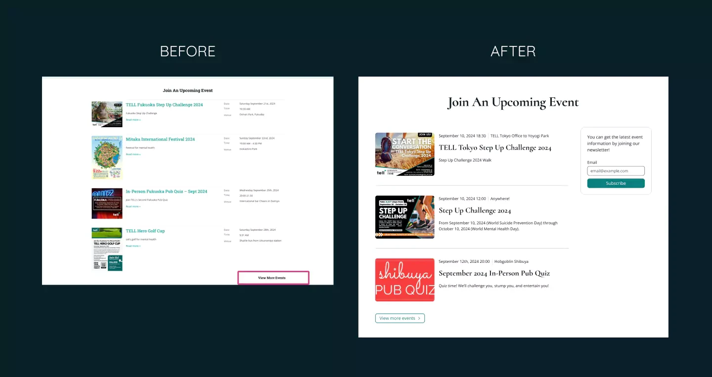
I added a right arrow icon to the "View More Events" link, making it clear that it redirects users to a new page.

👩🏻‍💻 Programming Fixes

While this blog focuses on design solutions, here are some programming-related accessibility fixes:

  1. "Skip to Content" Button Doesn't Work:
    Ensure the "Skip to content" button works.

  2. Missing Focus Indicator on Menu Toggle:
    Add a visible focus indicator to the menu toggle button on tablets and mobile devices.

  3. Alt Text for Images:
    Provide descriptive alt text for all images, especially those functioning as links.

  4. Inconsistent Heading Hierarchy:
    Adjust the heading structure to maintain a logical hierarchy.

  5. Broken Buttons at 737px Screen Width:
    Adjust button sizes to prevent them from breaking at specific screen widths.

  6. Inaccessible Menu Items on Mobile and Tablet:
    Ensure all menu items are fully accessible and clickable on touch devices.

  7. Overlapping Text in the "Join An Upcoming Event" Section:
    Fix overlapping text issues by adjusting layouts and using media queries to handle zoom and screen size changes.

📝 Lessons and Takeaways

  • Building a design system before expanding a website is essential for maintaining consistency and avoiding clutter as new content is added.

  • Conducting accessibility tests can reveal issues you might not have considered. Testing with keyboard navigation and screen readers is especially important for catching details that can easily be overlooked.

  • This project was my first experience with keyboard navigation and voiceover tools. It was time-consuming but invaluable for deepening my understanding of accessible design.

➡️ What's Next?

Even though I worked as a software engineer for over 3 years, I had never paid attention to accessibility… until I met my partner and he told me and showed me how important it is. I am super excited to learn more about how I can improve my design!

I’d love to hear your thoughts. Are there any accessibility issues I missed? What would you change in my redesign? Let’s connect on Mastodon!

Thank you for reading to the end!

Have a wonderful day 🥰

Related articles

A laptop and smartphone display a website or digital platform with a retro 70s-style graphic featuring people in vintage clothing against an orange background. The laptop screen shows a colorful title and group of individuals, while the smartphone displays an additional panel with text and another group photo.

Finding Balance Between Fun, Joy, and Seriousness

Designing the Sanat Ensemble website was both a rewarding and challenging experience. The task was to capture the vibrant energy of the 70s whilst honouring Turkish people and other communities who fought for equal rights. I also wanted the design to reflect the joy and lively spirit of their music and performances. Here’s a breakdown of the key struggles I encountered and how I overcame them! 1. …

On the left, there is a word that says Before and a mobile screen of the old version of the Seedlang registration process. On the right, there is a word that says After and a mobile screen of Yoshie's redesign of the Seedlang registration process.

Case Study: Redesigning Seedlang App for Accessibility and User-Friendliness

As a UI/UX designer passionate about creating inclusive and intuitive experiences, I collaborated with Seedlang, a German learning app, to improve their registration process and home screen. This project was an opportunity to merge accessibility best practices with user-centred enhancements, which resulted in a design that supports all learners (including myself as a power user of Seedlang 😚) in …

Website design comparison showing before and after screenshots of a musical event page with a vibrant pink background, highlighting improved layout and visual presentation of Cologne's musical event details.

Case Study: Designing An Inclusive & Accessible Platform for Musicians

Introduction I redesigned the website for Globale Musik Köln e.V. to improve usability and accessibility. Here's how I tackled its challenges, refined the user experience, and what I learned! You can visit the website from here. My Design Mission The original site had issues that made it hard for users to understand the organisation's purpose, see which musicians they support, find available …