🎨 Today’s Design Task
Today’s task was right up my alley—I love organising and creating lists, so working on components was really satisfying!
See task description

🚀 My Design Process
-
Understanding the Task: I began by carefully reading the task instructions to grasp what components I needed to create.
-
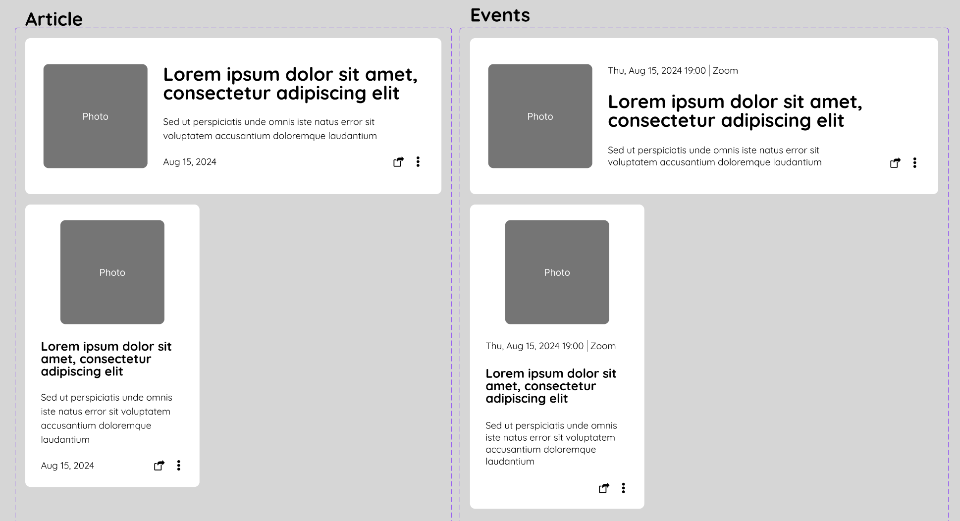
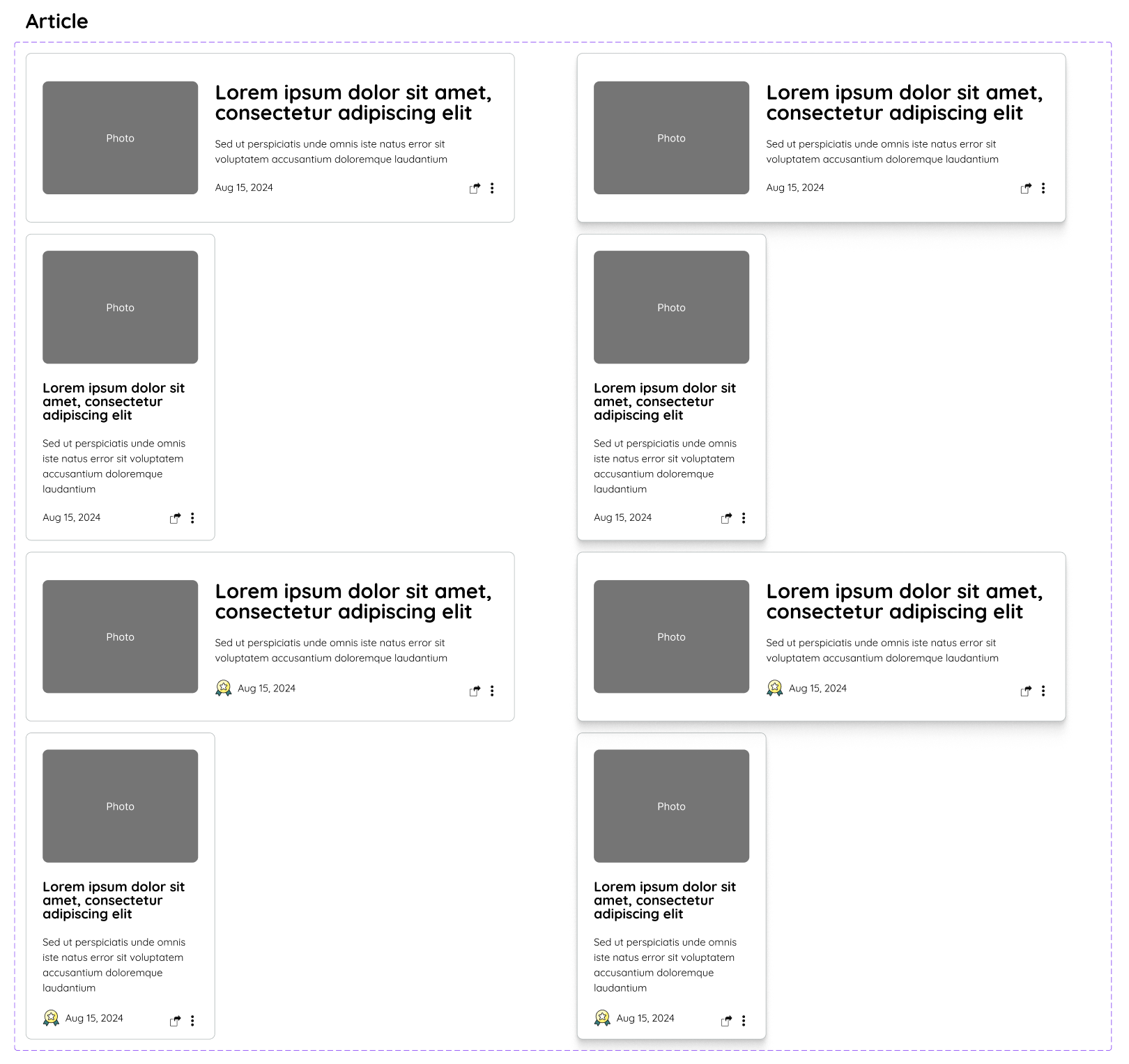
Base Components: I designed base components for articles and events, drawing inspiration from TELL’s current design and other sources.

-
Auto Layout: I tidied up the layout using Figma’s auto layout feature, ensuring everything was structured properly.

-
Mobile Variants: I created mobile-friendly variants for both components.
-
Photo Size Adjustment: I adjusted the photo size to a rectangular, which looks better on mobile devices.
-
Icon Selection: I spent a lot of time looking for the perfect icon on Streamline to indicate important articles and events, and carefully considered its placement.
-
Icon Variants: I created variants for the “important” icon, allowing it to be toggled on and off.
-
Event Card Variants: For event cards, I added variants to distinguish between past and upcoming events.
-
Hover States: I designed hover states for both components to enhance interactivity.
-
Button Variants: With some extra time, I created a button component with variants for different colours and statuses.
🧠 Challenges and Solutions
- Icon Selection: Finding a suitable icon for marking important events and articles was tricky. I ended up adjusting other icons to align better with the “important” star icon, which took some time.
- Layout Adjustments: Initially, hiding the important icon caused the date text to shift incorrectly. I resolved this by framing the icon, ensuring the rest of the layout stayed intact.
- Feedback from My Partner:
- Adjust the nested border radius (the photo’s border radius should be smaller).
- Event Card: Without the important icon, the top looked empty. My partner suggested moving the date to the left to balance the design.
🖼️ The Final Design


I’m pleased with today’s outcome. Although finding the right icons took longer than expected, I’m confident that with more experience, I’ll be able to speed up my workflow and devote more time to refining other elements.
💡 What I Learned Today
- Structuring frames correctly is crucial to prevent layout collapse when adding or removing elements.
- My partner introduced me to the iOS Design System, and I’m inspired by how neatly they organise their components. I aim to achieve that level of organisation in my own designs!
⏰ If I Had More Time
- I’d create button variants without strokes, particularly for “Read more” links or buttons in articles.
- I’d also implement my partner’s feedback.
💌 Any Thoughts?
What are you working on these days? I’d love to hear your thoughts on my design or any advice you might have!
Thank you for joining me on Day 21 of my challenge. See you on Day 22!
With love and light 🫶🏻
Yoshie
P.S. Yesterday marked our one-year anniversary! 🎊 We were excited to dine at a high-end restaurant, but it turned into quite a comedy show 😂 The waiter didn’t speak German or English, and despite booking a vegan course, some dishes we received weren’t vegan at all! It was chaotic but memorable. I’m grateful that my partner handled the situation, and we eventually got something to eat 🙏🥹 To top it all off, we saw a beautiful rainbow 🌈