🎨 Today’s Design Task
Today’s task was a lot of fun, especially since I got to play around with animations in Figma!
Task Overview:
Poopy Tracker App Landing Page with Animated Features
Design a landing page for the Poopy Tracker mobile app using Figma, featuring an animated transition for the key features section.
- Hero Section:
- Create a hero section explaining the app’s purpose
- Include a call-to-action for app download
- Animated Key Features:
- Design a section highlighting 3 key features of the app
- Use Figma’s smart animate to create a smooth transition between these features
- The transition should be triggered by user interaction (e.g., click or hover)
- Footer:
- Design a basic footer with essential links
🖼️ The Final Design
I’m really satisfied with today’s design! The animations add a lively touch, and the overall layout feels balanced.


🚀 My Design Process
-
Understanding the Task: I started by carefully reading through the task to ensure I fully understood the requirements.
-
Inspiration Gathering: I got some inspiration from apps like Atomic Habits and Calm to get a sense of the style I wanted to achieve.
-
Sketching the Layout: I sketched the initial design on my iPad to map out the structure and flow.

-
Copywriting Assistance: I used AI to generate the headline and subheadline for the page.
-
App Store Assets: I sourced the download buttons for the App Store and Google Play.
-
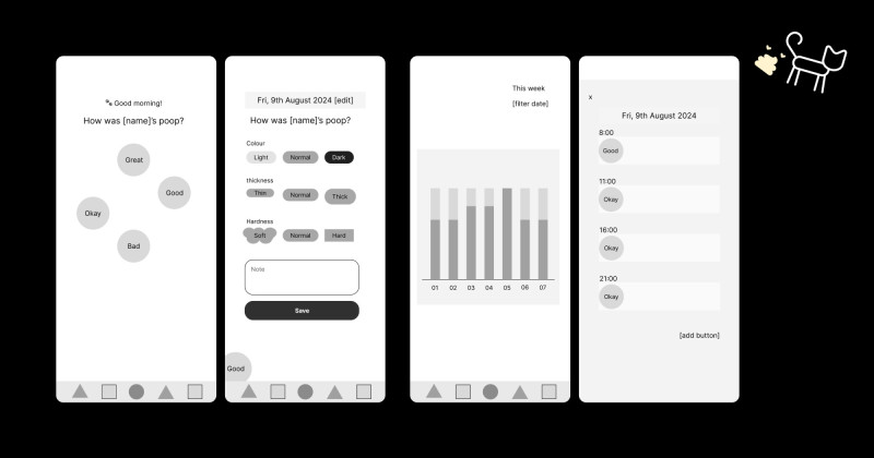
Style Guide: I referred to the style guide from the Cat Poopy Tracker app I previously designed to maintain consistency.
-
Building the Header: I started with the header, adding the titles and download buttons.
-
Key Features Section: I created three key feature sections with rectangular cards, initially using AI-generated descriptions.
-
Refining Content: I adjusted each card’s content to include a clear title and a concise description.
-
Creating the Footer: I designed a simple footer featuring social media icons, app download buttons, and the app name.
-
Animating the Features: I added animations to the three key feature cards to bring them to life.
-
Animating the Footer: I also added a subtle animation to the footer logo for an engaging touch.
-
Enhancing QR Code Visibility: To draw more attention to the QR code, I changed the phone image from black to grey.
-
Feedback and Adjustments: Based on my partner’s feedback, I made the following tweaks:
- Reduced the line height in the header for better readability.
- Shortened the footer animation to make it more dynamic.
- Displayed the app interface instead of just the QR code for a more compelling visual.
🧠 Challenges and Solutions
- Animation Balance: I love adding animations, but it’s easy to go overboard. I had to restrain myself to avoid making the page too busy and distracting.
- Creative Inspiration: Observing Teto’s movements sparked some ideas for the animations I implemented today!
💡 What I Learned Today
Looking back at my earlier Figma files for the Poopy Tracker app, I realised how much I’ve improved in creating animations. It’s been just two weeks, and I’m proud of the progress I’ve made!
⏰ If I Had More Time
- I’d add a section highlighting the steps to use the app, showing how easy it is to track data.
- I’d love to design a custom cat character for the app to give it a playful, unique identity.
💌 Any Thoughts?
What are you working on these days? I’d love to hear your thoughts on my design or any advice you might have!
Thanks for following along on Day 28 of my challenge. See you tomorrow for Day 29!
With love and light 🫶🏻
Yoshie
P.S. I might have captured the best portrait of Teto ever… 🥳 It’s been chilly, so Teto has been extra cuddly, and we’re enjoying it! 🥰 🐾


