🎨 Today’s design task
Thanks to our hungry cat Teto 🐈⬛, I had an early start today. After creating a poster this morning (detailed at the end), I tackled today’s challenge in the evening. After yesterday’s struggles, I was eager to dive in, knowing it could only go up from here!

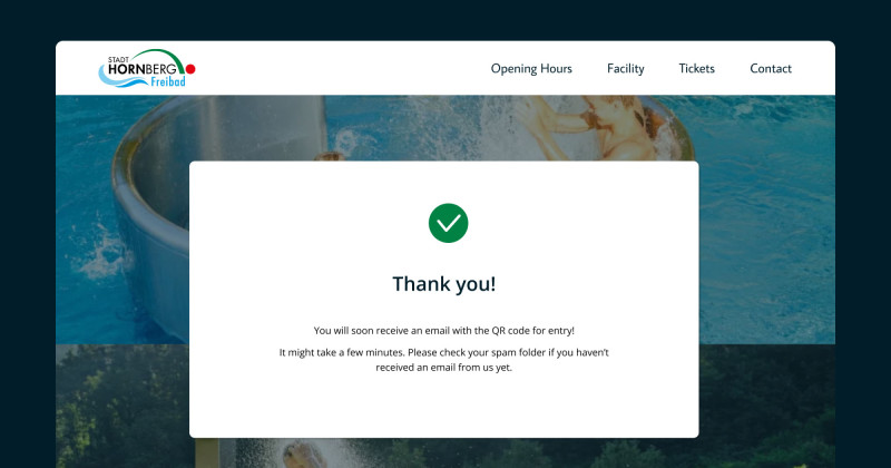
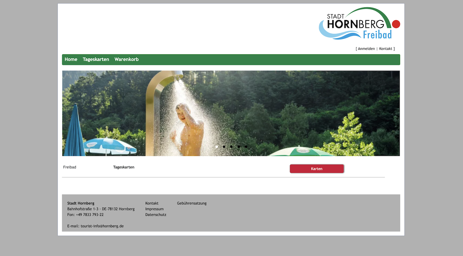
Here is the original website:
🚀 My design process
-
Gathered existing images from the current homepage
-
Identified essential nav bar and homepage elements
-
Researched other swimming websites for inspiration
-
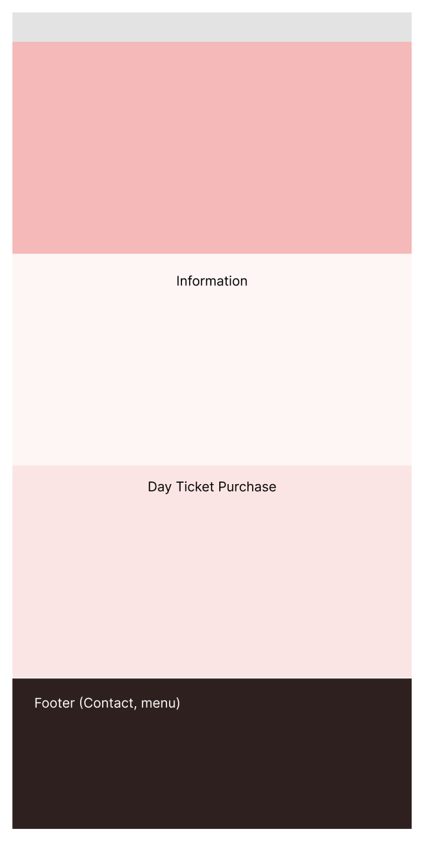
Sketched a lo-fi design

-
Transferred the lo-fi design to Figma
-
Selected colours and typography

-
Designed header and navigation menu
-
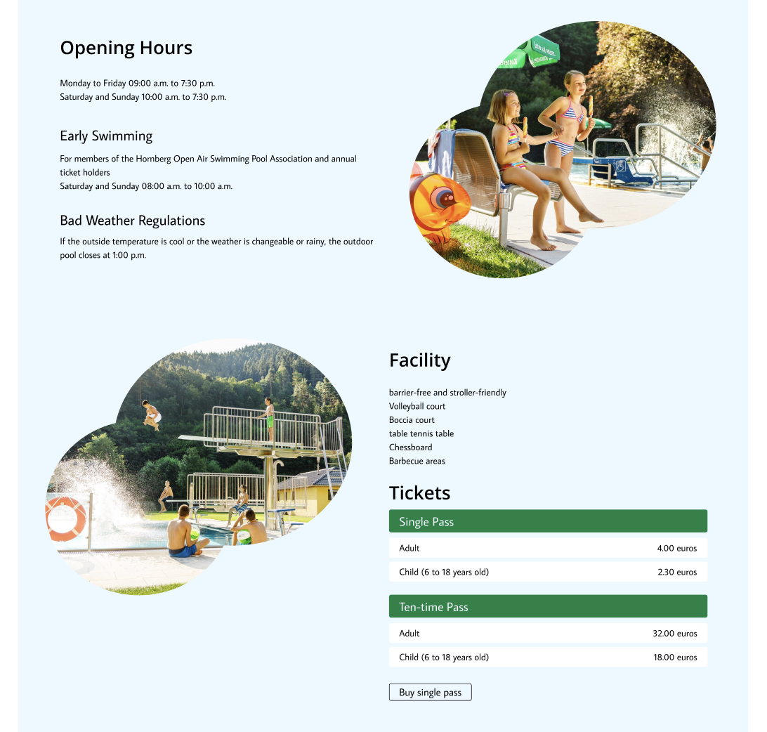
Created a hero section with a featured photo
-
Developed an image carousel component

-
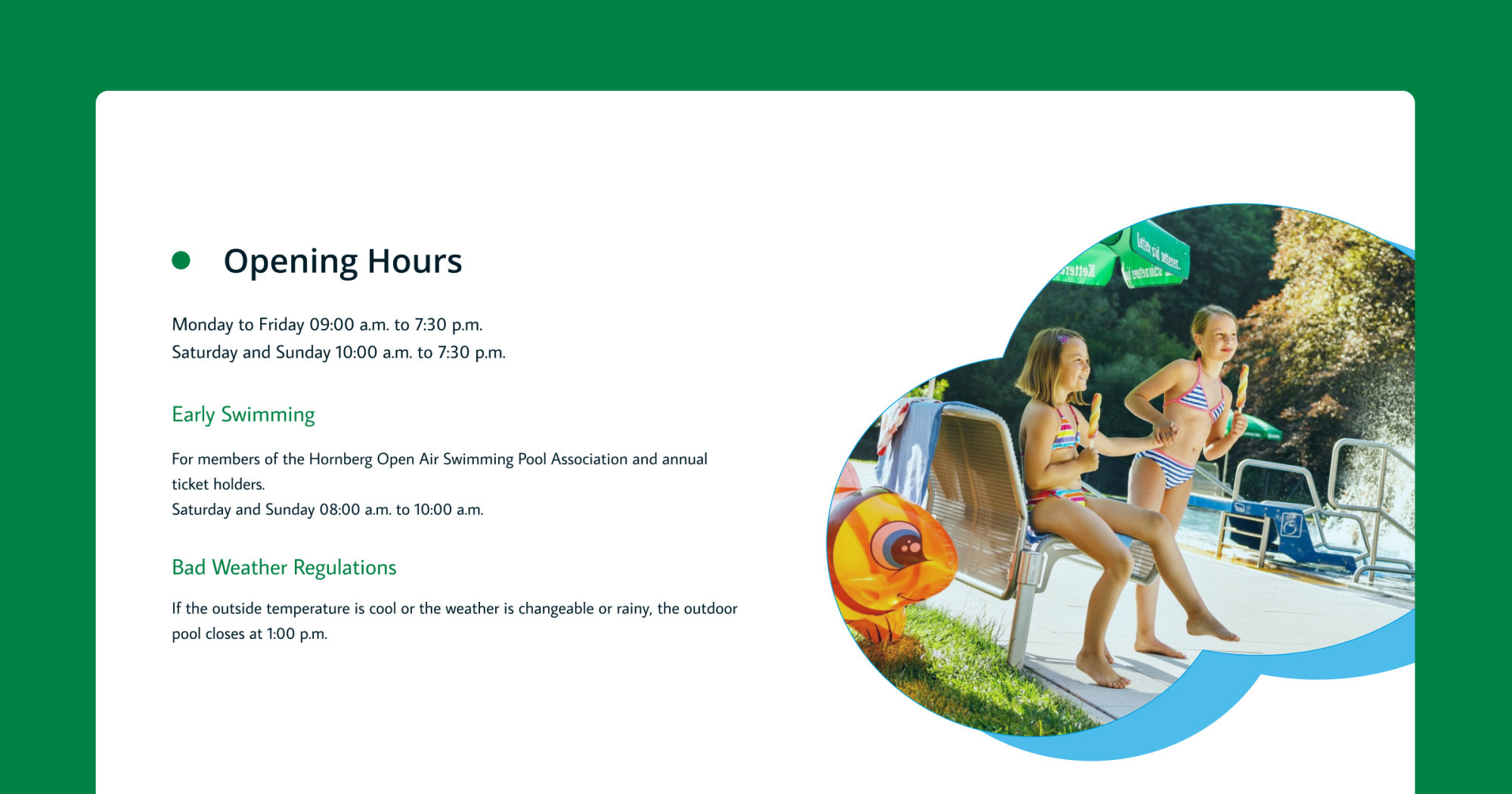
Designed an information section (with a pool-shaped image layout). I struggled with price section using green initially.
-
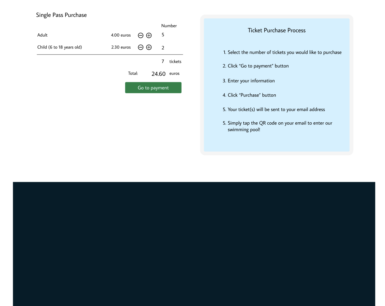
Built a ticket section outlining purchase steps (I tried to make a form but decided not to include)

-
Crafted a footer (originally planned dark, but time constraints led to a white design)
-
Final touches: colour adjustments and alignment fixes
🧠 Challenges and solutions
- Incorporating red without overpowering the design
- Time management (Today it took 3 hours for design, usually 2.5 hours plus 30 minutes for blogging)
- Mentor feedback:
- Red dot before title might imply being closed; and green for “open”
- Improve contrast in right ticket area
- Fix vertical alignment in left ticket area
- Refine footer icon (currently looks spiky)
🖼️ The final design
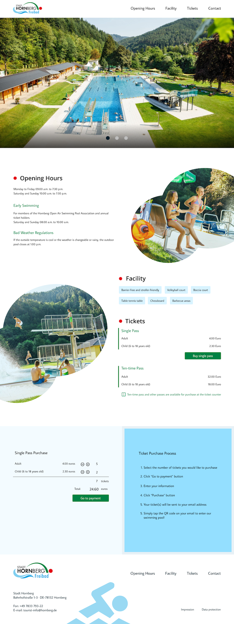
I’m pleased with the overall result, though the ticket purchase section could use some refinement.
💡 What I learned today
Investing time in a simple lo-fi design smoothed the design process.
⏰ If I had more time
- Remove the logo background colour and make the letter white for a darker footer design
- Implement mentor’s suggestions
💌 Any thoughts?
What projects are you working on? I’d love to hear your thoughts on my design or any advice!
Thanks for following Day 7 of my challenge. See you tomorrow for Day 8!
With love and light 🫶🏻
Yoshie
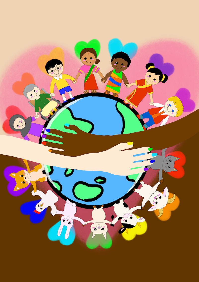
P.S. I completed a poster for the Open Call by https://verlagegegenrechts.de/ today. Learning to use the iPad and Procreate (a gift from my partner for this opportunity) was challenging but rewarding. As a child, I gave up drawing thinking I lacked talent. I still don’t think I have a special talent but now I know that it’s about learning and growing. I hope my painting conveys the beauty of inclusiveness, compassion, kindness, and love 💕