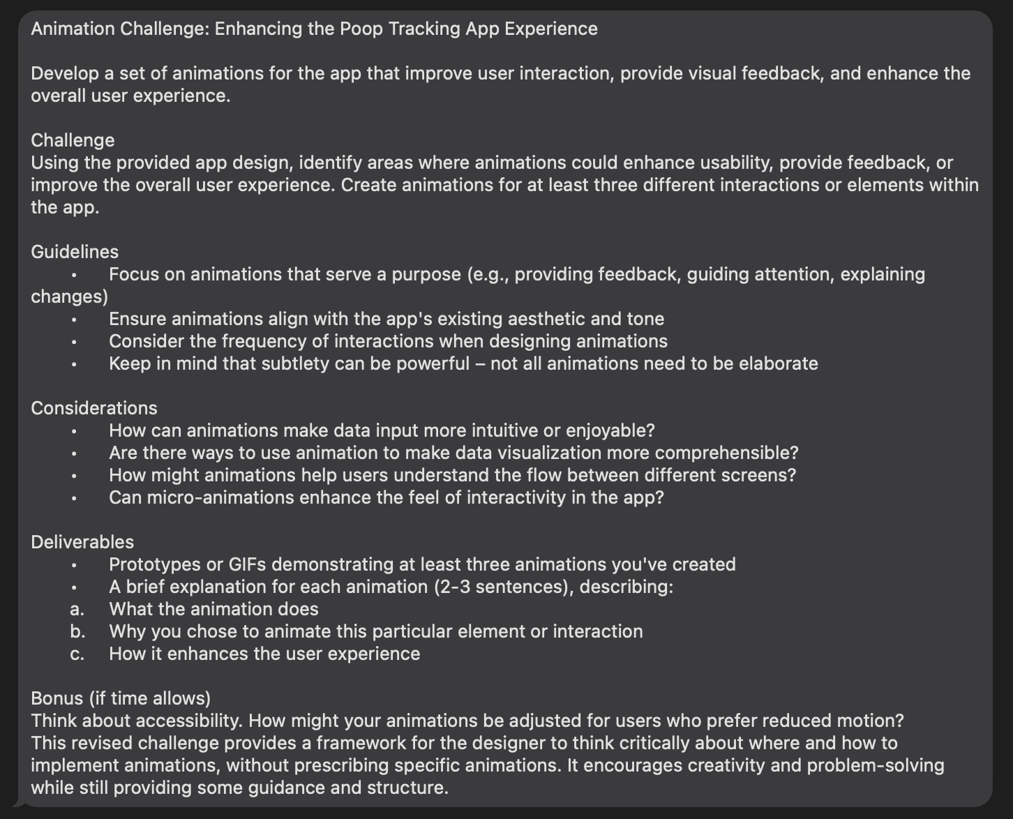
🎨 Today’s Design Task
I was really excited about today’s task—creating animations! While I’m still learning, I gave it my best shot 💪🏻
🚀 My Design Process
-
Task Review: Carefully read through today’s challenge.
-
Brainstorming: Jotted down ideas for possible animations on each screen.
-
First Animation: Focused on customising the message and selection on the second Data Entry screen.
-
Component Creation: Developed selection components with strokes for selected items.
-
Icon Management: I struggled to create dynamic icons, so I made separate components for each icon shape. My partner suggested nesting components for a cleaner setup, which I’ll try next time.

-
Display Testing: Experimented with different ways to highlight selected items.

-
Second Animation: Decided to animate messages on the second Data Entry screen.
-
Typewriter Animation: I initially tried creating a typewriter effect manually but switched to a plugin due to time constraints.
-
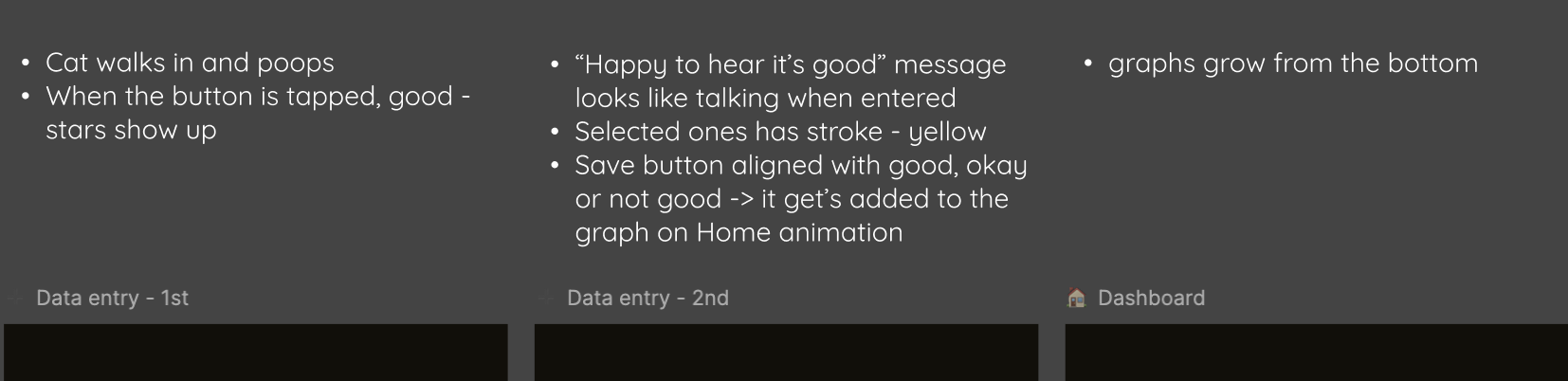
Third Animation: Added a fun animation where a cat walks in and poops on the first Data Entry screen.
-
Typewriter Retry: Gave the typewriter animation another go but ran out of time.
-
Save Button Animation: Planned to animate the “Save” button but didn’t have enough time to implement it.
🧠 Challenges and Solutions
- Learning Curve: I spent time watching tutorials and getting help from my partner to understand animation basics.
- Time-Consuming: Even simple animations took longer than expected, but it’s all part of the learning process.
- Partner Feedback: My partner suggested speeding up the cat walk animation and the message display.
🖼️ The Final Design
Overall, I’m pretty happy with today’s results!
Here are the three animations I created:
👇 The first and second animations are here.

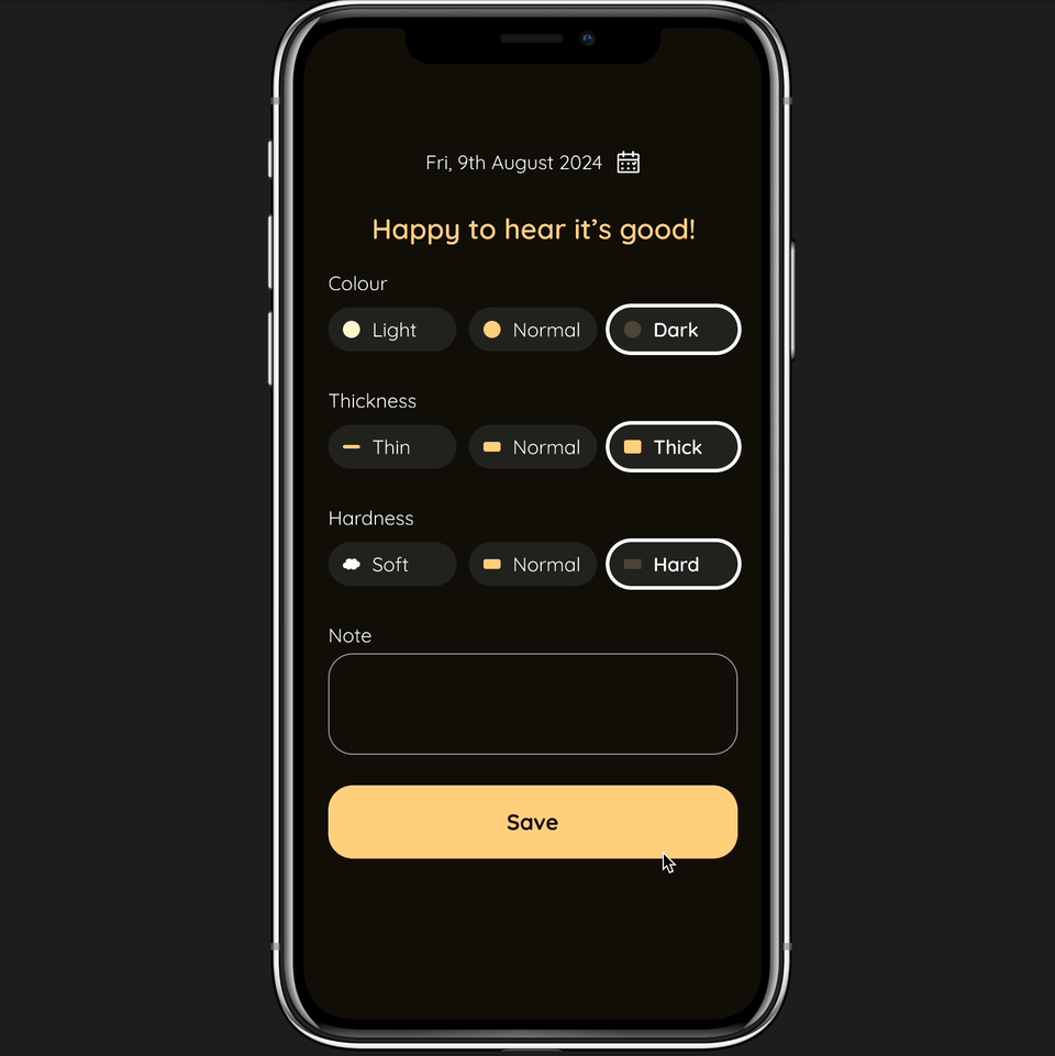
1. Dynamic Message and Field Selection:
- What it does: Displays a custom message and auto-selects fields on the next screen.
- Why: To save the user time when inputting data.
- Enhancement: Guides users smoothly through the process with selected fields.
2. Message Animation on Second Data Entry Screen:
- What it does: The message slides in from the left.
- Why: To ensure the user reads the message.
- Enhancement: Reinforces the choices made on the previous screen, showing care for the pet’s health.
3. Cat Walk and Poop:
- What it does: A cat walks in from the left and poops.
- Why: Honestly, because it’s cute!
- Enhancement: Adds a playful element to make the app more enjoyable.
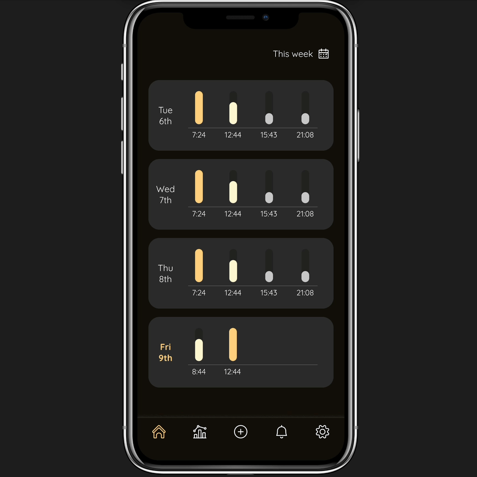
Additional: Save button turns into a graph
- What it does: When data is saved, the “Save” button turns into a graph on the Dashboard
- Why: The user can see that data is added
- Enhancement: User can learn that their data can be seen on the Dashboard and it’s added immediately
💡 What I Learned Today
I learned that short, simple animations are often the best choice for mobile apps.
⏰ If I Had More Time
- I’d make adjustments based on my partner’s feedback.
- I’d add a scroll effect on the Dashboard for newly added data, with hidden graph details for the selected day.
💌 Any Thoughts?
What projects are you working on? I’d love to hear your thoughts on my design or any advice you might have!
Thanks for following along on Day 17 of my challenge. See you tomorrow for Day 18!
With love and light 🫶🏻
Yoshie
P.S. Our cat, Teto, had some digestive issues earlier this week, but he’s been doing much better. His poops are healthy again, which is a big relief! Here’s our little boy helping me work 🐾