🎨 Today’s Design Task
I’ve been using a template for my blog, but my partner suggested I design my own—and he’d handle the coding! I was super excited to dive in and create something uniquely mine 🤩
🚀 My Design Process
-
Inspiration Gathering: I explored various blogging websites to gather inspiration.
-
Initial Sketches: I sketched out my ideas on my iPad.

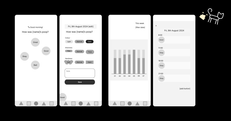
- Lo-fi Mockup: I created a lo-fi design in Figma to visualise the layout.

-
Custom Icon: I designed a lotus flower icon, which I love—let’s agree that it does look like a lotus flower, shall we? 😂

-
Style Guide: I developed a style guide for colours and typography.

-
Navbar Design: I started with the navbar, keeping it simple and consistent with the lo-fi design.
-
Tag Section: I made the “#” symbol larger to better align with the tag names and article counts. I also removed the “Other Tags” button, as I won’t have many tags to display.
-
Latest Posts Section: I designed this section with a focus on using Open Graph images at a 1200 x 630 ratio for consistency.
-
Challenge Section: I created a section for the “30-Day UI/UX Design Challenge,” reusing the card layout from the “Latest Posts” section.
-
All Posts Section: Initially, I considered adding images here but decided against it for a cleaner look, especially as the number of posts increases.
-
Footer Design: I experimented with the footer, initially giving it a different background color, but eventually opted for a more cohesive look with the rest of the site.
-
Card Shadows: I added subtle shadows to all cards for a polished effect.
-
Improving Readability: The date text on the article cards didn’t have enough contrast, so I darkened it for better readability.
-
Feedback & Adjustments: After receiving feedback from my partner, I made the following tweaks:
- Aligned stroke widths for the icon, “#” lotus flower icon, and line under menu items.
- Increased letter spacing for capital letters to 4%.
- Lightened the line under the navbar to reduce its prominence.
-
Final Checklist: I finally created a checklist to ensure I cover everything before considering a design complete (better late than never, right? 😅).

🧠 Challenges and Solutions
Designing from scratch allowed me to fully express my style, but it was challenging to think deeply about the purpose behind each design element.
🖼️ The Final Design
I’m really happy with how it turned out! I’m not sure when it’ll be implemented, but I’m super excited about the next steps.

💡 What I Learned Today
I’ve found that it’s easier to design when I understand the values, purpose, and desired user experience. This understanding is crucial for translating a client’s vision into a precise design.
⏰ If I Had More Time
- I’d add hover effects to enhance interactivity.
- I’d also plan out the design for individual blog posts, which I’ll do in tomorrow’s challenge.
💌 Any Thoughts?
What are you working on these days? I’d love to hear your thoughts on my design or any advice you might have!
Thanks for following along on Day 26 of my challenge. See you tomorrow for Day 27!
With love and light, 🫶🏻
Yoshie
P.S. I’m currently reading a book called DESIGN IS A JOB by Mike Monteiro. Even after just a few pages, it’s helped me focus more on the problems I’m solving through design rather than just making things look good. I’m eager to dive into more books on design, UI, UX, and psychology ☺️ What’s your favourite design book? 📖