Creating digital spaces that are inclusive, user-friendly and accessible to all through sustainable and thoughtful design.
Recent projects
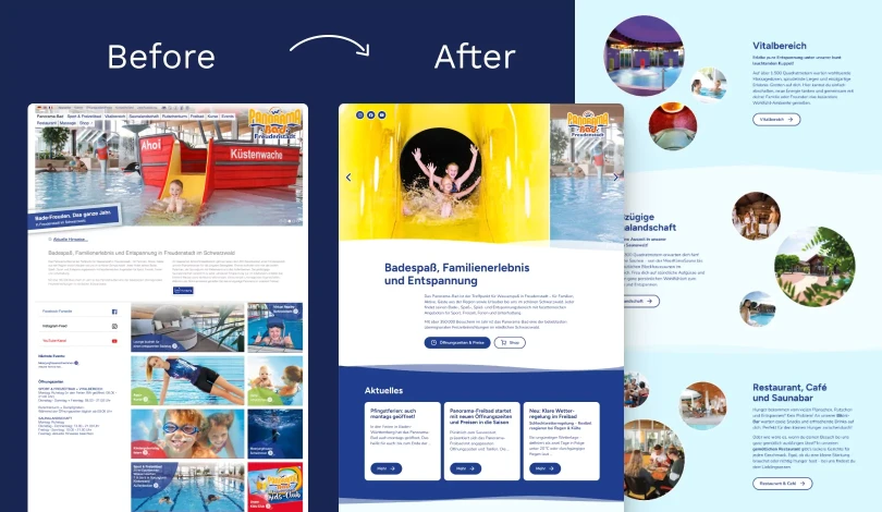
Panorama-Bad Freudenstadt →
Designed an accessible, easy-to-navigate website with playful interactions.
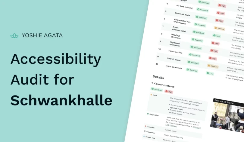
Schwankhalle →
Full accessibility audit for Schwankalle, including design, development and content writing accessibility issues.
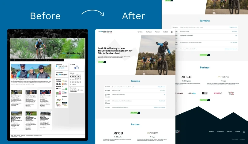
toMotion Racing →
Redesigned a website for a mountain bike racing organisation, focusing on showcasing events clearly and creating a streamlined user experience.
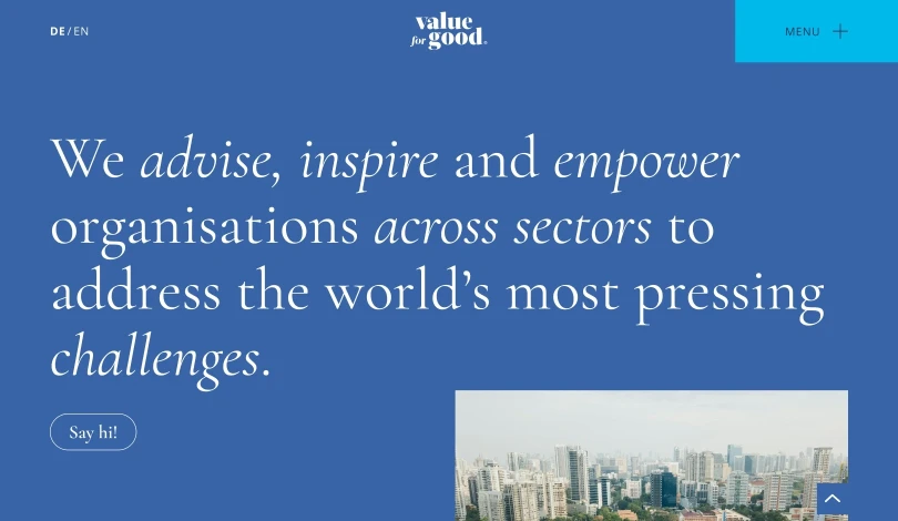
Value for Good →
Made the initial design development-ready and accessible for Value for Good's new website
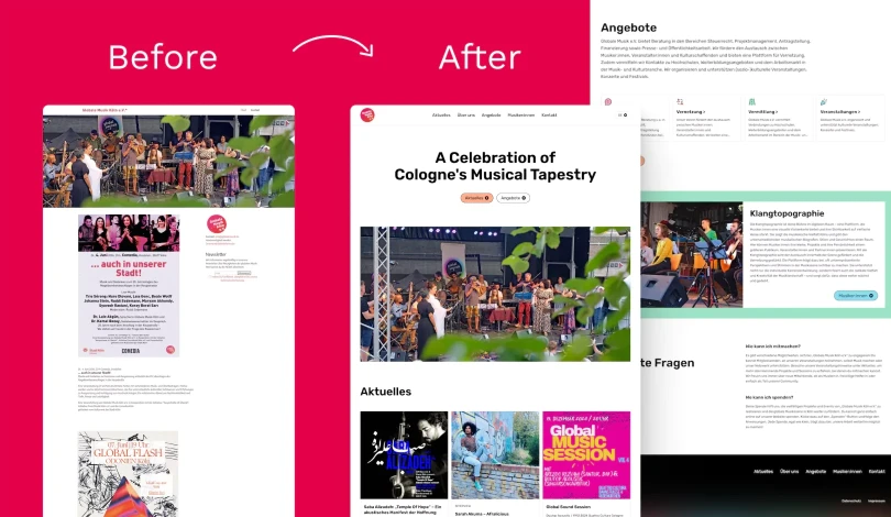
Globale Musik Köln →
Designed a vibrant, user-centred website with simple navigation and engaging interactions.
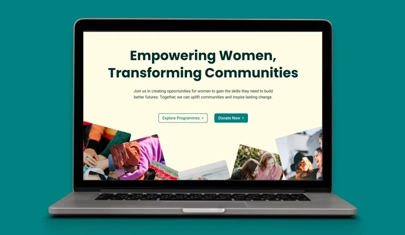
Uplift Horizons →
Designed and developed a user-friendly and accessible website to support and empower women.
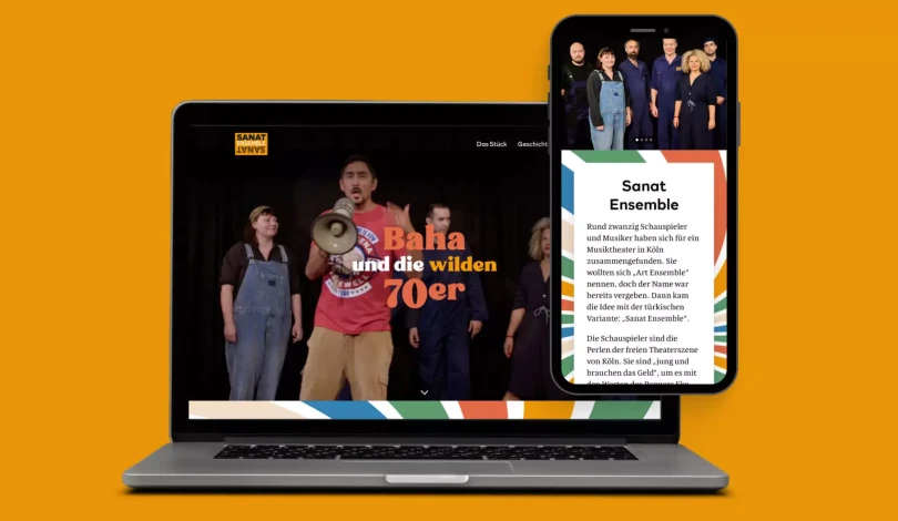
Sanat Ensemble →
A new website design with 1970s-inspired theme, focusing on accessibility and responsive, user-friendly navigation.
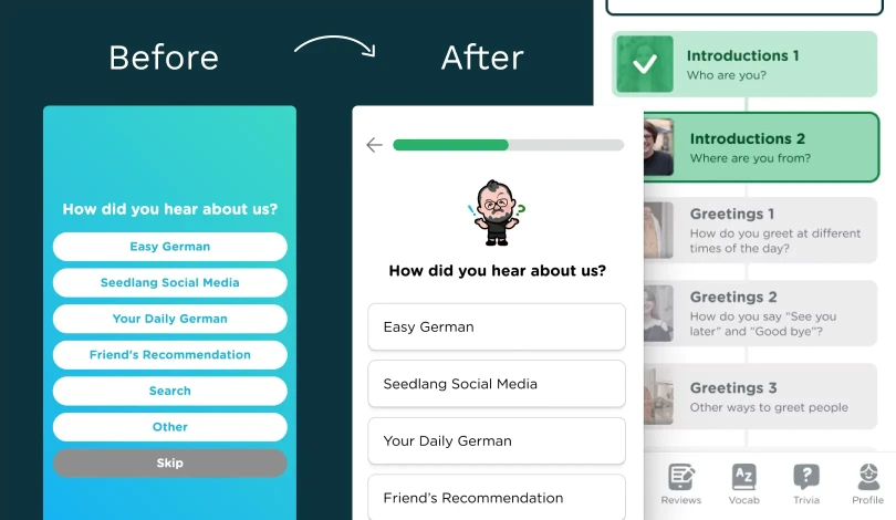
Seedlang →
Redesign of the onboarding and home screen of Seedlang app. My redesign improved accessibility and usability.