👩🏻🔬 Accessibility Testing Insights
During my review of the Fermenstation website, I identified 10 accessibility and UI/UX issues. While 3 required coding changes, I addressed 7 through design improvements. Here’s how I solved them:
✅ How I Solved Accessibility and UX Issues
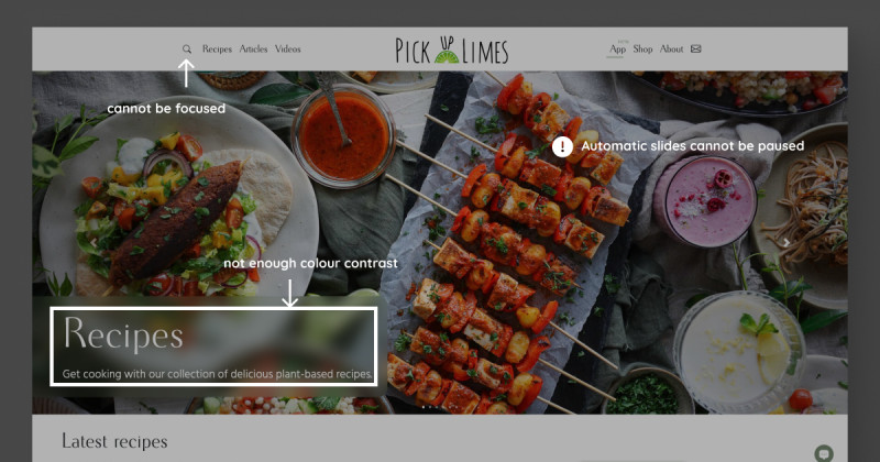
1. Low Colour Contrast:
The contrast on buttons, text, and links (e.g., “READ MORE” under NEWS) was too low.

I increased the contrast to meet the recommended 4.5:1 ratio, especially for hover states and important elements like the “ONLINE STORE” button.
2. Responsive Issues (Text Breaks and Spacing):
- Text in the News section breaks on tablets.
- Second-layer menu items in the navigation bar also break on tablets.
- There’s no space between the news section and the footer on tablets or when zoomed to 175% on desktops.
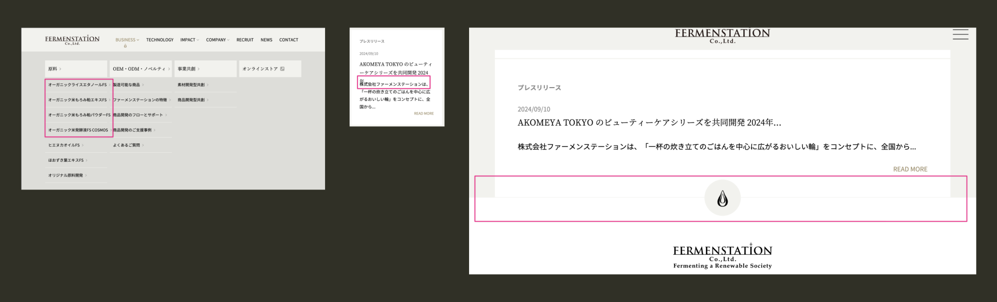
I adjusted the responsive design to prevent text and menus from breaking and added proper spacing between sections.
3. Language Inconsistency (Menu in English, Content in Japanese):
The site has English menus with Japanese content, confusing users who primarily read Japanese.
I localised the interface, ensuring the menus and navigation elements are in Japanese to match the rest of the site.
4. Unclear “READ MORE” Buttons:
Multiple buttons labelled “READ MORE” lacked context, making it unclear what content users would see next.

I replaced these with more descriptive labels in Japanese to clarify the destination or content type.
5. Small Text (Menu and Buttons):
The text size (14px) in the menu and “READ MORE” buttons are too small for readability, especially on smaller screens.
I increased the text size to at least 16px for better readability, especially for users with visual impairments.
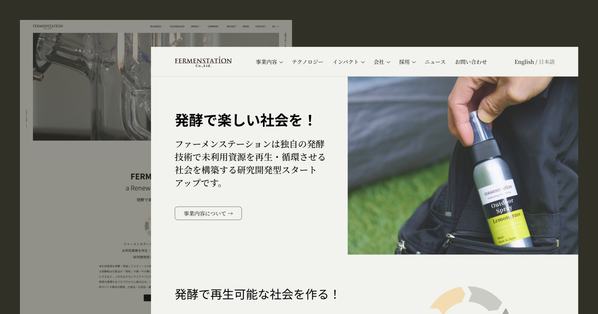
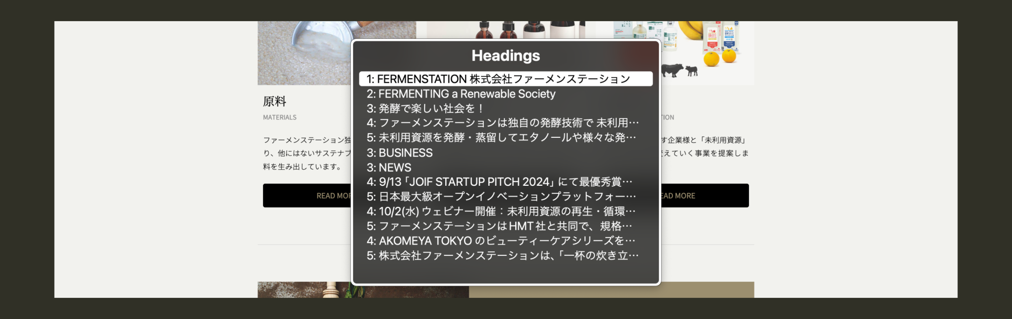
6. Text as an Image (“発酵で楽しい会社を!”):
Text embedded in images isn’t accessible to screen readers.
I replaced the image with CSS-styled text, allowing screen readers to interpret the content.
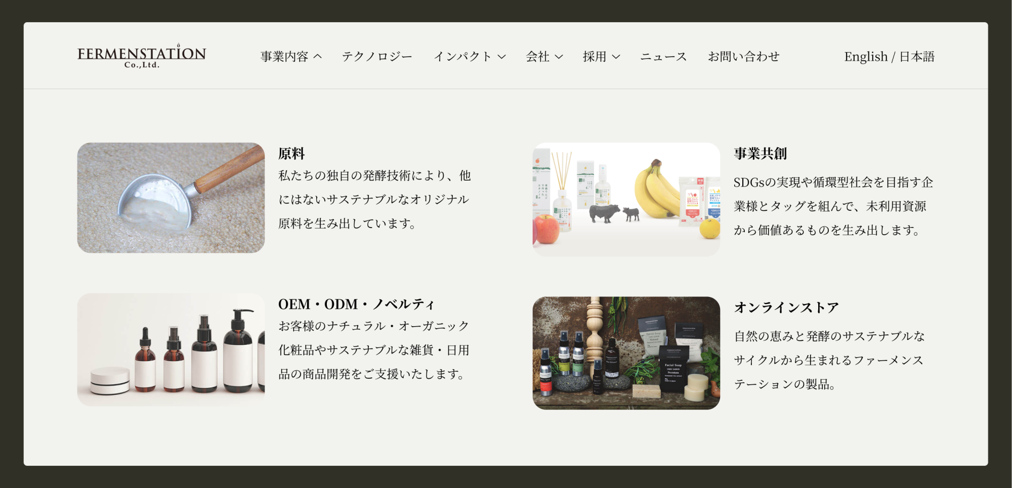
7. Confusing Hero Video:
The hero video didn’t provide clear information about the company or its mission.
I simplified the header by replacing the video with product images, their slogan, a short description of their mission, and a prominent button to learn more. I removed the unnecessary popup.
Bonus: 3-Layer Dropdown Menu
Using a three-layer dropdown menu is generally considered poor UX practice due to its complexity and difficulty for users to navigate. I simplified the menu structure to make it clearer and easier to use, reducing the number of layers for a more intuitive experience.
👩🏻💻 Programming Fixes
In addition to design changes, a few programming fixes are required for accessibility:
1. Keyboard Navigation Issues:
There are no focus indicators, no “Skip to Content” link, a lack of focus on popups, and an inability to open dropdown menus. The Business section images are also redundant links.
Fix: Add visible focus indicators, implement a “Skip to Content” link, and ensure all interactive elements (buttons, menus, popups) are keyboard accessible.
2. Screen Reader Issues:
- Dropdown menus are incorrectly coded as links instead of buttons.
- Social media links aren’t labelled, making them unclear for screen reader users.
- Improper use of heading and anchor tags.
- Only the header is marked as a landmark.
- Alt text is missing or unclear.
Fix: Correct the button and link distinctions, add proper ARIA tags, label social media links, and update alt text descriptions.
3. Lack of Landmarks:
The site only marks up the header (banner) as a landmark, limiting screen reader navigation.
Fix: Add ARIA landmarks (header, main, footer) to define different page sections and improve screen readers’ navigation.
📝 Lessons and Takeaways
- Initially, I didn’t expect many issues with accessibility and UX on this website, but I found more than expected!
- The issues I discovered were quite different from the ones I identified on the TELL Japan site, which was not what I expected.
- Conducting these tests is still time-consuming for me, but I enjoy it. I’d love to learn from others to find ways to streamline the process.
➡️ What’s Next?
I’ve been selecting websites from the B Corp list for testing, and it’s been a lot of fun. If you know of any websites that you’d like me to test or that seem like a good challenge, let me know!
You can reach out to me on Mastodon or via email.
Thanks for reading to the end!
Have a wonderful day 🥰