🎨 Today’s Design Task
Today’s challenge was quite interesting but also a bit tiring! 😅
Two-Day Japanese Web Design Challenge
Day 1: Research and Analysis
Gain insights into Japanese web design principles and select a website for improvement.
Tasks:
- Research
- Browse popular Japanese websites across different sectors
- Note common design elements, layouts, and navigation patterns
- Identify key differences from Western web design
- Look for unique features that cater to Japanese user preferences
- Website Selection and Analysis
- Choose a Japanese website that could benefit from some improvement
- Analyze its current design, focusing on:
- Layout and visual hierarchy
- Navigation and user flow
- Content presentation
🚀 My Design Process
-
Carefully read through the task to understand the objectives.
-
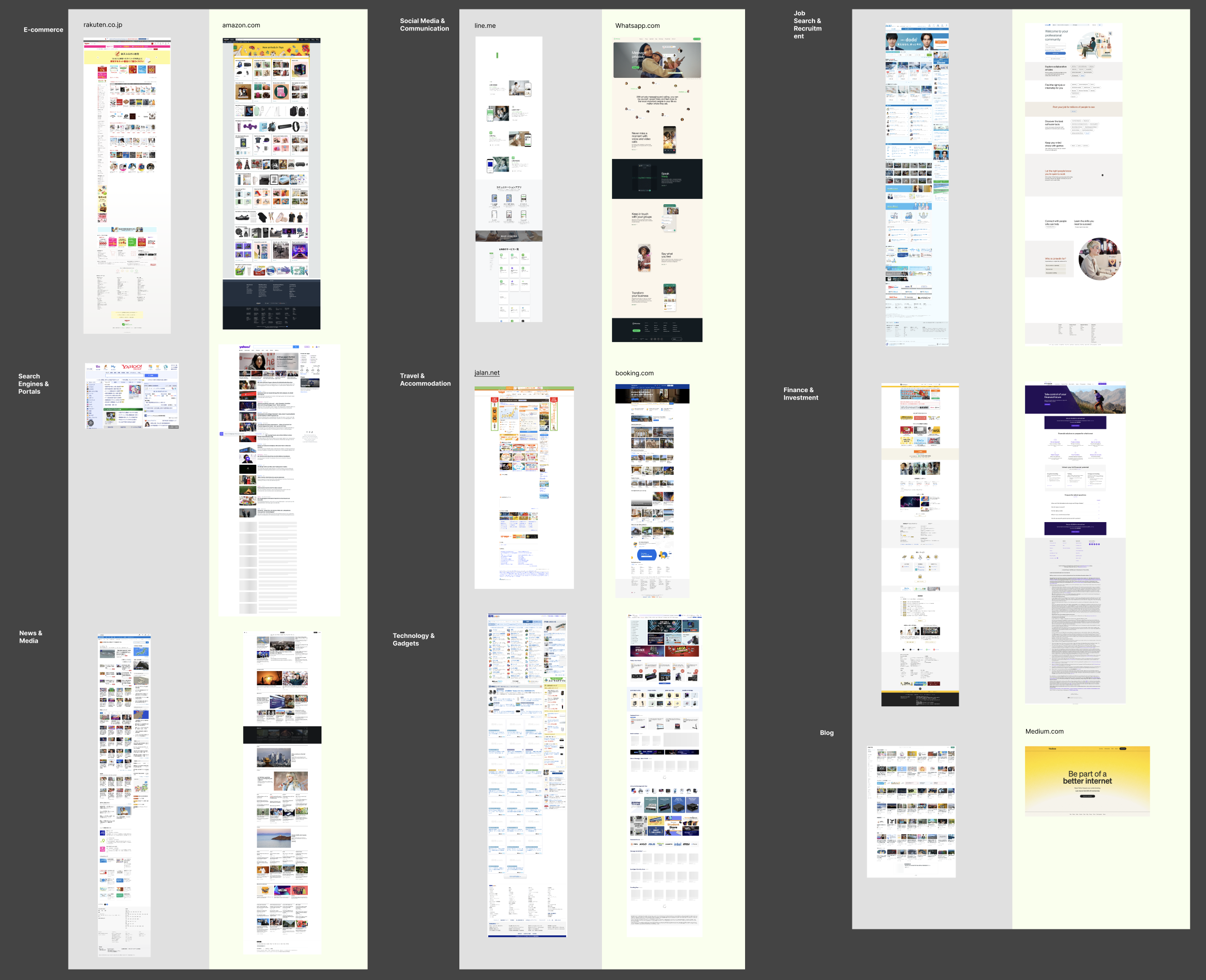
Used AI to compile a list of popular Japanese websites and their Western equivalents.
-
Documented all of them with screenshots 📸
-
Analysed and listed common design elements, layouts, and navigation patterns across these sites.
-
Identified unique features catering to Japanese user preferences.
-
Added explanations for why these features might appeal to Japanese users.
-
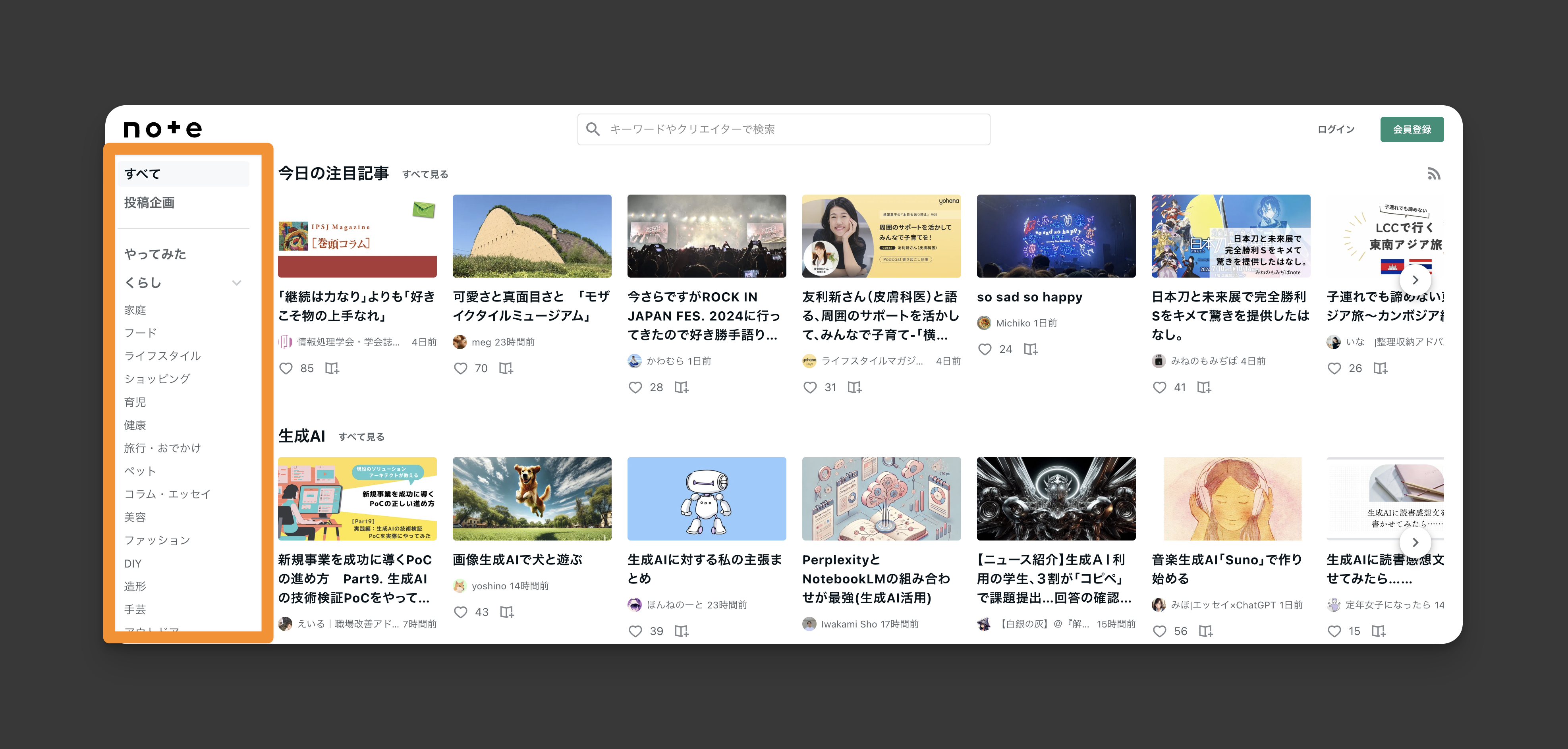
Chose a Japanese website for improvement: note.com.
-
Conducted a detailed analysis of its current design.
🧠 Challenges and Solutions
Browsing through Japanese websites was a bit overwhelming because of the sheer amount of information. To me, they often look cluttered. However, exploring ameblo.jp, another popular Japanese blog site, gave me hope that I could create a cleaner, more organised design ✨
🖼️ The Final Design
Common Design Elements, Layouts, and Navigation Patterns in Japanese Websites:
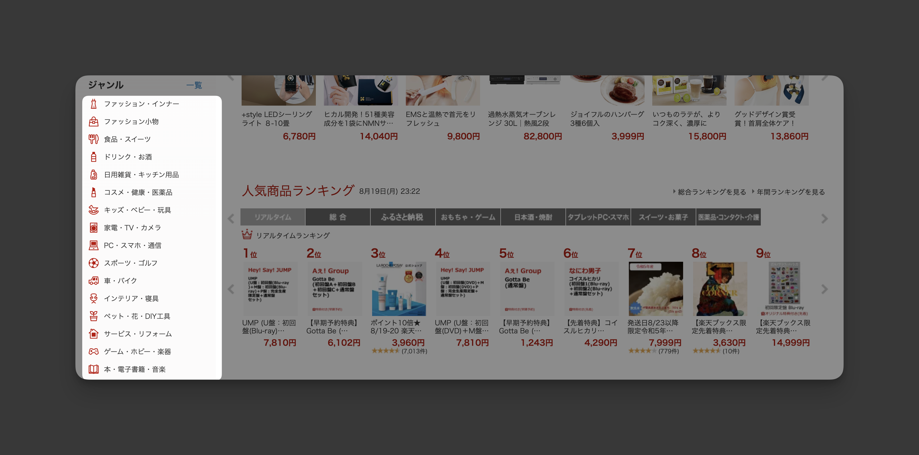
Navigation Bar
- Categories for shopping and blogs are often displayed vertically, not horizontally.
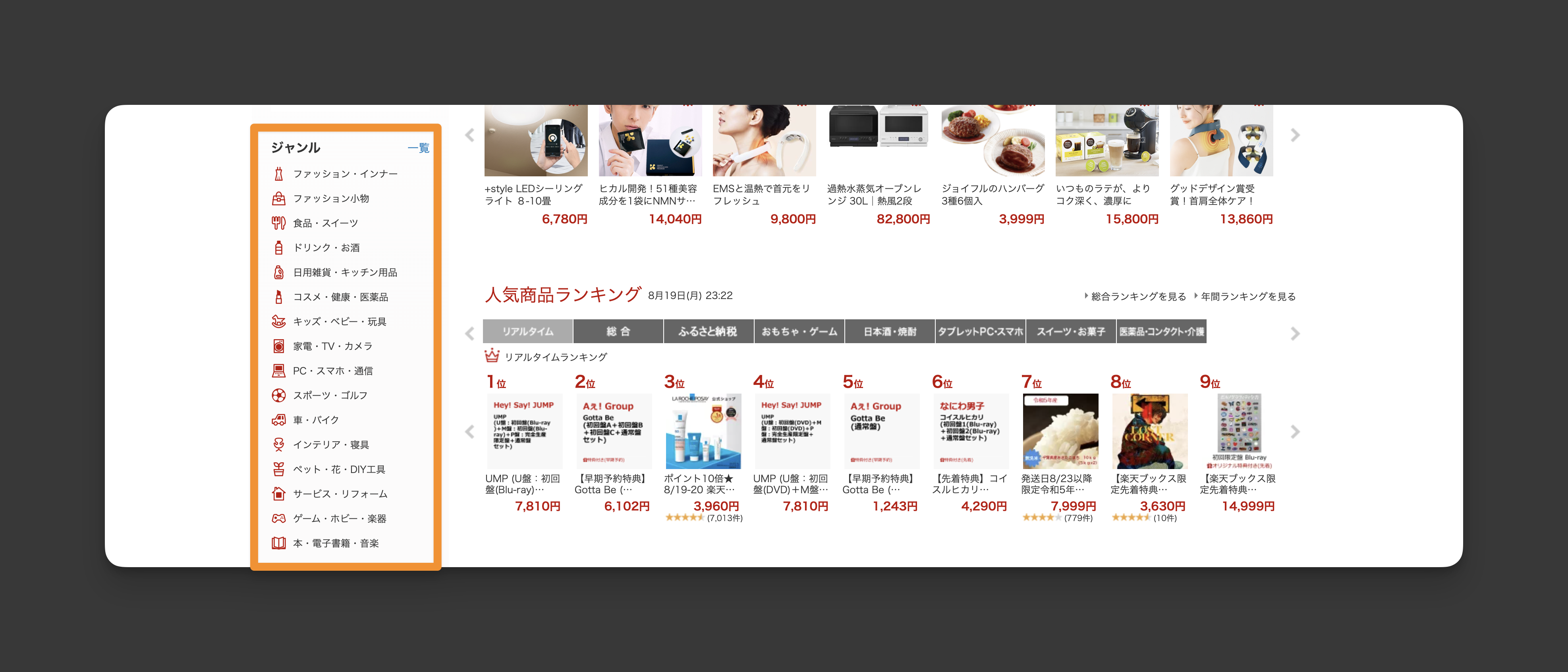
- All menu items are listed on the homepage (unlike Western sites, where they are often hidden or less detailed).
- Menu items are frequently duplicated (e.g., top nav bar and footer, or top nav bar and vertical menu).
Rakuten has the same menu items on the top bar and footer of their website:

- Menu items typically include both icons and text (Western sites often use text only).

Hero Section
- Often lacks a hero image, or if present, it’s much shorter.
Footer
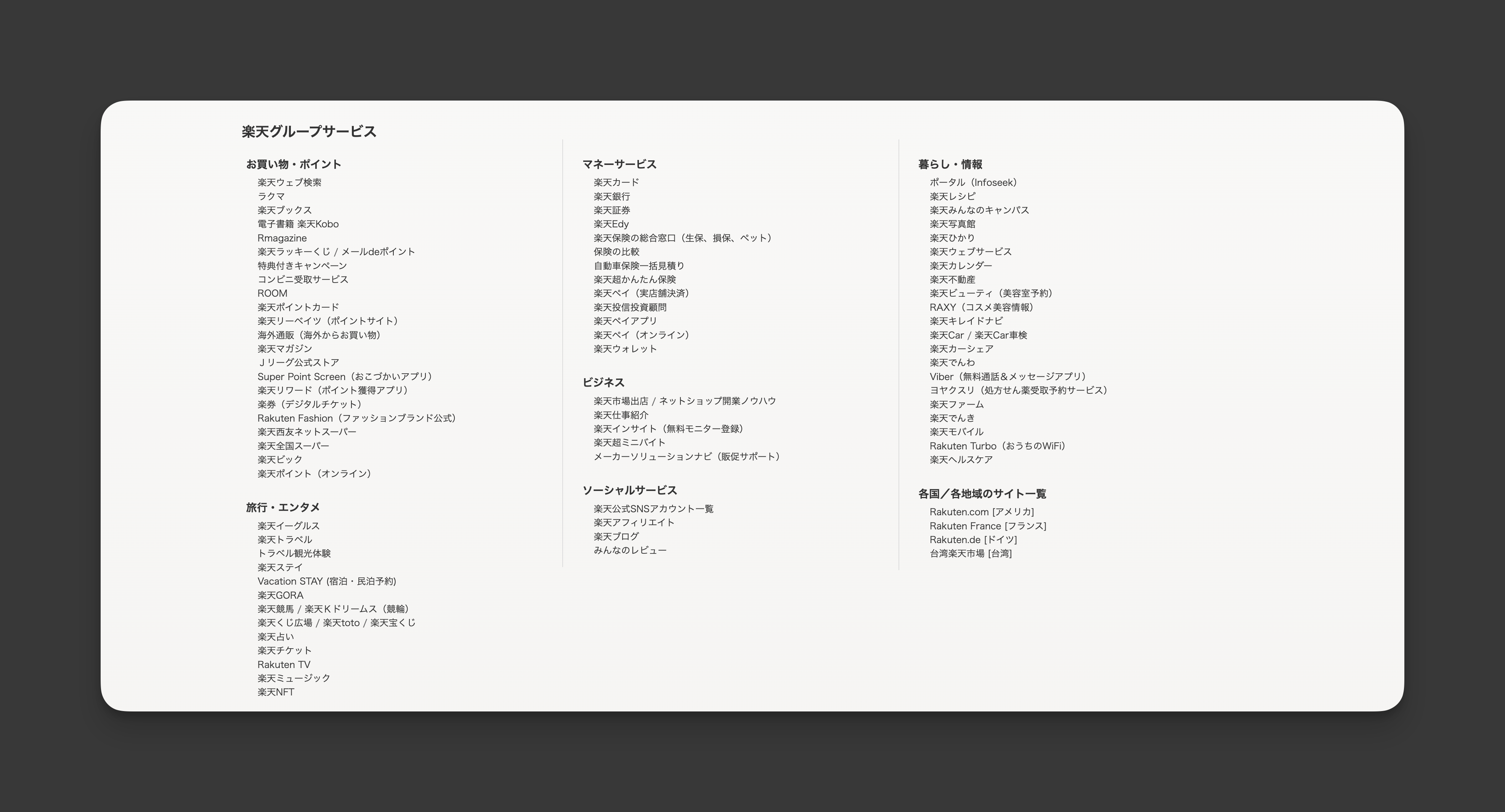
- Contains all menu items (Western sites usually display fewer items here).
Overall Design
-
Less white space, resulting in dense layouts with lots of information.
-
Full-screen usage with minimal spacing on the sides.
-
More colours and frequent use of red for positive or neutral indicators (e.g., discounts, new items).
Rakuten: red for their logo, campaigns, icons, buttons and price

Jalan: red for campaigns

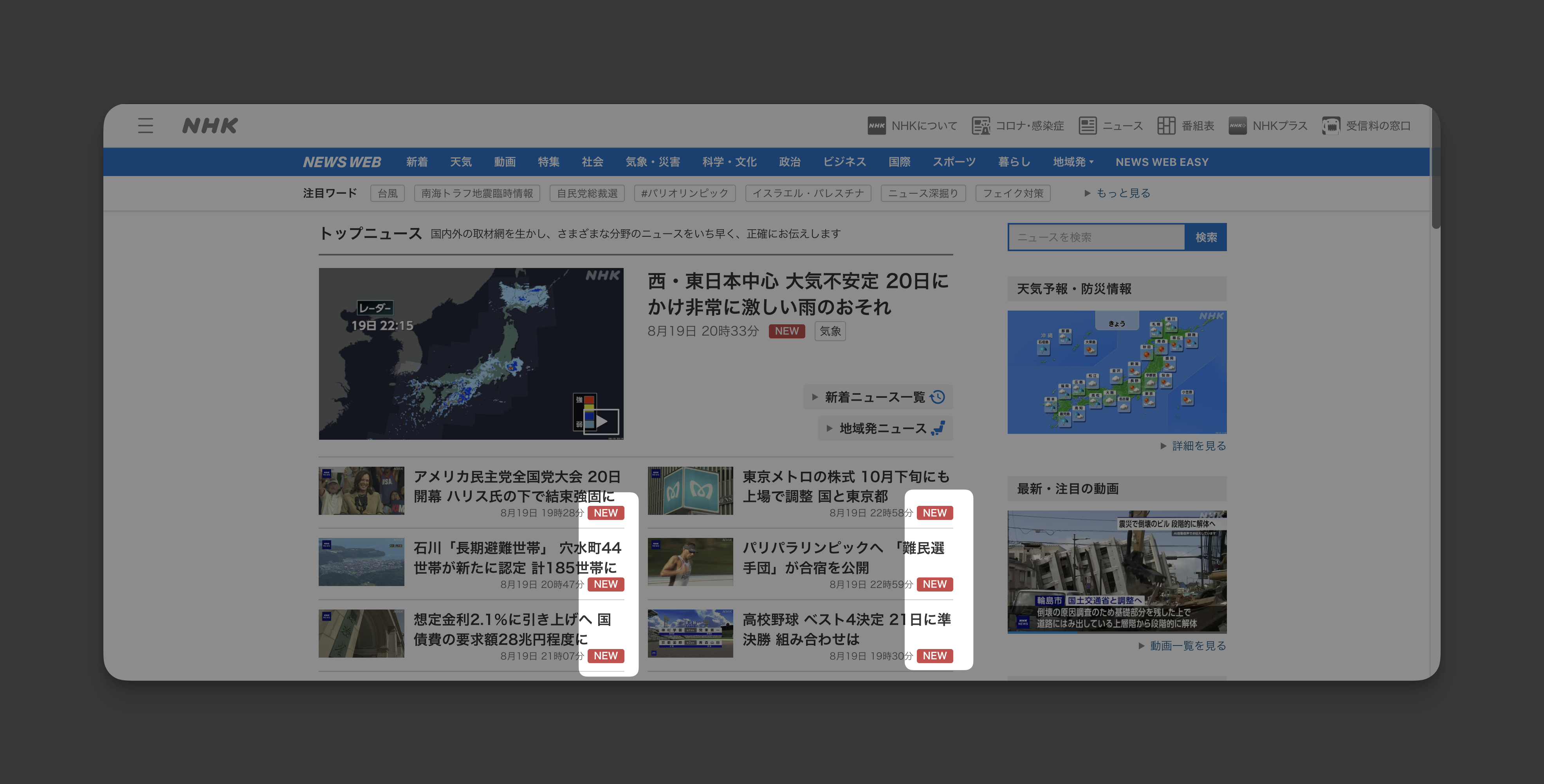
NHK: red for new
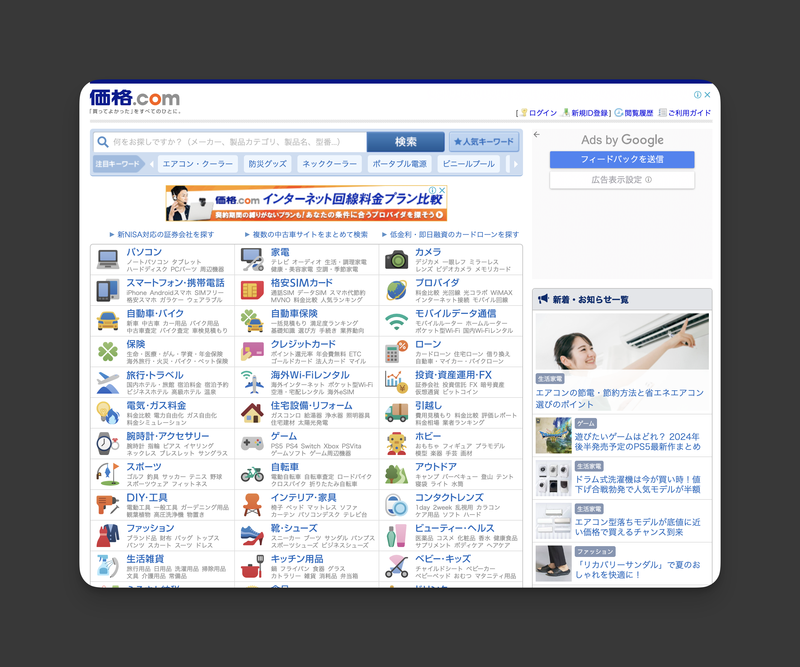
- Less emphasis on font size hierarchy (Western sites often use different font sizes to create a clearer hierarchy).
kakaku.com: no header
- Images frequently include text overlays.

- Many duplicated items (especially sales, campaigns, discounts).
Jalan has 4 same items 😂

- Multiple columns, small text, and numerous images or links.
- Use of bright, multiple accent colours.
Why Japanese Users Might Prefer These Features:
- Dense layouts: Allow users to see all relevant information at once without the need to click through multiple pages, reducing the fear of missing out. It also reduces customer inquiries since everything is readily accessible on the homepage.
- Text on images: Provides exhaustive details before users click on anything.
- Multiple accent colours: Creates a “busy” feeling that might appeal to users.
- Less hierarchy in font sizes: Users might prefer to determine what’s important on their own.
- Different fonts: Help differentiate sections and make content visually interesting.
- Less animation or interactive elements: Reduces confusion about what actions to take.
- More illustrations of people or characters: Adds a friendly and cute vibe.
Current Design of note.com
- Layout and Visual Hierarchy
- The blog genre has the largest font, followed by blog titles.
- The blog genre menu is vertically listed on the left side.
- Navigation and User Flow
- Numerous menu items are available (most are listed on the homepage).
- Search bars are prominently placed, and search results are detailed
- Content Presentation
- Content is displayed on a single long page rather than split into multiple shorter pages.
- Many blog article cards are displayed on the homepage, giving users plenty of options to choose from.
💡 What I Learned Today
As a minimalist, I prefer designs with a lot of white space to allow for breathing room. However, I now understand that less white space, while appearing cluttered, allows for more content and information to be presented upfront 🧐
⏰ If I Had More Time
I’d like to explore more Japanese websites to deepen my understanding of the differences between them and Western sites.
💌 Any Thoughts?
What are you working on these days? I’d love to hear your thoughts on my design or any advice you might have! 💬
Thanks for following along on Day 24 of my challenge. See you tomorrow for Day 25! 🙌
With love and light 🫶🏻
Yoshie
P.S. We ran out of turmeric the other day and that somehow reminded us how good golden lattes are, so we’ve been adding turmeric, cinnamon, and maple syrup to our coffee. It’s super delicious! 😋 ☕️