What are headings? Aren’t they just big bold titles? That’s what I used to think too. But headings are much more than that.
Headings are hierarchical elements that indicate the importance and relationship between different sections of content. They are essential for both sighted and visually impaired users.
Why having a proper heading structure matters 🤔
Sighted users understand website structure through visual cues.
For example,
- List items have bullets.
- Blank lines separate paragraphs.
- Different background colours indicate sections.
- We scan the largest, boldest text as titles, followed by smaller headings and body text.
If these visual cues aren’t structured properly, sighted users will struggle to navigate the website because they often decide if a page is relevant by quickly scanning these visual cues.
Without proper heading structure, they may misunderstand the content or they have to read every word to find what they need, which can be a frustrating experience.
You might be thinking,
“Okay, I understand having visual hierarchy is important so I can just make titles big and bold, right?” 🤷🏻♀️
Why using HTML headings properly is essential for accessibility ✨
It’s essential to have both a properly structured visual hierarchy and HTML headings.
Because those visual cues aren’t available to everyone, especially users with visual impairments or cognitive disabilities. People who rely on screen readers or assistive technology depend on properly coded headings to navigate content.
Screen readers, for example, use headings to create a “table of contents,” allowing users to skip to the section they need, rather than reading every word on the page.
A clear, well-structured heading hierarchy benefits all users and ensures accessibility for everyone.
(If you think users with visual impairments are rare, it’s more common than you think! Read my article here for more details 😉)
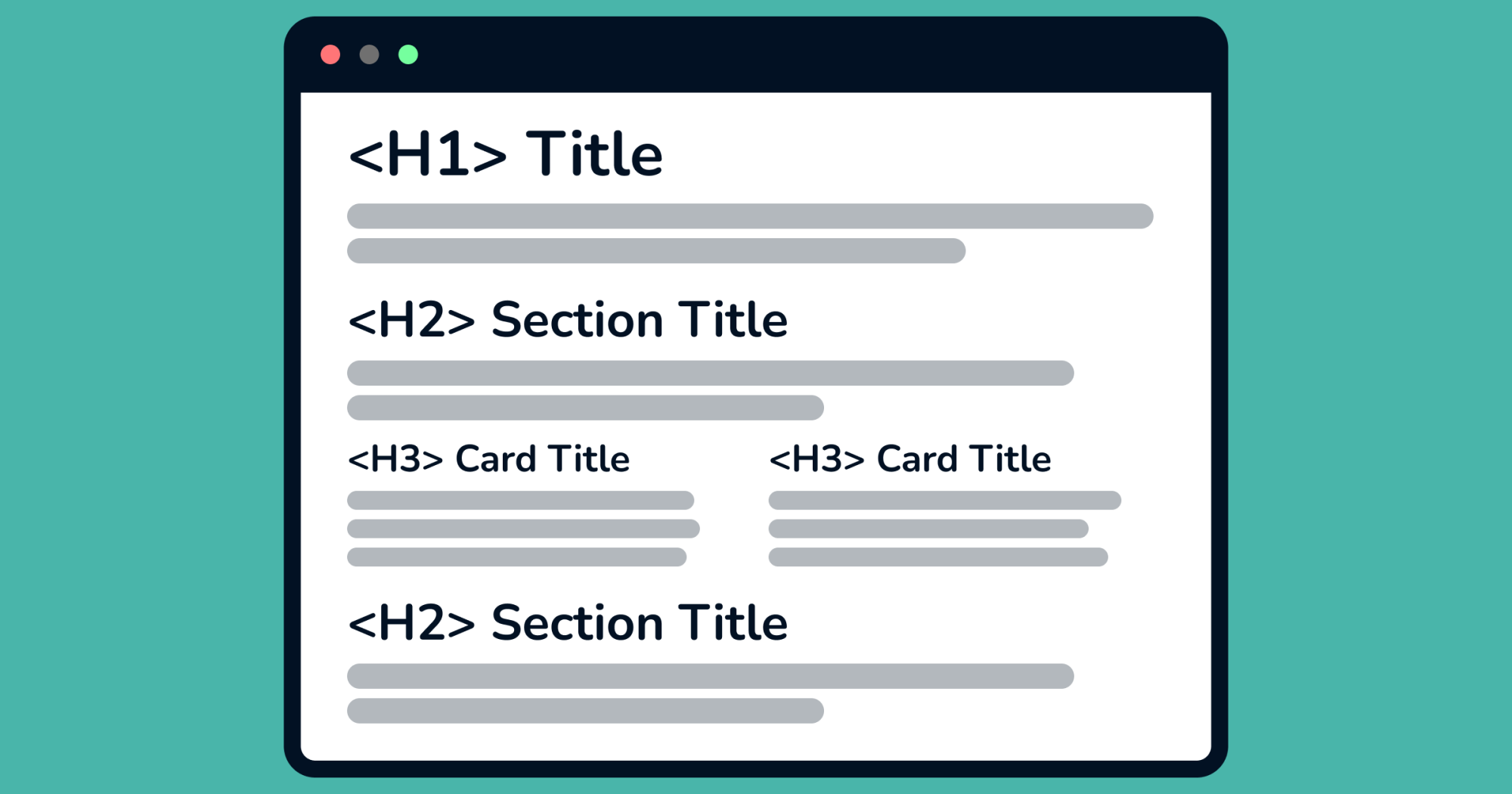
What is a proper heading structure? 🏗️
The rule is simple:
- Nest headings in a logical order without skipping levels.
- Use only one
<h1>per page.
Here’s how you might structure a page about an animal shelter:
<!doctype html>
<html lang="en">
  <head>
    <title>Animal Shelter</title>
  </head>
  <body>
    <h1>Animal Shelter</h1>
    <h2>Animals Waiting To Be Adopted</h2>
    <h3>Dogs</h3>
    --- text ---
    <h3>Cats</h3>
    --- text ---
    <h2>How To Adopt Animals</h2>
     ...
    <h2>About Us</h2>
    ...
  </body>
</html>
See how it flows naturally? Now here’s a checklist to make sure that your website has a proper heading structure ✍️
Your heading structure checklist ✅
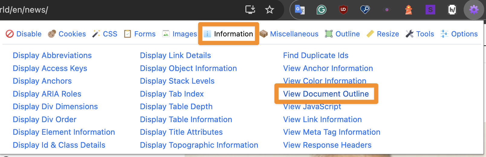
Before diving into fixes, let’s see how you can check the current heading structure:
I recommend using the Web Developer Chrome extension. Once installed, reload the website, click the extension, and select “Information” → “View Document Outline” to view all headings.
If you’re on a Mac, you can also use VoiceOver:
- Press
Command + F5. - Press
VO + Uand navigate to the headings window using the left or right arrow key.
Do you see the heading structure of your website? Great!
Here are 3 things to check!👇
There is a bad example for each so that you can see what not to do and how to fix them.
1. Each page has one <h1> tag
Use one <h1> tag per page since <h1> should indicate the main topic or title.
😕 Bad practice: A page has multiple <h1> tags
Using multiple <h1> tags can confuse screen readers, making it harder to understand the page’s hierarchy.
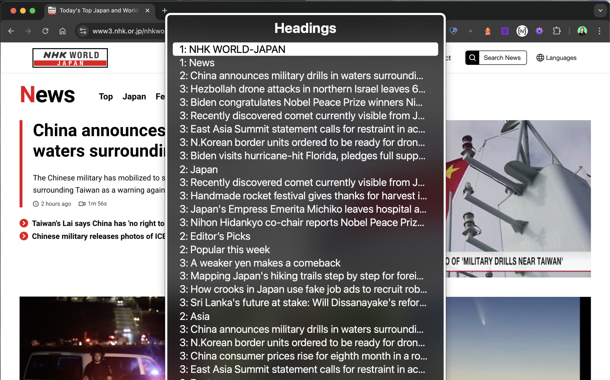
Here’s an example of NHK World Japan’s news page, where the logo and page title both use <h1>.
🛠️ Fix: Remove <h1> from the logo.

2. Every heading clearly indicates the part of the content it belongs to
Ensure that the <h1> element is the parent of the <h2> elements and that each <h2> element is the parent of its corresponding <h3> elements and so on.
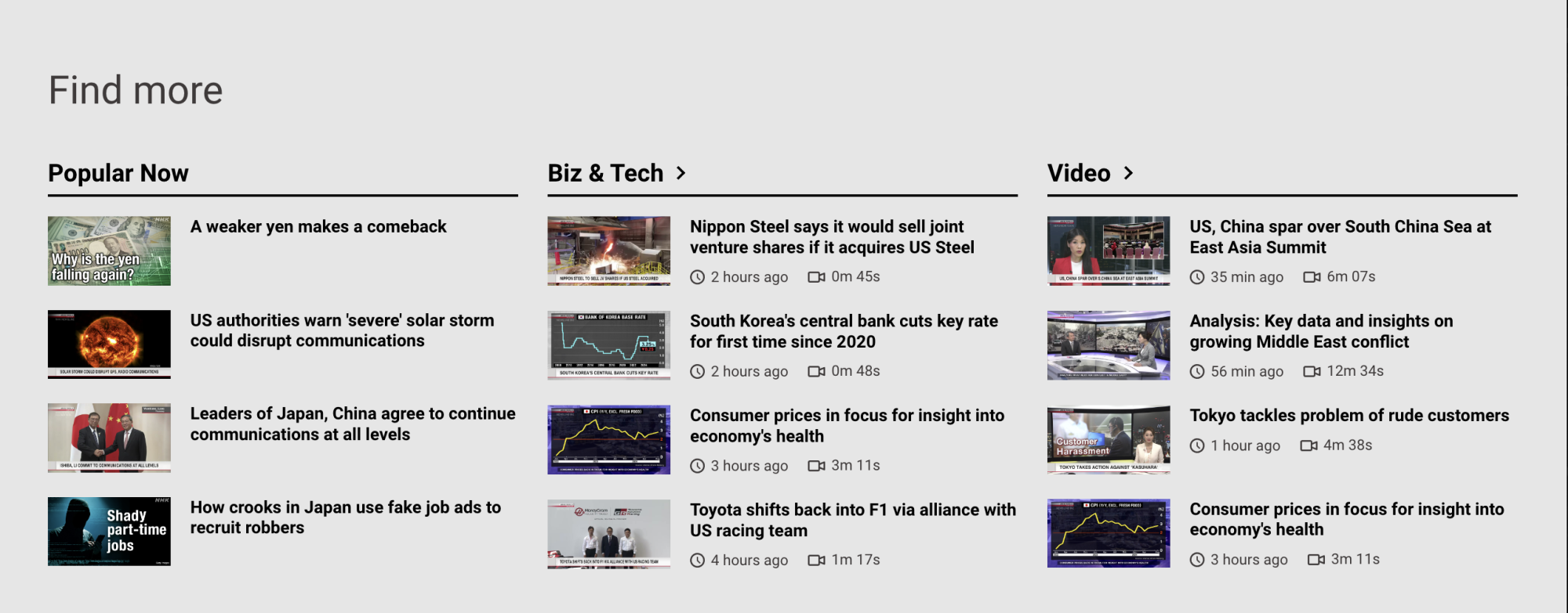
😕 Bad practice: The same heading level is used for the parent and child element.
For example, the news genre titles (“Popular Now”, “Biz & Tech” and “Video”) are <h3> and also the article titles (such as “A weaker yen makes a comeback”) are <h3>.
🛠️ Fix: Set the article titles as <h4>.
Heading structure:

The find more section on the NHK WORLD-JAPAN news page:
3. No skipped heading level
Ensure headings are used in a consistent order (<h1>, <h2>, <h3>, etc.) to avoid skipping levels.
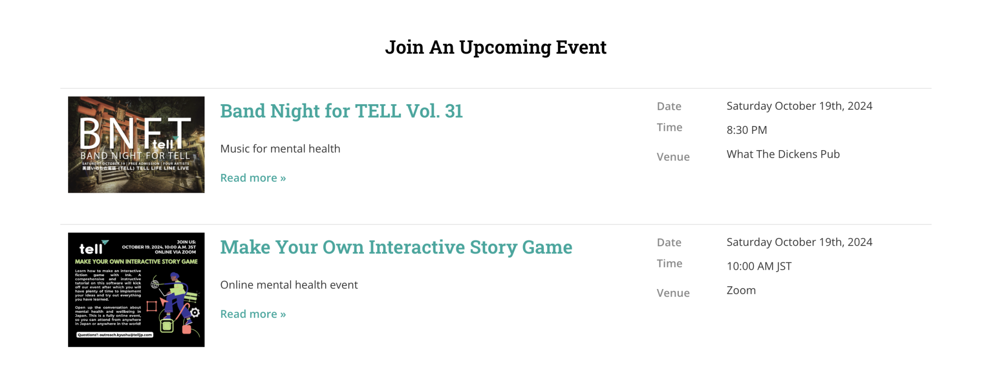
😕 Bad practice: Skipping heading levels (like using <h2> and jumping straight to <h4>) can disrupt the flow, making it hard for users to follow the content.
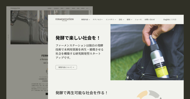
For example, <h4> and <h5> are skipped in the “Upcoming Events” section TELL Japan’s homepage:
🛠️ Fix: Set the section title, “Join An Upcoming Event” as <h2> and the event titles as <h3>.
Heading structure:

The event section on TELL Japan’s homepage:
Time for a small adjustment 🚀
If you’re unsure about heading levels, it’s a great opportunity to review your content and sitemap and have a logical flow for your website. When your headings are clear and consistent, your website is accessible to all users.
This not only improves the user experience but also benefits your website’s SEO and overall success 🙌🏻
Need help? 🙋🏻♀️
If you’re unsure about your website’s heading structure or need assistance, feel free to reach out to me via email 📧
Hope this was helpful for you. See you in the next post!
Have a wonderful day 🥰
Yoshie