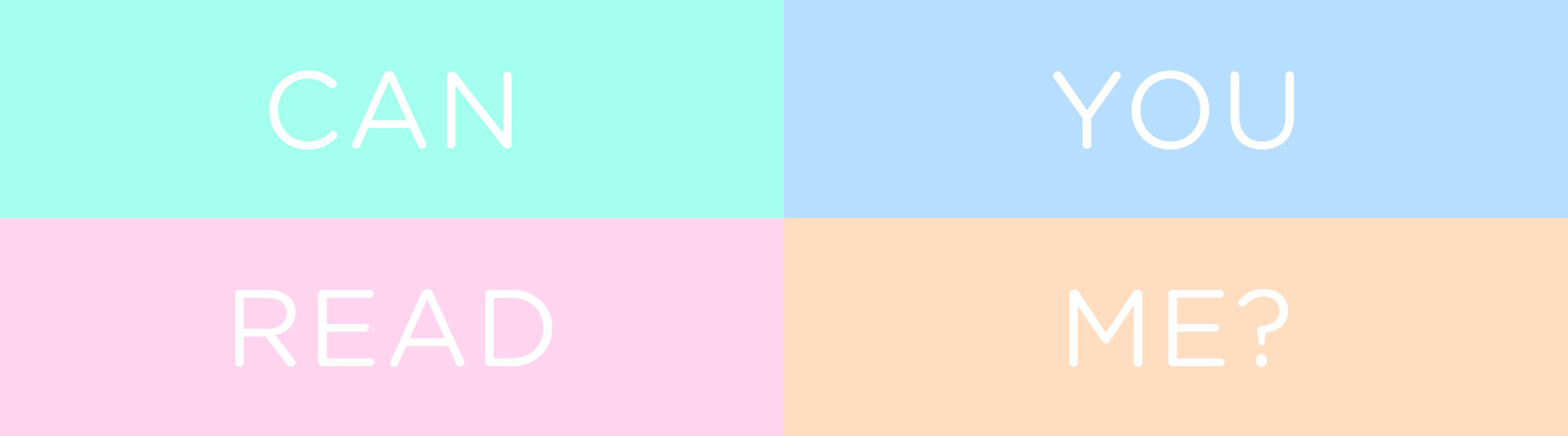
Have you ever used white text on a pastel background because it looked cute? You’re not alone—I’ve done it too 🥹
By the end of this blog, you’ll understand why that is a bad idea and how to maintain a beautiful, on-brand design without compromising accessibility.
Why Low Contrast is a Problem
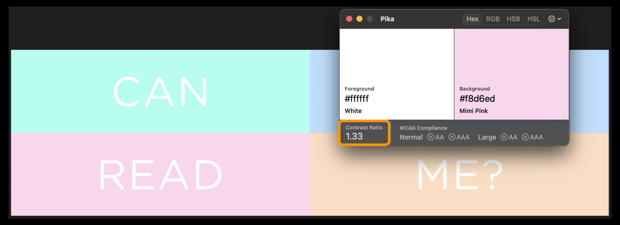
For people with low vision or colour blindness, low-contrast text can be nearly impossible to read. The image above, white text with pastel colour background, looks stylish but for someone with visual challenges, it’s like trying to read invisible ink 😵
But Visual Impairments Are Rare, Right?
Visual impairments are more common than you might think. Consider this 👇
- About 8% of the U.S. population has some form of visual impairment (according to the Health Policy Institute)
- About 30% of the population in Germany has a visual impairment, motor impairment, difficulty concentrating or limited reading skills (according to barrierefreies Design).
Our vision often declines as we age. So even if it feels foreign now, it is important to make sure that text has enough colour contrast so that more people including your future self can actually read 👵🏻👴🏻💕
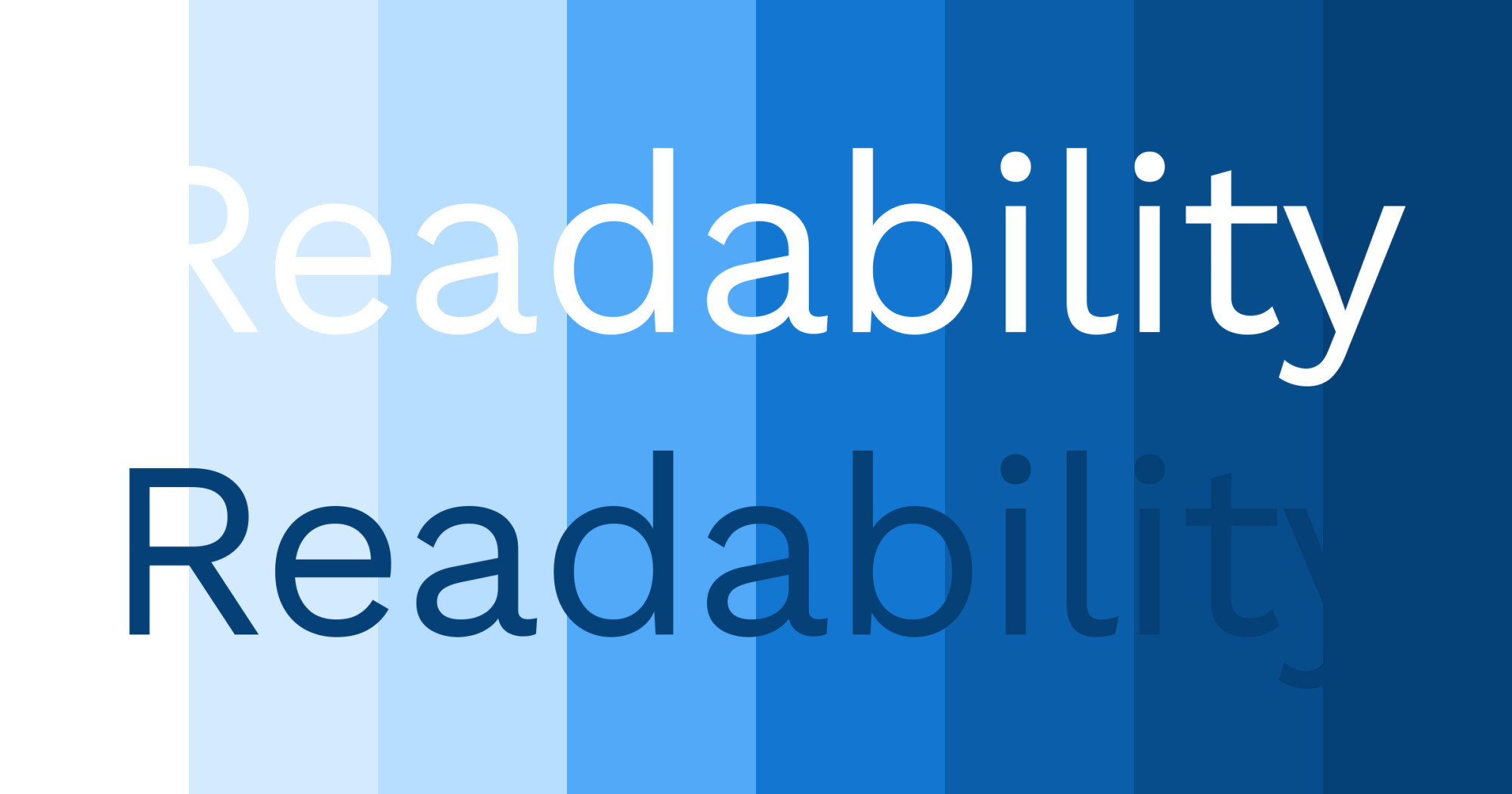
So, What’s “Enough” Contrast?
According to the Web Content Accessibility Guidelines (WCAG), the contrast ratio between text and its background should be at least 4.5:1 for regular text and 3:1 for larger text. Large text means at least 18 point (24 px) if not bold and at least 14 point (18.67px) if bold.
It might sound a bit technical, but don’t worry—I’ve got you covered with 2 simple steps!
Here’s What You Can Do
- Check Your Contrast Ratios:
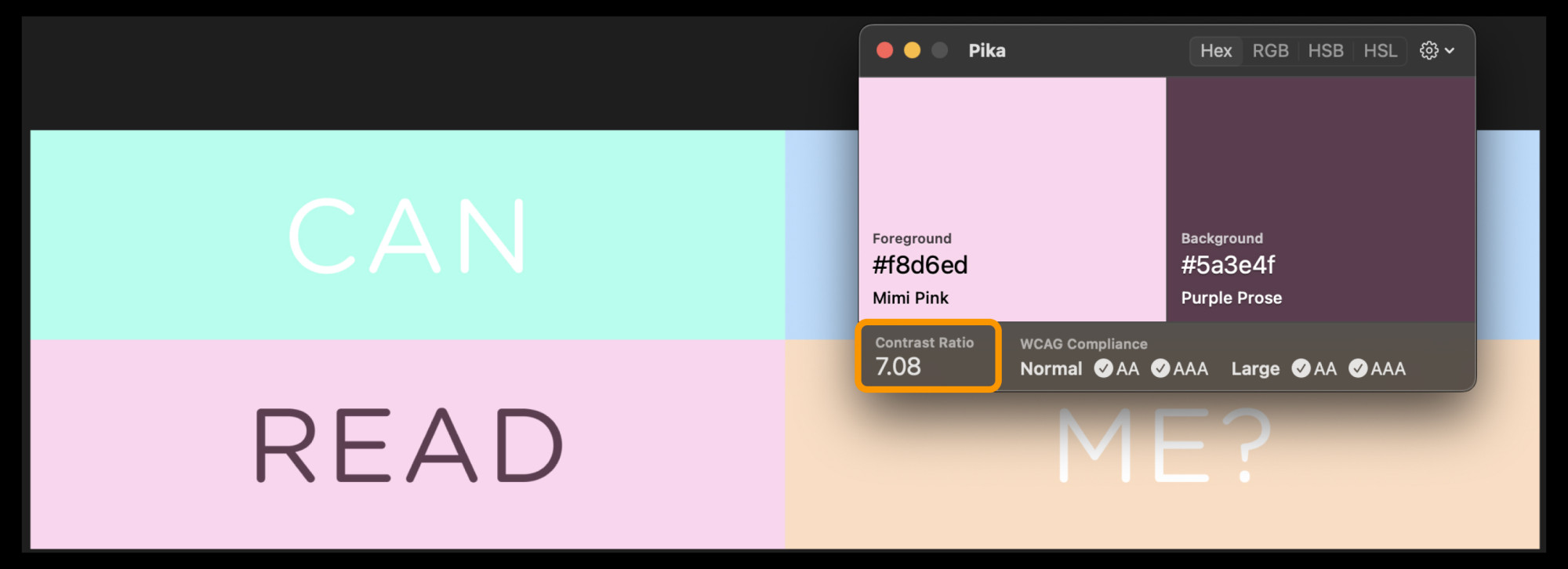
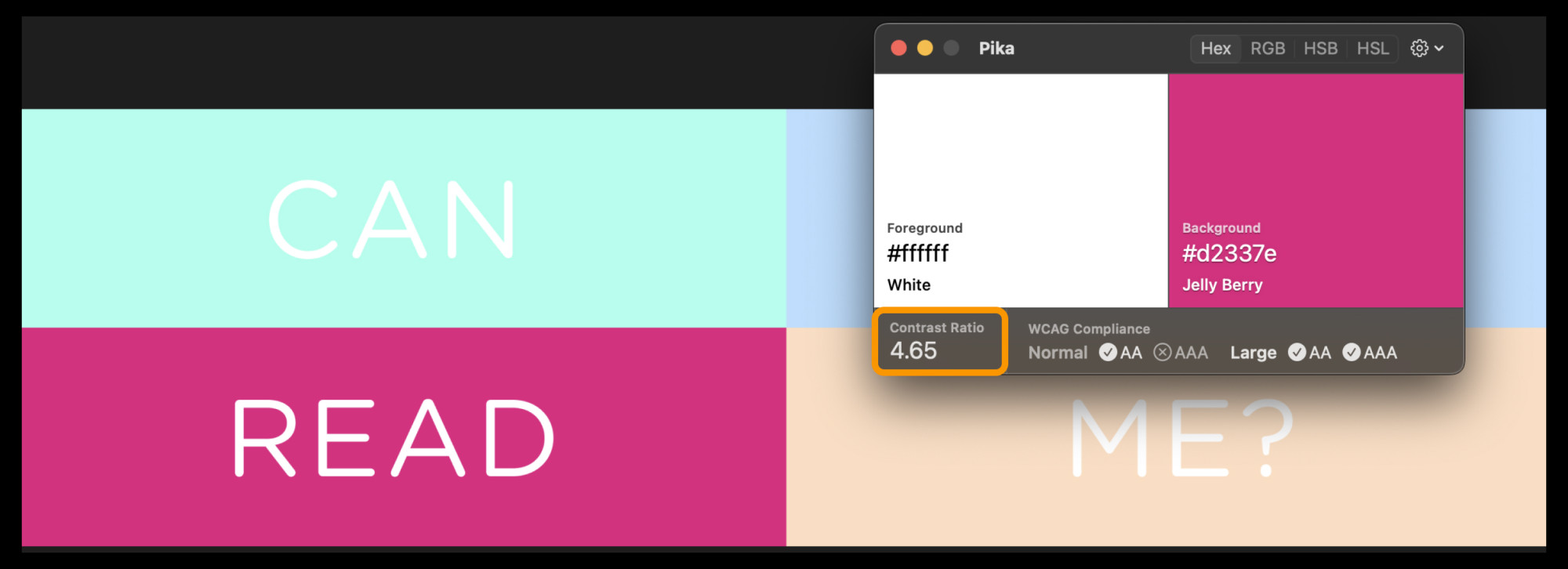
Use free tools like Pika or Contraste to check if your text meets the 4.5:1 contrast ratio or 3:1 for larger text.
- Adjust Colours:
If your contrast is too low, you can either lighten the text or darken the background (or vice versa) or choose a different colour that works within your brand’s palette.
Bonus tip: Make sure this applies to text on images too! Wherever possible, keep the text as actual text—not part of an image—for the best results.
For maximum readability, the best combination is black text on a white background (or white on black). This gives the highest contrast ratio (21:1), which is perfect for accessibility.
However, it might not align with your brand’s design system. Here are some actual examples where I improved colour contrast to make their website more accessible.
Real-Life Examples
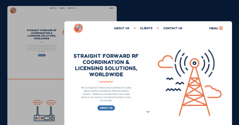
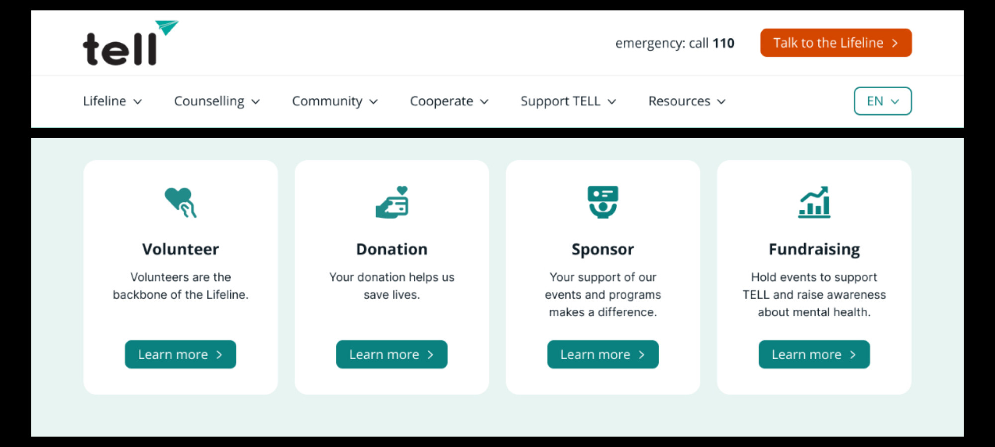
TELL Japan
Buttons and text had insufficient contrast, which I corrected by adjusting the colours to meet the 4.5:1 ratio. I also used a colour-blind simulator to optimise for users with deuteranomaly (red-green colour vision deficiency).

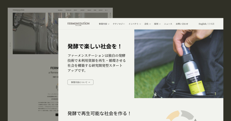
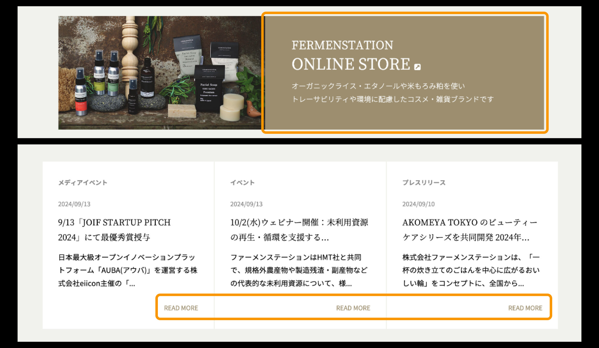
Fermenstation
Low contrast on buttons and links made navigation difficult. By boosting the contrast, especially on important elements like the “ONLINE STORE” button, I made it easier for all users to navigate.

Time for a Small Adjustment!
Colour contrast isn’t just a technical requirement—it’s a simple, effective way to make sure everyone can enjoy your content. By improving readability, you’re helping not just people with visual impairments but everyone!
Already made some adjustments? Celebrate that win! 🥳 🎉
If you’re not sure where to start or need help improving your website’s contrast, feel free to reach out to me via email 📧
Hope this was helpful for you! See you in the next post!
Have a wonderful day 🥰
Yoshie