👩🏻🔬 Accessibility Insights from My Review
While reviewing Mission Control’s website, I identified 13 accessibility and UI/UX issues on the homepage. Out of these, 7 required coding fixes, but I could address 6 through design changes. Let’s dive into how I solved them!
✅ How I Improved Accessibility and UX
Colour Contrast:
- Green/Yellow Buttons:
The original green and yellow buttons didn’t provide enough contrast with white text. To solve this, I used the site’s existing dark blue for the default state and navy for hover, ensuring both accessibility and brand alignment.
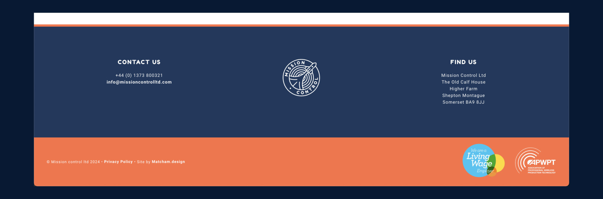
- White Text on Orange Background:
Instead of darkening the orange (which would have hurt the brand’s visual identity), I switched the footer background to dark blue, keeping things consistent yet more readable.
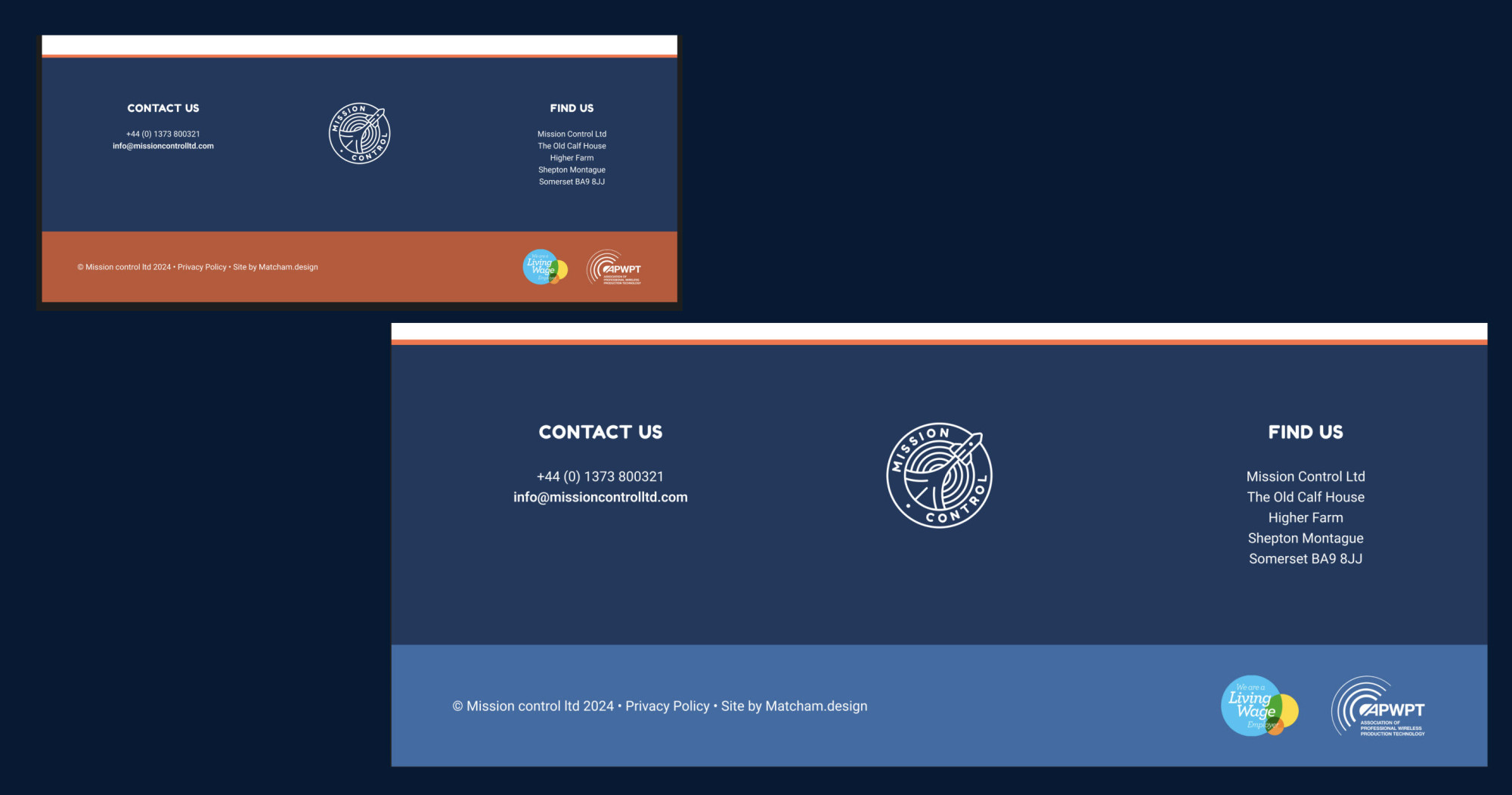
- Grey Text on White Background:
I replaced the grey with a 70% opacity navy. This keeps the brand’s style intact while improving legibility.
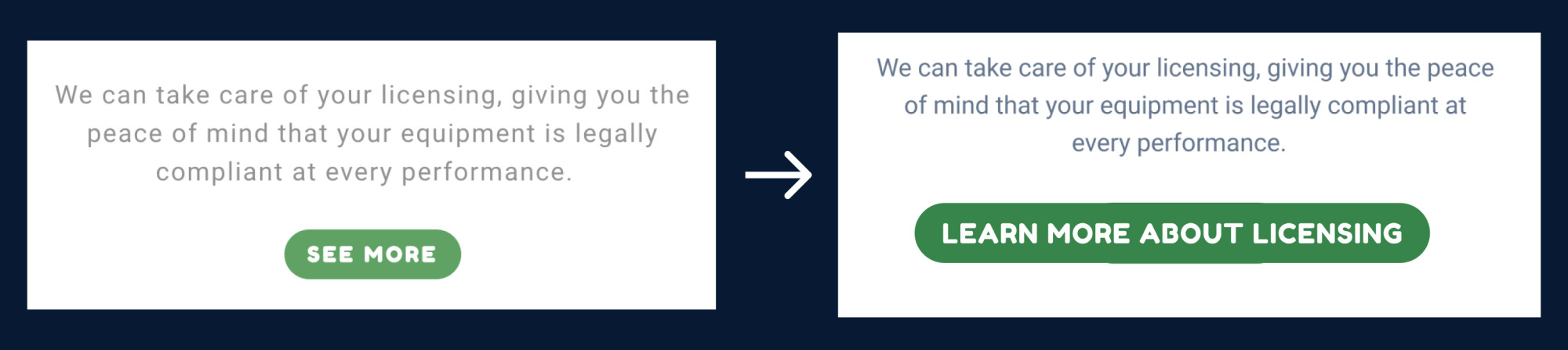
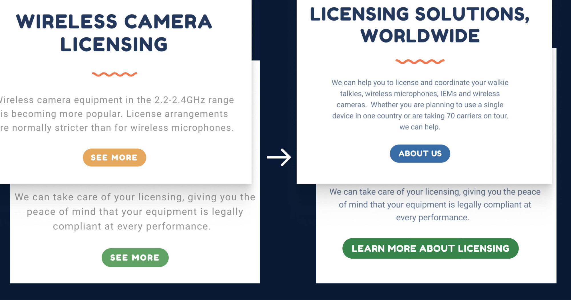
Buttons Without Discernible Names
Some buttons lacked accessible names, making it impossible for screen readers to interpret them. I changed the button text to ensure every button has a meaningful description. For example, the first button is “ABOUT US” and the second one is “LEARN MORE ABOUT LISENCING” instead of “SEE MORE”.
Responsive Button Sizing
The height of the mobile menu button was too small at 19.5px. I didn’t do the mobile redesign but I would increase the button height to 24px, the minimum size for touch targets, making it more user-friendly on touch devices.
Visual Hierarchy
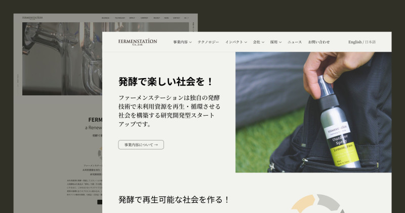
I restructured the headings, making a headline H1 in the hero section and the section titles H2. This ensures users can easily navigate the content, making the design more intuitive.
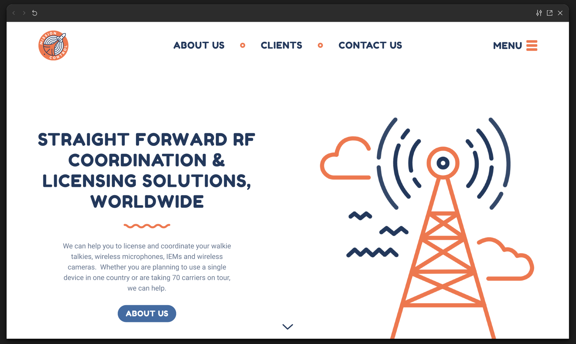
Scroll Arrow Indicator (UI/UX Fix)
I added a small down arrow with a subtle animation, like what’s used here, to indicate that the page is scrollable. It’s a small but effective touch that guides users.
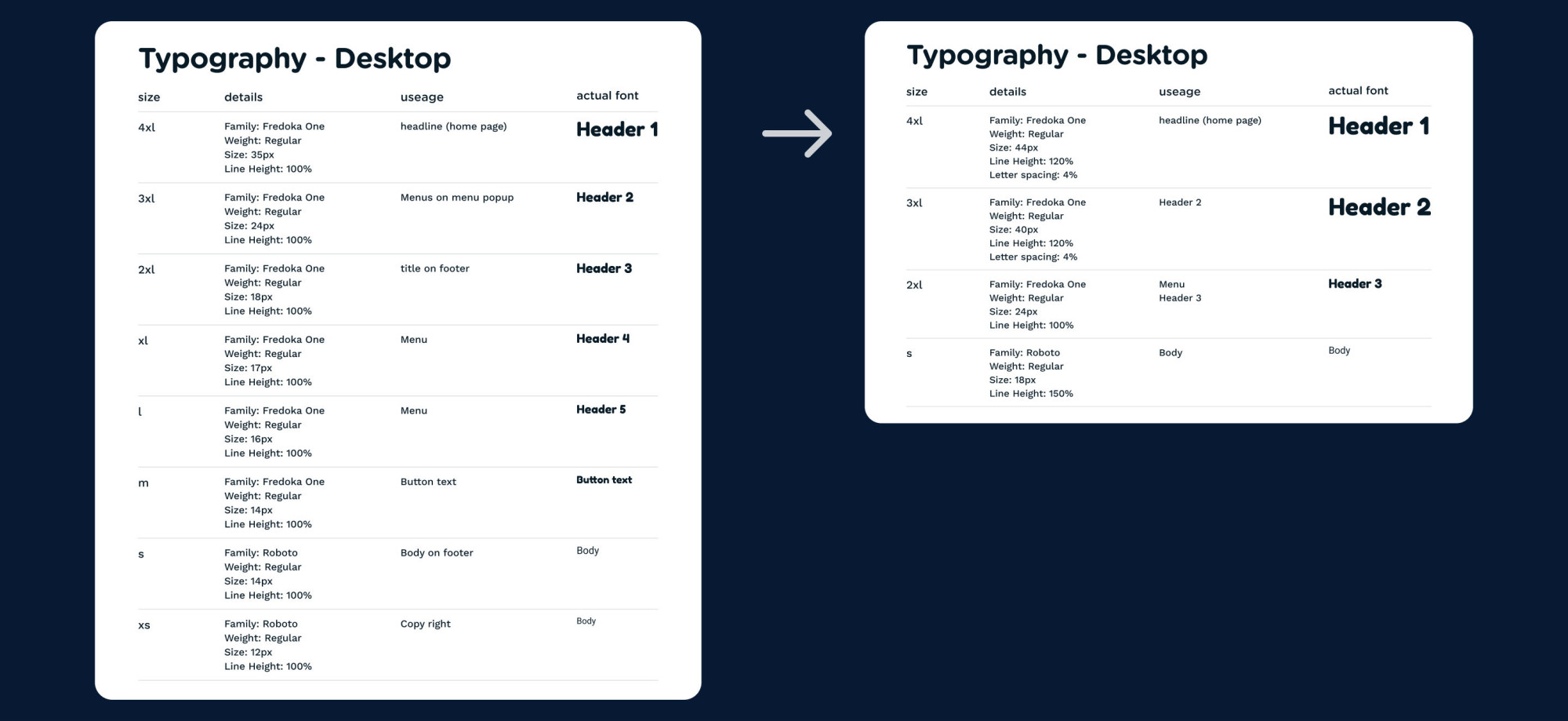
Font Size Consistency (UI/UX Fix)
To streamline the design and make developers’ lives easier, I reduced the number of font sizes/family from 8 to 4. This not only simplifies the visual hierarchy but also makes the site easier to maintain.
👩🏻💻 Coding Fixes for Accessibility
While the design updates made a big impact, several key programming fixes are also needed for full accessibility:
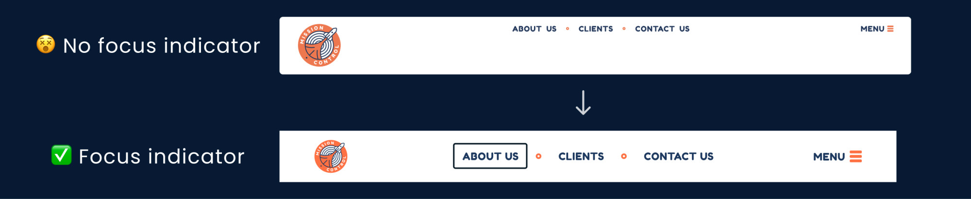
No Focus Indicators:
Without visual focus cues, keyboard users can’t see where they are on the page.
Fix: Stop disabling the default focus outline or apply clear focus styles like outlines or shadows to highlight where the user is when using the keyboard.
Zoom Restriction
The site prevents users from zooming, which can be a huge barrier for visually impaired users.
Fix: Remove the user-scalable="no" setting and the [maximum-scale]. This allows users to zoom in as needed, improving accessibility.
Missing “Skip to Content” Link:
There are not many elements to skip on this website but it is helpful to have.
Fix: Add a “Skip to Content” link at the top of the page to make navigation smoother for keyboard users.
Menu Focus Issues:
Once the menu opens, the menu items inside cannot be focused using a keyboard.
Fix: Ensure that focus moves to the menu once it opens and that all items are keyboard-accessible.
Missing Alt Text for Images:
Screen readers rely on alt attributes to describe images.
Fix: Add meaningful alt attributes to all image elements, providing necessary descriptions for screen readers.
No ARIA Landmarks:
ARIA landmarks help structure content for screen readers.
Fix: Add ARIA roles (like banner, navigation, main, and footer) to define key sections of the page.
Heading Structure:
Using multiple H1s can lead to a misunderstanding of the website’s structure. (Also, it’s bad for SEO.)
Fix: Implement a more comprehensive heading structure to make the content flow better for screen readers and users alike.
📝 What I Learned
I was initially confident the website wouldn’t have too many issues, but my review showed otherwise! This experience showed me the importance of testing after development. Even the best designs can lose impact if not properly implemented or checked for accessibility. As designers, it’s our responsibility to ensure our work has been implemented correctly for everyone.
➡️ What’s Next?
I’m working on a series called, “I Read the Web Content Accessibility Guidelines (WCAG) 2.2 So You Don’t Have To!” I’ll be breaking down each rule to help you navigate accessibility more easily. I am excited to share soon!
Let’s connect on Mastodon 🐘💚 — I’d love to hear your feedback. Did I miss anything? What would you improve in my redesign?
Have an wonderful day! 🥰