🎨 Today’s design task
Another exciting morning! After a hot day yesterday, I was grateful for the cool morning breeze today 🌬️
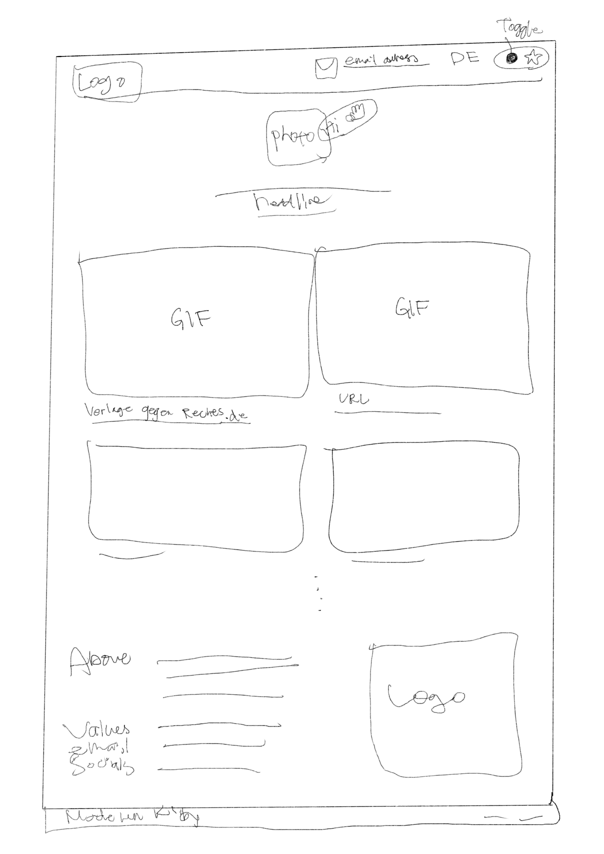
Today’s task: Redesign this website: medienbaecker.com.
Here is how it looks now 🥨

🚀 My design process
-
Study the website: I started by understanding what needs to be on the homepage.
-
Inspiration: I looked up some inspirations. There were so many cool ideas that it was hard to decide which ones to incorporate.
-
Sketching: I sketched my ideas on my iPad.
-
Color and typography: I was unsure whether to go for a colourful design or stick with a monotone, as many software engineer portfolios are monotone. I decided to start with a monotone and would consider a colourful version if I had time.

-
Gathering resources: I got some pictures and links from the website.
-
Adding GIFs: I decided to include GIFs, so I recorded my screen going through two websites and made them into GIFs using Adobe Express. This took more time than expected because of quality issues, but I managed to get it right by trimming the video to about 15 seconds.
-
Icons: I got some icons using the Iconify plugin in Figma.
-
Personal touch: I chose my favourite photo of him 🫶🏻
-
Colour experiment: I experimented with using yellow/orange in some areas.
-
Final touches: I added more cards without pictures or GIFs.
🧠 Challenges and solutions
- Time constraints: Completing the entire page within three hours was tough. It was a good decision to skip the “nice-to-have” features.
- Prototyping: I didn’t have time to add prototypes.
- Feedback: My partner’s feedback included:
- Use a beautiful shadow plugin.
- Stick to one icon style (stroke, filled, emoji).
- Consider different stroke colours for the projects.
- Nested border-radius - inner element should have less radius
🖼️ The final design

💡 What I learned today
I need to be more careful with consistency in radius and icons.
⏰ If I had more time
- I’d adjust the design based on my partner’s feedback.
- I’d add animations (hover effects and dark/light toggle switch).
- I’d create a colourful version of the web page.
💌 Any thoughts?
What are you working on these days? I’d love to hear your thoughts on my design or any advice you might have!
Thanks for following along on Day 9 of my challenge. See you tomorrow for Day 10!
With love and light 🫶🏻
Yoshie
P.S. Yesterday, my partner and I had a small bet about the spelling of “eyebrow.” I lost because my partner got it right while I thought it was “eyeblow” 🫠
I was pretty sure that I’ve seen the spelling “eyeblow” many times in Japan and when we googled it, some Japanese results came up 😂 Since I lost the bet, I had to redesign my partner’s website, which turned out to be pretty fun!