🎨 Today’s Design Task
I was excited about today’s task because I got to turn the accessibility issues I identified on Day 22 into actual design improvements! 🛠️
Today’s challenge:
Choose one page or screen and create a redesign that addresses the accessibility issues:
- Sketch or create a digital mockup of your improved design
- Focus on fixing the problems you identified while maintaining the overall look and feel
🚀 My Design Process
-
I reviewed the list of accessibility issues from Day 22 to understand what needed fixing.
-
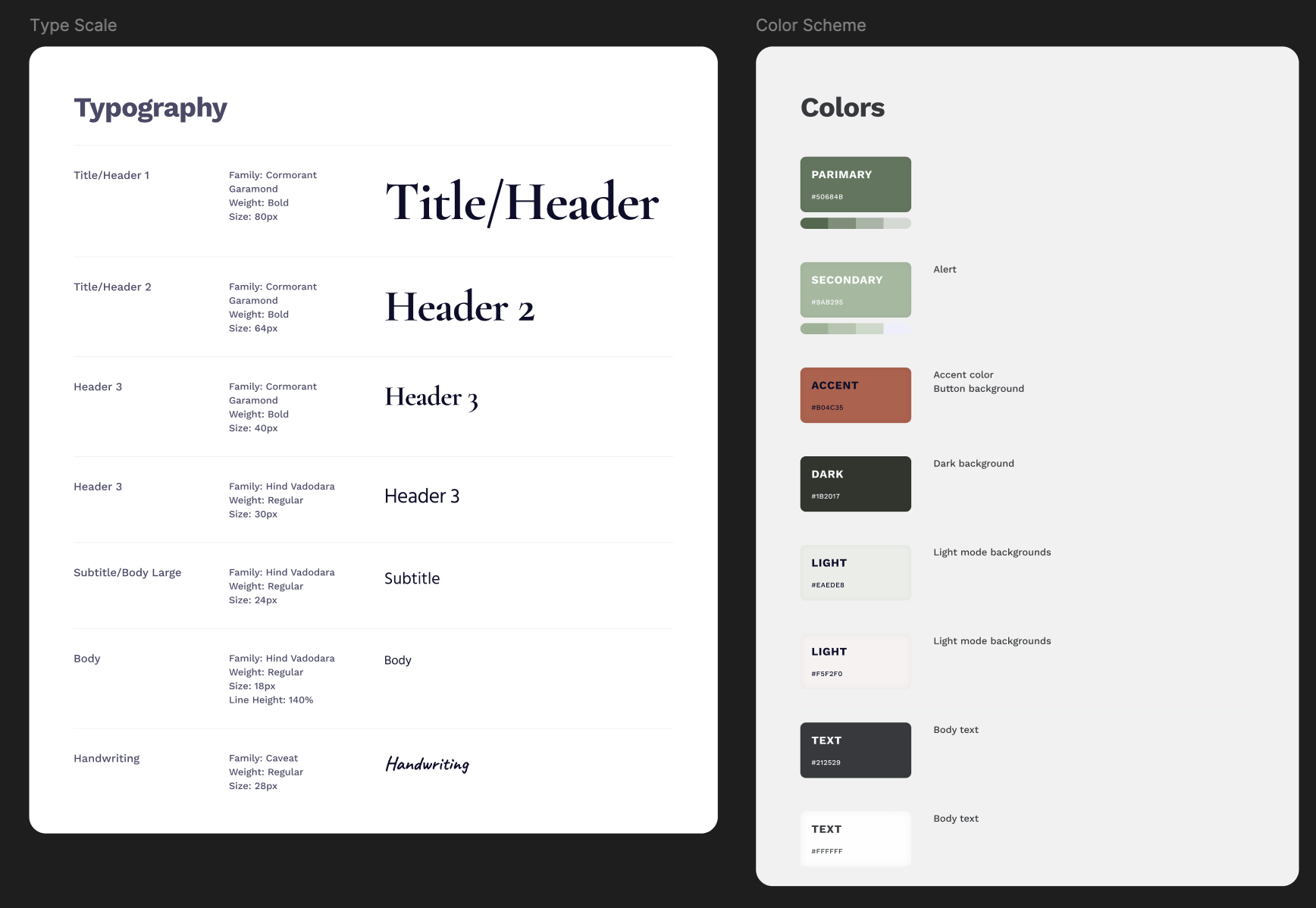
I created a style guide featuring the typography and colours currently used on the website.
-
I began by recreating the existing website design as a baseline.
-
From top to bottom, I checked each accessibility issue and made adjustments one by one.
-
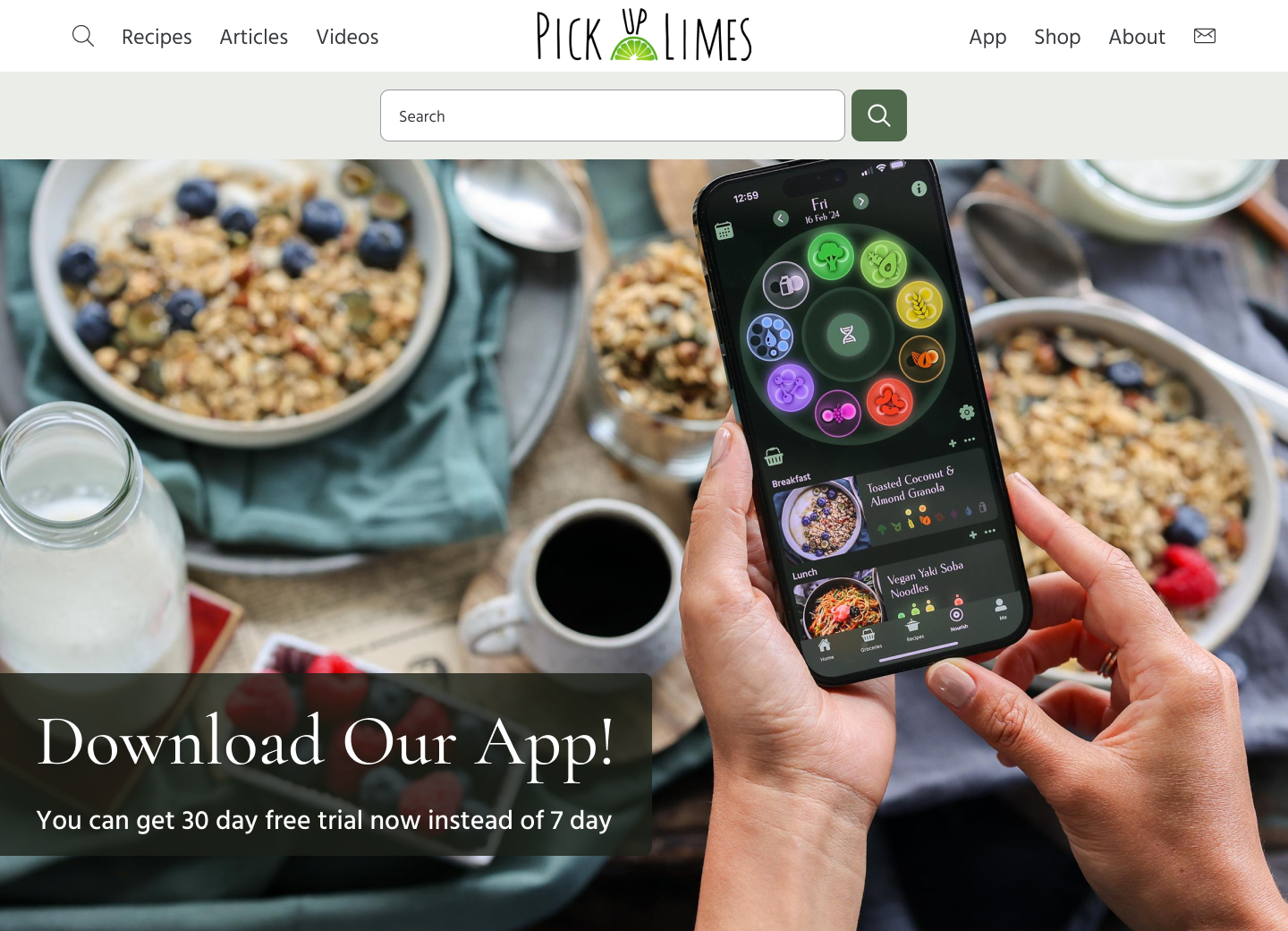
I designed a version with the search bar expanded.
-
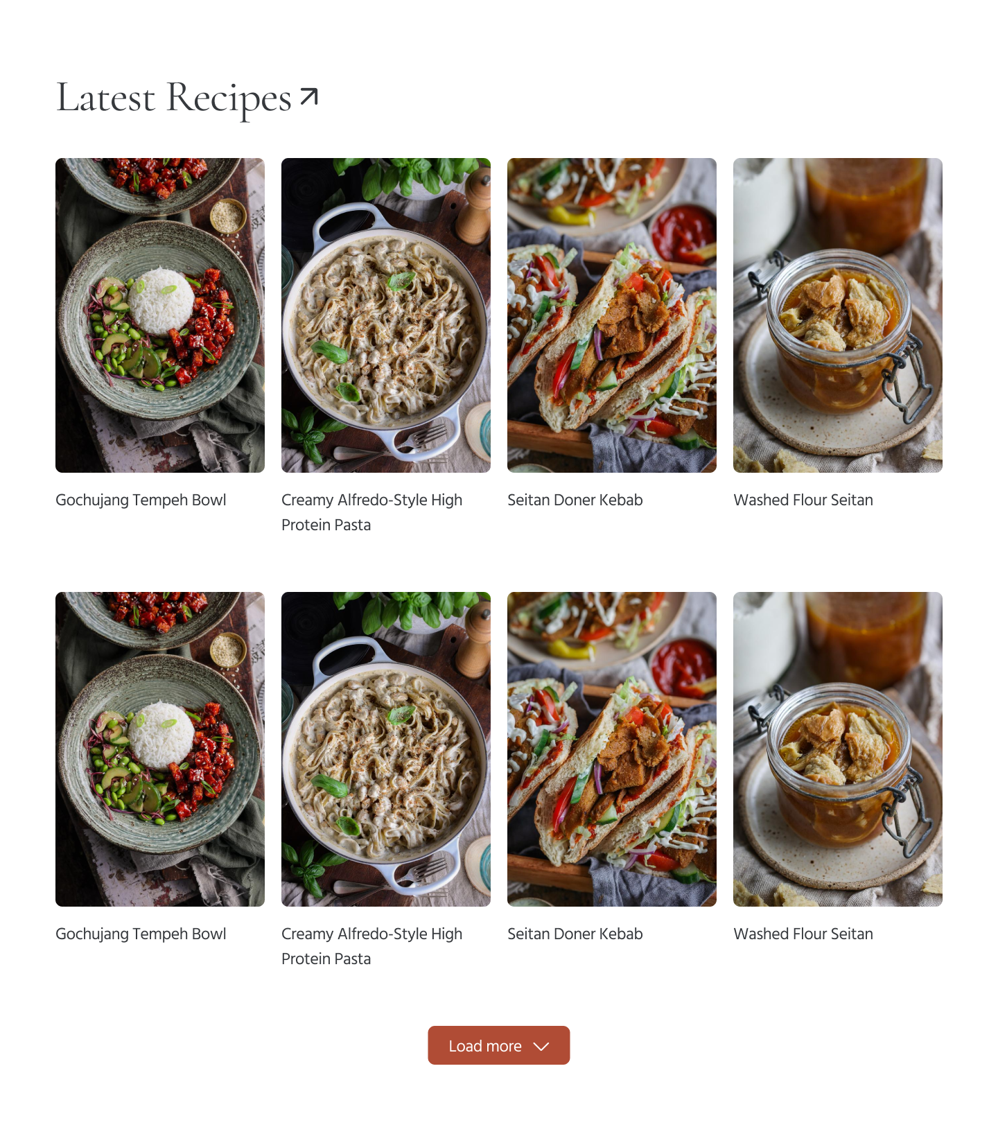
I created a layout for when users press the “Load more” button in the latest recipes section, ensuring enough spacing between rows.
-
I developed a version of the newsletter form showing error messages for incorrect email input.
-
I made additional tweaks based on my partner’s feedback:
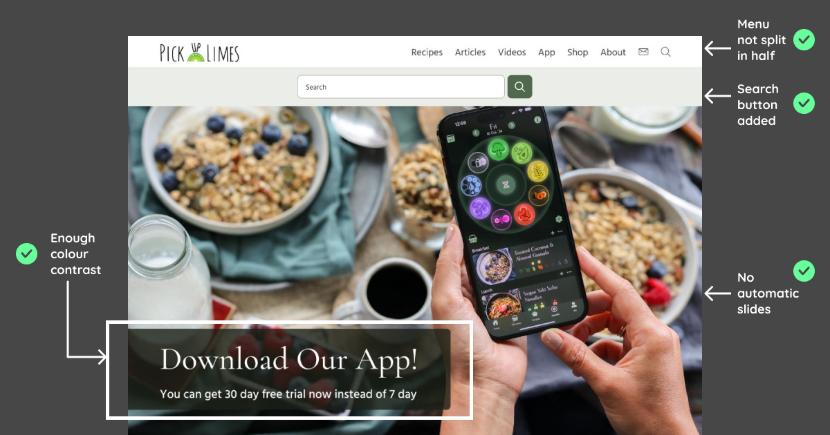
- Repositioned the logo to the left for more flexibility in adding or removing menu items. (Placing the menu below the logo could work, too)
- A search button was added for better accessibility.
- I initially added the dark green shadow on the header to have enough contrast for the headline and sub-headline in white but removed the green shadow because the food image doesn’t look great with it. As my partner suggested, I added a headline and subheadline at the bottom left with a dark green background.
- Adjusted the border-radius on non-clickable images, especially in the “Welcome Friends” section, where the rectangle background made it look odd.
- Replaced the arrow icon with a Unicode arrow for simplicity and alignment.
🧠 Challenges and Solutions
- The main challenge was balancing accessibility improvements without altering the overall design too much. I was tempted to introduce a new colour but held back from staying true to the original design 👩🏻🎨
- Adding a search button to the search bar didn’t look aesthetically pleasing at first, but I recognised its importance for accessibility.
🖼️ The Final Design

When the search icon is clicked:
Error message for email input on newsletter:

When the load more button is clicked for the latest recipes:
I’m okay with the result today. While I did miss a few areas that could’ve been improved—points that my partner highlighted—I’m happy that I’m learning new things every day! 😊
💡 What I Learned Today
I enjoyed working on accessibility fixes, but I’m not sure if I want to specialise in this area since it limits creative freedom. However, I’m eager to learn more about accessibility and see if it’s something I might grow to enjoy more 📚
⏰ If I Had More Time
- I’d like to work on other pages of this website to apply similar accessibility improvements.
💌 Any Thoughts?
What are you working on these days? I’d love to hear your feedback on my design or any advice you might have! 💬
Thanks for following along on Day 23 of my challenge. See you on Day 24! 🙌
With love and light 🫶🏻
Yoshie
P.S. My partner and I went on a half-day trip to Schiltach yesterday. It’s a cute town with a small hill, where we did a short hike and enjoyed Onigiri at the top 🍙 I love discovering new places, especially those with medieval paintings and fonts! Despite being super busy with work, I’m grateful that we still find time to explore beautiful places together 🙏🏻 🥰

