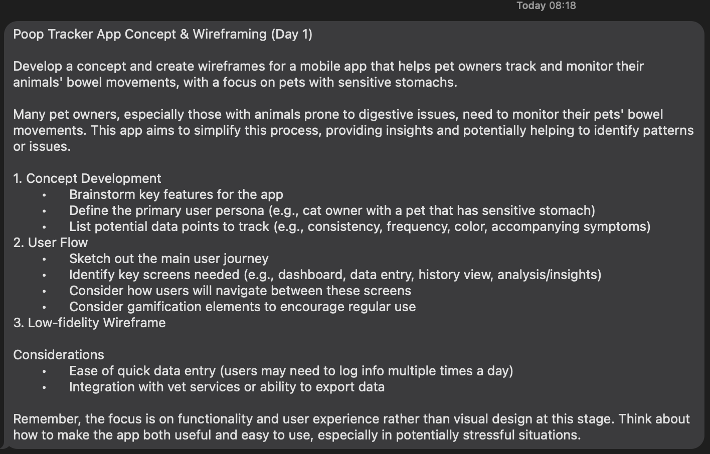
🎨 Today’s design task
Today’s project was so much fun because it allowed me to think about my baby, Teto 🐈⬛❤️
🚀 My design process
-
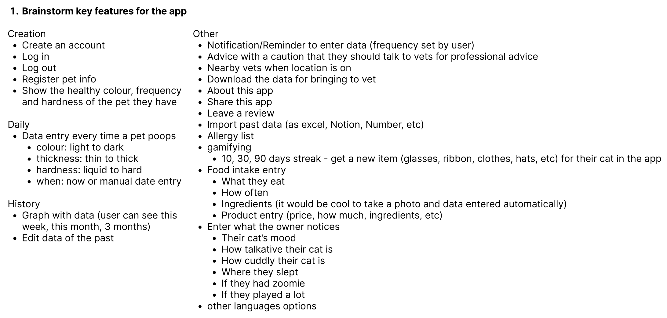
Brainstormed key features for the app: Started with a brainstorming session to identify essential features.
-
Defined the primary user persona: Essentially, I used myself as the primary user persona.

-
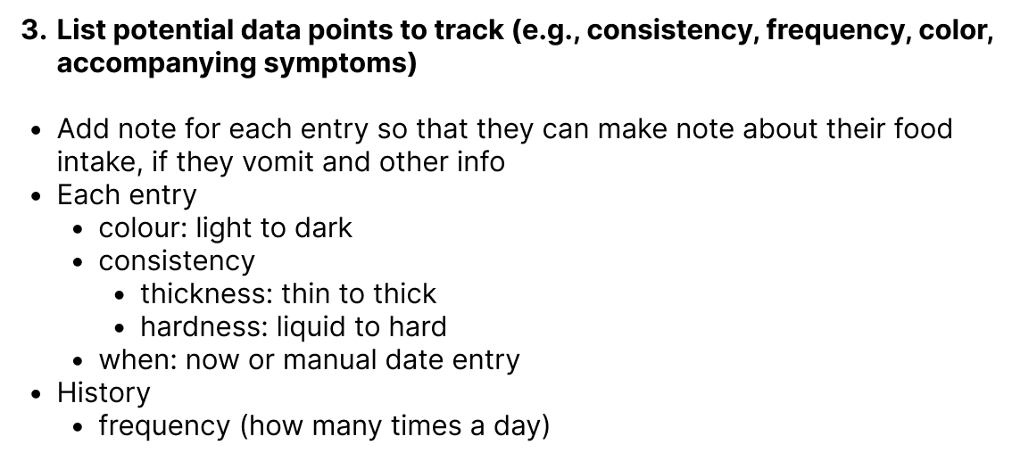
Listed potential data points to track: Created a list of data points that would be valuable to track in the app.
-
Sketched the main user journey: Outlined the primary user journey through the app.

-
Identified key screens needed: Determined which screens were necessary to support the user journey.

-
Mapped out navigation: Planned how users would navigate between different screens.

-
Added more notes on key features: Expanded on key features with additional notes.
-
Considered gamification elements: Included gamification elements to enhance user engagement.

-
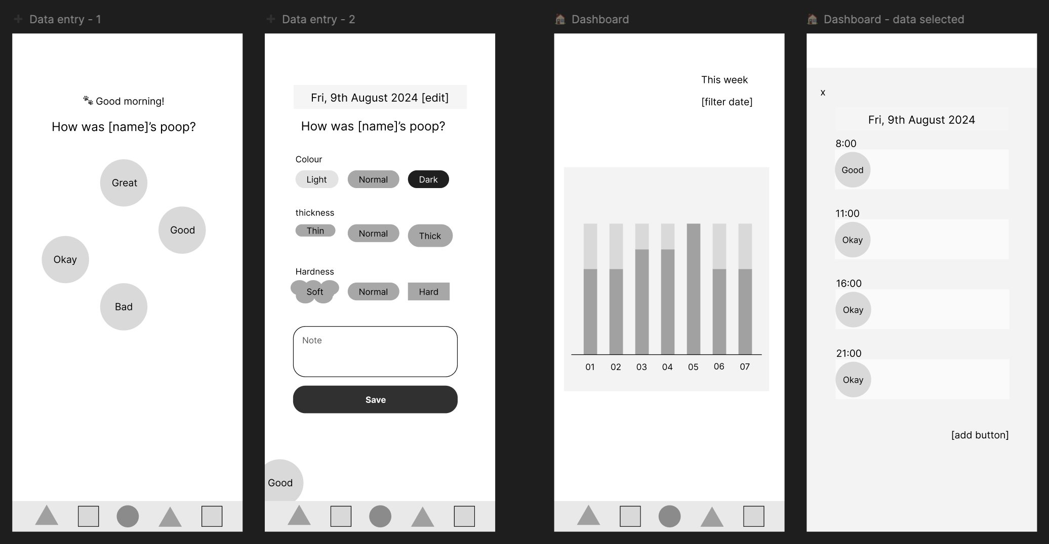
First screen consideration: Inspired by Unhinged, I considered using great/okay/bad as the first screen.
-
Lo-fi wireframes: Created lo-fi wireframes, starting with data entry screens. Initially, I included four options on the first screen and four inputs (color, thickness, hardness, and note) on the second screen.
-
Input method considerations: Instead of using sliding bars for colour, thickness, and hardness, I decided to give 3 easier-to-select options for each input.
-
Dashboard design: Focused the Dashboard on showing one kind of data, with detailed data available in a pop-up when a date is tapped.
-
Insight screen: Designed the insight screen to include more data and allow users to hide/show data by tapping the name.
-
Reminder and settings screens: Created screens for reminders and settings.
-
Nav bar icons: Added simple shape-based icons for the navigation bar.
🧠 Challenges and solutions
- Mobile app design: As this was my first mobile app design, I was unsure about sizes and overall appearance.
- Lo-fi vs. high-fi designs: Differentiating between lo-fi and high-fi designs was tricky, but I think I managed well.
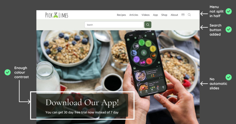
- Inspiration from Unhinged: Using Unhinged helped me understand what makes a mobile app user-friendly.
🖼️ The final design

💡 What I learned today
I was nervous about creating a mobile app design, but following the steps made it manageable. I am grateful for my partner’s guidance and support 🙏🏻🥰
⏰ If I had more time
For today’s task, I don’t think I would do more.
💌 Any thoughts?
What are you working on these days? I’d love to hear your thoughts on my design or any advice you might have!
Thanks for following along on Day 15 of my challenge. See you tomorrow for Day 16!
With love and light 🫶🏻
Yoshie
p.s. I’ve been reflecting on giving and receiving feedback. It’s not always easy to receive feedback without getting triggered, but I’m improving. Giving feedback is even harder because it requires understanding the issue and how to communicate it effectively. I want to keep being open to feedback even when I am 90! 👵🏻