🎨 Today’s design task
Last night, I discussed my task for today with my partner. I’m grateful for his input, as he’s always thinking about how I can upskill as a designer. 🥹❤️
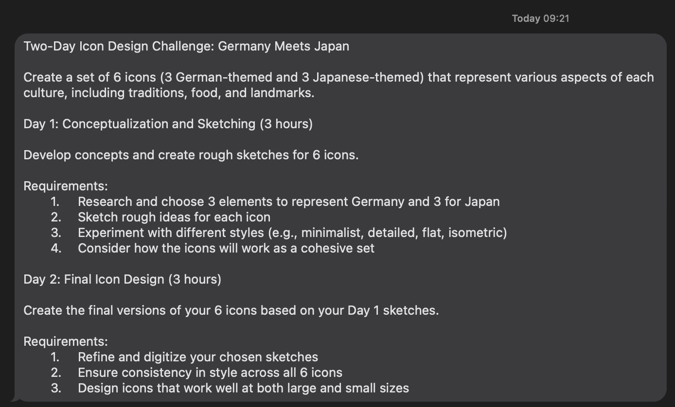
Today’s task: It’s a 2-day series focused on icon design!
🚀 My design process
-
Understanding the task: I started by reading the task requirements.
-
Research: To understand how to make consistent icons, I read this article on designing icon sets.
-
Taking notes: Key points from the article:
- Three stages: Conceptualization, design, and evaluation.
- Three keys:
- Use precise messages.
- Be graphically accurate.
- Ensure visual consistency (same grid, stroke width, key shapes, corner radius, and angles).
-
Following steps: I decided to follow the steps mentioned in the article.
-
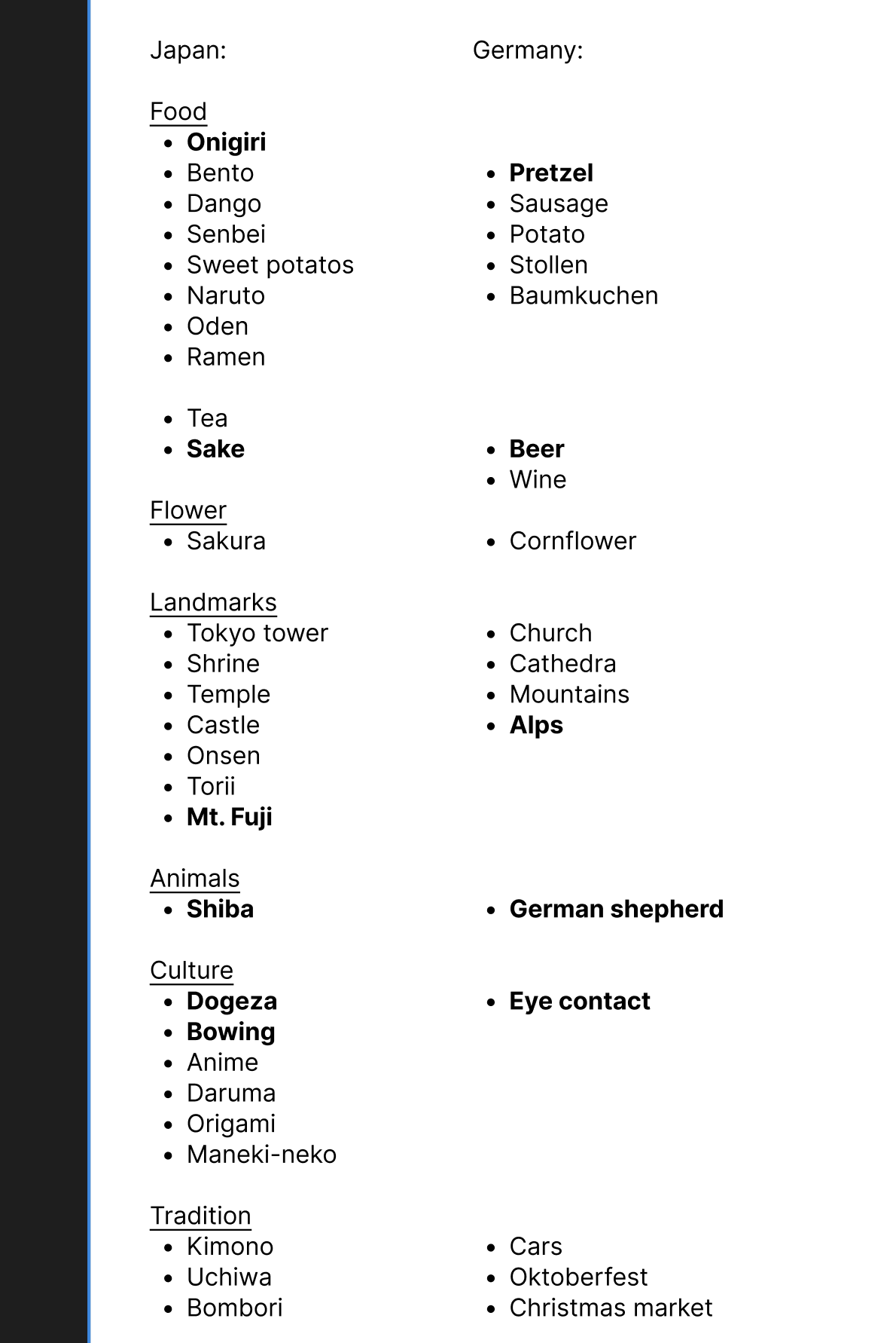
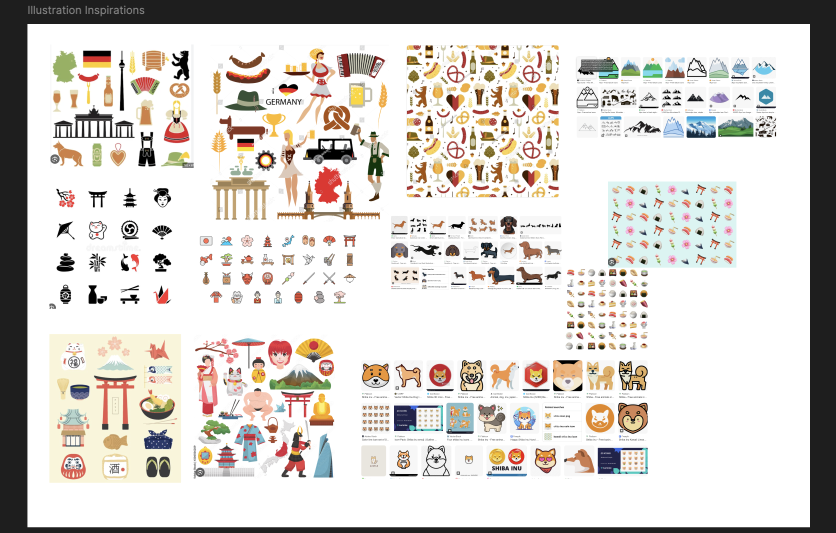
Conceptualization: I listed all the icons we plan to design by researching traditional items recognized in each country (Japan and Germany).
-
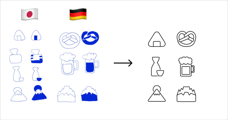
Narrowing down ideas: I chose the following pairs:
- Onigiri - Pretzel
- Sake - Beer
- Mt. Fuji - Alps
-
Detailing: Answered three questions for more details:
- Tone: Fun, friendly, and kind.
- Style: Line.
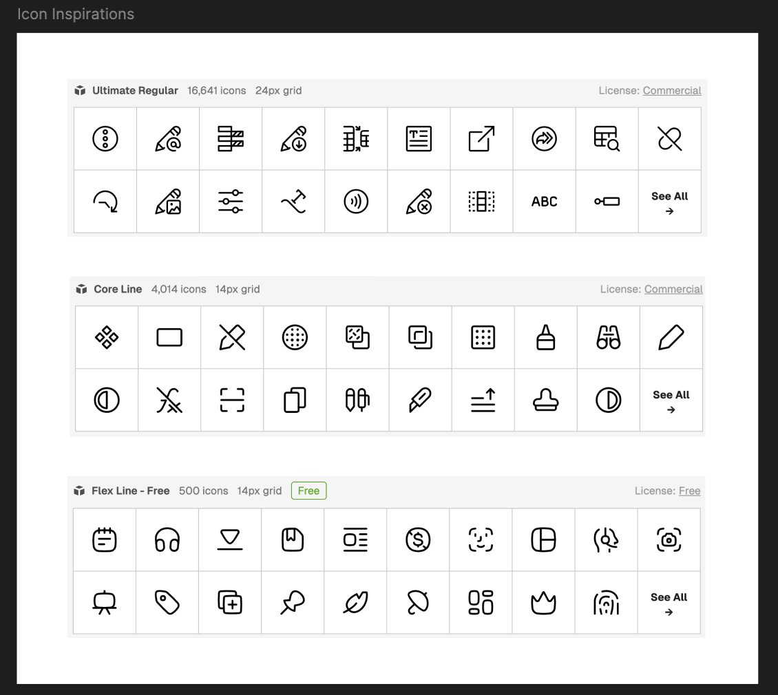
- References: I used Streamline Icons for reference.
-
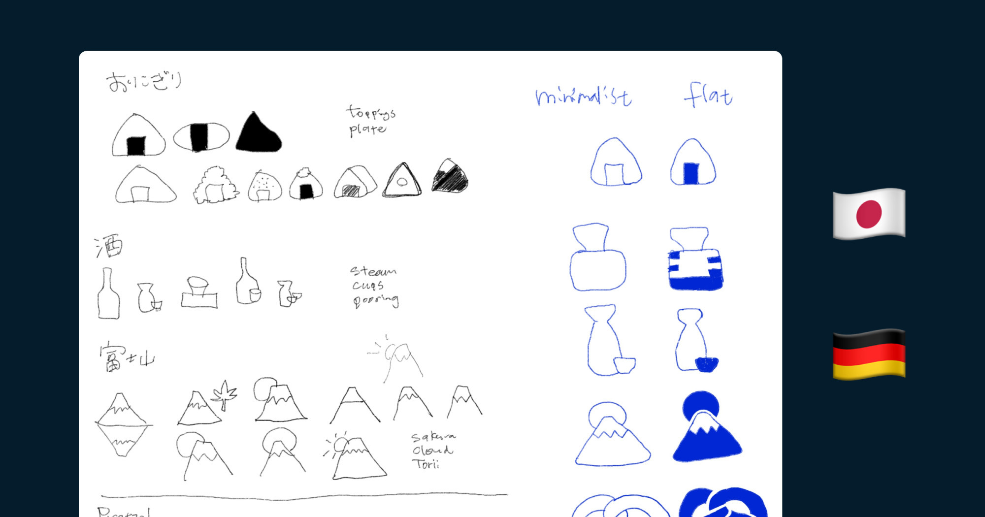
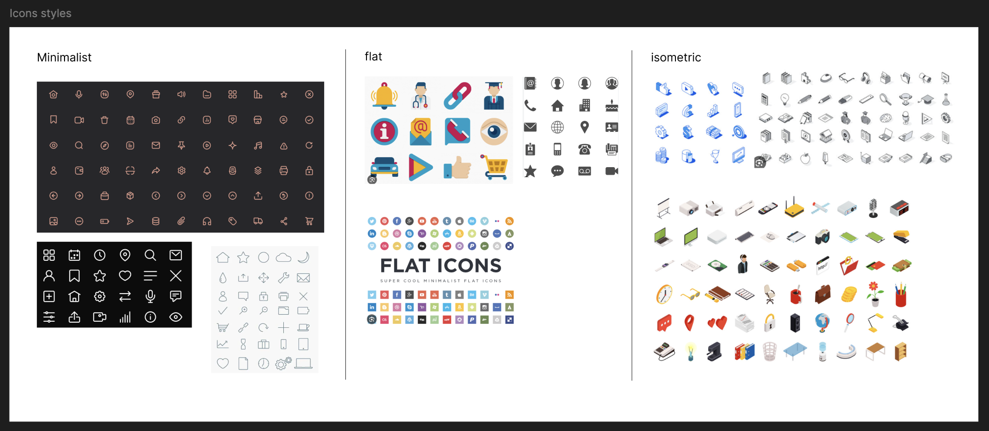
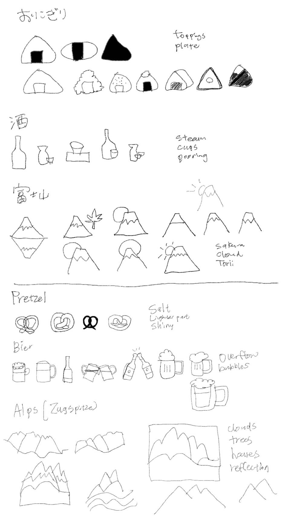
Design: I researched different icon styles and sketched three icons for Germany and Japan, looking at photos and online inspirations. (In the sketching I added some notes for what more I can add to the icons.)
-
Sketching: I sketched all icons in minimalist and flat styles. For clarity, I made two versions of the Sake icon.
-
Final adjustments: Added white lines to the flat icons for better clarity, I’ll see how they look on Figma tomorrow.
🧠 Challenges and solutions
- Simplicity vs. recognition: Even as a minimalist, making easily recognized icons was challenging.
- Time investment: Learning about icons took time, but it was worthwhile for creating quality icons.
- Feedback: Thomas sensei’s feedback was encouraging: “Good job! 👏🏻”
🖼️ The final design
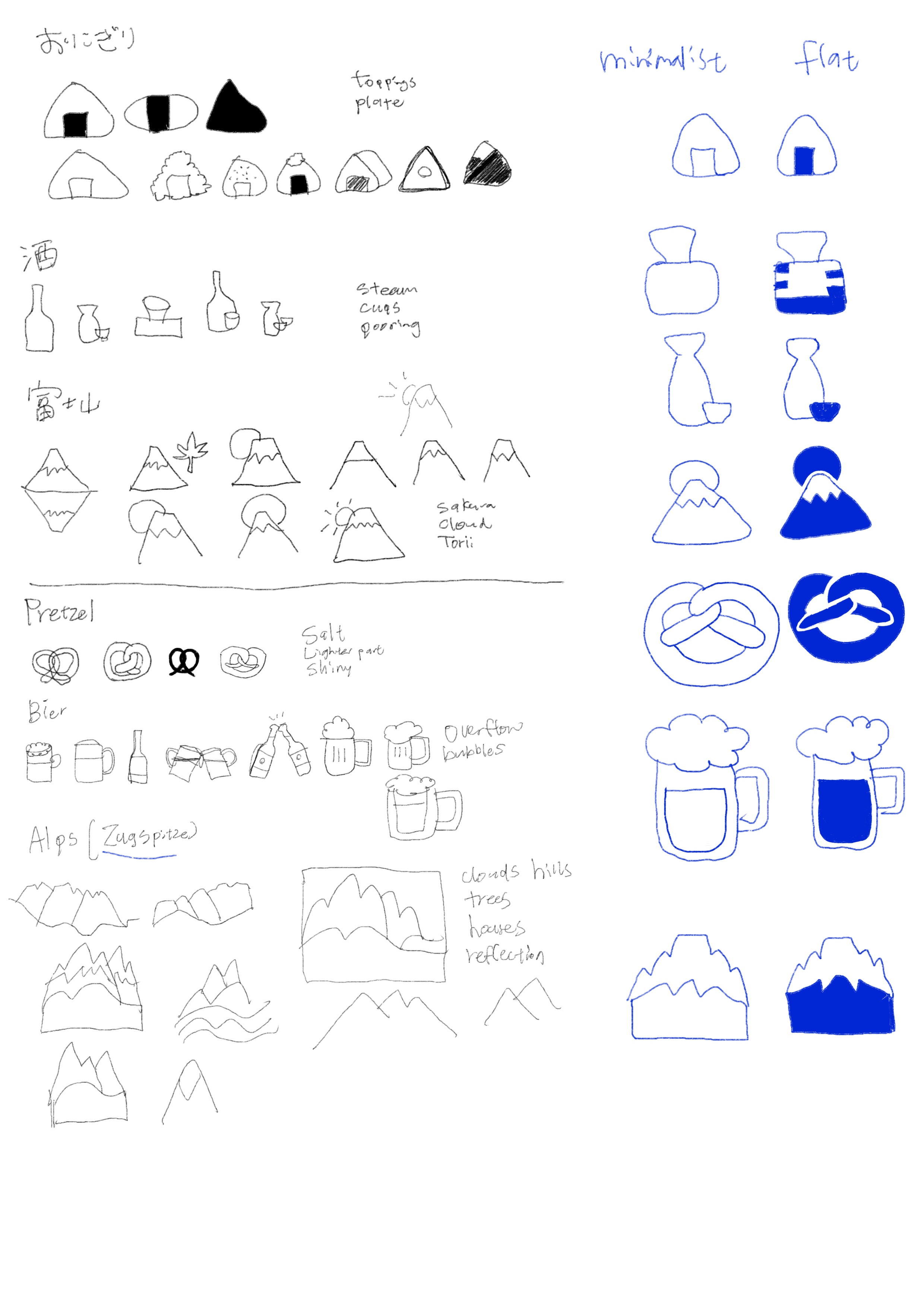
I’m content with the results. They didn’t turn out as badly as I feared 😂. I’m excited to see how they look digitised!
💡 What I learned today
Understanding principles and taking time in the initial steps are crucial. I’m thankful for the abundance of free resources available and for my partner’s guidance to good resources.
⏰ If I had more time
- I’d decide which Sake icon to use.
- I’d learn more about using Procreate to add radius and create tablet shapes, making my sketches more accurate.
💌 Any thoughts?
What are you working on these days? I’d love to hear your thoughts on my design or any advice you might have!
Thanks for following along on Day 10 of my challenge. See you on Day 11!
With love and light 🫶🏻
Yoshie
P.S. I’ve started drinking energy drinks lately 🔋. They help with my tiredness, though I’m unsure about their health effects. I’ve tried various Red Bull flavours (Cactus and Summer Edition are my favourites) and 28 Black Acai, which is the best tasting and vegan. If I were in the US, I’d love to try Juni sparkling drinks. Which energy drink do you like best? 🥛 Or do you drink coffee daily like my partner? 🤔☕
