🎨 Today’s design task
Another exciting morning! Today’s project is continuing to make the icons!
Day 2: Final Icon Design (3 hours)
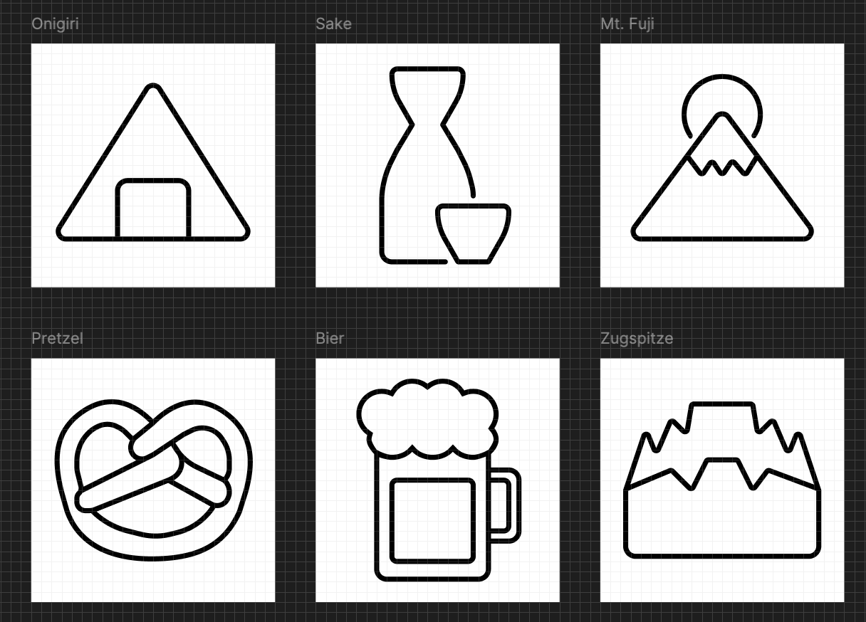
Create the final versions of your 6 icons based on your Day 1 sketches.
Requirements:
- Refine and digitize your chosen sketches
- Ensure consistency in style across all 6 icons
- Design icons that work well at both large and small sizes
🚀 My design process
-
I finished reading the article I started yesterday
-
Since I’m creating icons on Figma, I read a Figma-specific icon design article
-
Created a 24px x 24px frame and added key shapes

-
Established design rules for a fun, friendly, and kind aesthetic:
- 0.5 px stroke
- Rounded ends
- Rounded corners (corner radius 1px)
-
Initially attempted using circles and rectangles, but switched to the pen tool for line icons (Here is the image when I struggled using shapes for the Sake icon 🤣 As you can see, I was completely lost.)

-
Overcame challenges with the Sake icon shape using the pen tool
-
Faced difficulties with all German icons 🥲
-
Wanted to adjust German icons further, but time was up! ⌛
🧠 Challenges and solutions
- Japanese icons were much easier than German ones. Should’ve chosen simpler shapes for German icons.
- Initially struggled with circles, triangles, and rectangles. Learned to use union, remove fill, and add stroke.
- Learning Figma’s interface and tools was time-consuming but valuable.
- My partner’s feedback: Onigiri icon appears too angular
🖼️ The final design

💡 What I learned today
Maintaining consistency was challenging (deciding which rules to keep or break). Learned basic icon principles from the articles, which I can apply to future website/mobile site and web app/mobile app designs!
Thanks to my partner for choosing this helpful fun task 🫶🏻
⏰ If I had more time, I would
- Choose different items for German icons
- Implement partner’s suggestions
- Create flat versions of all icons
💌 Any thoughts?
What are you working on these days? I’d love to hear your thoughts on my design or any advice you might have!
Thanks for following along on Day 11 of my challenge. See you tomorrow for Day 12!
with love and light 🫶🏻
Yoshie
p.s. I downloaded a mobile app called Unhinged. It’s super cute and I’m sure it helps many people like it does for me! Our cat, Teto, has a sensitive stomach, and I’ve been thinking it would be nice to have a tracker for his food intake, digestion, and cuddle levels. I might design something like that in the coming days! 🐈⬛


