Hello! Welcome to my first blog. I’m Yoshie and I’m so excited to share this new adventure with you here – my 30-day UI/UX design challenge. Here’s where I am, what this challenge is, and why I’m diving into this creative journey.
🙋🏻♀️ A bit about me

First, let me introduce myself. I look like I’ve been a bit all over the place, with a heart full of love and passion for helping others:
- For 3 years, I was a full-stack developer, building web apps and occasionally designing when needed.
- More recently, I’ve been working as a coach and energy healing practitioner, focusing on helping women find true love.
- Now, I’m exploring UI/UX design. It feels like a perfect mix of my tech skills and my passion and love for helping others.
🙌 What I’ve done so far
To prepare for this challenge, I’ve been studying and designing for about a month:
- I took the “Figma UI UX Design Essentials” course by Daniel Walter Scott on Udemy.
- I also completed a 6-hour “Interactive UI/UX Crash Course” by DesignCourse.
These courses have been eye-opening, and I’m so grateful for the foundation they’ve given me.
🥇 My first design project
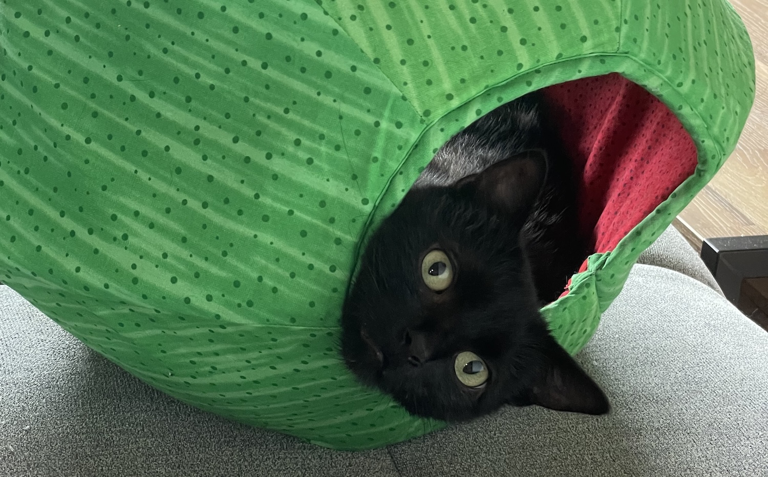
I recently designed a website for an animal shelter, and it was such a heartwarming experience. My partner and I adopted our cat, Teto, from the shelter, so this project was extra special.
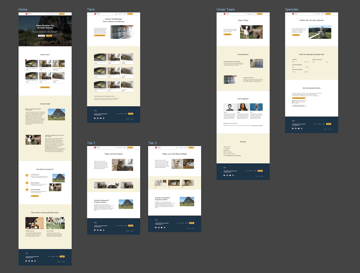
It feels amazing to create something that might help other furry friends find loving homes too.
📆 The 30-day challenge: what’s the plan?
Here’s what I’ll be doing:
- Designing one website section or page each day.
- My partner (who’s also my mentor) will use AI to give me random design tasks.
- Each day, I’ll get a colour, page type, and target audience to work with.
- I can use AI to help with logos if needed.
- I’m giving myself up to 2 months to finish all 30 designs. (I know I can get overwhelmed a bit easily, so I’m being kind to myself with the timeline.)
🤷🏻♀️ Why am I doing this?
- This challenge isn’t just about creating pretty designs. It’s a journey of self-discovery and growth for me:
- I’m hoping to find my unique design style.
- I’m excited to discover which parts of design I love most.
- I spend up to 3 hours per day on design. (A perfectionist side of me wants to improve again and again so this limitation helps, I think.)
- I might even build a whole website using my favourite designs from the challenge.
- I’m hoping to build a habit of consistent learning and creating.
- Most importantly, this challenge will help me see if web design is something I want to pursue further.
I’m a bit nervous, but mostly excited about this journey. There will probably be days when I feel stuck or frustrated, but I’m committed to being kind to myself throughout the process.
I’m curious about your journey so far and your new path ahead. Have you ever taken on a creative challenge like this? How did it go? I’d be so grateful to hear your stories and any advice you might have.
Send me a message on Mastodon
Or email me!
I’ll be back tomorrow to share my first day of the challenge. Thanks for joining me on this adventure!
With love and excitement 💕
Yoshie

