🎨 Today’s Design Task
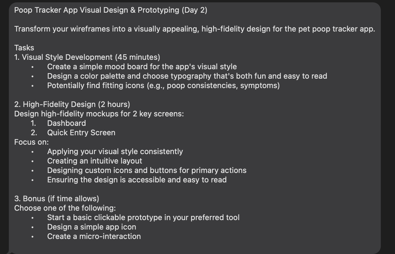
Today’s challenge was to create a high-fidelity mobile app design based on yesterday’s low-fidelity design. I had a clear vision for the colours and overall vibe, but this project was more challenging than expected! 🥲
🚀 My Design Process
-
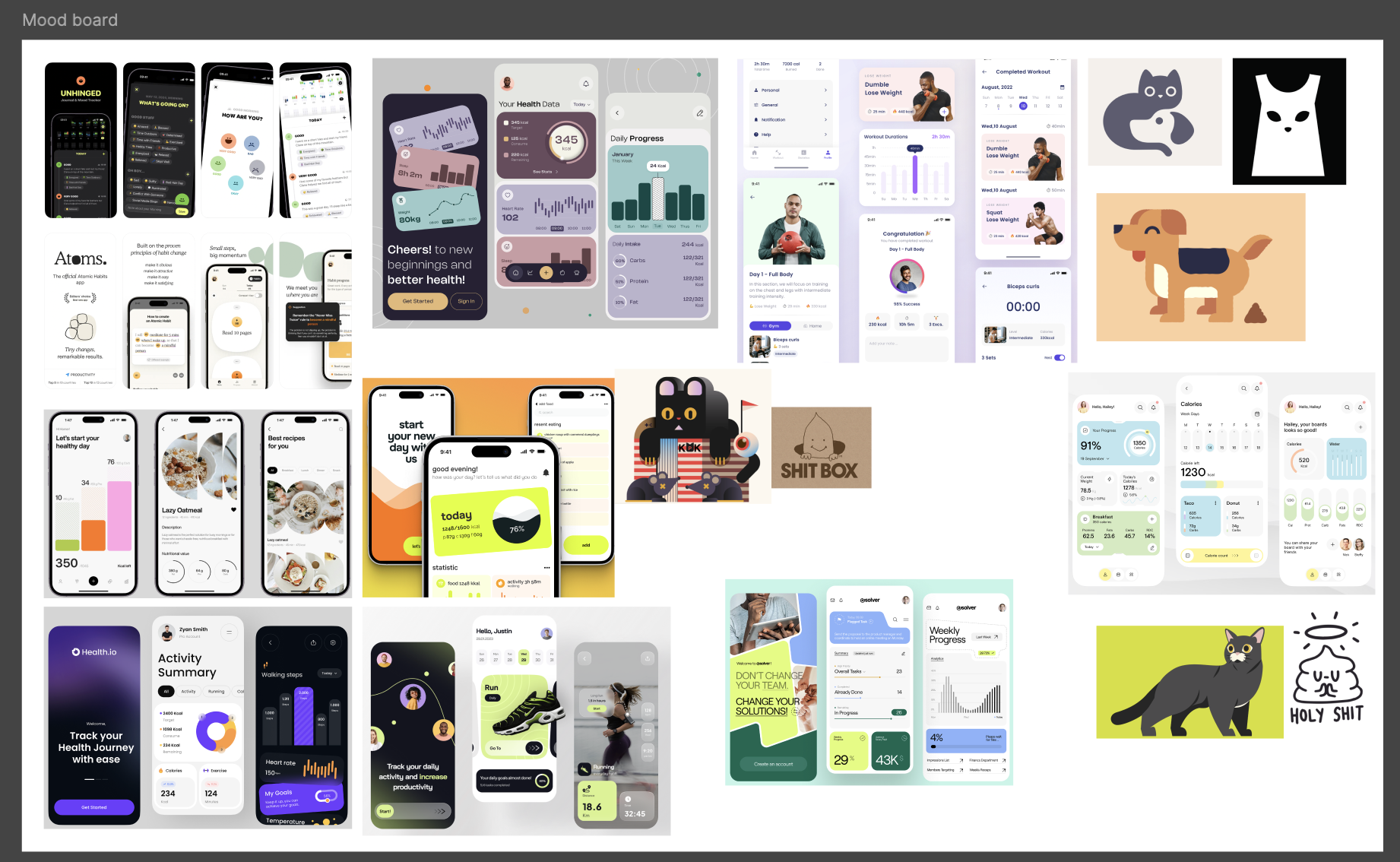
Inspiration Gathering: I started by collecting inspiration from Dribbble and other mobile apps, and building a mood board.
-
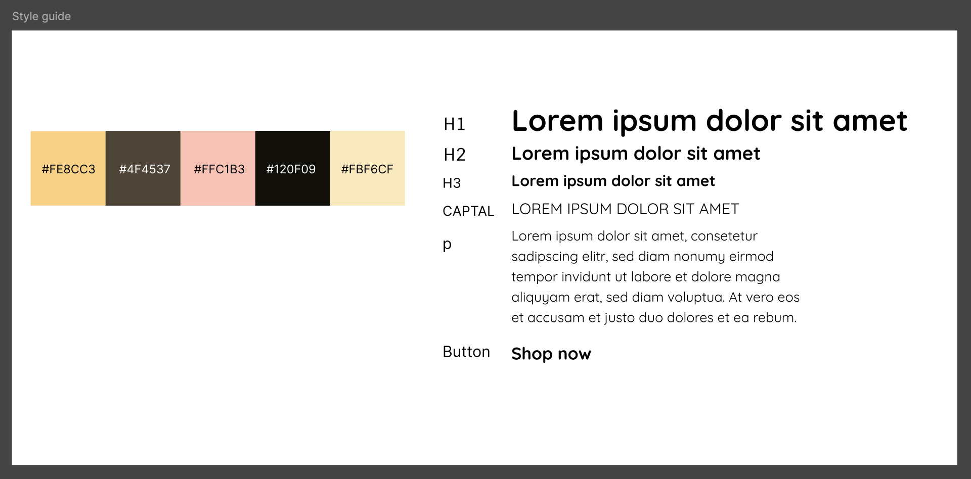
Color and Typography: I selected a colour palette and typography that felt right for the app’s purpose.
-
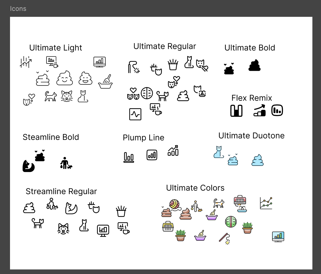
Icon Collection: I sourced icons related to cats, poop, health, and navigation from Streamline.
-
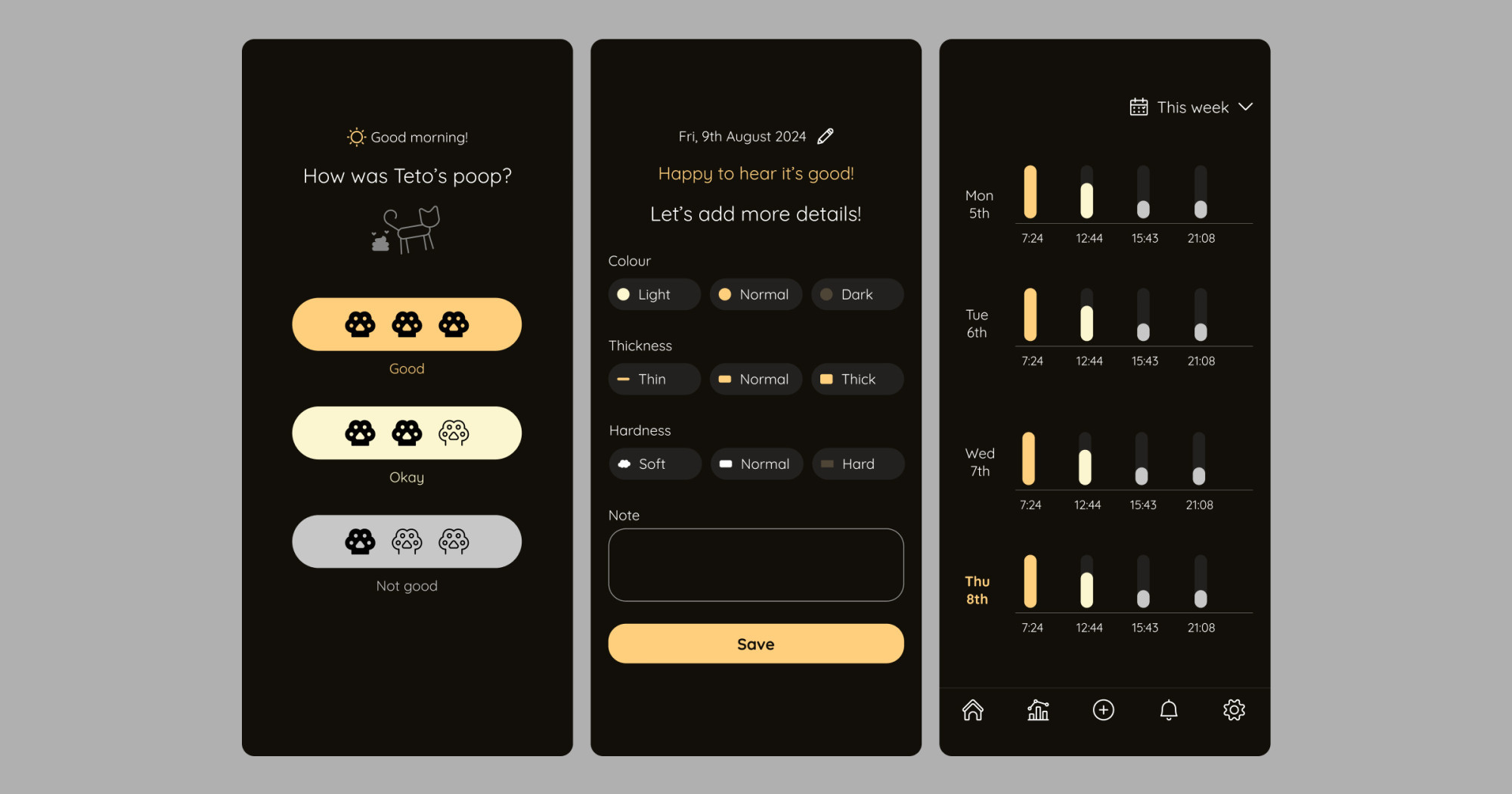
Nav Bar: I made a component of the nav bar first.

-
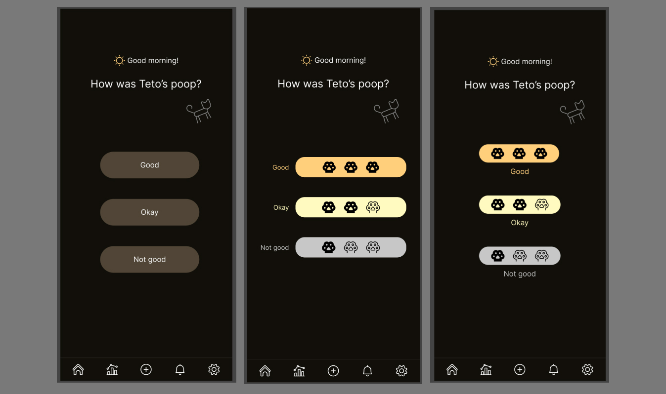
First Screen Design: I focused on the Data Entry screen, experimenting with different layouts until I found the right balance.
-
Second Screen Design: For the second Data Entry screen, I used small icons to represent each selection, keeping the design clean and intuitive.
-
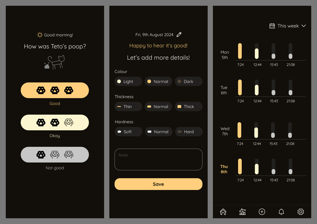
Dashboard Design: I designed the Dashboard for the weekly view, ultimately simplifying the layout after considering various options.

-
Nav Bar Icon: I tried using a different nav bar icon but put it back.

🧠 Challenges and Solutions
- Avoiding a “Dirty” Look: Balancing the theme with appropriate colours and icons was tough. I wanted to avoid a design that felt too heavy or off-putting.
- Design Direction: I spent a lot of time experimenting with different designs, which slowed my progress. As a result, I didn’t finish the daily insights on the Dashboard page.
- Feedback: My partner suggested:
- Adjusting spacing and readability on the Data Entry screens.
- Making clickable elements more obvious on the Dashboard.
- Adding padding to the home button.
🖼️ The Final Design
💡 What I Learned Today
I realised I’ve never really paid attention to the thought and effort behind mobile app designs, even though I use them daily. This project made me appreciate the work that goes into creating user-friendly interfaces, and I’m excited to keep learning about mobile design!
⏰ If I Had More Time
- I would refine the detailed day view on the Dashboard page.
- I’d also implement my partner’s feedback.
💌 Any Thoughts?
What projects are you working on right now? I’d love to hear your thoughts on my design or any advice you might have!
Thanks for following along on Day 16 of my challenge. See you tomorrow for Day 17!
With love and light 🫶🏻
Yoshie
P.S. I have two pieces of good news! First, my portfolio is finally ready 🙆🏻♀️ You can check it out here or at the bottom of this page. Big thanks to my partner for all the help 🙏🏻 Second, one of the organizations I contacted about a redesign proposal replied to my message! It’s great to see things moving forward 🥰
