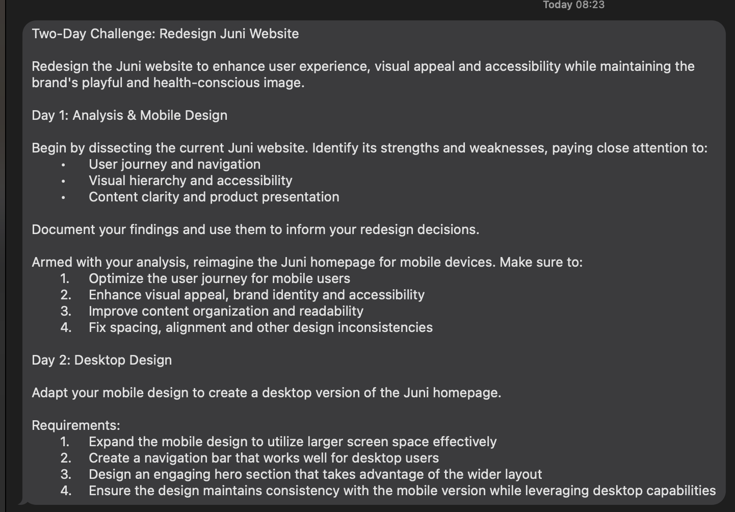
🎨 Today’s design task
Hi, everyone! Today’s challenge is the second day of my 2-day task of redesigning the Juni website! Today, I focused on the desktop version to align with the mobile design I created yesterday. Let’s dive in! 👏🏻
🚀 My design process
-
Task Review: I started by thoroughly reading today’s task.
-
Current Website Check: I checked their current website and noticed their top message had changed since yesterday.
-
Typography Guide: I created a typography guide to ensure consistency.
-
Top Bar Message: Designed a top bar message.
-
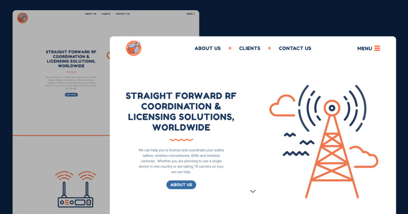
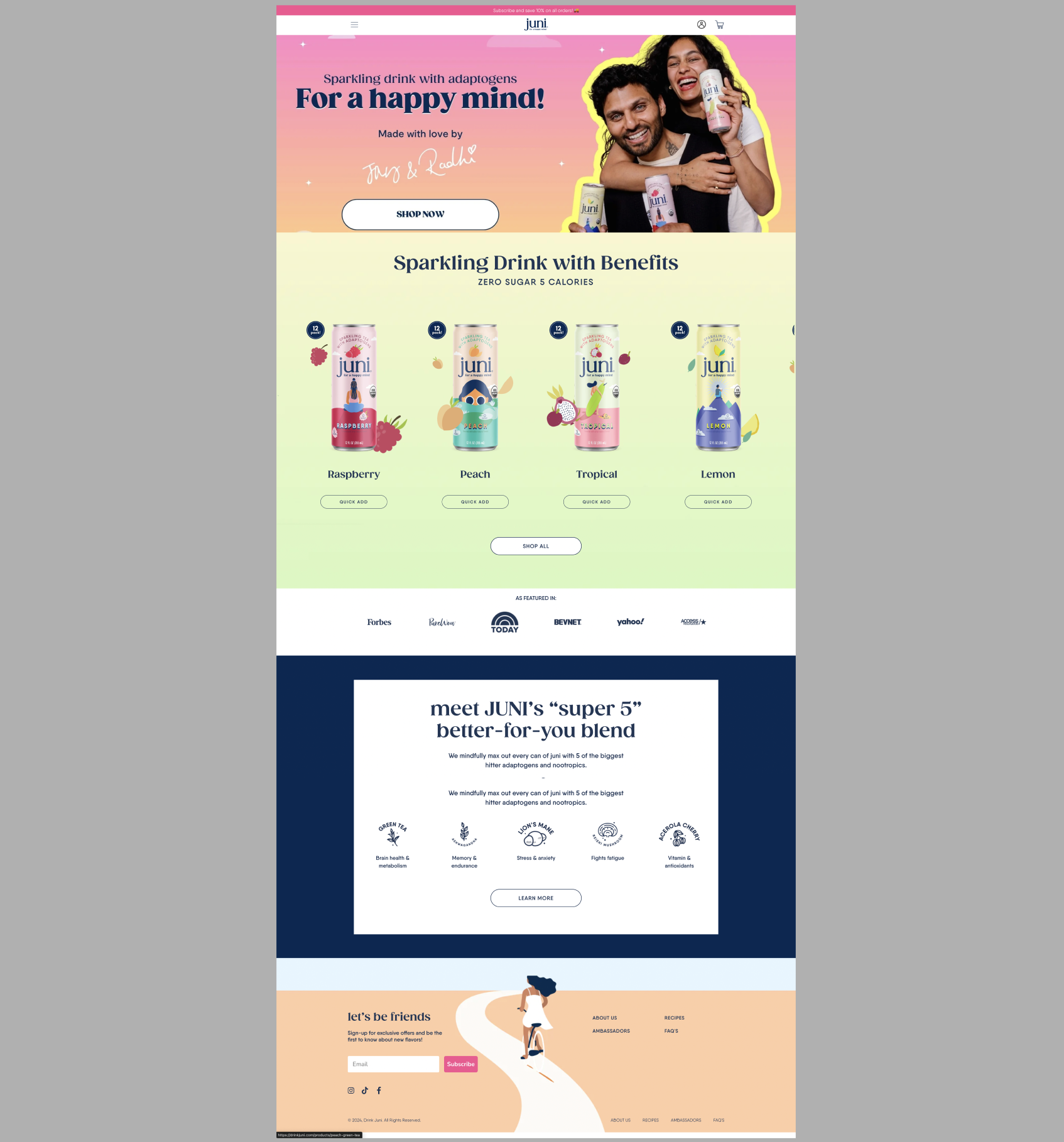
Navbar: Created a navbar. I debated whether to put all the menu items under the logo in the middle or toggle them under the “Shop” menu. I decided to place them all next to the logo for better visibility.


-
Hero Section: Designed the hero section. I considered making the button bigger but kept it consistent with the mobile version to maintain uniformity.
-
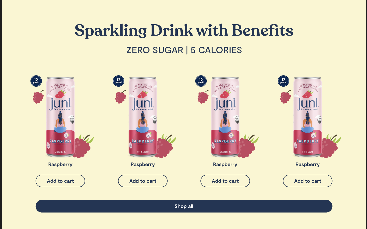
Product List Section: Created a product list section using the same products for now. I plan to add prototypes later.
-
Featured and Super 5 Sections: Designed the “Featured In” and “Super 5” sections, making the logos and icons larger than in the mobile version.
-
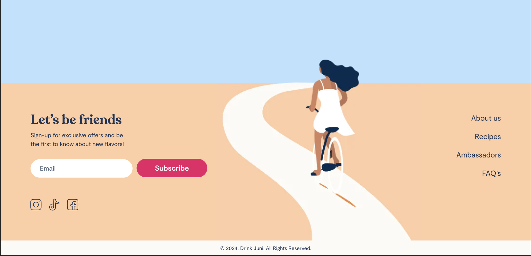
Footer: Created the footer. It’s similar to the mobile version but with a one-line email form and button. I placed the image in the middle. I liked their current website’s footer with the image above, but it didn’t work with the navy background, so I added a light blue section above the footer.
-
Horizontal Scrolling for Product List: Added horizontal scrolling to the product list. I forgot how to do it, so I watched a Figma course on Udemy.
-
Automatic Scrolling: Implemented automatic scrolling for the product list, but it was too fast since the maximum duration in Figma is 10 seconds. I decided to stick with manual scrolling. Even though I didn’t use auto-scrolling, it was a good learning experience.

-
Scroll Issue Fix: Realized I couldn’t scroll to the very right, so I added an empty frame on the right in the product list, giving the last product a right margin of 80 px.

Not enough space on the right end 
-
Shop All Button: My partner suggested making the “Shop All” button shorter, so I adjusted it.
🧠 Challenges and solutions
- Prototyping: I’m still getting familiar with prototypes, so I had to look up how to do auto and manual scrolling. I’m glad I reinforced this skill today!
- Mobile to Desktop Transition: Once I completed the mobile design, transitioning to the desktop design was much easier.
- My partner’s feedback:
- Navbar: looks a bit unbalanced, maybe the logo on the left or right?
- Header - sub-headline: a bit too big for a kicker
- Super 5 section - headline: line-height too tall
- Super 5 section - cards: more spacing below the icon
🖼️ The final design
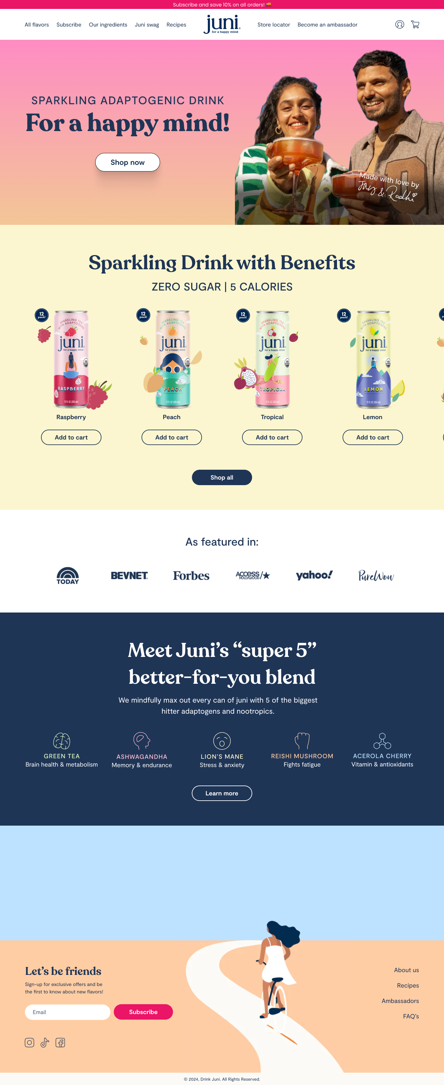
I’m pretty happy with today’s result. I can see myself getting more comfortable with using auto layout and prototypes!
💡 What I learned today
Comparing my redesign to the current website, I feel the new design is more breathable and user-friendly. I learned that less is often more for this specific website.
⏰ If I had more time
- I’d add other sections (I will do this and send my design to them today!).
- I’d make further adjustments based on my partner’s suggestions.
💌 Any thoughts?
What are you working on these days? I’d love to hear your thoughts on my design or any advice you might have!
Thanks for following along on Day 14 of my challenge. See you tomorrow for Day 15, almost halfway!
With love and light 🫶🏻
Yoshie
P.S. My partner and I went to the outdoor swimming pool yesterday. It was fun as always, but when we were getting ready to leave, a massive grasshopper jumped on my foot. For a microsecond, I thought it was Teto (our cat) and felt its warmth. I was terrified and shocked and couldn’t get that moment out of my head for a while (still scared thinking about it now) 😂. I’ve been living in the countryside for the last 9 months, but I guess I’m still a city girl at heart 🤷🏻♀️ 🏙️