🎨 Today’s design task
I’m back with another exciting day of my UI/UX Design Challenge. I saw a job post on Dribbble and decided to tackle some of the requirements as my challenge for today.
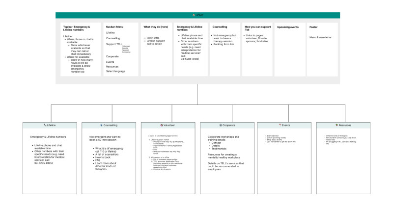
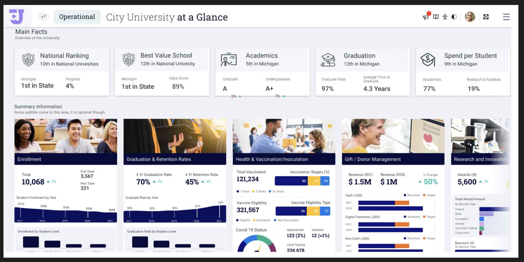
Task: Design the dashboard page based on the provided wireframe. (The requirement has a design of ‘Snapshot View’ page but I decided to do only At a Glance page for this challenge)
🚀 My design process
-
I read the requirements carefully to understand what I needed to do.
-
I studied the wireframe to get a clear picture of the Dashboard’s layout.
-
I researched Dribbble for Dashboard inspirations.
-
I sketched a rough draft of my envisioned layout.
-
I chose colours and typography based on the wireframe.

-
I decided to switch between Main Facts and Summary Info instead of cramming everything onto one page.
-
I added a navbar with their logo.
-
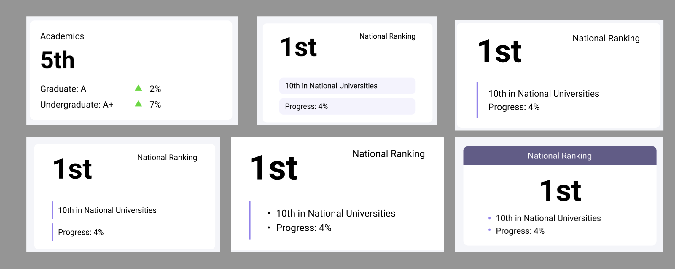
I experimented with card designs on the Main Facts page (this took a lot of time and was quite confusing).
-
I tested different designs for the Summary Info card.
-
On the first card of Summary Info, I decided to merge two graphs into one.
-
I ran out of time to design all the cards and create tablet and mobile versions.
-
I made final adjustments with spacing, colours, and alignments for what I had completed.
🧠 Challenges and solutions
- First time working with a graph: Finding good designs on Dribbble made this easier.
- Overwhelming information: The wireframe was packed with data, which was initially confusing. Spending extra time reading the requirements and analyzing the wireframe proved beneficial.
🖼️ The final design
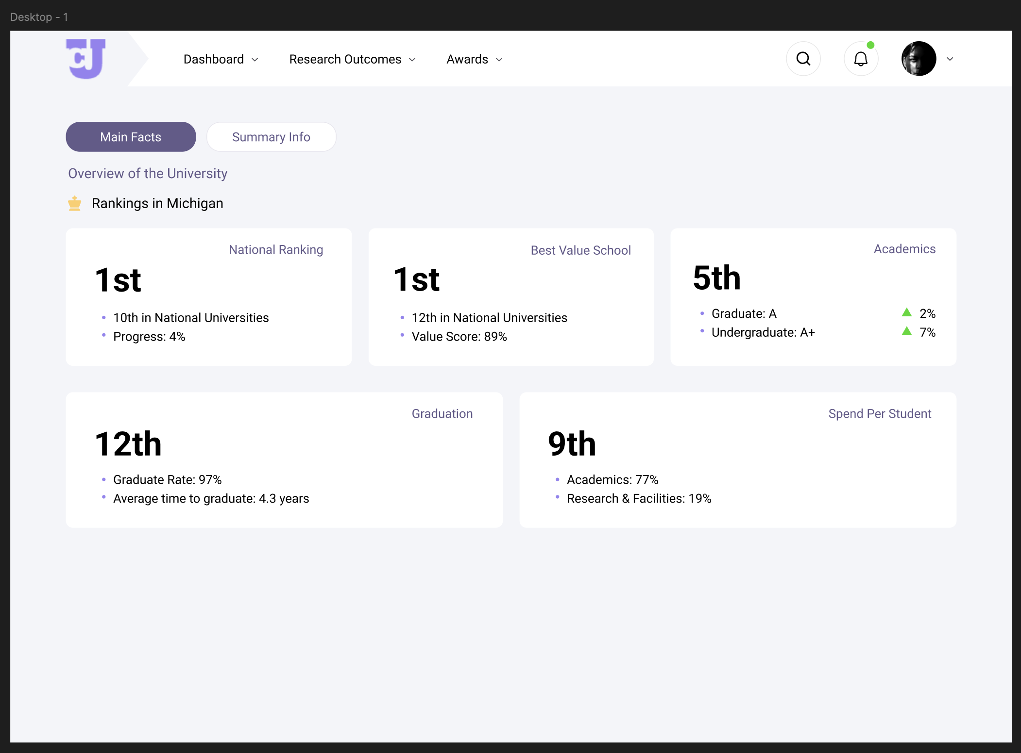

I’m pleased with today’s outcome. I believe the process will speed up as I gain more experience, so I’m acknowledging my current capabilities. (I am following what I committed doing this challenge; being kind to myself 🥰)
💡 What I learned today
Understanding and categorising content was crucial due to the high volume of information and data. I learned that when working with clients, taking the time to thoroughly understand the content will be essential.
⏰ If I had more time
- I’d finish designing all the cards.
- I’d find a more friendly profile photo. 😂
- I’d add rounded corners to the graph rectangles. I made them as lines and didn’t have time to replace them with rectangles.
💌 Any thoughts?
What are you working on these days? I’d love to hear your thoughts on my design or any advice you might have!
Thanks for following along on Day 11 of my challenge. See you tomorrow for Day 12!
With love and light 🫶🏻
Yoshie
P.S. Since I spent a lot of time on this design, I plan to send an email to the company with my work, including additional tablet and mobile designs I will probably create in the coming days. I haven’t completed the entire design and don’t have much experience (they seem to be looking for a skilled designer), but it’s great practice for me to interact with potential customers and get used to rejections. 😆