🎨 Today’s design task
Despite feeling a bit tired from a late night, I was excited about today’s task: creating a wireframe for a medieval artist’s portfolio website. It’s a two-day project, but my partner helped me break it down into manageable steps. As a fan of medieval art (thanks to playing Pentiment), I was thrilled to work on this.

The task:
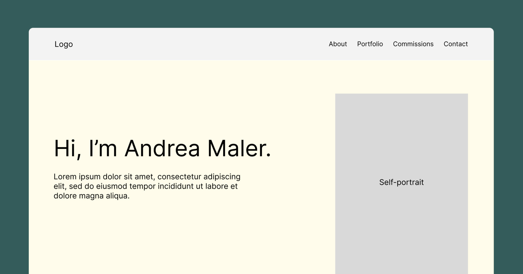
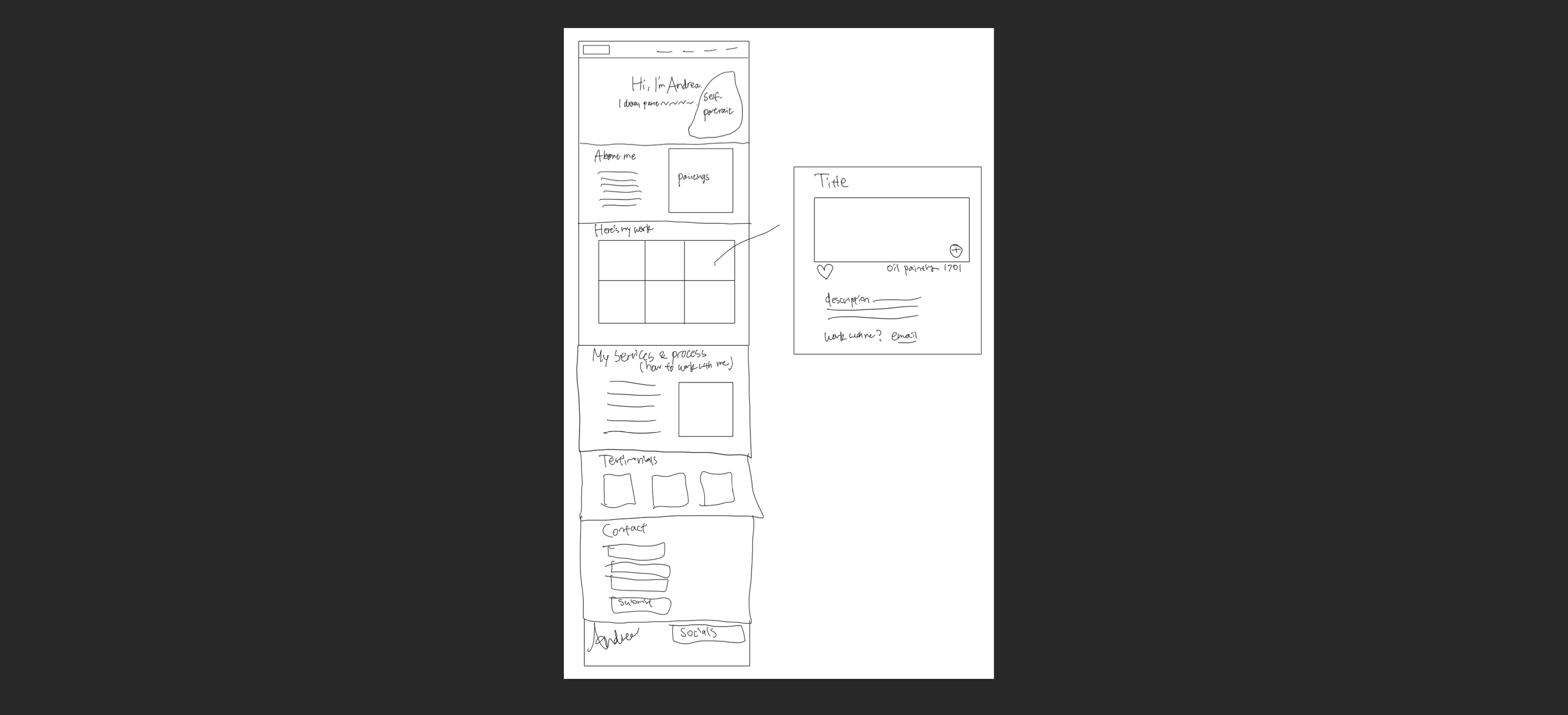
Create a lo-fi design for a single-page portfolio for Andreas Maler, including a header, hero section, about, portfolio gallery, commissions, testimonials, contact form, and footer. I decided to make a lo-fi design of a modal to prepare for tomorrow.
🚀 My design process
-
Got inspiration from the Pentiment video game website.
-
Created a mood board using images from the website.

© 2024 Obsidian Entertainment, Inc. -
Sketched initial ideas on my new iPad (a surprise gift from my partner!).
-
Transferred my sketch to Figma, making minor adjustments.
🧠 Challenges and solutions
- I’ve been designing sections, not an entire web page, so it was easy to go right ahead with hi-fi design. Today I learned the importance of doing lo-fi design to see the entire page so if I am actually designing a web page or a whole website, I know which section I am working on and what’s left. It helped me see the big picture.
- Working without colours was a bit dull, but I recognised its importance in the design process.
🖼️ The final design

My lo-fi design is simple and straightforward. I’m excited to work with colours and design the art section tomorrow!
💡 What I learned today
Lo-fi design is quick but valuable. It helps me appreciate colours and typography more. I realised I’ve been doing this step on my sketch in previous days, but I’ll make sure to include it in Figma from now on.
⏰ If I had more time
- I’d spend more time on the Hero section to make it more engaging, perhaps centring the self-portrait.
💌 Any thoughts?
What are you working on lately? I’d love to hear your thoughts on my design or any advice!
Thanks for reading until the end of Day 3 of my challenge. See you tomorrow for Day 4!
With love and light 🫶🏻
Yoshie
P.S. I’m so grateful for my new iPad. As a child, I enjoyed drawing but gave up thinking I had no talent. Now, 20 years later, I’m giving it another shot, focusing on learning rather than relying on talent. I might share some artwork here too!