🎨 Today’s Design Task
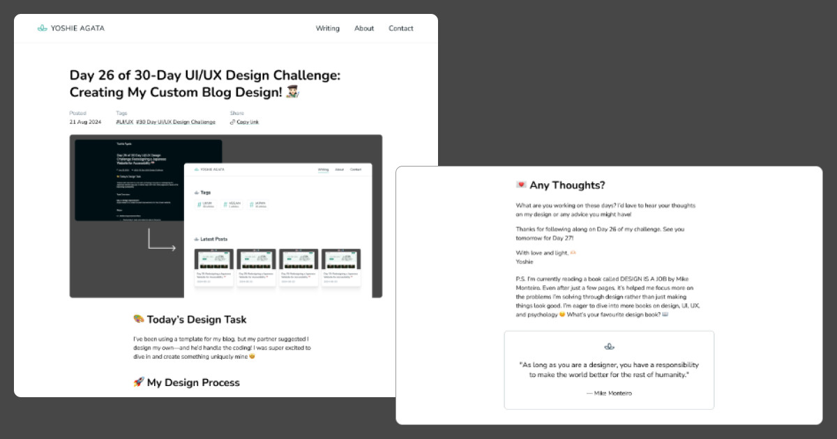
I was really excited about today’s task! After designing the overall layout for my blog yesterday, I focused on designing how each article page would look.
🚀 My Design Process
-
Component Research: I started by examining other blog articles to identify the components I wanted to include in my design and made a list.
-
Initial Layout Testing: I added some of my existing blog content to the design to experiment with image and text sizing. I increased the body text size for better readability.
-
Element Creation: I created all the necessary elements based on my list of components. You can see the image later on The Final Design.
-
Layout Adjustments: While positioning elements, I realized that placing the date, tags, and share link immediately after the title improved the layout. I made that adjustment.
-
Recreating a Blog Article: Once all elements were in place, I recreated my blog article from yesterday using the new design.
-
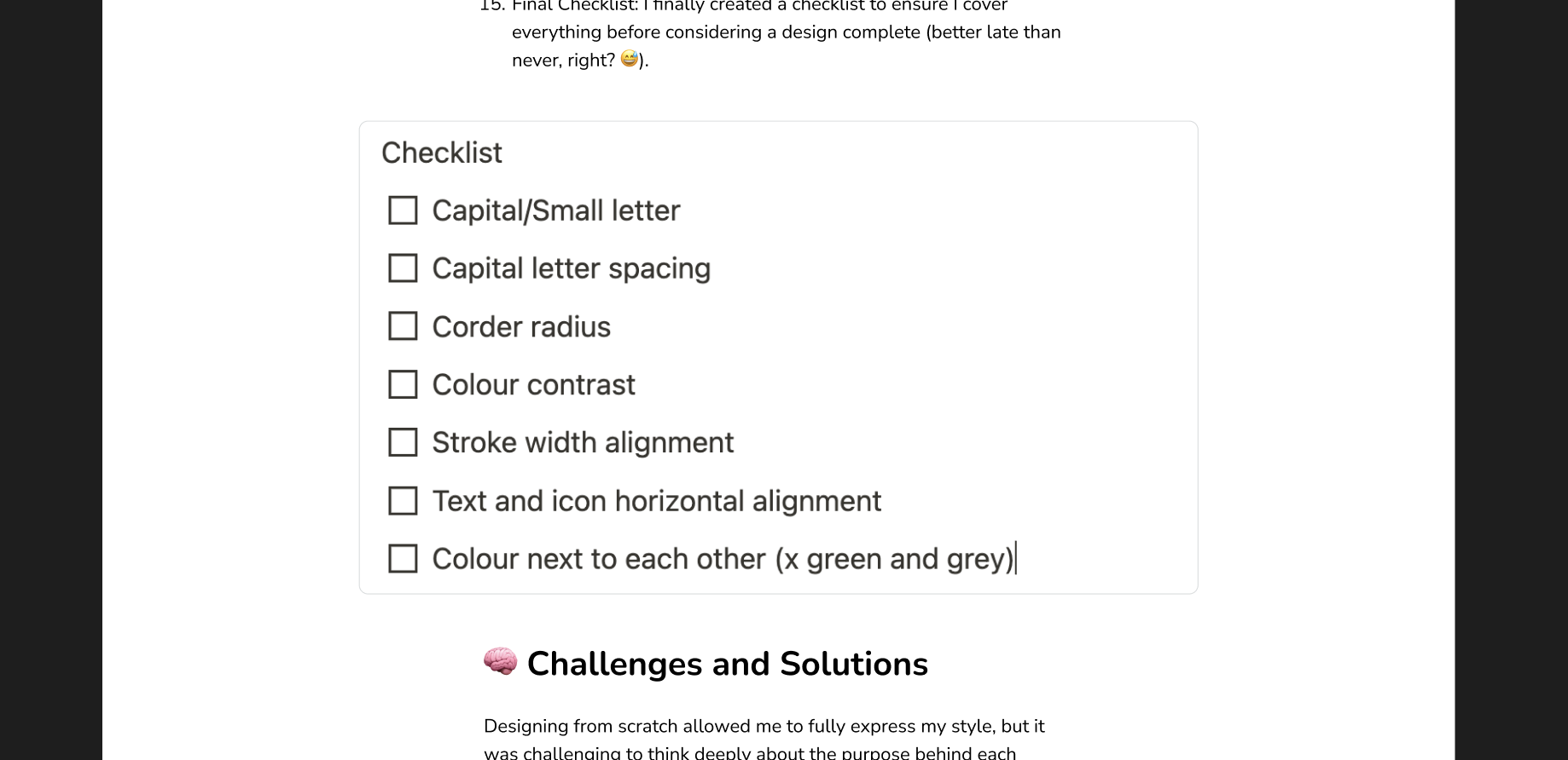
Added Features: I included a quote and a photo gallery as examples to test the design.
-
Feedback and Refinements: After getting feedback from my partner, I made the following adjustments:
-
Added a divider for articles without an Open Graph image.
-
Implemented consistent list and paragraph spacing (set to 20) instead of using blank lines.
-
Added a light grey stroke to images for better separation from the background.
-
🧠 Challenges and Solutions
- Dark Background Consideration: I didn’t initially account for white images against the dark background. This was a learning opportunity, and I’ll be more mindful of contrast moving forward.
- Image Sizing: I spent considerable time experimenting with image sizes. While I ensured that the maximum number of characters per line stayed below 80 for readability, I wanted the images to stand out without being too wide. After some trial and error, I found a good balance!
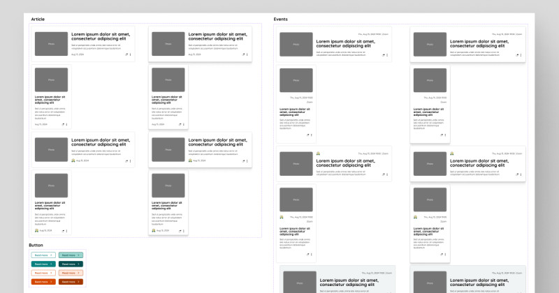
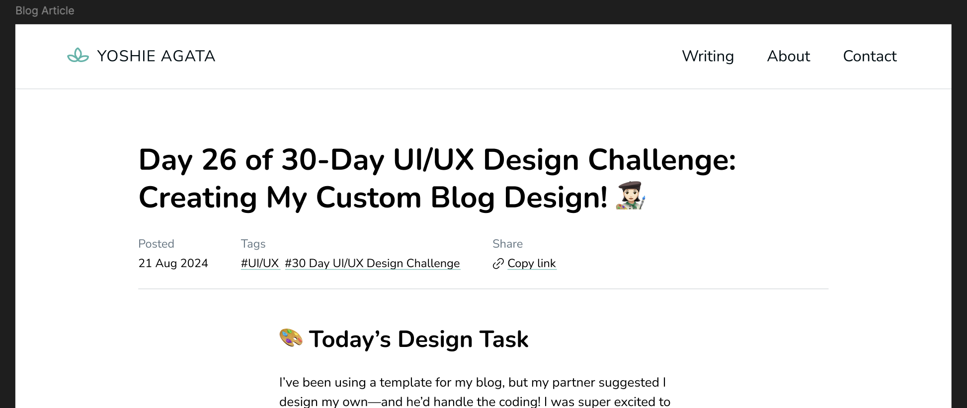
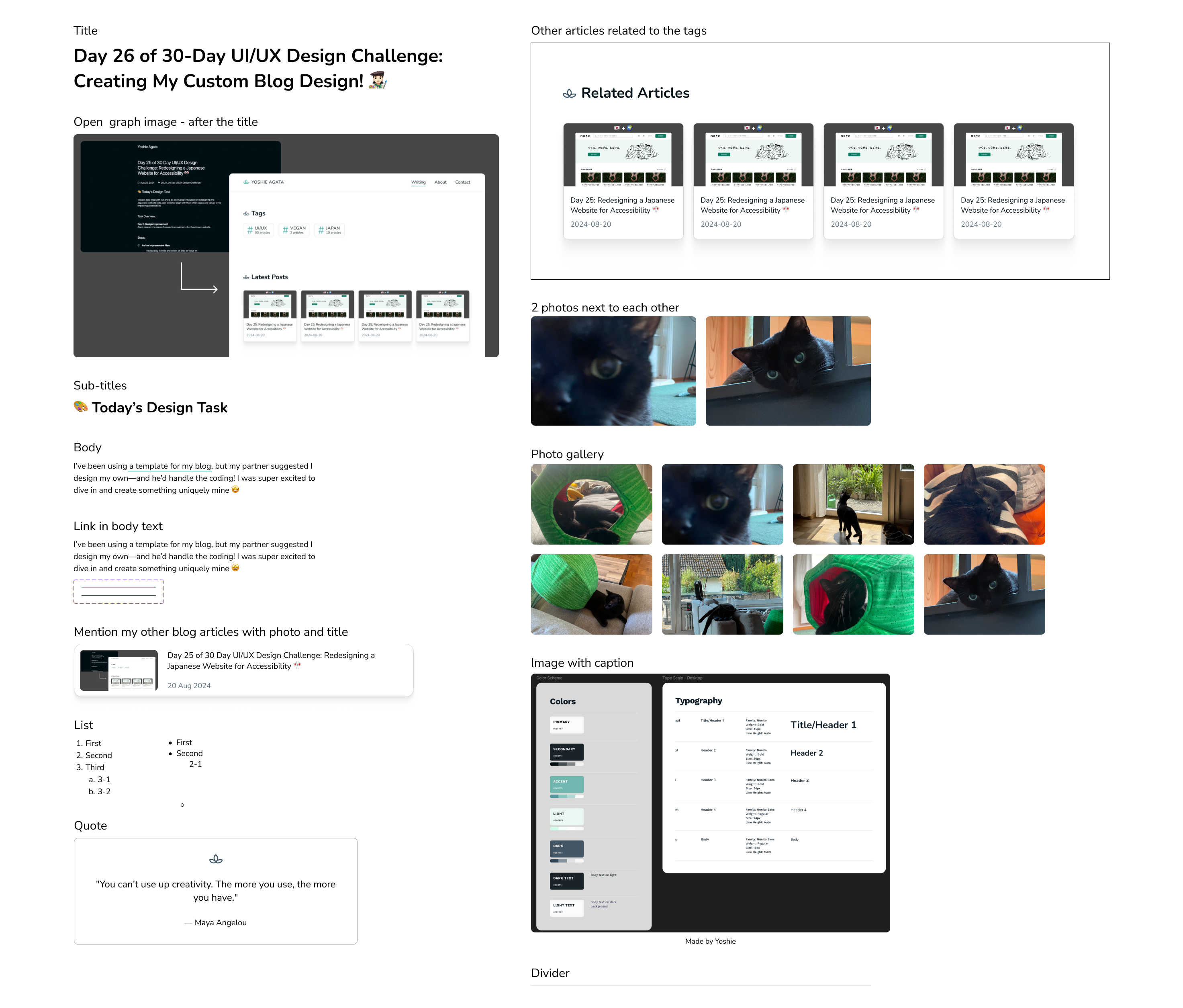
🖼️ The Final Design
The whole design of yesterday’s article is a bit too long so here is the image of a list of elements I made:
I’m really happy with the final design and can’t wait to see it implemented! ☺️
💡 What I Learned Today
Exploring other blog articles taught me that there are countless elements you can include in an article page. However, it’s crucial not to overwhelm readers with too many links and buttons. Instead, focus on providing what they really need, in a clear and accessible way.
⏰ If I Had More Time
- I’d experiment with a dark mode version to see if I prefer it over the light mode.
- I’d explore other designers’ blogs for more inspiration and to discover interesting articles that could enhance my learning.
💌 Any Thoughts?
What are you working on these days? I’d love to hear your thoughts on my design or any advice you might have!
Thanks for following along on Day 27 of my challenge. See you tomorrow for Day 28!
With love and light 🫶🏻
Yoshie
P.S. Only 3 days left in this challenge! It’s been tough at times, but mostly a lot of fun. I can be inconsistent and lazy, so having this challenge has really helped me stay focused and learn something new every day. To keep this momentum going, I’m thinking of starting another challenge after the current one—any suggestions? ☺️🙏