“Alt text is just the text that shows up when an image doesn’t load, right?”
That's what I thought when I was a software engineer. Sometimes I’d throw in a file name as alt text, and other times I’d skip it entirely. What I didn’t realise back then was that alt text is not optional, it’s essential.
By the end of this article, you’ll know why alt text is so important, how to write it effectively, and how it benefits both your users and your SEO.
Why Is Alt Text Critical?
For sighted users, they understand non-text content like images by looking at them. However, for those with visual impairments, alt text provides an alternative way to understand images through assistive technologies like screen readers or braille devices.
Imagine an image of a black cat lying on its back on a green blanket, sunlight streaming over its exposed belly. With this text, you can understand the information in the image.
Adding descriptive alt text makes your website’s non-text content accessible to a broader audience.
What Counts as Non-Text Content?
According to WCAG (Web Content Accessibility Guidelines), any non-text content that conveys meaning counts as an image. This includes:
- Photographs, illustrations, and 3D renderings
- Graphs, charts, and infographics
- Icons, animations, and decorative visuals
However, purely decorative images like a line separator or a background pattern don’t require alt text. Instead, they should have a null alt attribute (alt="") so assistive technologies can ignore them.
Pro tip for developers:
Leaving out the alt attribute is not the same as using alt="". Without an alt attribute, screen readers will announce the image file name, which is often unhelpful.
Why I Add Alt Text to Images that Don't Require Alt Text
Even for decorative images, I often add alt text for two reasons:
- Partial visual impairments: Some users may see part of an image but not enough to understand it fully. Alt text bridges that gap.
- Emotional impact: Images can evoke feelings that enrich the user experience. For instance, alt text like "A blue sky with fluffy white clouds" can convey calmness and openness to all users, regardless of their visual ability.
That said, if you decide to make an image ignored by assistive technologies, make sure to mark it as such using alt="".
How to Write Descriptive Alt Text
Follow these simple tips for writing effective alt text:
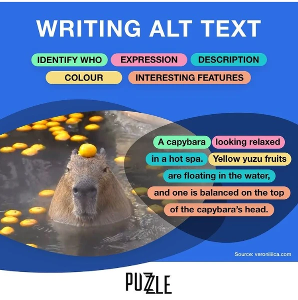
- No need to add “image of” or “picture of" since screen readers already indicate it’s an image.
- Focus on clarity and relevance. The description should provide as much detail as the image’s purpose requires.
This is a great example:

If you want to learn more, you can read "How To Write Alt Text and Image Descriptions for the Visually Impaired" by Veronica.
But Isn't It A Lot Of Work to Add Alt Text to Images?
I understand that it feels like a lot of work without getting much reward. But consider this:
It's a great opportunity to make your website or app more accessible and user-friendly by:
- Removing images that distract or don’t align with your brand.
- Removing generic stock images or replacing them with more meaningful visuals.
- Considering how alt text can be translated for multilingual sites.
Alt text doesn’t just make your website accessible, it boosts SEO too!
Search engines use alt text to understand and index images, improving your visibility in search results.
Time for a small adjustment
Whether you’re a designer, developer, editor, or business owner, try navigating your website using a keyboard and screen reader. Testing your product with assistive tools helps you see the user experience from every perspective!
Thank you for reading until the end. Hope this was helpful for you!
Have a wonderful day 🥰
Yoshie
p.s. Here is the image of a black cat lying on its back on a green blanket, sunlight streaming over its exposed belly, which I used as an example in this article. Our family member, Teto 🐾:


