Today’s task was both fun and a bit confusing! I focused on redesigning the Japanese website note.com to better align with their other pages and values while improving accessibility.
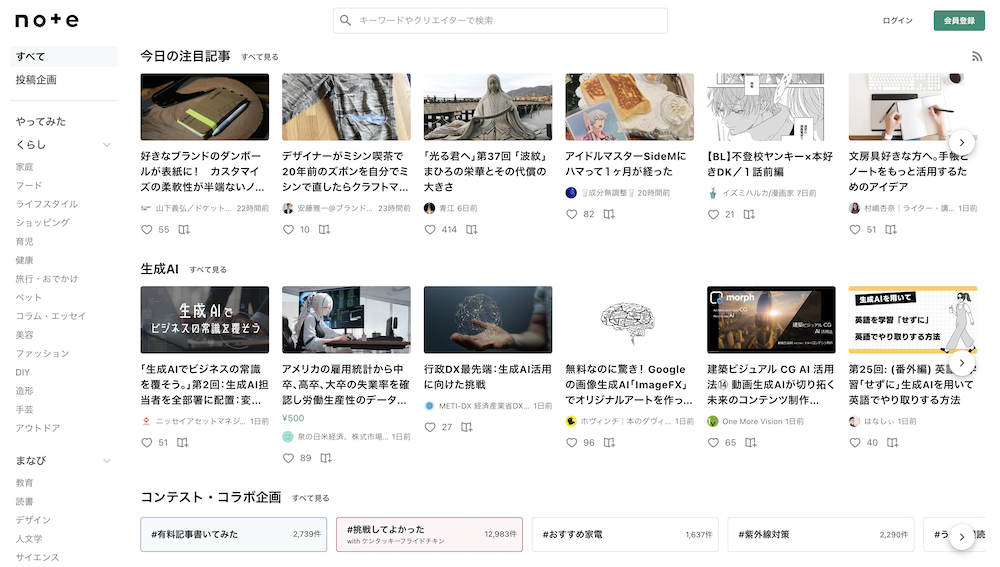
The current website:
Task Overview:
Day 2: Design Improvement
Apply research to create focused improvements for the chosen website.
Steps:
Refine Improvement Plan:
Review Day 1 notes and select an area to focus on.
Sketch your improvement idea.
Design Implementation:
Create a mockup using Figma or Penpot.
Ensure the design respects Japanese web design principles while enhancing usability.
Reflection and Documentation:
Write a brief explanation of your design decisions.
Highlight how your improvement aligns with Japanese user expectations and enhances the overall user experience.
Considerations:
Understand and respect Japanese user expectations.
Aim for culturally appropriate improvements rather than a complete redesign.
Consider how changes might be perceived by a Japanese audience.
Balance information density and visual appeal, which is common in Japanese web design.
🚀 My Design Process
I reviewed my notes from Day 24 and decided to focus on improving readability without significantly reducing the information density.
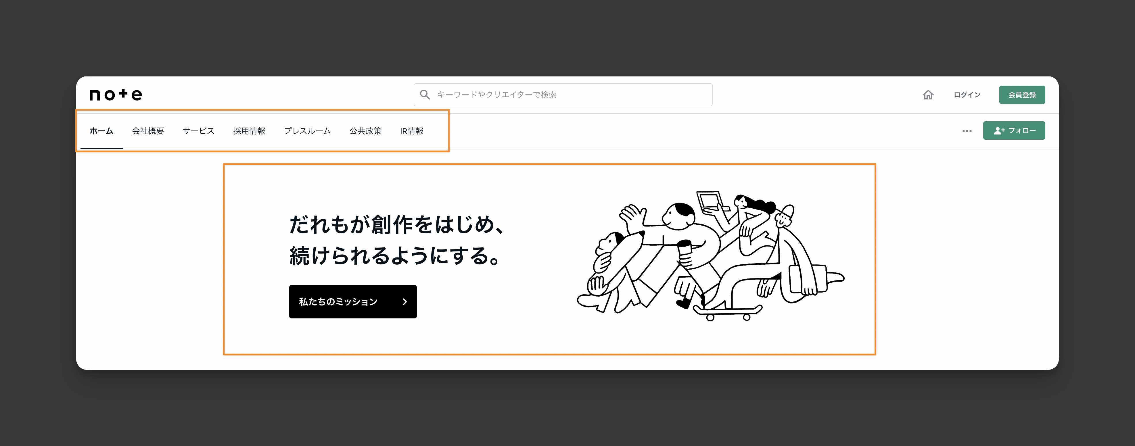
I read the note.com mission statement and aimed to make the redesign align more closely with their values. Other pages of their website look more like a Western-style website.
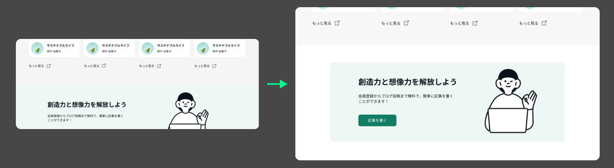
For example, a simple nav bar and hero section:
More white space:
I explored other Western blog websites like Dev Community, Substack, and Vocal Media for inspiration.
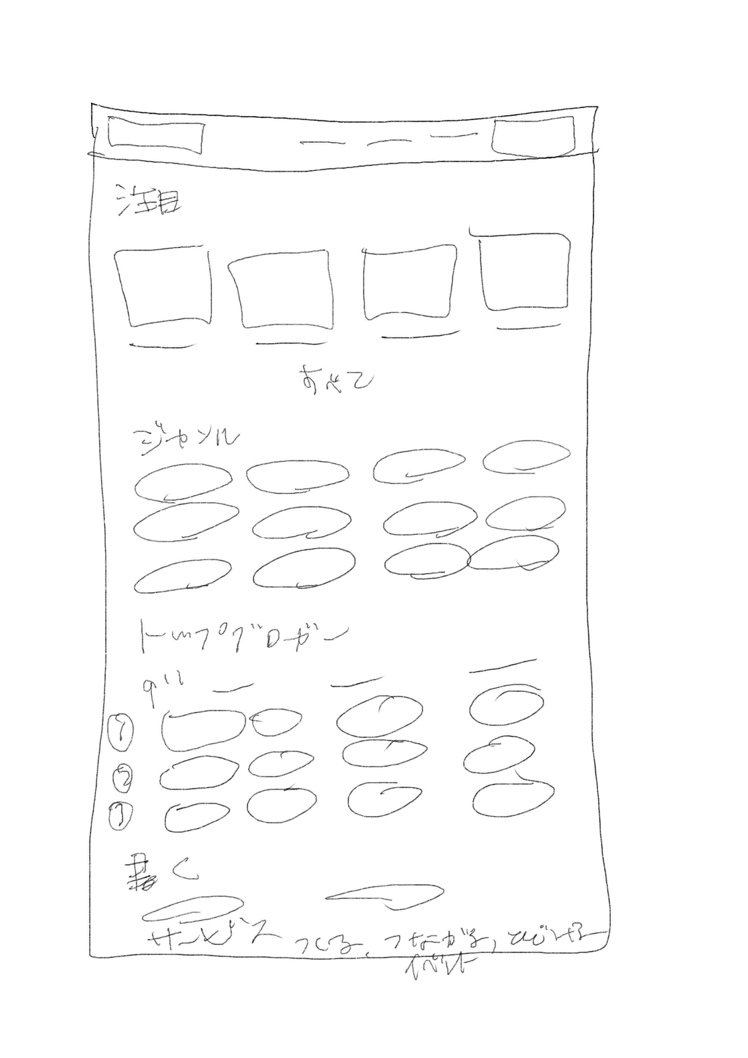
I sketched a lo-fi design concept.
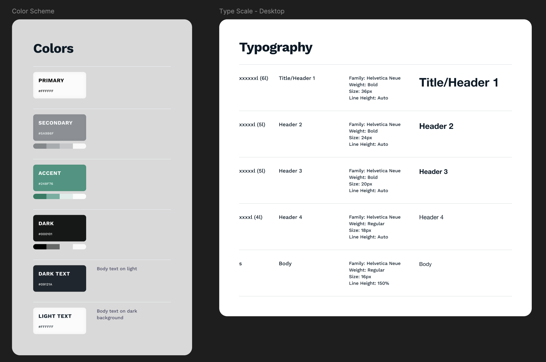
I created a style guide for colours and typography.
I built a lo-fi design in Figma, starting with the header, and adding a cute image I found on their site.
I designed the navigation bar with a focus on creating an account (placed as a button on the right) and a prominent search bar in the centre.
I simplified the hero section, keeping it short with a clear call to action (“Read”) and guiding users to select a genre or view today’s popular articles.
The first section showcases “Today’s Top Articles” with 4 cards per row and a “Load More” option on the top right. I experimented with button styles but kept it simple, as Japanese characters are visually strong without additional elements.
Inspired by Ameblo, I added sections for popular topics, genres, and bloggers.
I created a “Write Your Article” section to support note.com’s mission of empowering creators.
I highlighted events and added another “Create an Account” button.
I designed a simple footer with the logo, menu, and social media links.
I made revisions based on my partner’s feedback:
Grouped article cards visually.
Horizontally centre the “Load More” text and icon.
Adjusted clashing green and grey backgrounds.
Ensured event cards had equal spacing inside vertically and horizontally.
Toned down and changed the shape of non-interactive tags to differentiate from buttons visually.
Increased the border radius for event cards and the newsletter box.
🧠 Challenges and Solutions
Working with grey and green was tricky, and I realised I needed to improve my colour theory skills.
I didn’t want to reduce the content too much but I think I ended up reducing a lot from the homepage. I think less content makes it easier for users to actually click on an article and read it. However, I don’t know enough about how Japanese users consume information and how they interact on websites.
🖼️ The Final Design
Key Focus Areas:
Alignment with Style and Values:
Simplified menu at the top.
Hero image with note.com’s art.
Increased white space.
Fewer horizontal elements.
Readability:
Larger font sizes.
Clearer typography hierarchy.
Darkened green for better contrast with white text on buttons.
💡 What I Learned Today
Attention to detail is crucial. The suggestions my partner made were points they’d mentioned before, which means I need to develop a checklist to systematically review my designs before calling them finished.
⏰ If I Had More Time
I’d delve deeper into understanding how Japanese users interact with websites.
I’d explore more effective ways to incorporate their signature green colour.
💌 Any Thoughts?
What are you working on these days? I’d love to hear your thoughts on my design or any advice you might have!
Thanks for following along on Day 25 of my challenge. See you tomorrow for Day 26!
With love and light 🫶🏻
Yoshie
P.S. I was surprised to see so many clicks on my blog about vegan milk! I’m considering creating a list of vegan meats, yoghurts, and other foods my partner and I enjoy. It’s a lot of work with photos, ratings, and comments, but it’s fun, and I hope it helps others—lovely vegans and non-vegans! Maybe I’ll include some Japanese recipes we make here in Germany 🇩🇪 🇯🇵 👀