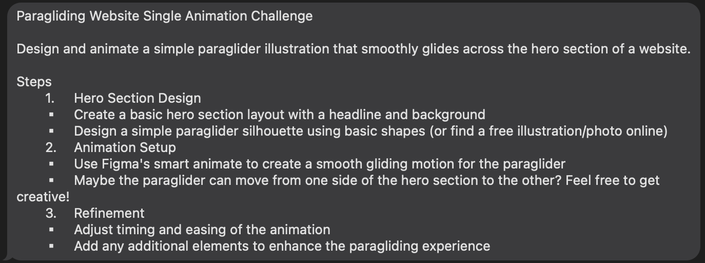
🎨 Today’s Design Task
Today’s task was something I knew I’d have to tackle eventually, so I’m glad I took it on!
See task description
🚀 My Design Process
-
Understanding the Task: I carefully read the task to ensure I knew exactly what was required.
-
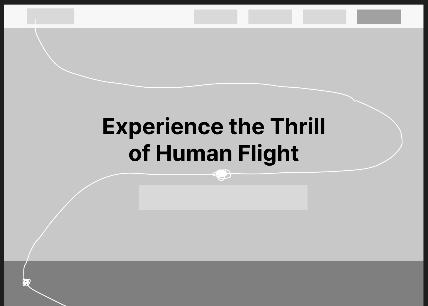
Lo-Fi Design: I started by creating a lo-fi design of the navigation bar and hero section, adding a path for a paraglider silhouette.
-
AI Assistance: I used AI to generate a fictional paraglider company, complete with a name, headline, and colour scheme.
-
Icon Collection: I gathered paraglider icons from Streamline for use in the design.
-
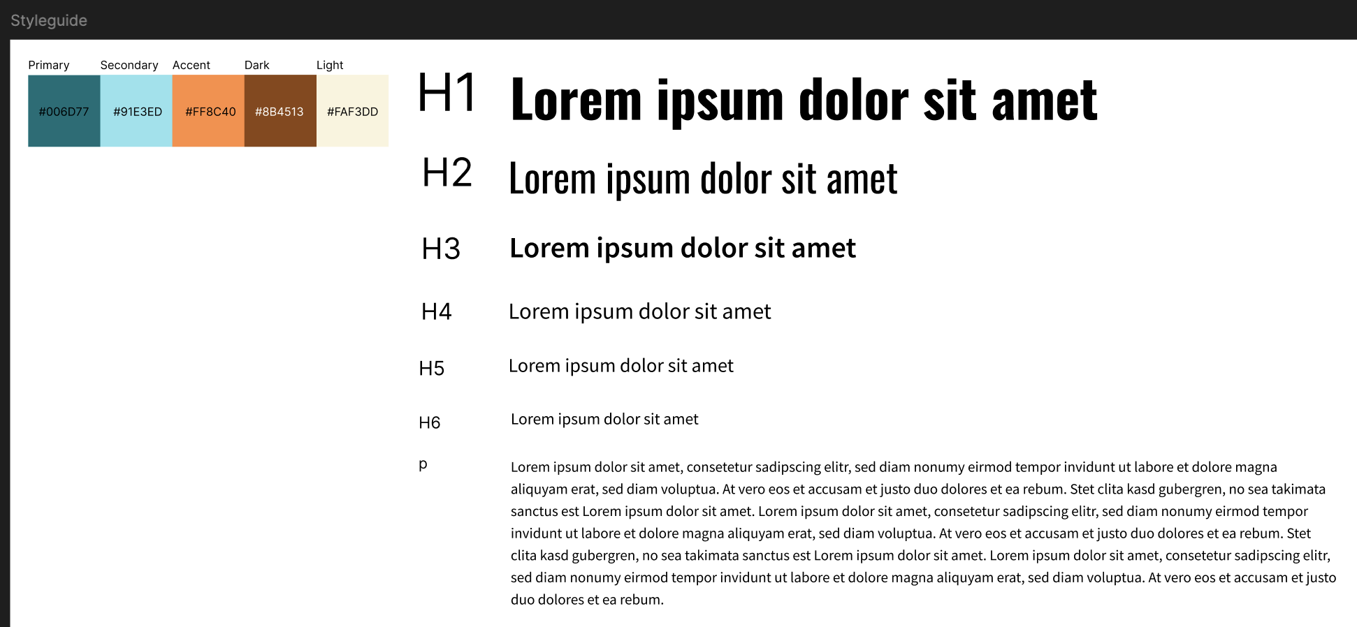
Color and Typography: I selected colours and typography that matched the brand concept.
-
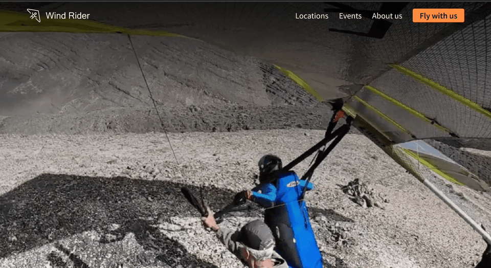
Hero Image: I found a paraglider video for the hero section and converted it into a GIF since I don’t have Figma Pro.
-
Logo Creation: I designed a logo to tie the brand together.

-
Another Animation Work: I created animations with delay.
-
Another Animation Work: I created animations with smooth mouse enter effects.

-
Design Adjustment: Realising that both a video and an animated icon in the header were too much, I replaced the video with an image.
-
Icon Placement: I moved the icon animation to the section below the header to reduce visual clutter.
-
Headline Addition: I added a clear and compelling headline to the design.
🧠 Challenges and Solutions
- Figma Limitations: As a former software engineer, I found Figma’s animation tools a bit frustrating.
- Finding the Right Resources: While there are many Figma tutorials online, finding exactly what I needed was challenging. I’ll need to streamline my learning process for future tasks.
🖼️ The Final Design

💡 What I Learned Today
Adding movement to a website is fun, but it’s crucial to balance it with other design elements to avoid overwhelming users.
⏰ If I Had More Time
- I’d add more sections and create a full page with paraglider animations. It would be cool if the paraglider returned to the logo in the footer!
- As my partner pointed out, having a video in the header is key for a paraglider company, so I need to find ways to make the video engaging without distracting from the main call to action.
💌 Any Thoughts?
What are you working on these days? I’d love to hear your thoughts on my design or any advice you might have!
Thanks for sticking with me through Day 20 of my challenge. I can’t believe I’m already two-thirds of the way through! I’m excited for the upcoming challenges. See you on Day 21!
With love and light 🫶🏻
Yoshie
P.S. A few days ago, my partner and I finished watching Frieren: Beyond Journey’s End. It was amazing. I’m usually hesitant to start a new anime, but I’m glad I gave this one a chance. The biggest takeaway for me was that nobody is perfect. But by trying to understand each other, putting ourselves in each other’s shoes, and communicating openly, we can resolve conflicts and build deep connections. Can’t wait to dive into the new manga next!