🎨 Today’s design task
Another exciting morning!

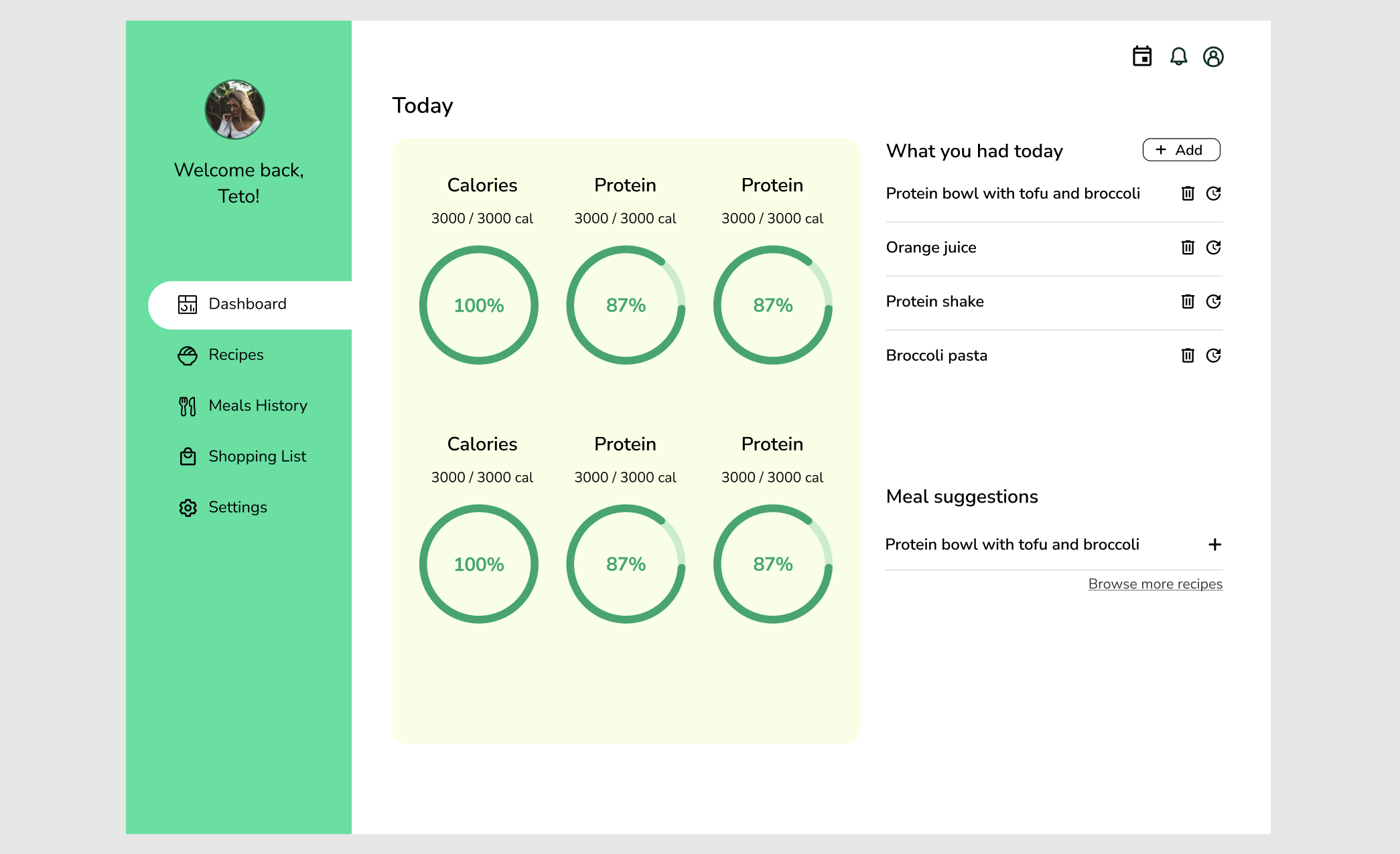
Today’s project is a nutrition dashboard with a green theme. As a vegan who loves green, this task really resonates with me, even though I’m not a nutrition expert.
🚀 My design process
-
I started by sketching my initial ideas on paper. My experience with dashboard design as a software engineer came in handy!

-
I researched daily nutritional needs and how they’re measured.
-
I chose colours and typography (Nunito, Nunito Sans), inspired by designs from Google and Dribbble.


-
Firstly, I made a menu on the left side.

-
I found a great pie chart design (Circle Chart by Pavel) in the Figma community. <- This took a lot of time 😅
-
I added icons using the Iconify plugin in Figma.
-
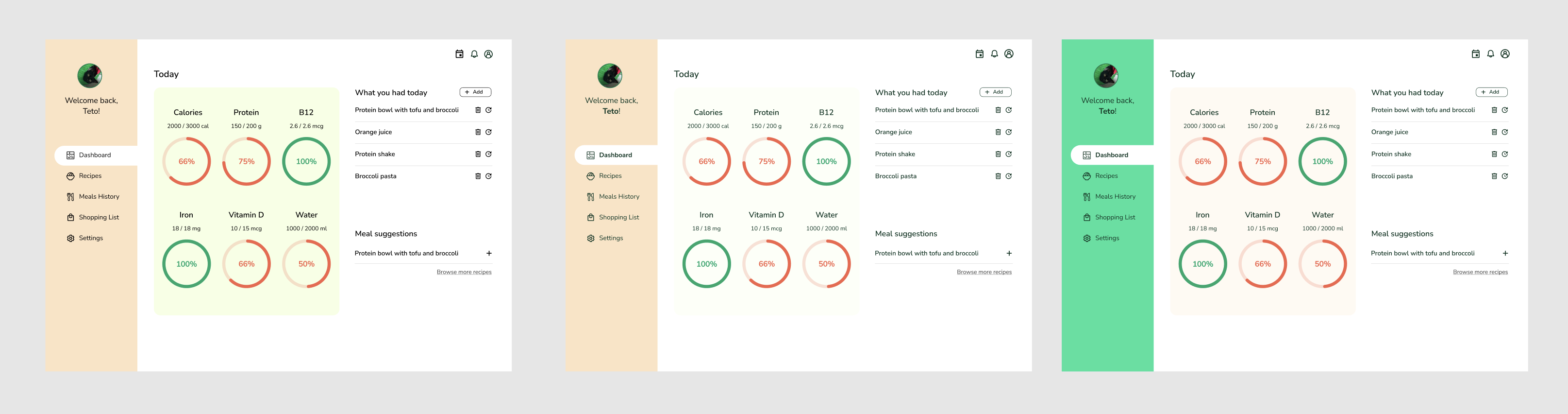
I experimented with colours, using an accent colour for unachieved nutrition goals. (I also snuck in a photo of my cat, Teto, as the profile picture!)
-
Finally, I settled on the colour scheme.
🧠 Challenges and solutions
- Working with green was trickier than I expected.
- Since I’m not big on nutrition apps (except for tracking water, B12, and D), it was a bit challenging to stay engaged.
- My mentor, Thomas Sensei, suggested some tweaks to the background brightness and vertical alignments, which I implemented.
🖼️ The final design
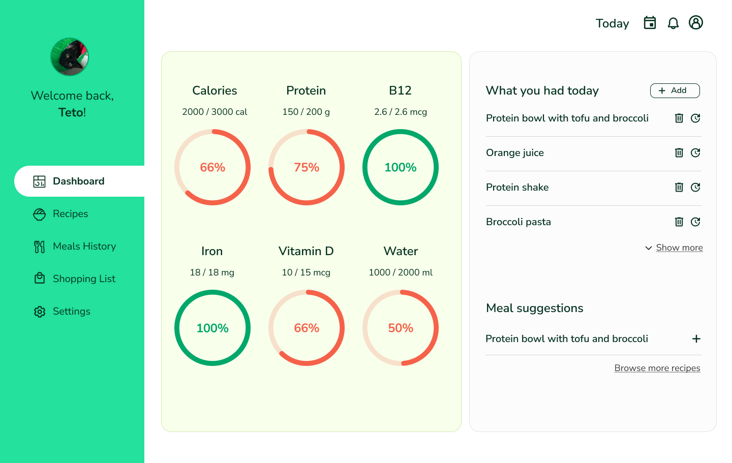
I’m pretty happy with day two’s result. I can’t wait to look back on this later and see how far I’ve come!
💡 What I learned today
Maintaining consistency with buttons and other elements can be tricky. I think I did okay using similar colours and icon styles, but there’s definitely room for improvement.
⏰ If I had more time
- I’d adjust the stroke width of the icons to make them more uniform.
- I’d add some animations to make the dashboard more dynamic.
💌 Any thoughts?
What are you working on these days? I’d love to hear your thoughts on my design or any advice you might have!
Thanks for following along on Day 2 of my challenge. See you tomorrow for Day 3!
with love and light 🫶
Yoshie
p.s. We found this vegan chocolate pudding in Edeka yesterday.
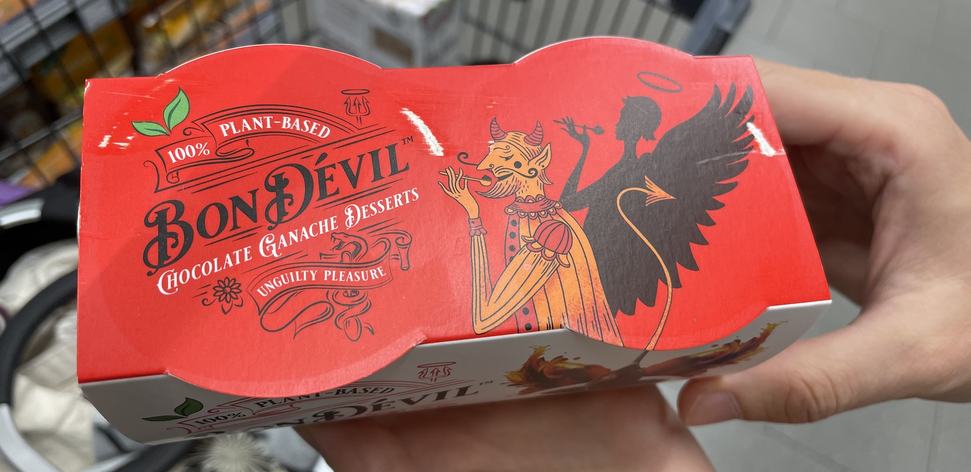
I love the design and concept. Super cool. And the chocolate pudding is possibly the best I’ve ever had! Unfortunately, their website isn’t very accessible. I might do a challenge to improve some websites so this one could be a good one 😚