🎨 Today’s design task
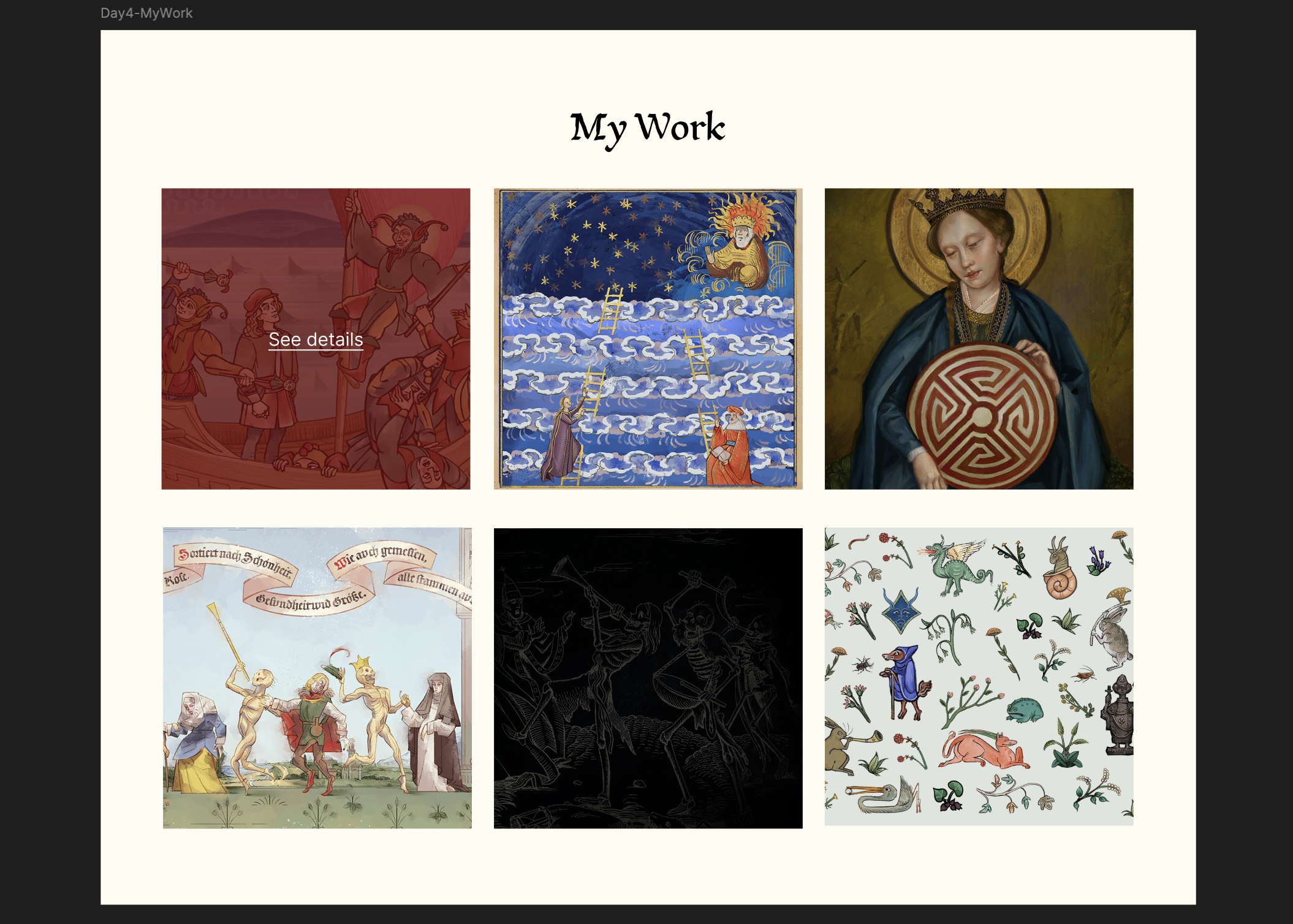
I was so excited about today’s task that I even dreamed about it last night! 😂 Today, I’m building on yesterday’s wireframe by designing the Portfolio Gallery section for Andreas Maler, capturing his unique art style and the game’s aesthetic.
Design the Portfolio Gallery section from your wireframe, capturing the essence of Andreas Maler’s art style and the game’s aesthetic:
- Design a way to display 6-8 artwork thumbnails
- Create a detailed view for one selected artwork, including:
▪ Larger image of the artwork
▪ Title of the piece
▪ Year created
▪ Medium used
▪ Brief description or artist’s statement- Add an interactive element (e.g., zoom function, comparison tool showing before/after restoration)
- Ensure the design reflects both Andreas’ 16th-century setting and modern usability
Aim to create a design that feels authentic to Andreas Maler’s character and time period while still being accessible to a modern audience.
🚀 My design process
-
Started with copying and pasting yesterday’s lo-fi “my work” section
-
Downloaded Pentiment’s fankit for fonts and images
-
Added 6 of Andreas Maler’s paintings to “my work” section
-
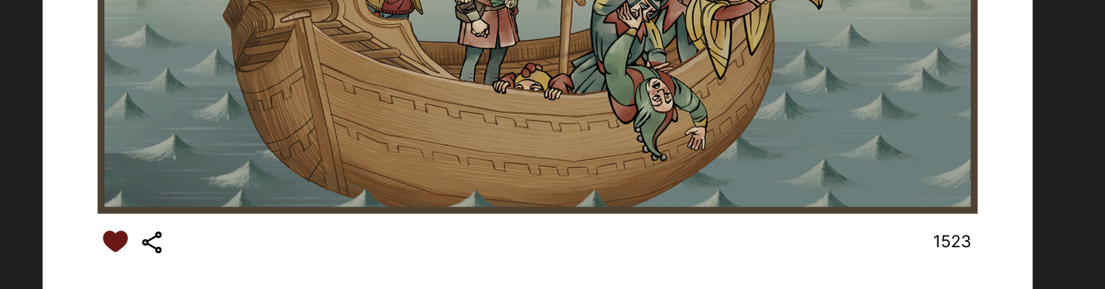
Created a modal for “The Ship of Fools” with an AI-generated description
-
Designed interactions:
- Instagram-style heart for likes
- Toggle for colour/line drawing versions
-
Adjusted background colours to match toggle status
-
Added hover effect on “The Ship of Fools”
-
Implemented prototypes for hover and click effects
🧠 Challenges and solutions
- Struggled with font installation (restarting Figma helped)
- Balancing Andreas’ dark colour palette was tricky
- I just love Medieval age art style so I simply enjoyed looking at them. I would love to draw and paint in this style one day!
🖼️ The final design


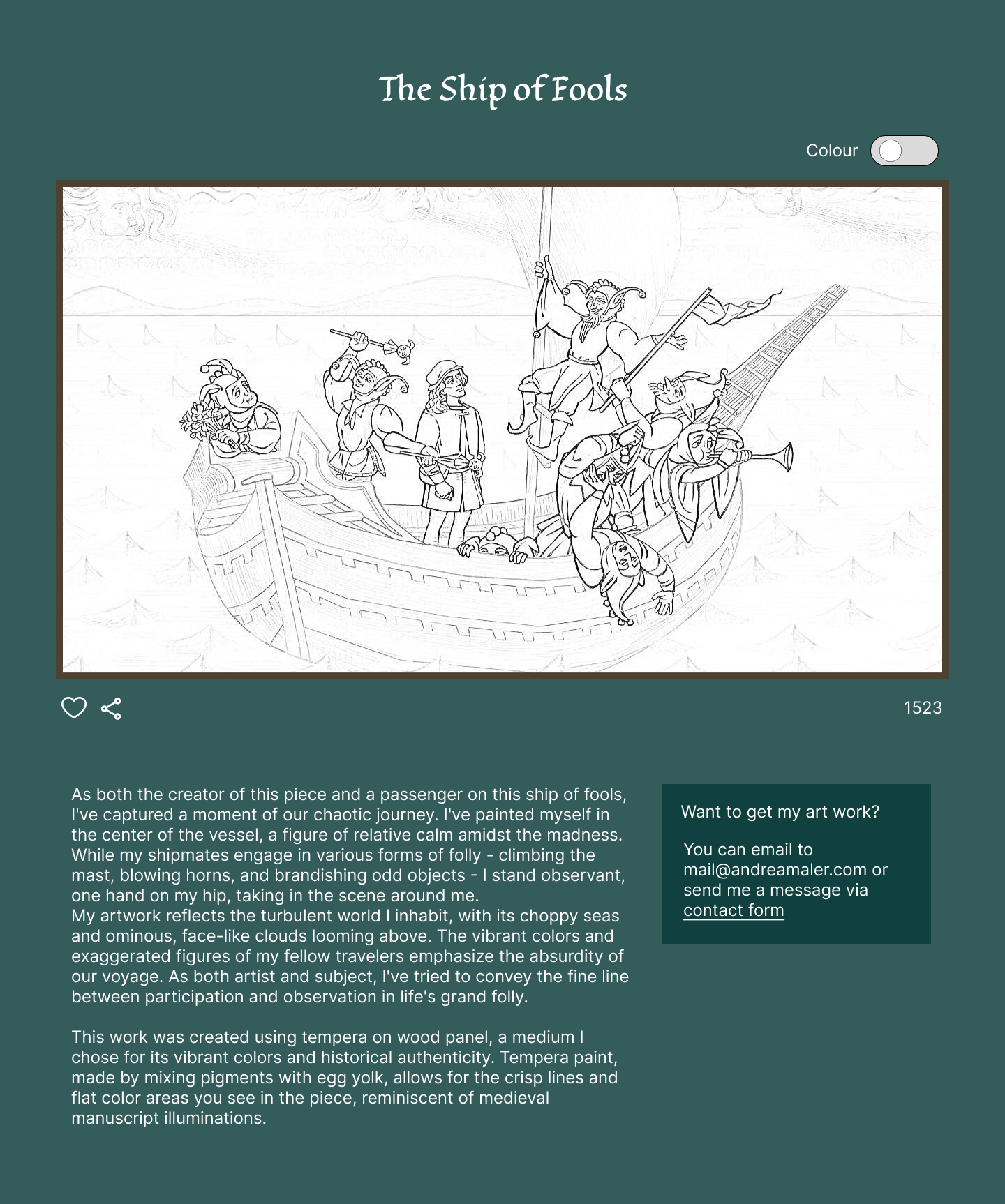
While I wish I had more time for the description layout, I’m really proud of the animations I created.
💡 What I learned today
Yesterday’s overwhelm turned into today’s accomplishment. Breaking tasks into smaller steps really helps manage my anxiety.
⏰ If I had more time
- Refine the modal description layout
- Experiment with the background, possibly adding some art elements
💌 Any thoughts?
I’d love to hear your feedback on my design or any advice you might have! My Mastodon account and email are below.
Thanks for following Day 4 of my challenge. See you tomorrow for Day 5!
With love and light 🫶🏻
Yoshie
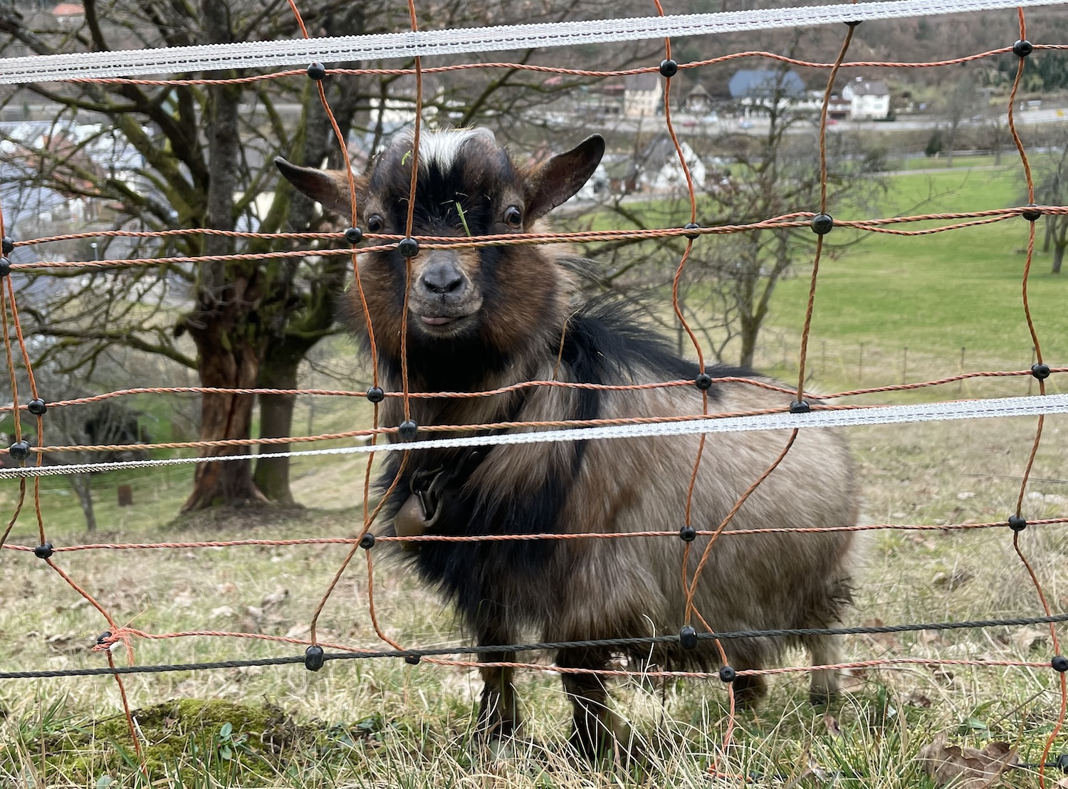
P.S. We visited our neighbour’s goat, Max, yesterday. Here’s a throwback photo from February
Images and the font on images: © 2024 Obsidian Entertainment, Inc.