🎨 Today’s Task
Conduct an accessibility audit for pickuplimes.com
Today’s task was both challenging and valuable. Accessibility is a crucial aspect of design, and I learned a lot from this deep dive!
🚀 My Process
I followed the Accessibility Insights for Web assessment guidelines closely to ensure I covered all necessary checks.
🧠 Challenges and Solutions
- Finding the Right Guidelines: Initially, I wasn’t sure which accessibility guidelines to follow, but my partner introduced me to a helpful tool that streamlined the process.
- Time-Consuming: Reading through all the accessibility tests took me over three hours, partly because I’m a slow reader. But it was time well spent!
🖼️ The Final Result
Here’s a list of the accessibility issues I identified based on the task guidelines:
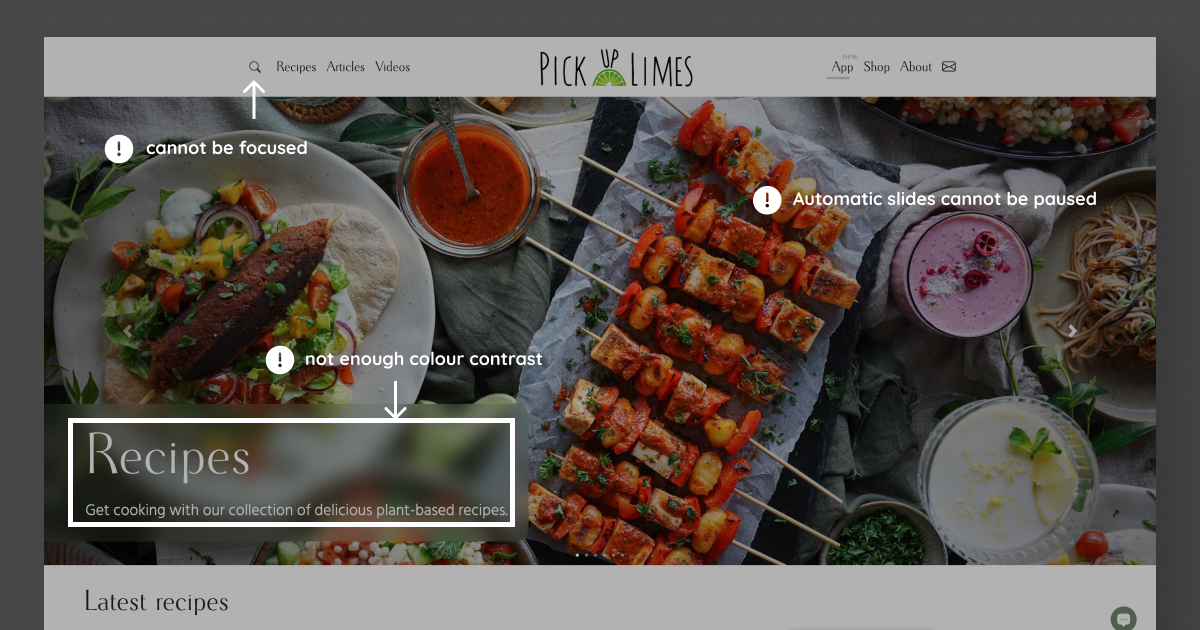
Color Contrast Issues
- Headline: The white text on a blurred background in the headline lacks enough contrast to be easily readable.
- “New” Animation: The colour contrast in the app menu’s “New” animation is not enough.
Keyboard Navigation Issues
- Search Button: It cannot be focused using the keyboard.
- Header Navigation: Users should be able to navigate between slides using the arrow keys.
- “More” Button: This isn’t a button element, so it’s inaccessible via keyboard navigation.
- Focus Outline Visibility: The “Learn more” button’s focus outline isn’t clear enough.
- “Go to the Top” Button: This button can’t be focused using the keyboard.
- Clickable H2 Elements: Some H2 elements that are links should visually indicate that they are clickable (e.g., by using an underline or arrow).
- Search Bar: It lacks a visible focus outline.
- Mobile Slides: The slides don’t have visible focus outlines, making navigation difficult.
Heading Structure Issues
- Article Description: It’s currently set as an H3, the same as the title, but it should be an H4 or a paragraph to maintain a clear hierarchy.
Alt Text Issues
- Alt Text for Images: Some alt texts aren’t descriptive enough, such as the header image’s alt text, which simply says, “Banner image 2.” These need to be more self-explanatory.
Form Labels and Error Messages
- Checkbox Error Handling: An error message should appear if the checkbox isn’t ticked when the sign-up button is pressed.
- Email Input Validation: When the email input is incorrect and the sign-up button is pressed, an appropriate error message should be displayed.
Other Accessibility Issues
- Moving Content:
- The “New” animation can’t be stopped, which can be problematic for users with certain disabilities.
- Header slides should have the option to pause automatic sliding, as this feature is often inaccessible.
- Spacing:
- On tablets, the cards don’t have enough vertical spacing, making it hard to see which text belongs to which image.
💡 What I Learned Today
I was surprised by the number of accessibility issues that can exist on a website that looks very beautiful on the surface. It was a real eye-opener 😯
⏰ If I Had More Time
I’d start brainstorming solutions to these accessibility issues. Fortunately, that’s part of tomorrow’s task, so I’ll dive into it then ☺️
💌 Any Thoughts?
What are you working on these days? I’d love to hear your thoughts on my design or any advice you might have!
Thank you for following along on Day 22 of my challenge. See you tomorrow for Day 23!
With love and light 🫶🏻
Yoshie
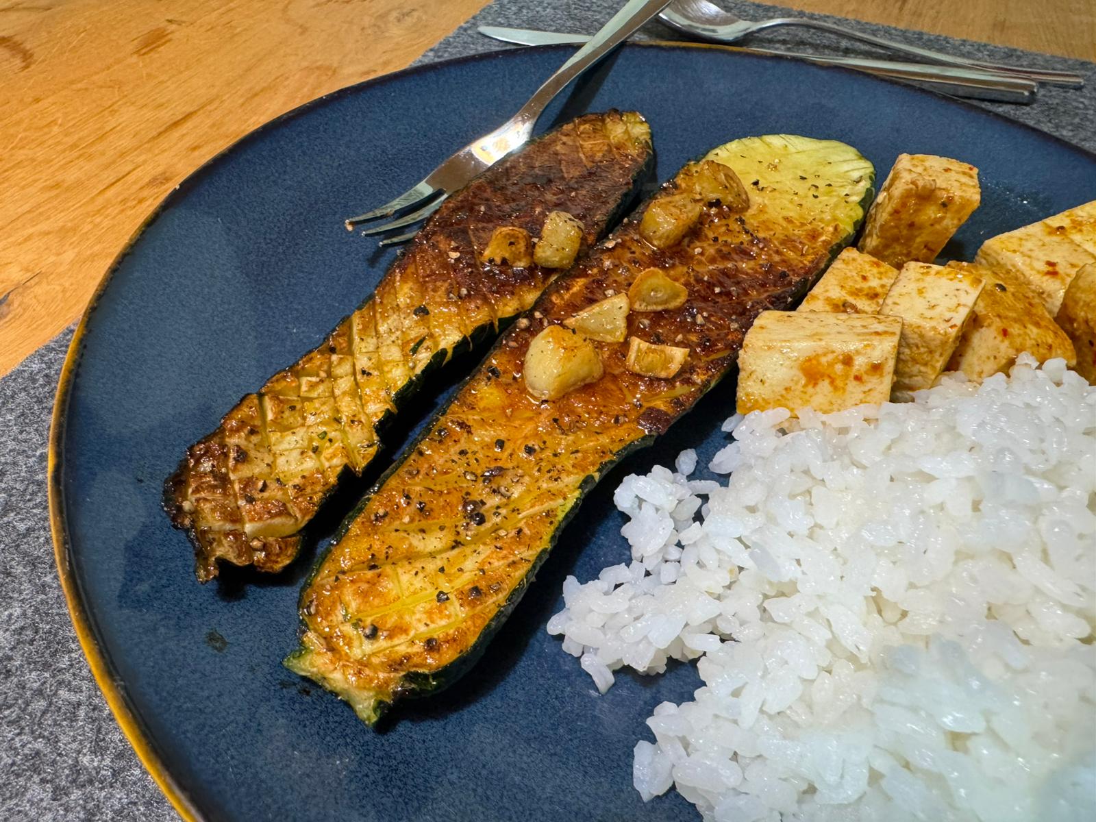
P.S. We made an amazing zucchini lunch today! I feel so lucky to have a partner who’s such a great cook 😋