🎨 Today’s design task
I woke up super excited today — a feeling I haven’t had in a while! My partner gave me an amazing project to work on.
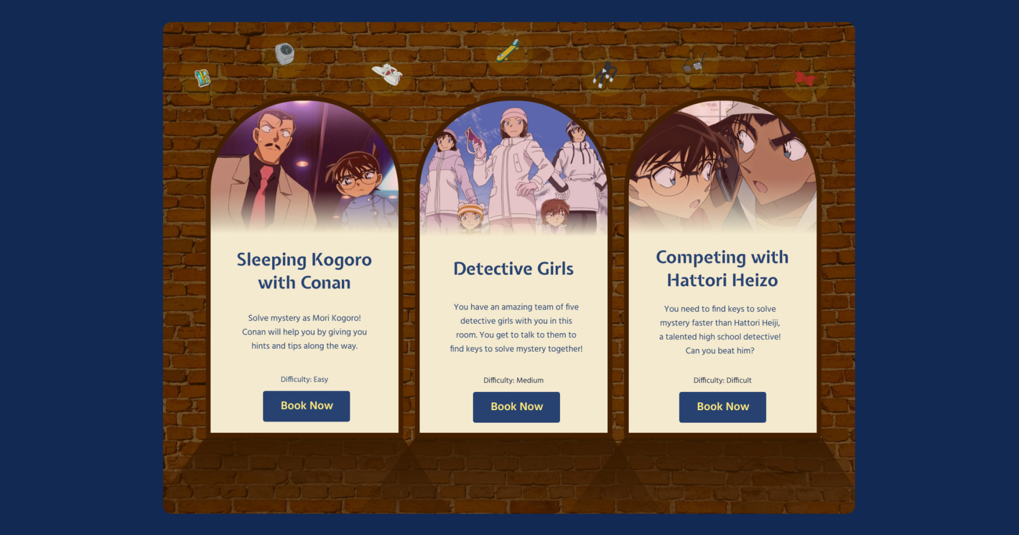
Detective Conan Escape Room Booking Page:
Design a visually engaging and user-friendly page for the “Beika Street Escapes” website. A company offering Detective Conan-themed escape rooms
Target Audience
- Detective Conan fans aged 15-45
- Escape room enthusiasts
- Groups looking for unique entertainment experiences
Design Requirements
- Color Scheme: Use a palette inspired by Detective Conan (blue, white, beige, red accents)
- Typography: Choose fonts that evoke a detective/mystery theme
As a huge fan of both Detective Conan and escape rooms, I couldn’t wait to get started!
🚀 My design process
-
I started by sketching some ideas on paper.

-
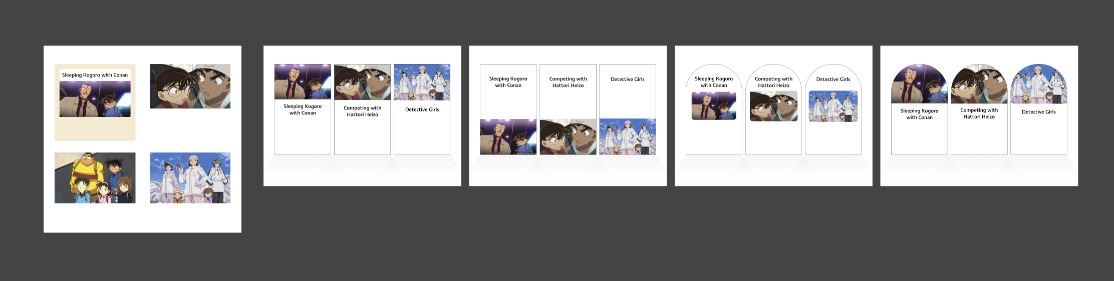
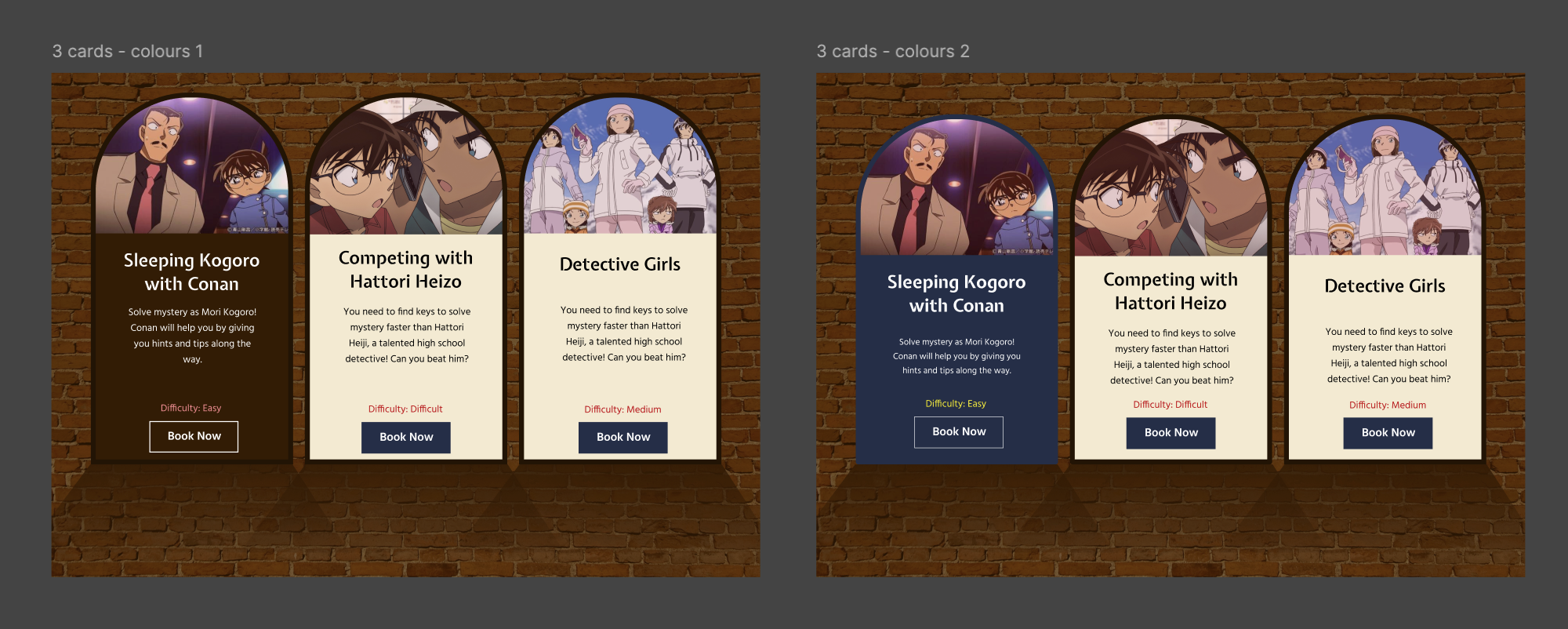
I decided to create a section showcasing 3-4 escape room options.
-
I researched Detective Conan’s official pages and escape room websites from Berlin and California for inspiration.
-
I looked at card designs on Dribble and door illustrations (inspired by Detective Conan’s episode openings).
-
I looked into the font pairing website to find fonts that match this project!
-
After trying different card designs, I chose one and added colours and backgrounds.
-
I tweaked the design based on my partner’s suggestion about the division between images and text in the cards.
-
As a fun touch, I added Conan’s iconic items at the top with a subtle light effect.

-
Finally, I lightened the card strokes to improve the overall look.
🧠 Challenges and solutions
- The theme of mystery and problem-solving made it easier to come up with ideas.
- The main challenge was working with the colour scheme. I had to use more brown than expected to balance the Detective Conan colours.
- I love Detective Conan so much (I watched over 1,000 episodes more than twice) so I enjoyed even just looking at the characters and thinking about them.
🖼️ The final design

For my first day, I’m pretty happy with how it turned out!
💡 What I learned today
I learned that it’s okay to experiment and make mistakes. Instead of trying to create a perfect draft, focusing on trial and error helped me achieve better results.
⏰ If I had more time
- I’d make the difficulty texts lighter or add a badge instead of texts to show the difficulty, as suggested by my partner.
- I’d add hover effects for buttons.
- I’d create additional sections for pricing, locations, and maybe some souvenir ideas.
💌 Share your thoughts
I’d love to hear about your current projects or hobbies! What do you think of my design? Any suggestions or advice? (My Mastodon and email are below. Please come say hi 🙋🏻♀️)
Thank you for joining me on Day 1 of this challenge. See you tomorrow for Day 2!
With love and light 💕
Yoshie
p.s. I am reading this book to learn more about typography.

It is certainly much deeper than I thought. I love the analogy that they made about typography that a little change can change massively in the same way as cooking. I will share more about what I learned from this book in this blog!
© YOMIURI TELECASTING CORPORATION
© B-SIDE LABEL
© HELLO ANIME!
© 青山剛昌/小学館・読売テレビ・TMS 1996