Accessibility Audit for Globale Musik
List Overview
Lack of Language Attribute
Number of Characters per Line
Details
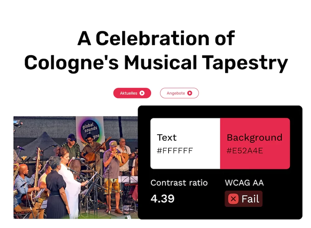
1. Low Colour Contrast
Issue
The white text does not have sufficient contrast against its pink background. This makes it difficult for users with visual impairments or colour blindness to read or interact with content.
Suggestion
Make sure that the colour contrast is at least 4.5:1 for regular-sized text and 3:1 for large-scale text according to WCAG SC 1.4.3 Contrast.
Location
Categories
Screen size

2. Alt Text Missing
Issue
Some images lack alternative text. This prevents screen reader users from understanding their purpose or content.
Suggestion
Add meaningful alt text for all informative images. Decorative images should have an empty alt="" to be ignored by screen readers. Reference: WCAG SC 1.1.1 Non-text Content
Categories
Screen size

3. Lack of Language Attribute
Issue
The website does not specify a language attribute in the <html> tag, which can cause screen readers to mispronounce content or use the wrong voice settings.
Suggestion
Add the appropriate language attribute (e.g., <html lang="en"> for English) in the HTML document. If the site has multilingual content, ensure correct attributes are used on different language sections. Reference: WCAG SC 3.1.1 Language of Page
Location
All pages
Categories
Screen size
4. Heading Structure
Issue
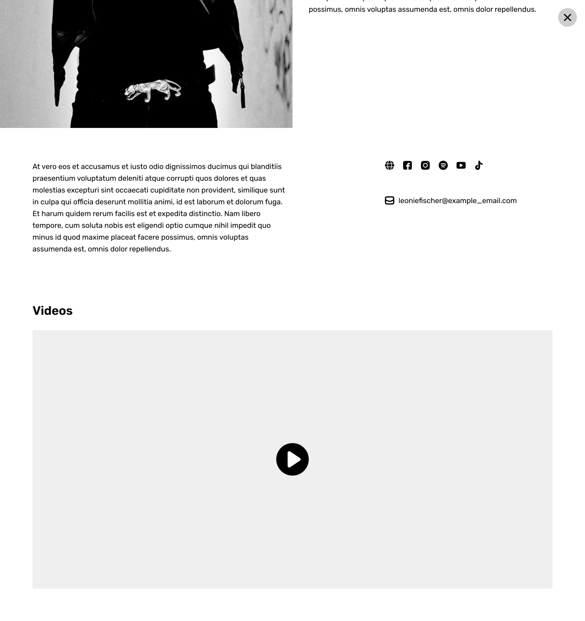
Some headings are skipped on a musician page. The section of videos has a heading but the sections of bio and social media don't have a heading. This affects screen reader users and page navigation.
Suggestion
Add a logical heading hierarchy (<h1> to <h6>) to improve readability and assistive technology navigation. Ensure headings describe sections meaningfully. Reference: WCAG SC 1.3.1 Info and Relationships
Location
Musician page
Categories
Screen size

5. Number of Characters per Line
Issue
The number of texts per line is too large. There are 111 characters per line on a 1440 px screen on the About Us page. This reduces readability and makes it harder for users to follow content, especially those with cognitive disabilities or low vision.
Suggestion
Limit line length to less than or equal to 80 characters for body text to improve readability. Reference: WCAG SC 1.4.8 Visual Presentation (Level AAA)
Location
About Us page
Categories
Screen size

Full List of Accessibility Audit
Would you like to receive a full detailed list of the accessibility audit for your website?
Legend
Severity
This issue severely impacts accessibility, making content or functionality difficult or impossible to use for some users. It fails to meet WCAG 2.1 A and AA standards and creates major barriers. Immediate fixes are needed.
This issue affects usability but does not completely block access. While it may meet WCAG 2.1 AA, it does not follow best practices, causing confusion or difficulty. Fixing it improves both accessibility and user experience.
This issue is not a major barrier but an opportunity to enhance inclusivity. Addressing it aligns with WCAG best practices, improving readability, navigation, and usability for a wider audience.
Status
The process to address this issue has not yet begun.
Work is currently being carried out to resolve the issue.
The necessary changes have been implemented and are now awaiting review.
This status is updated only by Yoshie upon her confirmation that the issue has been resolved.
Screen sizes
Mobile phones (≤ 600px)
Tablets and small screens (601px – 1024px)
Laptops and desktops (1025px – 1440px)
Terminologies
The Web Content Accessibility Guidelines (WCAG) are internationally recognised standards developed by the World Wide Web Consortium (W3C) to make digital content more accessible to people with disabilities. WCAG provides specific criteria to improve accessibility for users with visual, auditory, motor, and cognitive impairments.
Following WCAG ensures a more inclusive digital experience and helps meet legal accessibility requirements in many countries.
Colour contrast is a term used in colour theory that describes the difference between different colour hues. The details of how to meet the accessibility standard of colour contrast are in this article: Make Your Website Easy to Read for Everyone (Why Colour Contrast Matters)
