Day 30 of 30 Day UI/UX Design Challenge: Reflecting on My Journey 🌱
🎨 Today’s Task: Reflection and Review
For the final day, my partner suggested I reflect on the 29 challenges I’ve completed to identify what I enjoyed most and what areas I excel in.
💡 Reviews & Redesigns
Here’s a look back at what I would change now and which challenges I enjoyed the most!
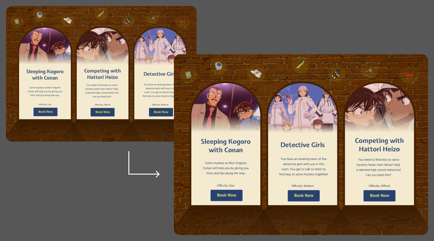
Day 1: Detective Conan Escape Room Booking Page
- Card Order: I’d reorder the difficulty levels from easy to hard (left to right).
- Button Color: The yellow was too harsh; I’d opt for a softer yellow.
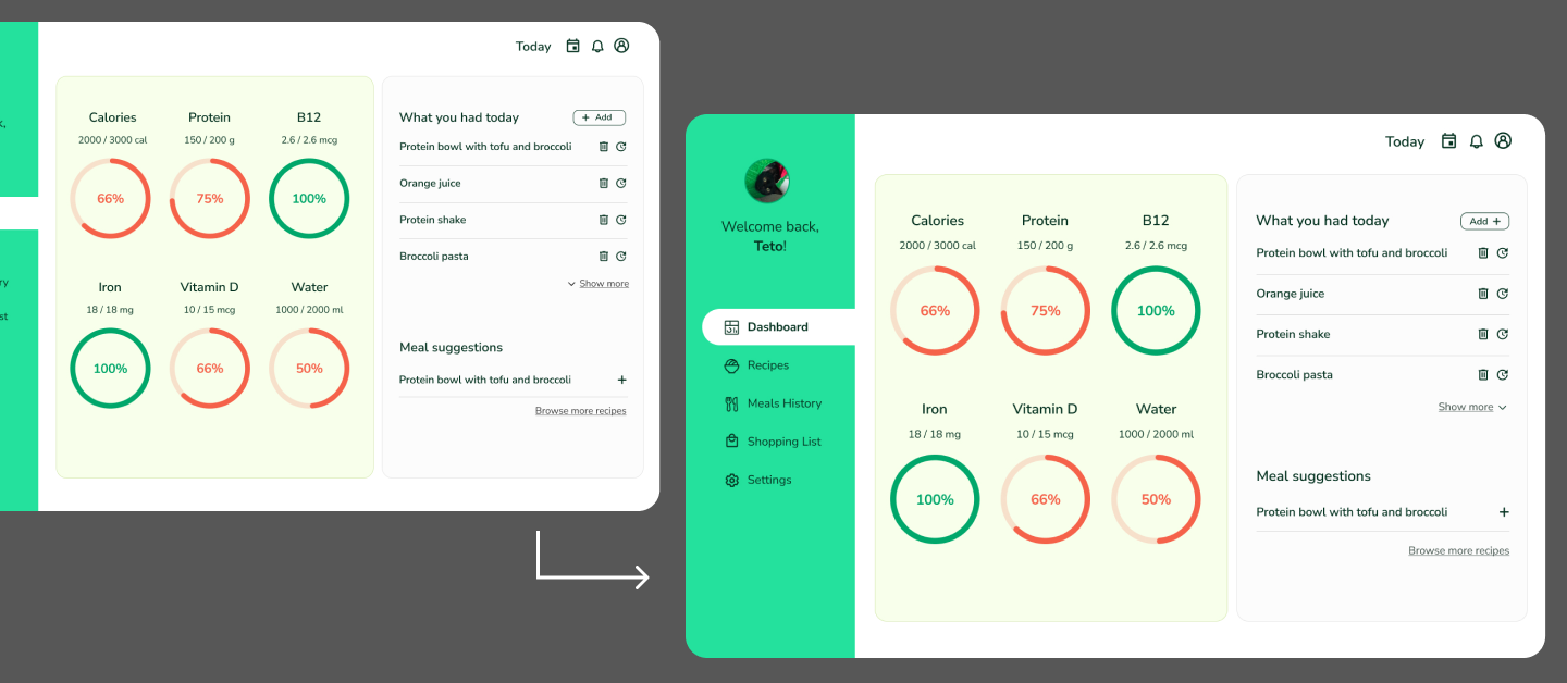
Day 2: Dashboard for Vegan Athletes
- Alignment: The “Add” button, “Show more,” and other elements on the right side need better alignment.
- Button Icons: I’d place icons on the right side of the buttons for consistency.
- Colors: I’d love to refine the colour palette further.
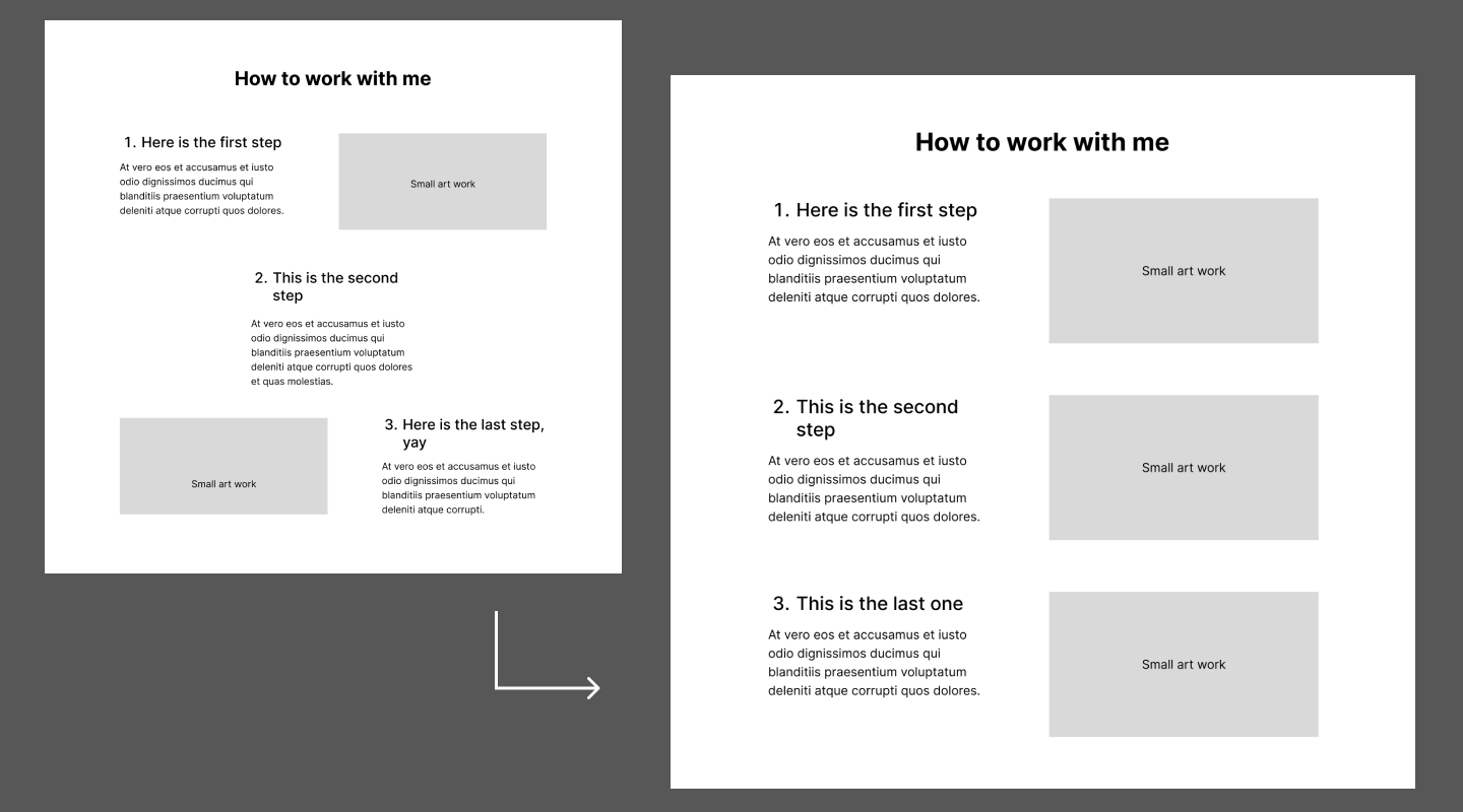
Day 3: Medieval Artist Portfolio
- Accessibility: I’d redesign the “How to work with me” section to be more screen reader-friendly.
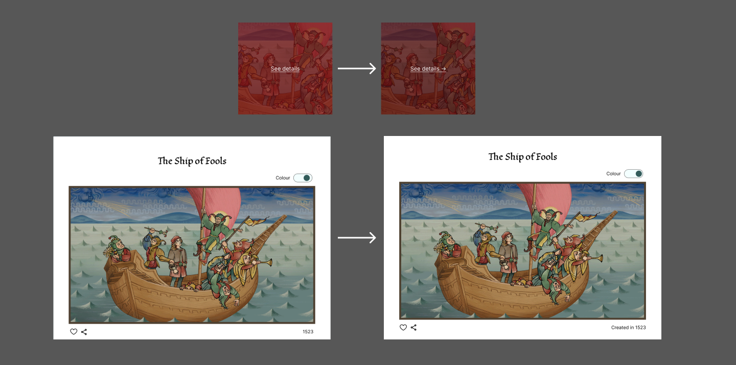
Day 4: Portfolio Gallery Section
- Toggle Button: Aligning the toggle circle with the outer line improved the design.
- Year Label: I added “Created in” before the year for clarity.
- Hover Effect: I darkened the hover background and added an arrow icon for better visual feedback.
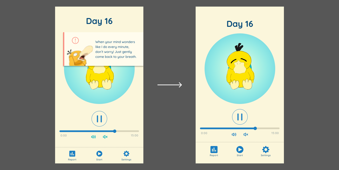
Day 5: Psyduck’s Mindfulness App - Meditation Screen
- No Alerts: I’d remove alerts, keeping reminders as voice prompts during meditation.
- Spacing & Icons: More bottom spacing and larger menu icons, with a darker volume button.
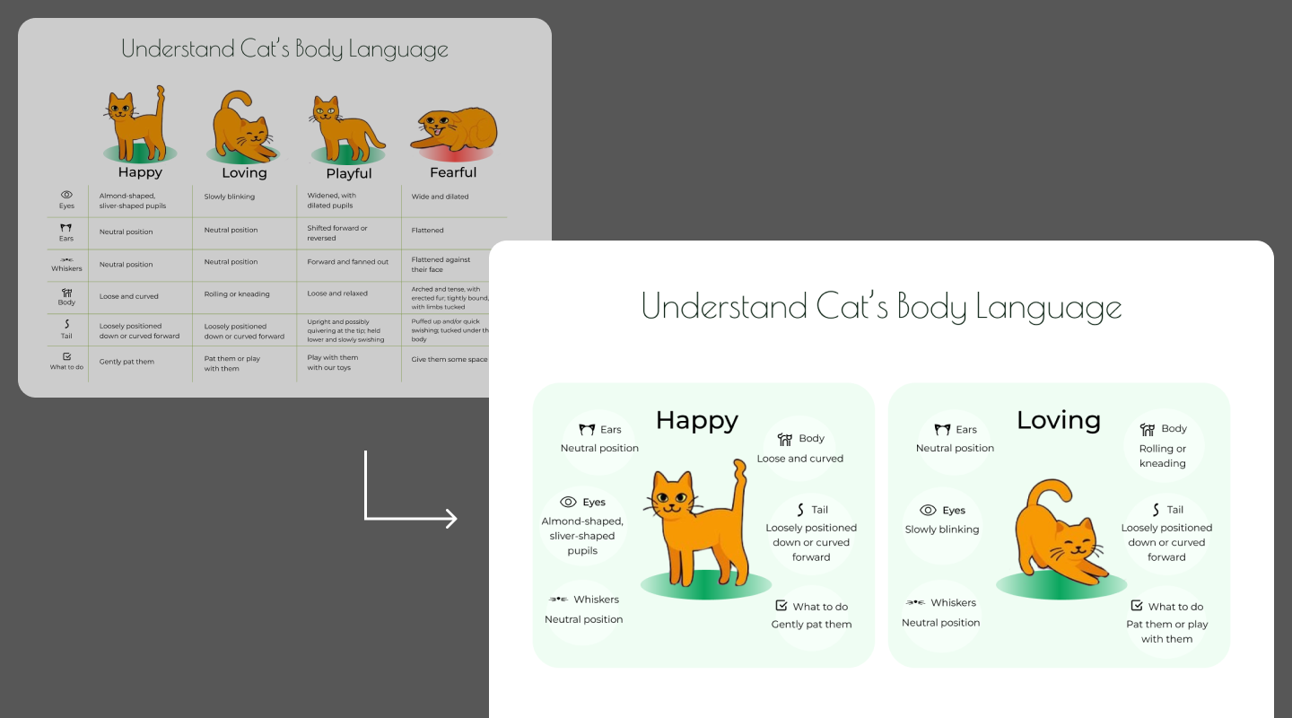
Day 6: Ethical Cat Café Website Infographic
- Redesign: The original table was unclear, so I’d switch to individual cards for each cat’s state, with added body language illustrations.
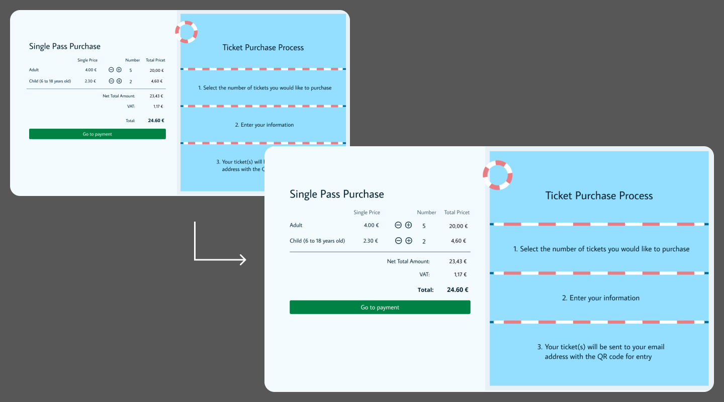
Day 7: Modernizing the Freibad Hornberg Website
- Spacing: I’d refine the spacing for ticket prices and lighten the titles.
- Pool Bar: I’d simplify the pool bar design.
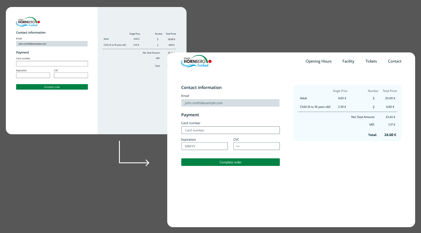
Day 8: Cart/Checkout Redesign for Freibad Hornberg
- Navbar & Price Section: I’d add a top navbar and make the price section more visually appealing.
- Input Fields: I’d include placeholders for each input field.
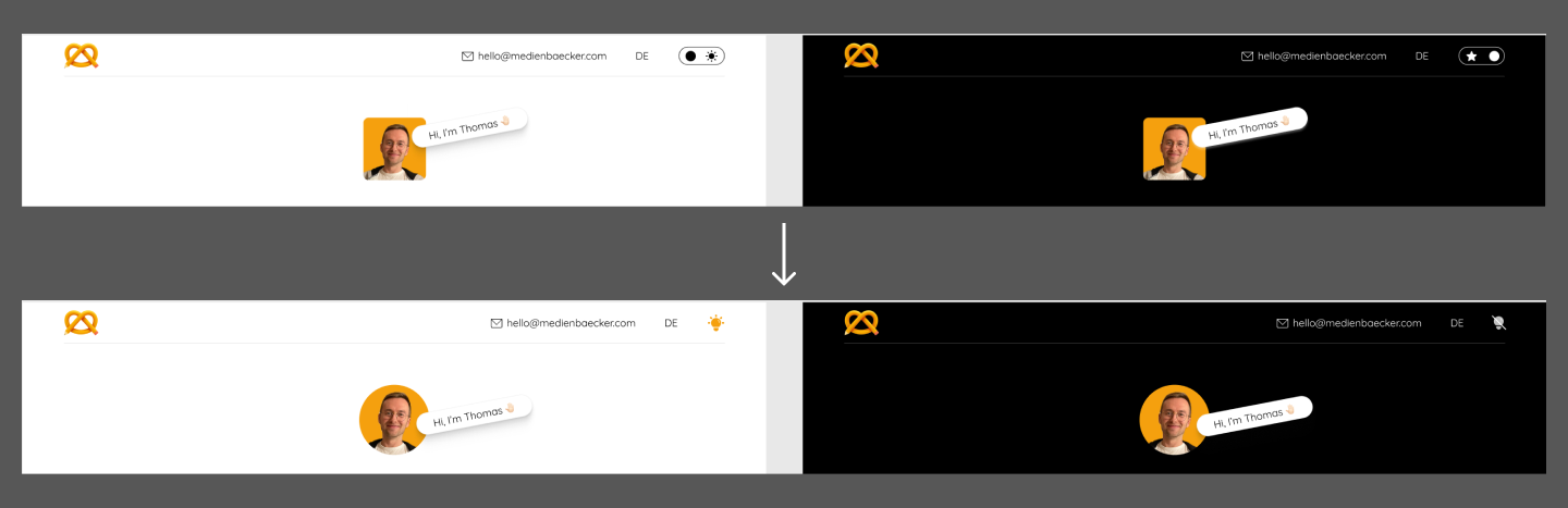
Day 9: Redesign of medienbaecker.com
- Toggle Button: I’d replace the toggle with an icon for a cleaner look.
- Profile Photo: I’d make the profile photo circular.
Day 10 & 11: German & Japanese Culture Icons
- Icon Swap: I’d replace the Pretzel and Zugspitze icons with a sausage, traditional hat, or simpler mountain.
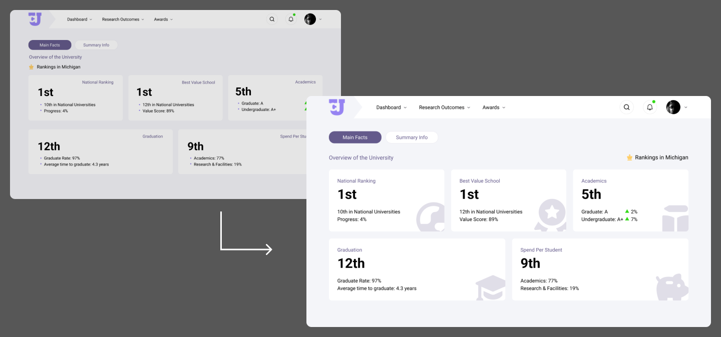
Day 12: Dashboard for Hexalytics
- Text Alignment & Icons: I’d align all text to the left and add icons to each card.
Day 13 & 14: Redesigning the Juni Website
- Menu Alignment: I’d left-align the menu, reduce the sub-headline size, and adjust the spacing under icons in the Super 5 section.
Day 15: Poop Tracker App Concept & Wireframing
- No Changes: I’m satisfied with this design as is.
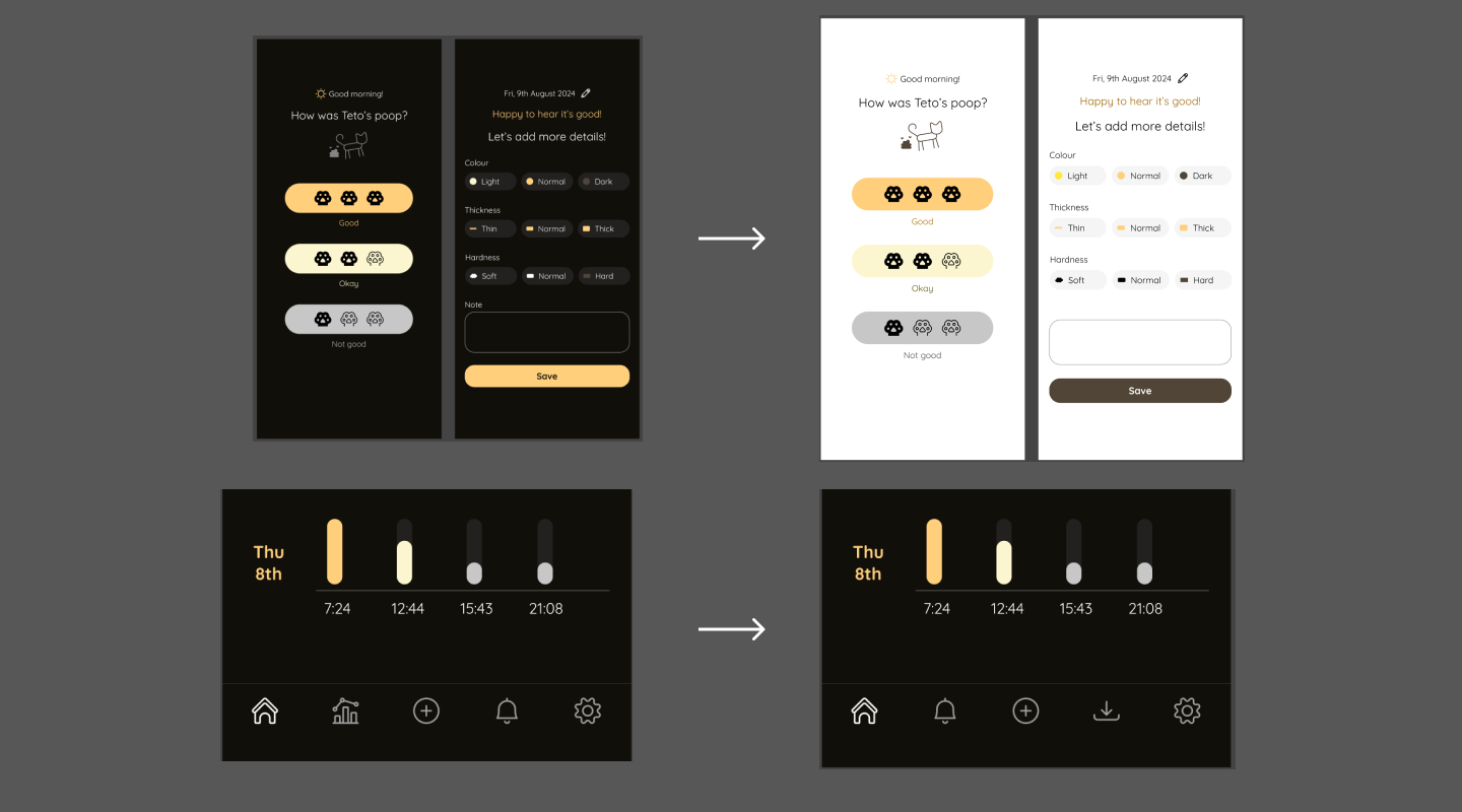
Day 16: Poop Tracker App Visual Design & Prototyping
- Light Mode: I’d add a light mode option.
- Navbar: I’d include a download menu in the navbar and remove the insight menu since it’s already on the home screen.
Day 17: Enhancing the Poop Tracking App Experience
- User Reminder: I’d explore more prominent ways to remind users of their previous choices on the second entry screen.
Day 18: Redesigning the TELL Japan Logo
- Speech Bubble: I’d modify the speech bubble shape for consistency in smaller versions.
Day 19: Content Restructuring for TELL Japan Website
- No Changes: I’m happy with this redesign.
Day 20: Paragliding Website Animation
- Single Section: I’d limit the animation to one section rather than using it in the header.
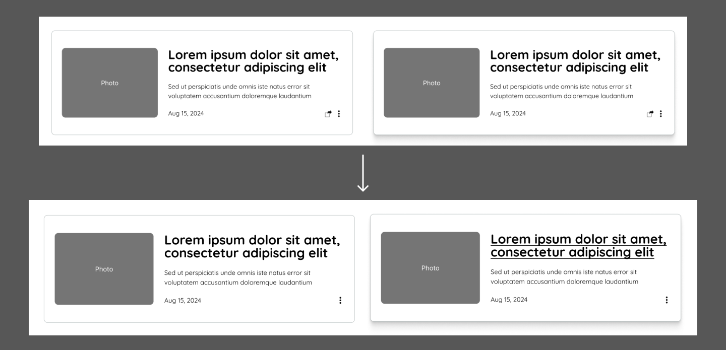
Day 21: Versatile Article/Event Card Component for TELL Japan
- Share Icon: The share icon isn’t obvious; I’d remove it and add a share or copy link button on the event page.
- Hover Effect: I’d underline event titles in addition to the shadow effect to signal clickability.
Day 22: Accessibility Audit for Pick Up Limes Website
- No Changes: Satisfied with the accessibility improvements made.
Day 23: Redesign for Pick Up Limes Website
- Clickable Sections: I’d remove clickable section titles and streamline buttons to direct users to specific pages.
Day 24: Insights into Japanese Web Design
- Further Research: I’d like to conduct more research and potentially select a different website for improvement.
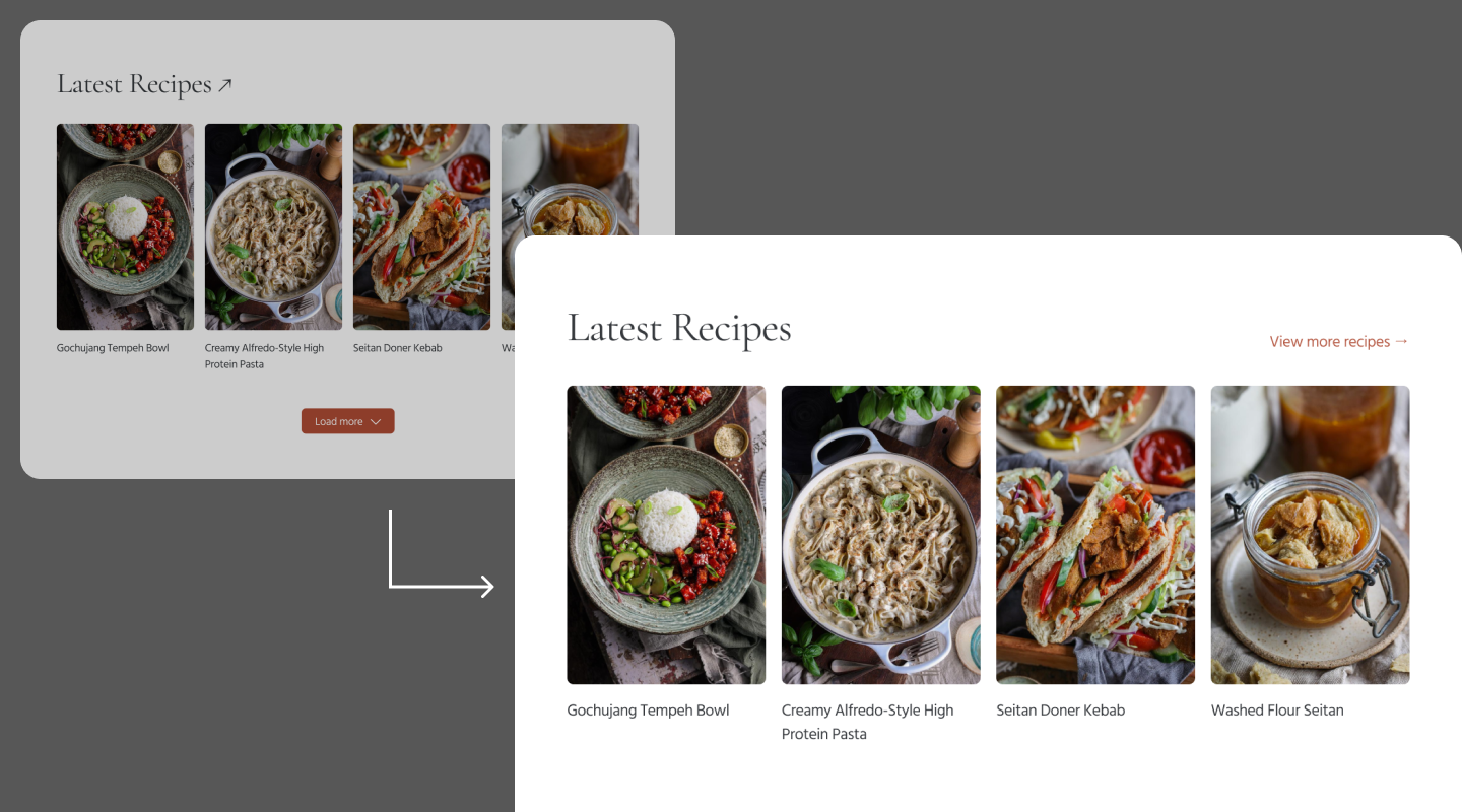
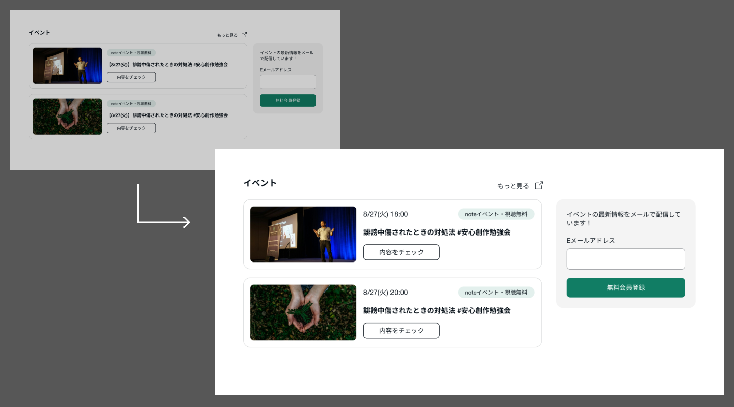
Day 25: Redesign of note.com
- Newsletter Box: I’d make the newsletter box wider and add dates to the top of each event card.
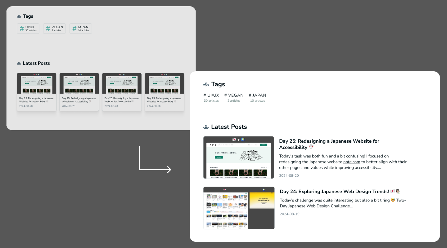
Day 26: Designing My Own Blog Page
- Tag Design: I’d redesign the tags to look more like physical tags and reduce the latest posts to two.
Day 27: Designing My Blog Article Page
- No Changes: After experimenting with alignment, I prefer the centred layout.
(image)
Day 28: Poopy Tracker App Landing Page with Animated Features
- Additional Animations: I’d animate the cat and poop on the mobile frame.
- Mobile Frame Ratio: I’d adjust the mobile frame to the actual ratio for accuracy.
(image)
Day 29: Redesigning Seedlang Registration
- Color Scheme: I’d consider changing the colour scheme entirely, possibly using a darker blue or their green as the primary colour.
Most Enjoyed Challenge: Day 1 - Detective Conan Escape Room!
I had a lot of fun with this challenge, envisioning the escape room experience. It turned out even better than I expected, which made it especially satisfying! 💕
💌 Any Thoughts?
If you’ve been following along, thank you so much! I hope my journey provided some value, inspiration, or maybe even a touch of nostalgia. I love connecting with other designers, developers, or any open-minded people—feel free to reach out via email or on Mastodon!
With love and light 🫶🏻
Yoshie
P.S. I’m considering another challenge focused on accessibility. If you have any ideas on how I can continue to grow as a UI/UX designer aligned with values like inclusiveness, sustainability, and accessibility, please let me know! 🥰
Archive
- Day 30 of 30 Day UI/UX Design Challenge: Reflecting on My Journey 🌱 Sep 02, 2024
- Day 29 of 30 Day UI/UX Design Challenge: Redesigning the Registration Process for Seedlang 🌱 Aug 29, 2024
- Day 28 of 30 Day UI/UX Design Challenge: Landing Page for Cat Poopy Tracker! 🐾 Aug 26, 2024
- Day 27 of 30 Day UI/UX Design Challenge: Designing the Blog Article Page! ✍🏻 Aug 22, 2024
- Day 26 of 30-Day UI/UX Design Challenge: Creating My Custom Blog Design! 👩🏻🎨 Aug 21, 2024