Case Study: Redesigning Seedlang App for Accessibility and User-Friendliness

Posted
Tags
Case Study
Share
On the left, there is a word that says Before and a mobile screen of the old version of the Seedlang registration process. On the right, there is a word that says After and a mobile screen of Yoshie's redesign of the Seedlang registration process.

As a UI/UX designer passionate about creating inclusive and intuitive experiences, I collaborated with Seedlang, a German learning app, to improve their registration process and home screen. This project was an opportunity to merge accessibility best practices with user-centred enhancements, which resulted in a design that supports all learners (including myself as a power user of Seedlang 😚) in their language journey.

Accessibility Improvements

One of the most significant enhancements I introduced was improving colour contrast across the app. This adjustment ensures that text and interactive elements are easier to read for users with visual impairments, enhancing the overall usability for everyone.
(Learn more about colour contrast in this article.)

A mobile screen that shows the old version of Seedlang's registration process. The background has a gradient of light green and light blue. There is a title that says what is your German level?. There are 6 options to choose from, A1: Beginner, A2: Elementary, B1: Intermediate, B2: Upper Intermediate, C1: Advanced and N: Native Speaker.
Before
A mobile screen that shows one of Yoshie's redesigns of Seedlang's registration process. The background colour is white. There is an illustrated character of a man on the top. There is a title that says what is your German level?. There are 3 options to choose from, I'm new to German, I know some basic words, and I can have a conversation.
After

Making the Registration Process More User-Friendly

To streamline and simplify the onboarding experience, I made several key changes:
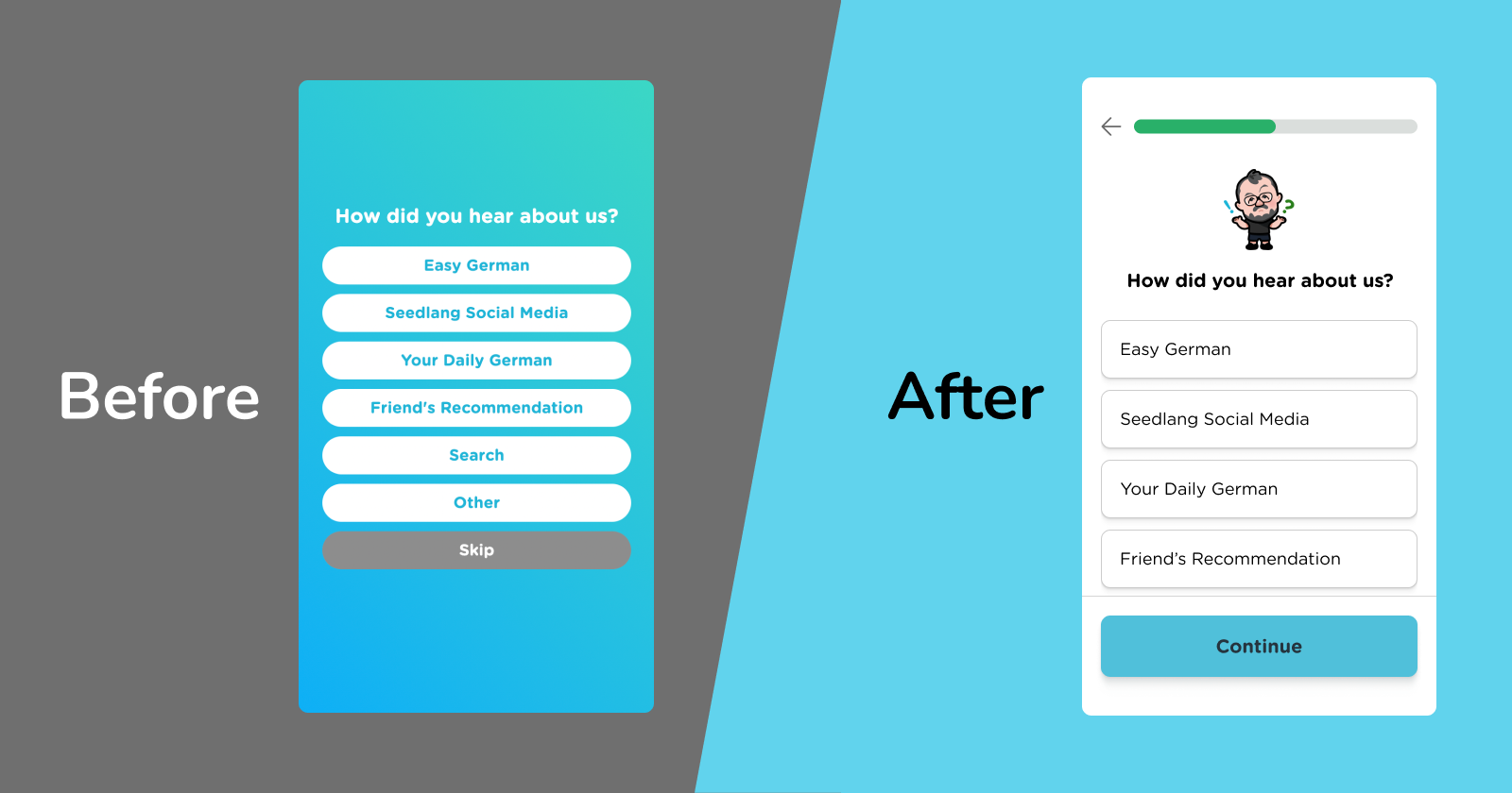
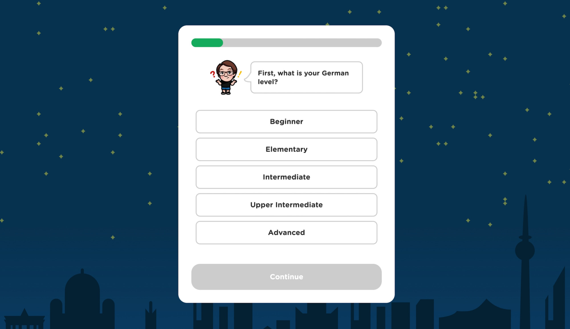
Back button

Introducing a back button empowers users to easily review or correct their previous inputs without restarting the process.
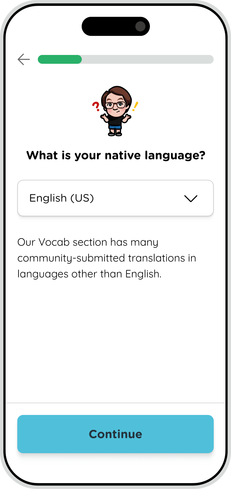
A mobile screen that shows the old version of Seedlang's registration process. The background has a gradient of light green and light blue. There is a title that says What is your native language?. There is a language dropdown which has English (American) selected. Below the dropdown, there is a sentence that says Our Vocab section has many community-submitted translations in languages other than English.
Before
A mobile screen that shows one of Yoshie's redesigns of Seedlang's registration process. The background colour is white. There is a title that says What is your native language?. There is a language dropdown which has English (US) selected. Below the dropdown, there is a sentence that says Our Vocab section has many community-submitted translations in languages other than English.
After

Progress bar

As you can see in the after image above, I also added a progress bar to give users a clear sense of where they were in the process and what to expect next. It reduces potential frustration.

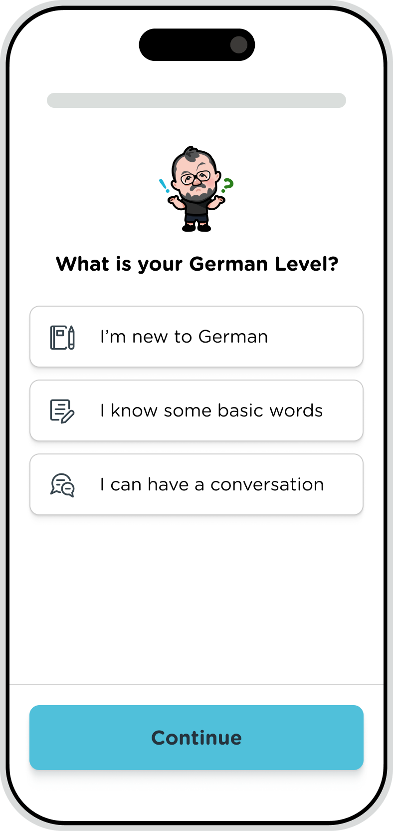
Animations of illustrated teachers

As I understood that a lot of new users come from Easy German YouTube Videos, using the playful animations of the main people from Easy German brings personality and familiarity to the app and keeps the experience engaging.

The explanation of the video: A mobile screen that shows one of Yoshie’s redesigns of Seedlang’s registration process. The background colour is white. There is an animated character of a man on the top that expands and then shrinks back to the original size within a few seconds. There is a title that says “What is your German level?”. There are 3 options to choose from, I’m new to German, I know some basic words, and I can have a conversation.

Consistent icons and “continue” buttons

I ensured visual consistency throughout every step of the process by having consistent icons and the same style buttons that have consistent texts. This creates familiarity and builds trust.
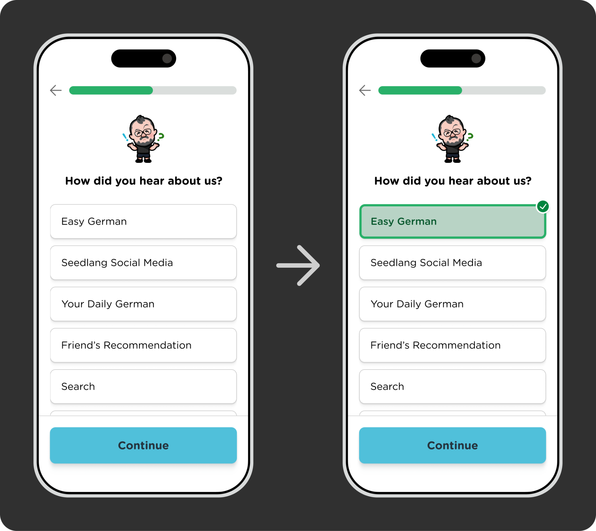
Clearer Selection

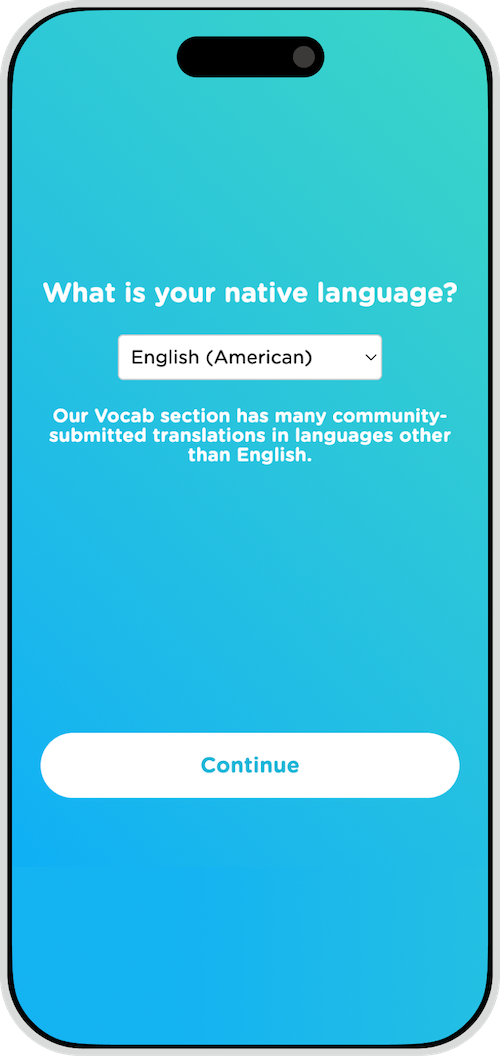
In the old registration process, selecting an option worked as a button that not only selected an option but also immediately went to the next screen.
Rather than making the option to do these 2 actions, I created a new screen where you can see which one you selected and then click “Continue” to go to the next step. This way users can understand which one they select more clearly and accurately.

There are 2 mobile screens and a right arrow in the middle. The left mobile screen is one of Yoshie's redesigns of Seedlang's registration process. The background colour is white. There is an illustrated character of a man on the top. There is a title that says How did you hear about us?. There are 5 visible options to choose from, Easy German, Seedlang Social Media, Your Daily German, Friend's Recommendation and Search. The right mobile screen is the same except for the first option, Easy German is selected.

Enhancing the Home Screen

The redesign of the home screen I made enables users to track their progress effortlessly and see what lessons to take next. This clarity keeps users motivated and helps them stay on track with their learning goals.

Mobile screen of the old version of Seedlang homepage.
Before
After

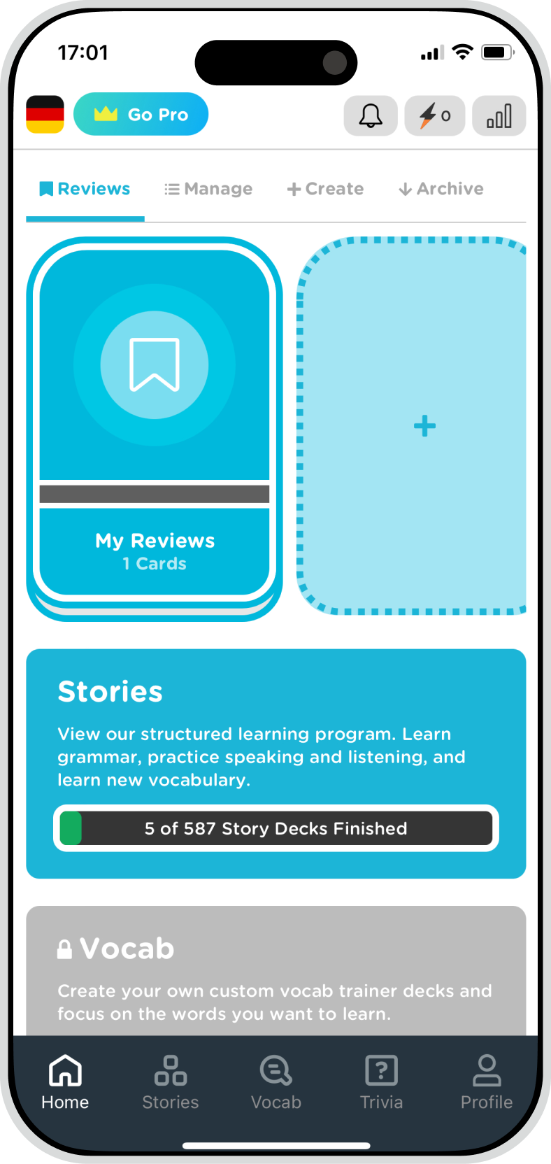
The explanation of the video: A mobile screen that shows Yoshie’s redesign of the Seedlang homepage. The menu that says Foundational is clicked and then a modal opens. And then the close button is clicked and the modal closes.

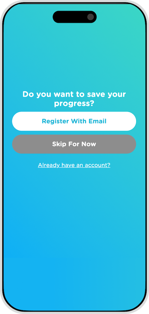
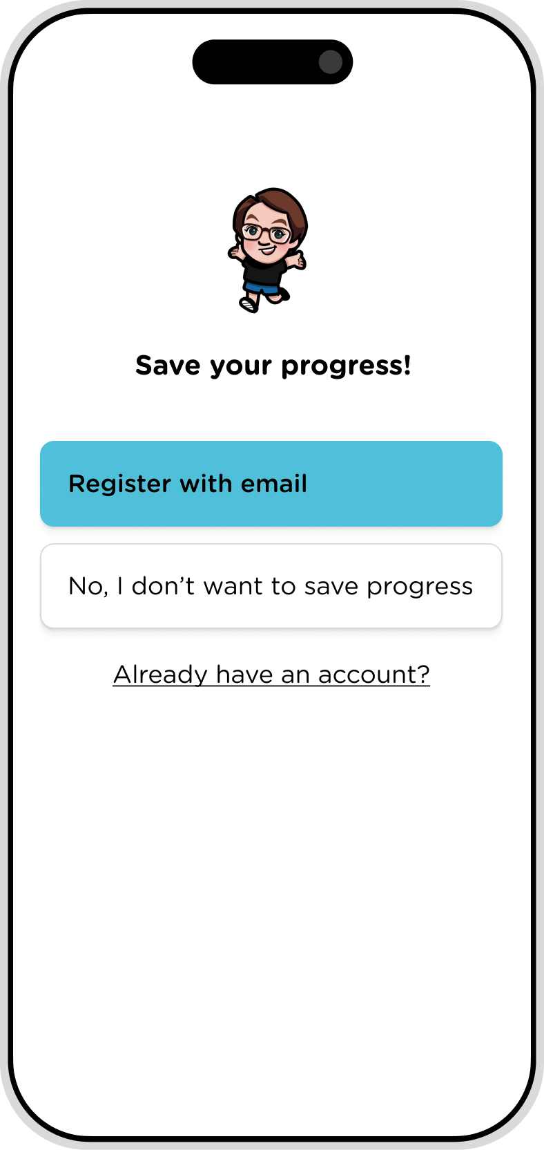
Driving Account Creation Through Strategic Changes

The screen to put the email and password for account creation was the third step right after language selection. At this point, new users have not invested enough time and energy to give their email address and they are not sure if it’s worth creating an account.

I solved this problem by moving the email input screen to appear right after the first lesson which is automatically selected by the level the user chooses. This subtle yet impactful change allows users to experience the app before committing to creating an account, significantly increasing the likelihood of signups.

A mobile screen that shows the old version of Seedlang's registration process. The background has a gradient of light green and light blue. There is a title that says Do you want to save your progress?. There are 3 buttons to click, Register with Email, Skip For Now, and Already have an account?
Before
A mobile screen that shows one of Yoshie's redesigns of Seedlang's registration process. The background colour is white. There is an illustrated character of a woman on the top. There is a title that says Save your progress! There are 3 buttons to click, Register with Email, Skip For Now, and Already have an account?
After

Impact and Reflections

Some of the new designs of registration have been implemented and are now live on Seedlang 🥳
You can check it out here: Seedlang homepage ↗︎

Screenshot of a language learning app featuring a cartoon avatar and the question

If you’d like to explore how accessible and intuitive design can transform your app or website, feel free to reach out! hello@yoshieagata.com

Related articles

A laptop screen showing a website with the text

Case Study: Designed and Built a Website for an Empowering Women Community

Creating a website for a women’s empowerment community was an exciting opportunity to apply thoughtful design and development practices. I created a visually appealing yet practical platform that aligns with the brand’s values of kindness and inclusivity. While the project didn’t go live, the process was a valuable learning experience that I am proud to share 🙌 You can see the whole homepage …