Creating a website for a women’s empowerment community was an exciting opportunity to apply thoughtful design and development practices. I created a visually appealing yet practical platform that aligns with the brand’s values of kindness and inclusivity. While the project didn’t go live, the process was a valuable learning experience that I am proud to share 🙌
You can see the whole homepage prototype in Figma!
Design Process
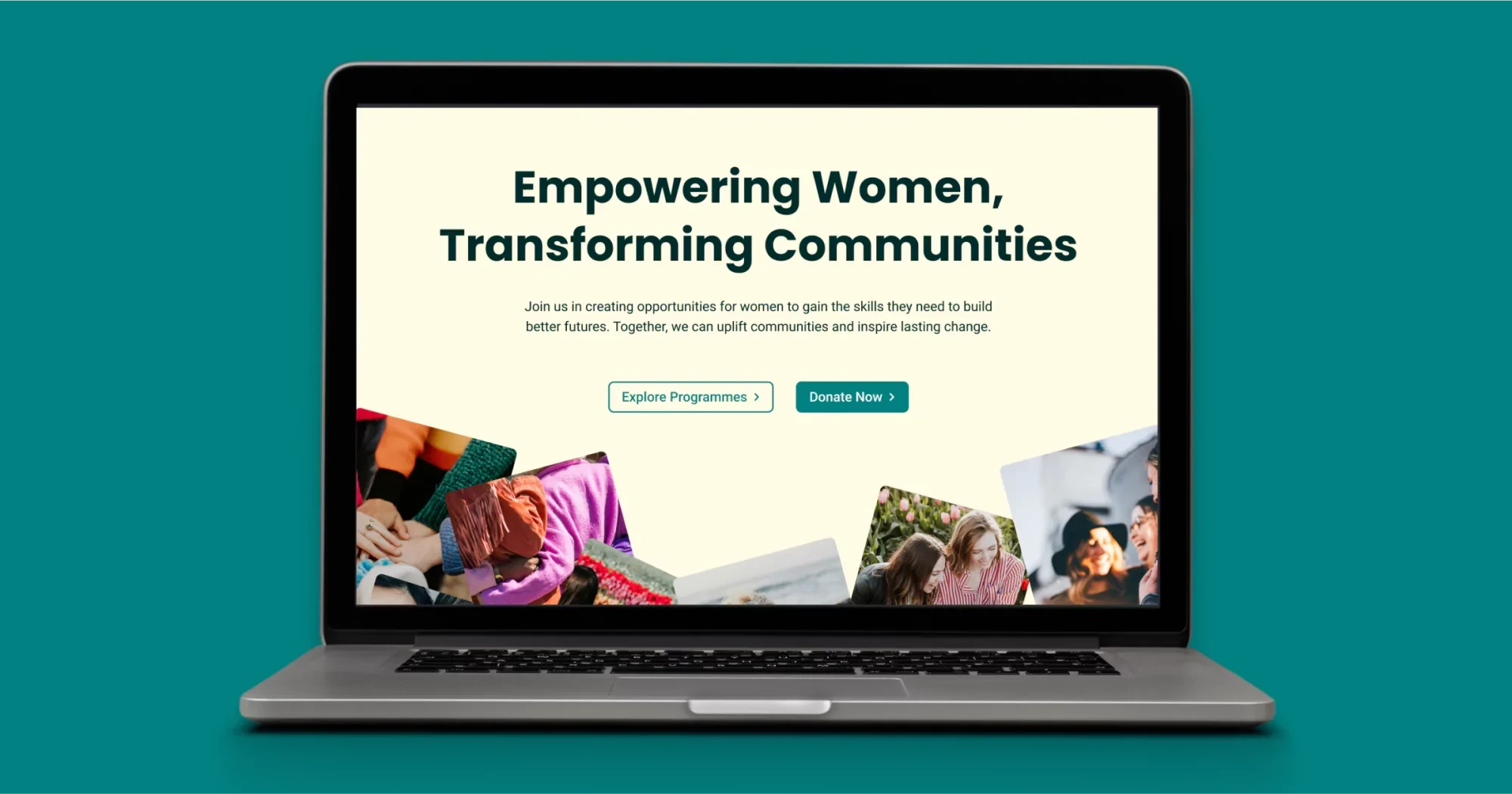
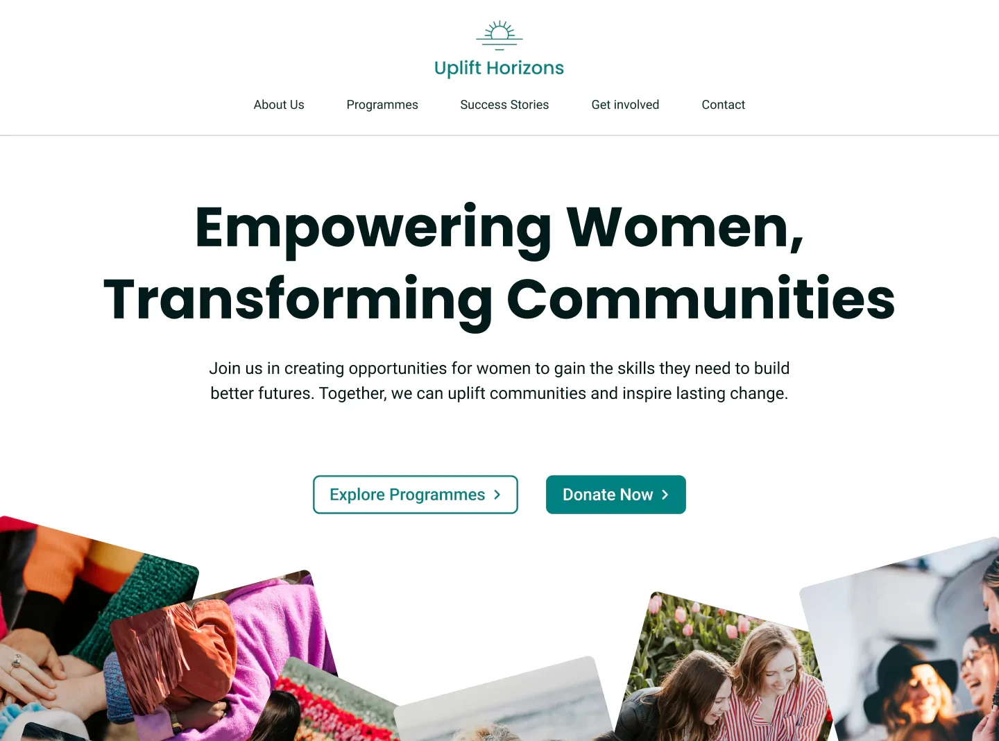
Brand Colours and Visual Choices
Working with the client’s brand colours, I created two design versions for them to choose from:
-
A clean white background with bordered text boxes for simplicity and readability.
-
A light yellow background, which offered a friendly and kind vibe that better reflected the brand’s image.
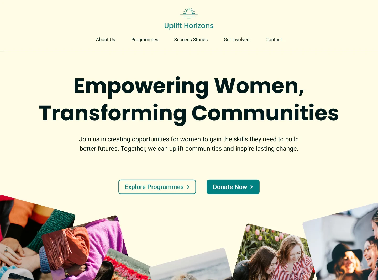
The client ultimately chose the light yellow version. While it required more thoughtful adjustments for contrast and usability, I think it was a better fit for their brand.
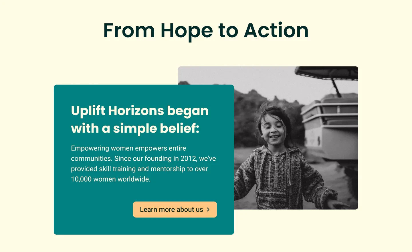
Call-to-Action Section
The first call-to-action section, “Hope to Action,” had a design challenge. The initial white text box on the light yellow background didn’t stand out enough 🥲

To address this:
- I changed the background to the brand’s primary blue colour to enhance visibility.
- I experimented with button colours and found that the secondary yellow clashed with the blue, creating an unfriendly atmosphere. Introducing an accent orange brought warmth and consistency to the website’s overall tone.
Footer Alignment
Initially, the logo was placed on the left of the footer. However, the sunrise logo’s symmetry worked better when centred. This adjustment required rethinking the layout:
- Aligning the elements beneath the logo was tricky. Three equal-width rows appeared misaligned with the centred logo.
- I redesigned the footer with a 1/2 width layout for the lower sections, creating a harmonious and balanced appearance.
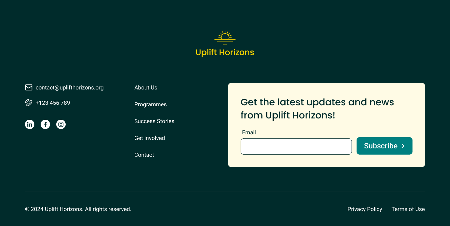
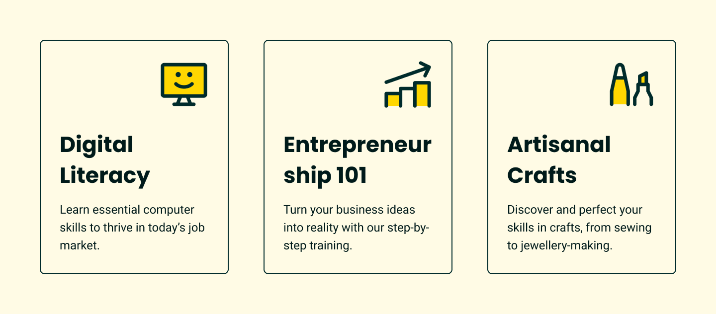
Cards Section
The cards section needed to be clean, friendly, and bold. I selected icons that embodied these traits and experimented with colour palettes:
- The light yellow background initially made colour choices tricky. After testing all palette options, I chose yellow for consistency.
- Adding a stroke around each card helped group the icon, title, and text. Grey strokes looked dull, so I opted for the brand’s text colour, close to black, to maintain elegance and contrast.
Development Process
Building websites
This was my second project building a website after a 5-year gap. My partner, experienced with development, supported me during the development phase, which helped me overcome challenges 🙏
Design Adjustments During Development
While implementing the design, I noticed that the black text on the light yellow background felt too harsh and didn’t align with the brand’s values. I revisited Figma and adjusted the text colour to a mixture of black and the brand’s primary blue. This maintained sufficient colour contrast while introducing a friendlier tone.
Reflection
Although this project didn’t reach the launch stage, I gained invaluable experience in creating accessible, user-friendly, and visually appealing designs.
The lessons learned, especially in balancing brand values with usability and aesthetics, have been helping me in other projects 😊
I’m excited to continue building websites that empower communities and create meaningful online experiences! 🫶


